SalesPatriotYC W25 landing page report.
← Back to YC W25

Your landing page’s weakest score is Trust.

How SalesPatriot ranks

  1. 1.Govly76
  2. 2.Sweetspot76
  3. 3.GovDash75
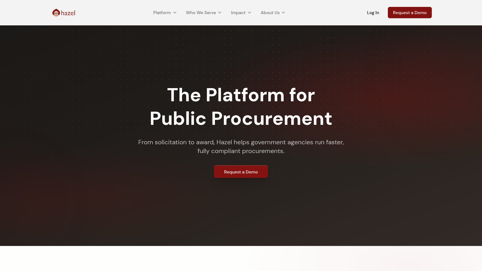
  4. 4.Hazel71
  5. 5.SalesPatriot59
Fix Trust

Score over time

908070605040Govly 77 on May 2 (Wayback)Govly 76 on Jun 4 (Wayback)Govly 78 on Sep 8 (Wayback)Govly 76 on Sep 21 (Live)Sweetspot 77 on Jul 13 (Wayback)Sweetspot 76 on Sep 20 (Live)GovDash 70 on Apr 19 (Wayback)GovDash 73 on Aug 3 (Wayback)GovDash 75 on Sep 20 (Live)Hazel 71 on Jul 20 (Wayback)Hazel 71 on Sep 20 (Live)SalesPatriot 45 on May 19 (Wayback)SalesPatriot 63 on Jun 17 (Wayback)SalesPatriot 60 on Jul 13 (Wayback)SalesPatriot 60 on Jul 30 (Wayback)SalesPatriot 59 on Sep 21 (Live)May 19Jun 17Jul 13Jul 30Sep 21
Past reportsShow past reportsHide past reports
  1. Sep 21, 202659LiveOverall −1 · Information hierarchy −6 · Value props +6Viewing
  2. Jul 30, 202660Value props −6 · Trust +4View →
  3. Jul 13, 202660Overall −3 · Information hierarchy −4 · Value props −4View →
  4. Jun 17, 202663Overall +18 · Value props +31 · Information hierarchy +30View →
  5. May 19, 202645First tracked report — strongest CTA 64, weakest Value props 25View →

Trust

38Poor

Proof that the product is real, competent, and safe to try.

Govly
GovDash
Sweetspot
Hazel
Trust read
SalesPatriotNo visible trust signal identified.
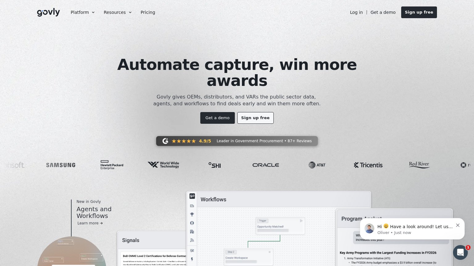
GovlyG2 badge: "4.9/5 — Leader in Government Procurement • 87+ Reviews"
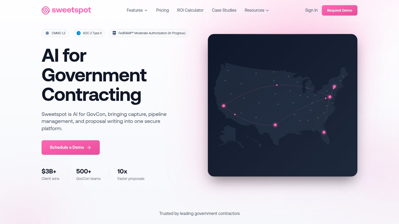
SweetspotCompliance badges: "CMMC L2", "SOC 2 Type II", "FedRAMP® Moderate Authorization (In Progress)"
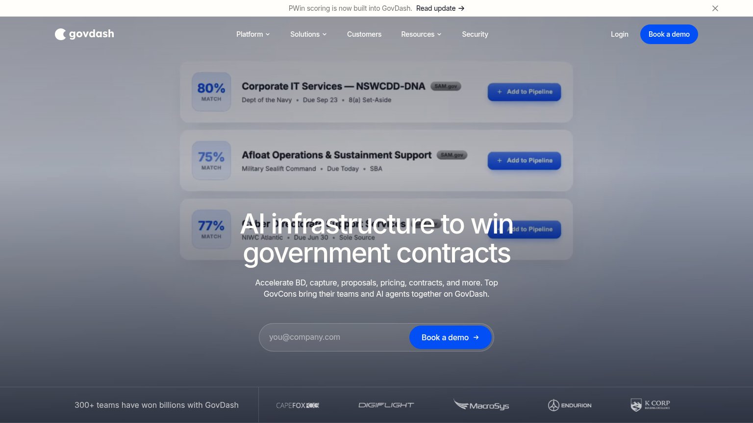
GovDash"300+ teams have won billions with GovDash" line beside the customer logo strip
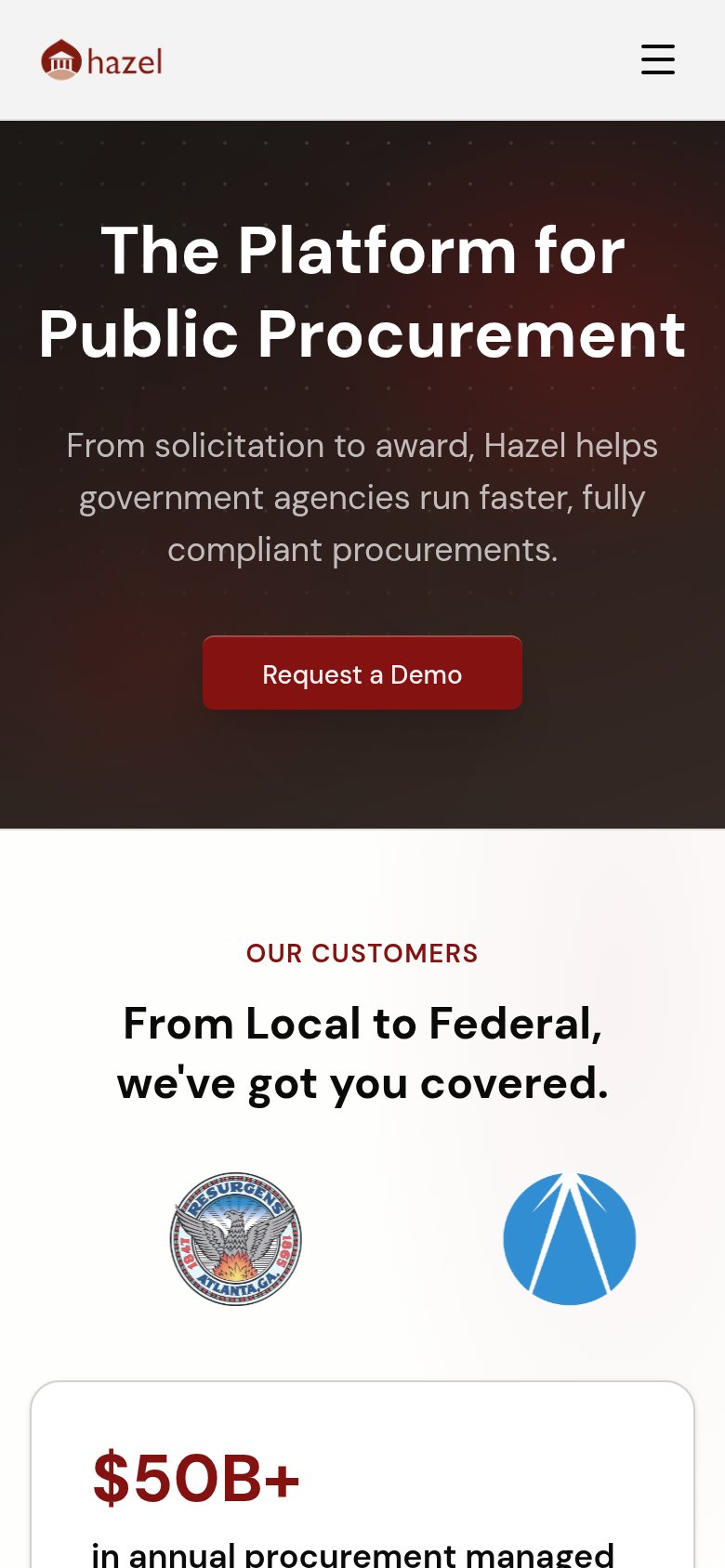
Hazel"$50B+ in annual procurement managed" stat beneath the OUR CUSTOMERS logo row (mobile)

Value props

52Fair

Title, subtitle, hero — do they sell the product's true value?

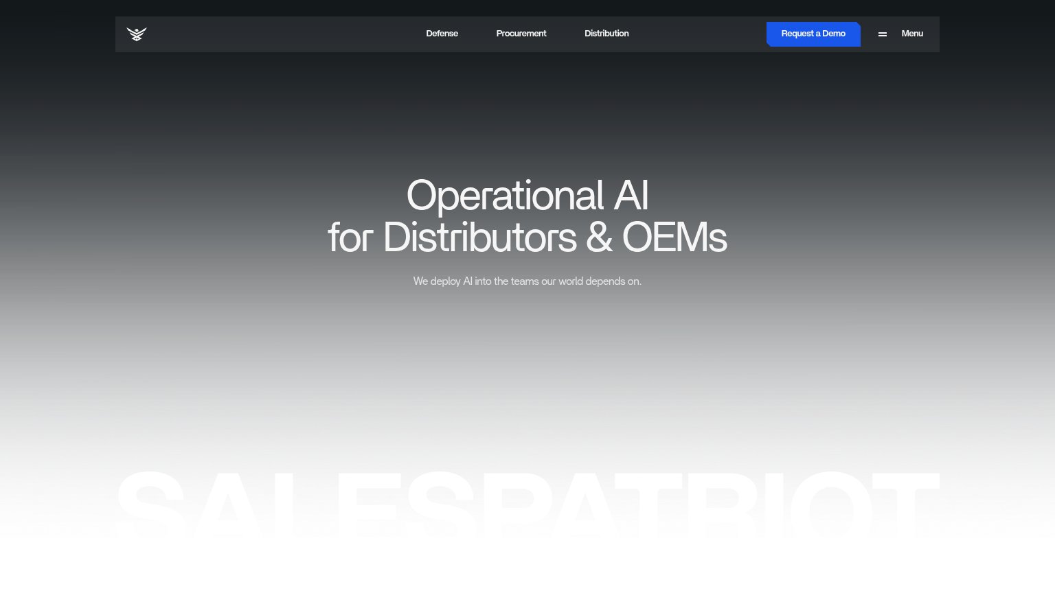
SalesPatriot’s headline vagueOperational AI for Distributors & OEMsWe deploy AI into the teams our world depends on.

Working

  • Names the exact audience: distributors & OEMs
  • Mission-driven tone fits defense buyers
  • Clean, uncluttered single message

Could improve

  • "Operational AI" says nothing concrete
  • Subhead adds sentiment, not specifics
  • No product visual or proof in the fold

CTA

62Fair

Copy, size, verb, cost-feel — does the primary CTA earn the click?

SalesPatriot
Govly
Sweetspot
GovDash
Hazel

Problems

  • 'Request' feels costly, permission-seeking
  • no CTA in the hero itself
  • desktop button is nav-sized only
  • click delivers a sales call, not value

Information hierarchy

72Fair

Does the design help or inhibit what the page is trying to say?

Information hierarchy annotations on the desktop capture123
  1. Gray subheadline text — "We deploy AI into the teams our world depends on" is low-contrast gray on gray and nearly disappears.
  2. Hero headline block — The headline sits in mid-gray against a gray gradient, muting the core value proposition instead of commanding it.
  3. Menu toggle beside CTA — A second "Menu" control sits directly next to "Request a Demo", splitting attention at the exact conversion point.

Mobile web

72Fair

The phone experience as a first-class citizen.

Mobile web annotations on the mobile capture123
  1. Split header controls — "Request a Demo" and the hamburger/Menu sit in one crowded top bar; the CTA is a mid-width pill rather than a full-bleed, thumb-friendly button.
  2. Low-contrast subheadline — "We deploy AI into the teams our world depends on." renders in gray on gray as the gradient lightens, hurting legibility at arm's length.
  3. Three-line wrapped headline — "Operational AI for Distributors & OEMs" scales down only slightly and wraps to three lines, eating a large slice of the first viewport.