
Your landing page’s weakest score is CTA.
How GovDash ranks
75Growth scoreupdated
category scores
category scoresShowHide
CTA
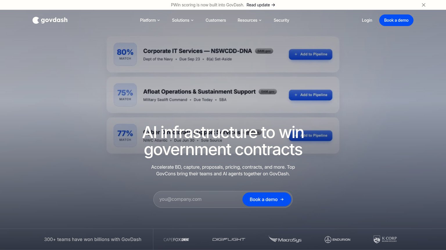
68FairCopy, size, verb, cost-feel — does the primary CTA earn the click?
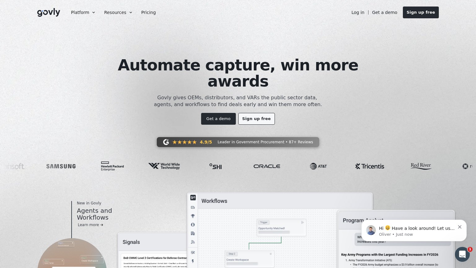
Problems
- 'Book' feels costly — sales call ask
- no immediate product value on click
- demo-gated; nothing to try signed-out
Information hierarchy
72FairDoes the design help or inhibit what the page is trying to say?
123- Headline over pipeline cards — The H1 overlaps the blurred opportunity cards, so 'AI infrastructure to win…' fights the mockup for legibility instead of sitting on a clean surface.
- Announcement banner — The PWin banner with 'Read update →' is the first element on both viewports and pulls attention away from the hero before the value prop lands.
- Duplicate Book a demo — The navy header 'Book a demo' repeats the hero CTA at similar visual weight, splitting the single conversion target into two.
Mobile web
72FairThe phone experience as a first-class citizen.
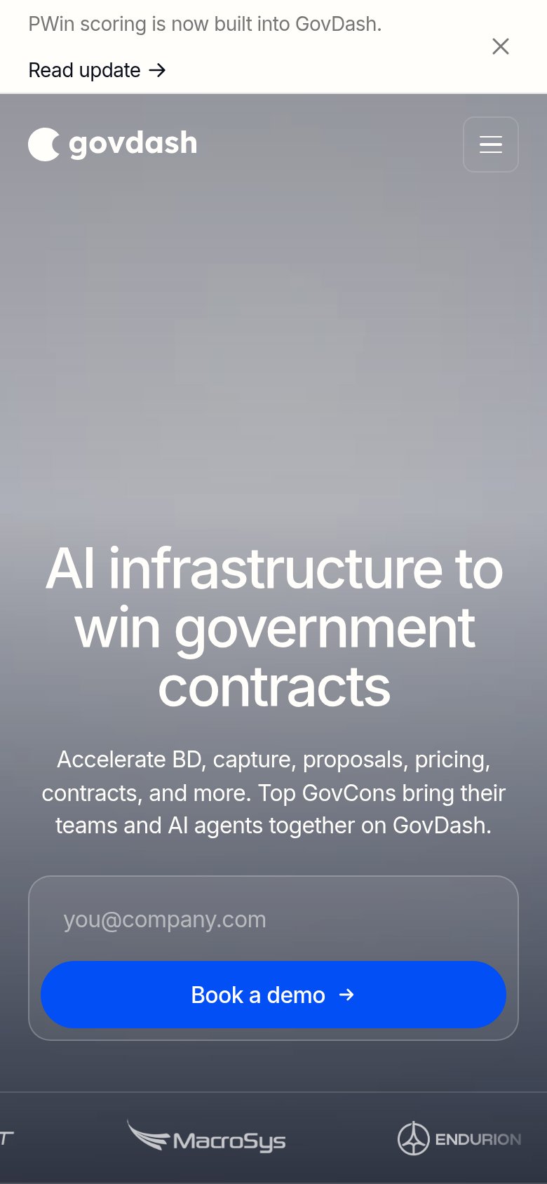
What works
What to improve
Trust
78FairProof that the product is real, competent, and safe to try.
How GovDash compares
Trust read
Value props
84StrongTitle, subtitle, hero — do they sell the product's true value?
GovDash’s headline
AI infrastructure to win government contracts
Accelerate BD, capture, proposals, pricing, contracts, and more. Top GovCons bring their teams and AI agents together on GovDash.
Working
Could improve