
Your landing page’s weakest score is Information hierarchy.
How Govly ranks
76Growth scoreupdated
category scores
category scoresShowHide
Information hierarchy
72FairDoes the design help or inhibit what the page is trying to say?
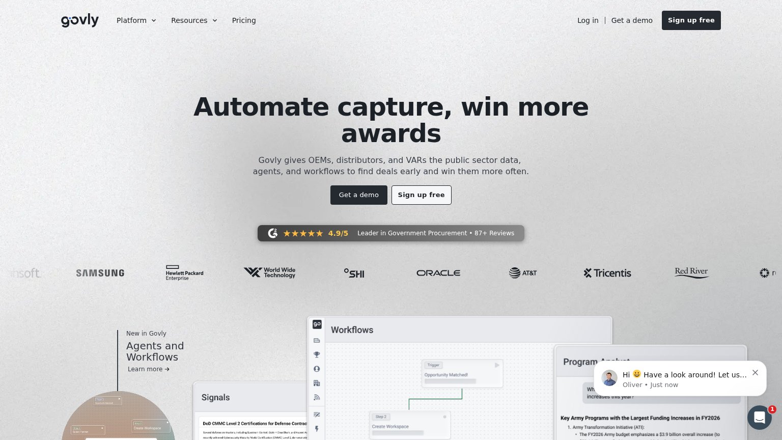 1234
- Dual hero CTAs — "Get a demo" and "Sign up free" sit side by side at near-equal weight, splitting the primary action and forcing a choice before commitment.
- Chat widget popup — Auto-opened "Hi 😀 Have a look around!" bubble covers the product screenshot and drags attention off the scan path.
- Header duplicate CTAs — "Get a demo" and "Sign up free" repeat in the nav at competing weight, adding two more decision points above the fold.
- Cropped logo strip — Leftmost and rightmost partner logos are cut off mid-word, reading as a rendering error in the trust band.
Value props
72FairTitle, subtitle, hero — do they sell the product's true value?
Govly’s headline sells
Automate capture, win more awards
Govly gives OEMs, distributors, and VARs the public sector data, agents, and workflows to find deals early and win them more often.
Working
- Names ICP: OEMs, distributors, VARs
- Outcome-led: win more awards
- Hero shows real product workflow
Could improve
- Zero numbers in headline/subhead
- 'Awards' ambiguous outside GovCon
- 'Find deals early' lacks proof
Mobile web
72FairThe phone experience as a first-class citizen.
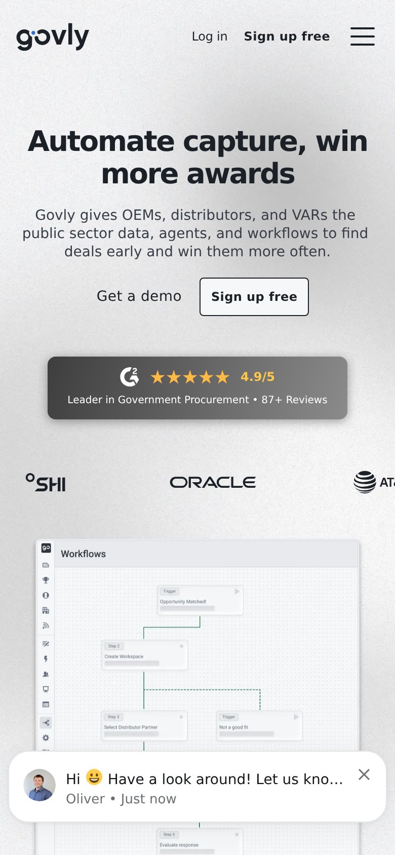
What works
What to improve
CTA
78FairCopy, size, verb, cost-feel — does the primary CTA earn the click?
How Govly compares
Recommended rewrites
Trust
84StrongProof that the product is real, competent, and safe to try.
How Govly compares
Trust read