
Your landing page’s weakest score is CTA.
How Sweetspot ranks
- 1.
Sweetspot76
- 2.
Govly76
- 3.
GovDash75
- 4.
Hazel71
- 5.
SalesPatriot59
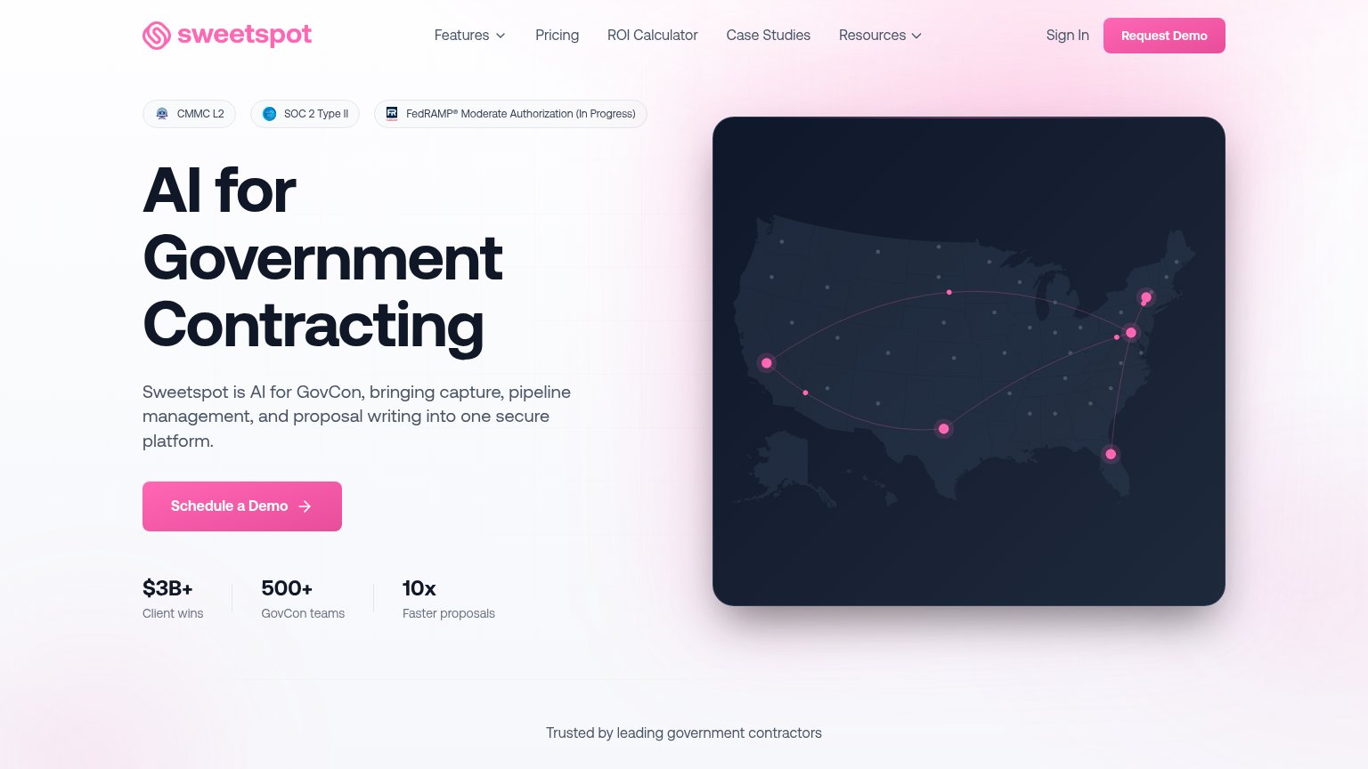
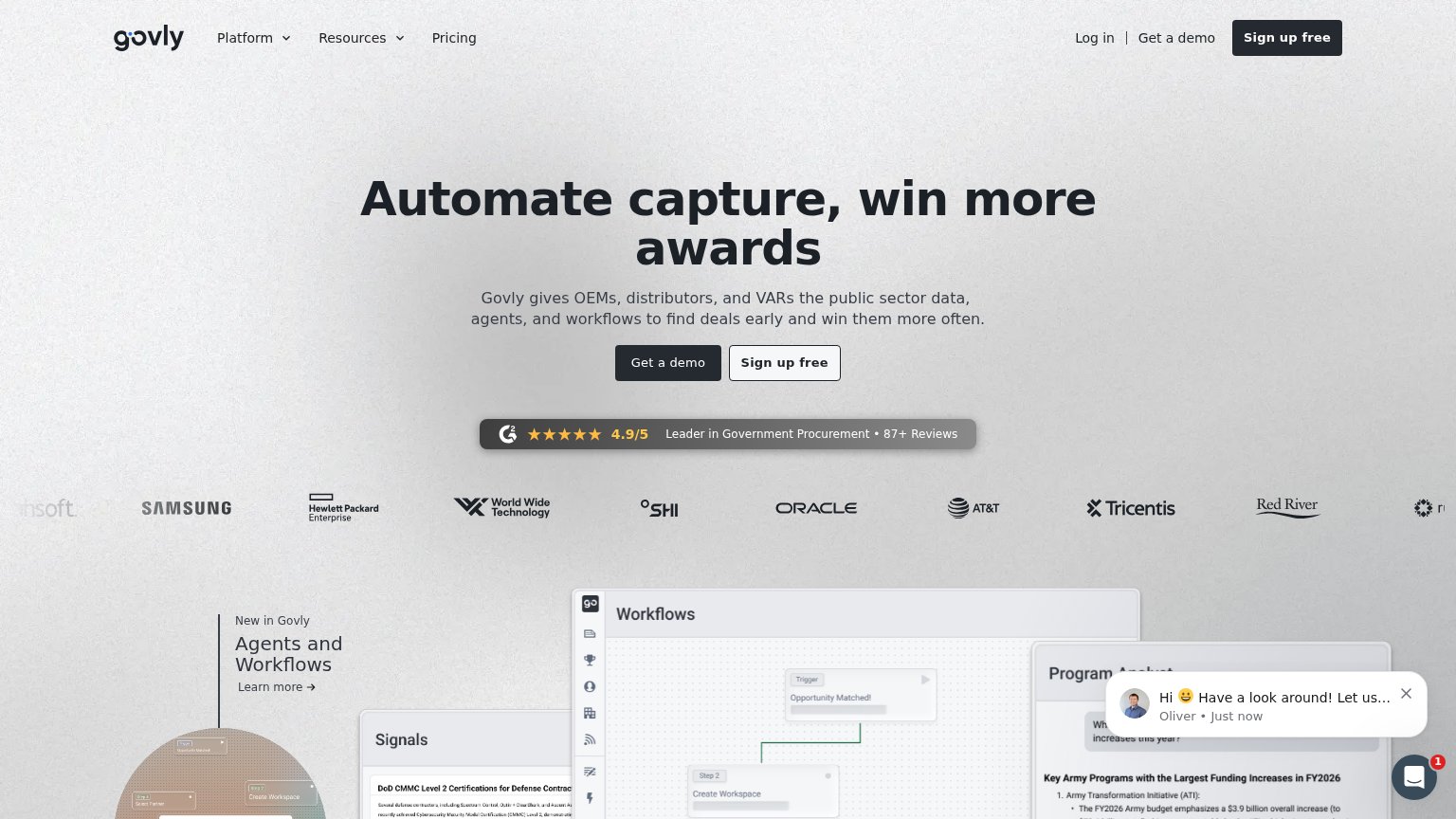
CTA
68FairCopy, size, verb, cost-feel — does the primary CTA earn the click?
Problems
- 'Schedule' makes click feel costly
- nav says 'Request Demo' — inconsistent
- no low-friction alternative path
Trust
76FairProof that the product is real, competent, and safe to try.
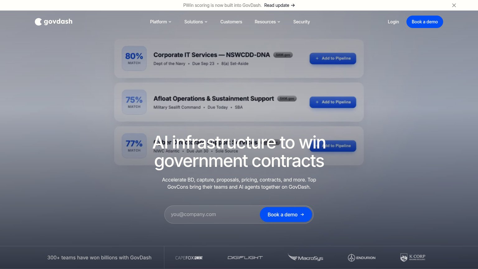
| Trust read | |
|---|---|
| Sweetspot | Compliance badges: "CMMC L2", "SOC 2 Type II", "FedRAMP® Moderate Authorization (In Progress)" |
| No visible trust signal identified. | |
| G2 badge: "4.9/5 — Leader in Government Procurement • 87+ Reviews" | |
| "300+ teams have won billions with GovDash" line beside the customer logo strip | |
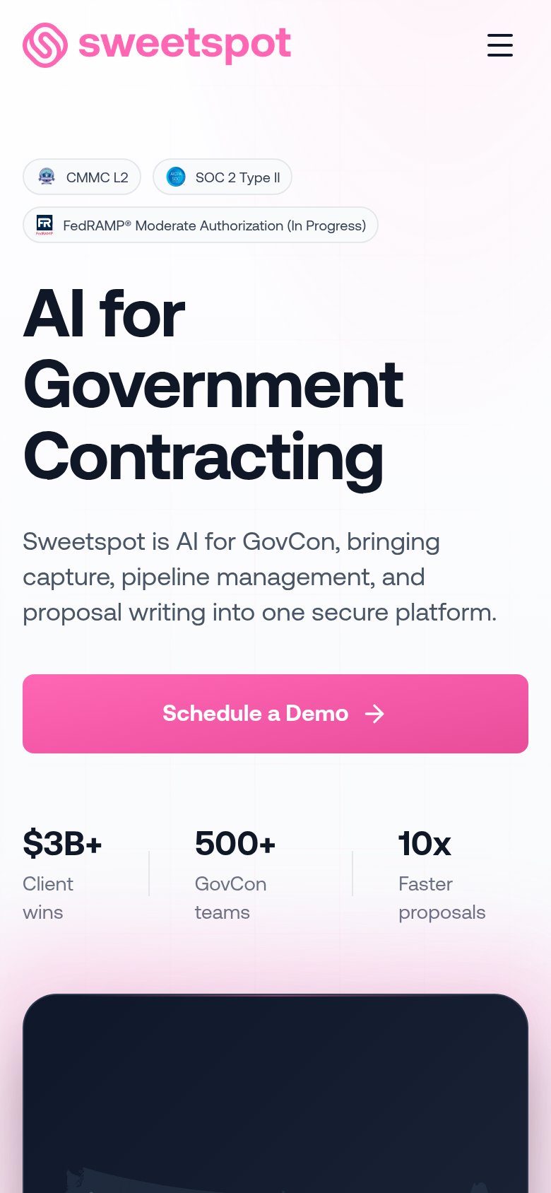
| "$50B+ in annual procurement managed" stat beneath the OUR CUSTOMERS logo row (mobile) |
Value props
78FairTitle, subtitle, hero — do they sell the product's true value?
Sweetspot’s headline
AI for Government Contracting
Sweetspot is AI for GovCon, bringing capture, pipeline management, and proposal writing into one secure platform.
Working
Could improve
Mobile web
78FairThe phone experience as a first-class citizen.
What works
What to improve
Information hierarchy
80StrongDoes the design help or inhibit what the page is trying to say?
What works
What to improve