
Your landing page’s weakest score is Trust.
How Insurf ranks
68Growth scoreupdated
category scores
category scoresShowHide
Score over time
Trust
44PoorProof that the product is real, competent, and safe to try.
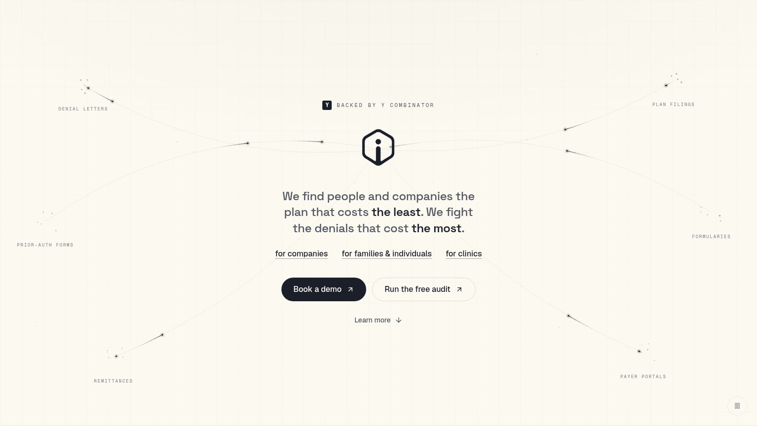
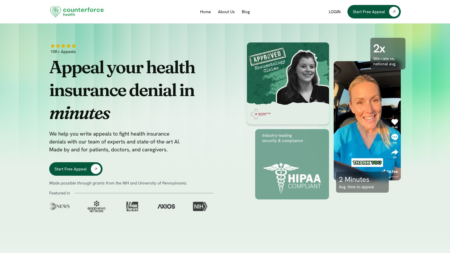

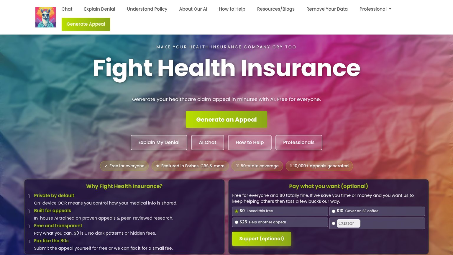

| Trust read | |
|---|---|
| Insurf | "BACKED BY Y COMBINATOR" badge above the hero logo |
| "Our Work and Stories Covered In:" press bar with The New York Times, Bloomberg, POLITICO, and TIME logos | |
| "10,000+ appeals generated" badge beneath the hero CTA | |
| "Made possible through grants from the NIH and University of Pennsylvania." beneath the hero CTA | |
| Real product dashboard screenshot showing balances ($1,800.00, $405.10) and household enrollment UI |
Value props
72FairTitle, subtitle, hero — do they sell the product's true value?
Insurf’s headline sells
We find people and companies the plan that costs the least. We fight the denials that cost the most.
Working
- Names two concrete outcomes
- Least/most parallelism is memorable
- Audience links clarify who it's for
Could improve
- No numbers or proof of savings
- No subhead adds specifics
- Hero art decorates, doesn't demo
Mobile web
72FairThe phone experience as a first-class citizen.
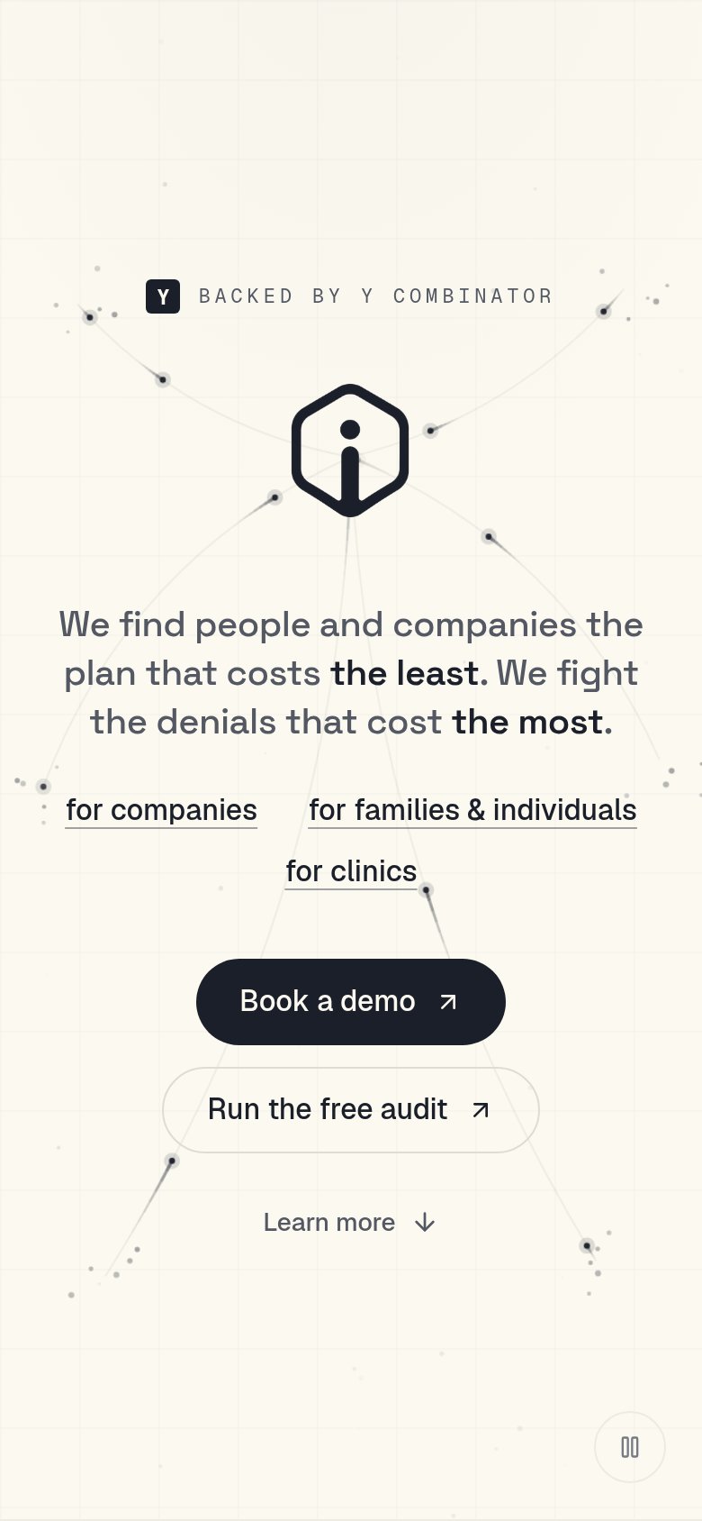 123
- Book a demo button — Two-thirds-width pill instead of a full-bleed thumb target; same issue on 'Run the free audit' below it.
- Hexagon logo mark — Oversized decorative mark eats vertical space and pushes the primary CTA toward the bottom of the fold.
- Audience link row — Three underlined links wrap into an uneven two-row stack, adding competing taps above the CTAs.
Information hierarchy
76FairDoes the design help or inhibit what the page is trying to say?
123- Three audience links — 'for companies', 'for families & individuals', 'for clinics' sit at equal weight above the CTAs, splitting attention three ways before the primary action.
- Run the free audit — Secondary button matches 'Book a demo' in size and shape, so the fold reads as two co-equal actions instead of one primary.
- Headline serves two audiences — One sentence pitches both cost-saving plans and denial-fighting, forcing every visitor to parse which half applies to them.
CTA
76FairCopy, size, verb, cost-feel — does the primary CTA earn the click?
Problems
- demo click feels costly
- free offer demoted to secondary
- no 'free' despite free audit