
Your landing page’s weakest score is Trust.
How Grip ranks
42Growth scoreupdated
category scores
category scoresShowHide
Score over time
Trust
28PoorProof that the product is real, competent, and safe to try.
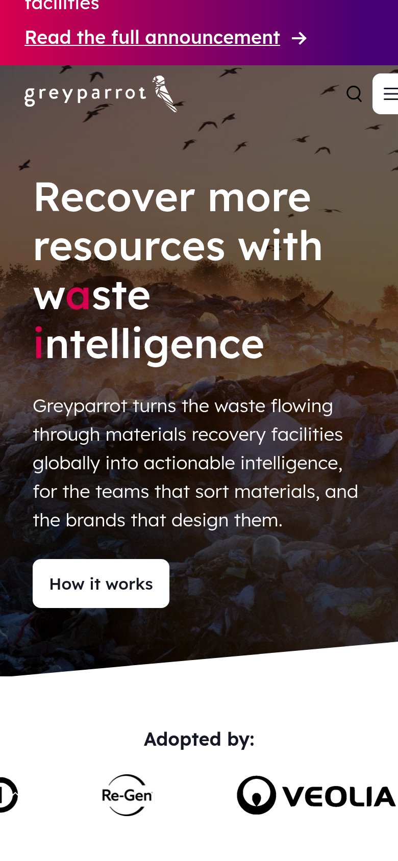
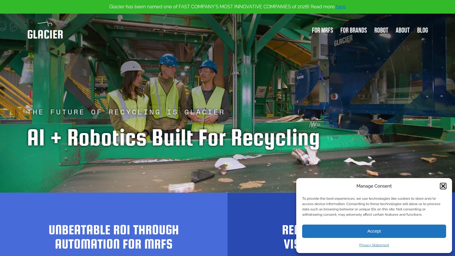

| Trust read | |
|---|---|
| Grip | No visible trust signal identified. |
| No visible trust signal identified. | |
| "Adopted by:" logo strip with Veolia and Re-Gen (mobile capture) | |
| implicit context ZenRobotics may benefit from pre-existing familiarity among its target audience. | |
| "VALTRIS, SWS and Recycleye explain how AI-" — named partners introducing a case story on the mobile fold | |
| "Glacier has been named one of FAST COMPANY'S MOST INNOVATIVE COMPANIES of 2026" announcement bar |
CTA
42PoorCopy, size, verb, cost-feel — does the primary CTA earn the click?

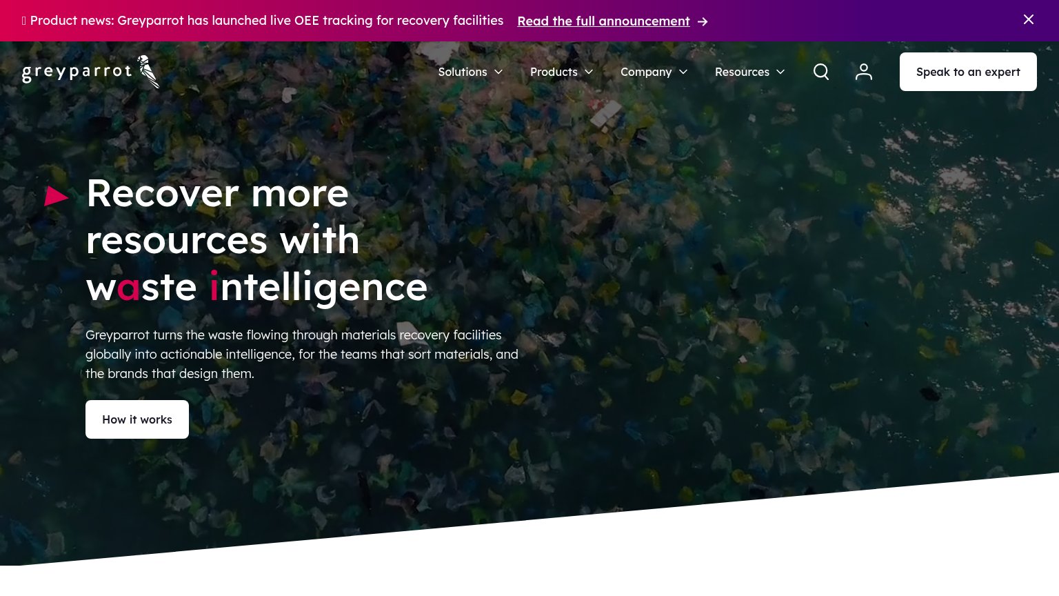

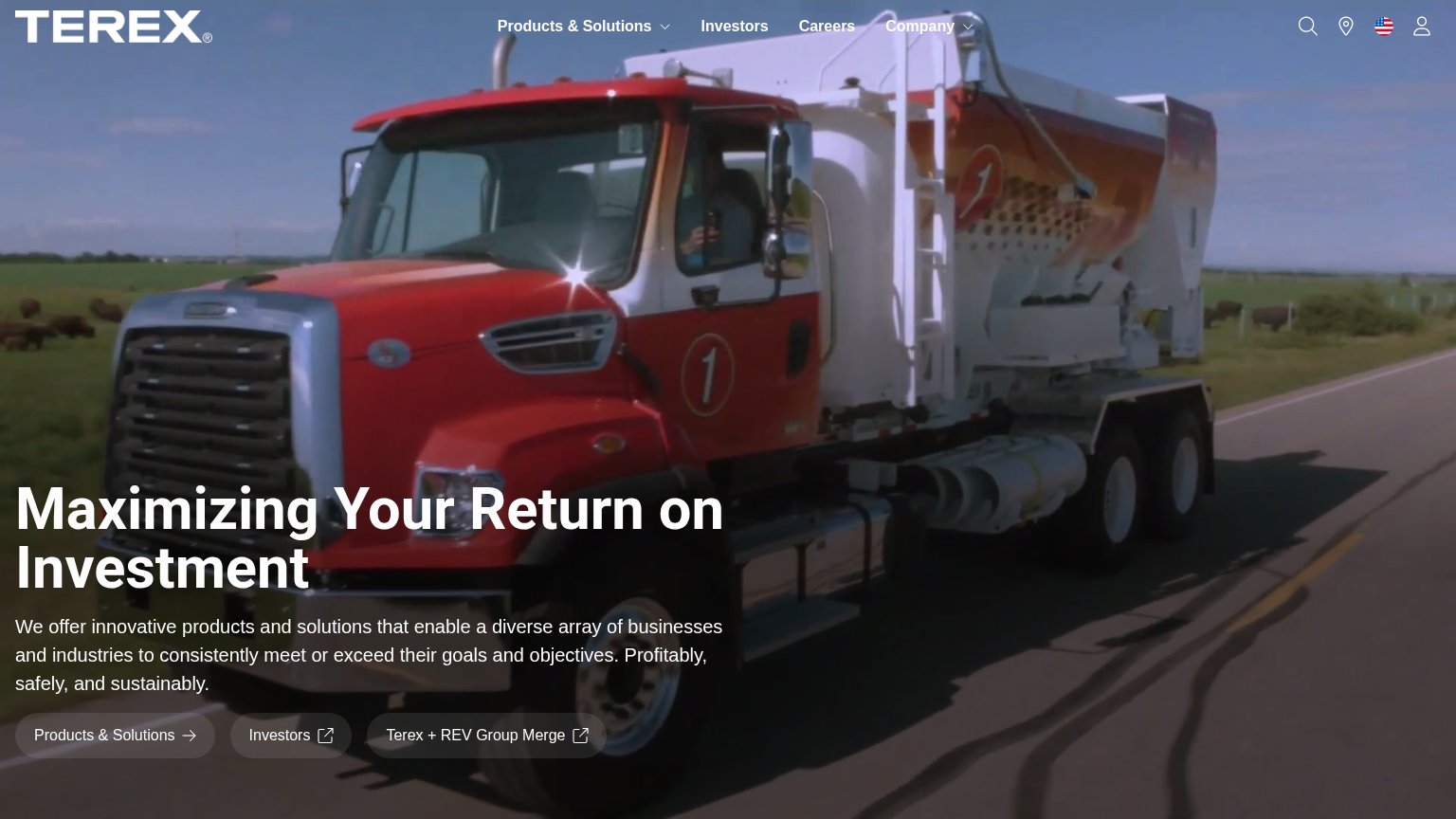
Problems
- no CTA anywhere in the hero
- nav links 'Join'/'Contact' only actions
- no action verb or value promise
- tiny text links, zero visual weight
Value props
42PoorTitle, subtitle, hero — do they sell the product's true value?
Grip’s headline vague
Redefining the economics of waste.
A brain that learns the stream — sharper with every grasp.
Working
- Hints at learning system that improves
- Economic angle targets buyer motivation
- Distinctive voice, not generic SaaS-speak
Could improve
- Never says it's a sorting robot
- "Stream" and "grasp" need insider context
- No hero image or proof points at all
Mobile web
44PoorThe phone experience as a first-class citizen.
 12
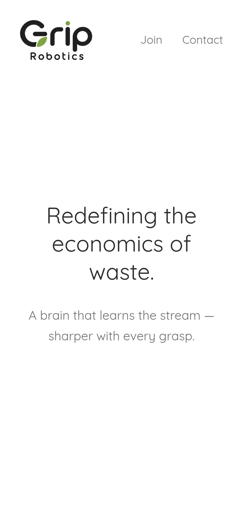
- Uncollapsed nav links — "Join" and "Contact" render as a desktop text-link row instead of a hamburger, leaving low-contrast, small tap targets.
- Oversized hero headline — Headline scales down too little and wraps into three tall lines that dominate the viewport.
Information hierarchy
52FairDoes the design help or inhibit what the page is trying to say?
 12
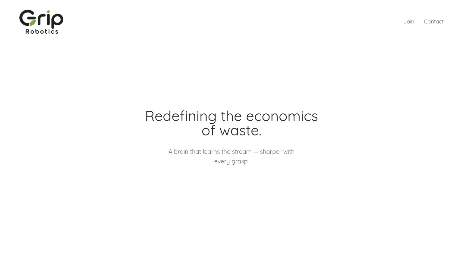
- Nav links only exits — "Join" and "Contact" are the only clickable elements, styled as quiet text links that don't read as the intended action.
- Low-contrast headline — Thin light-gray type on white weakens the one message the fold carries.