
Your landing page’s weakest score is CTA.
How Glacier ranks
- 1.
AMP65
- 2.
Molg61
- 3.
Revise Robotics56
- 4.
Glacier52
CTA
42PoorCopy, size, verb, cost-feel — does the primary CTA earn the click?
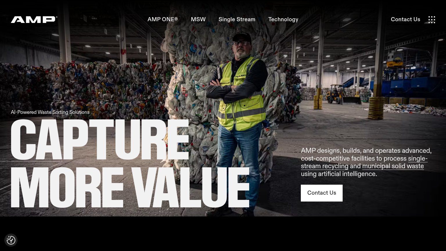
Problems
- no CTA anywhere above the fold
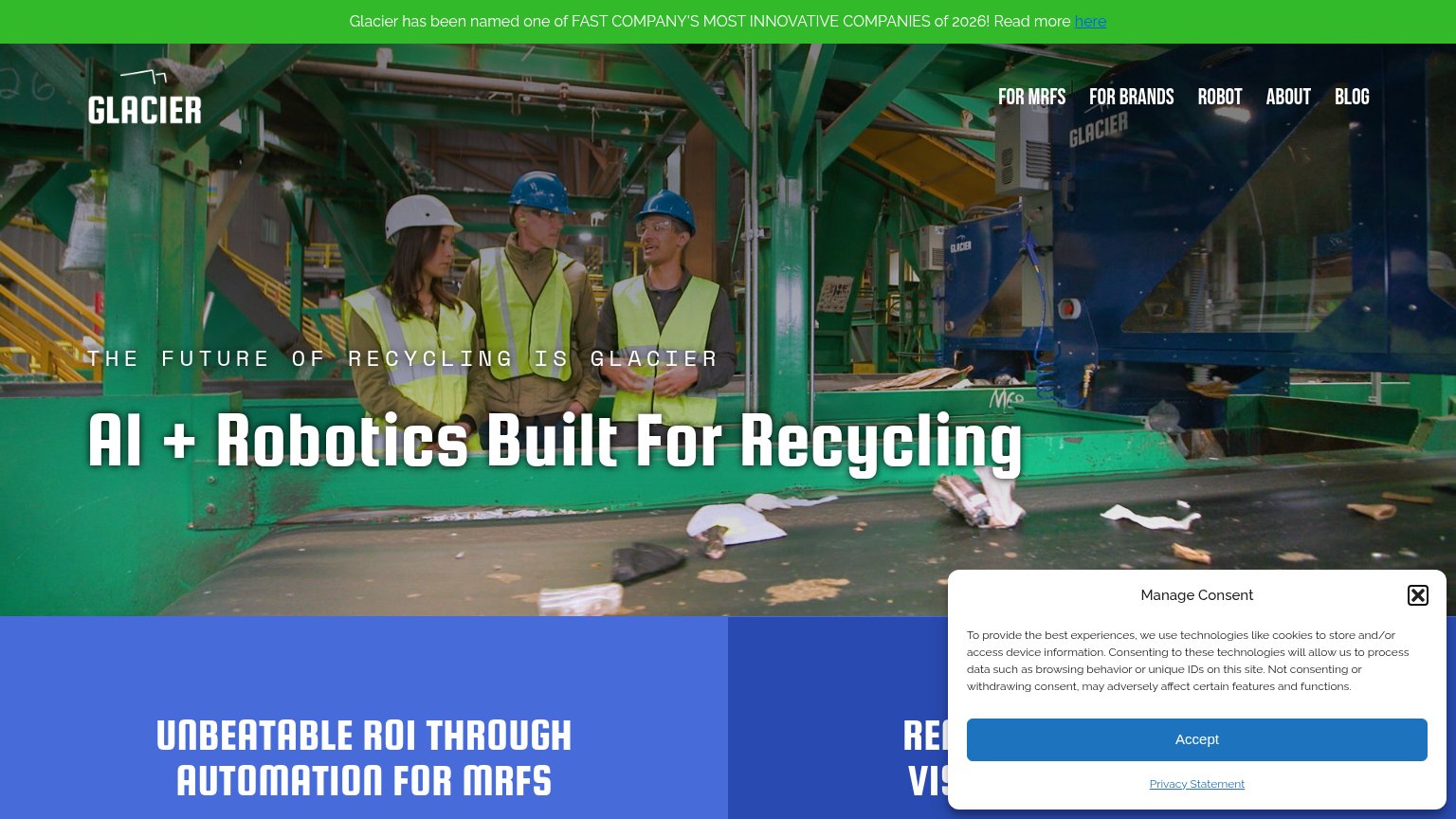
- cookie Accept is the only real button
- nav links are the only path to act
- announcement 'here' link outranks hero
Mobile web
44PoorThe phone experience as a first-class citizen.
 123
- Cookie consent wall — Covers the bottom half of the screen with a dead 'Accept' blocker and no conversion CTA.
- Announcement bar — Wraps into four lines and consumes a large slice of the fold before the logo.
- Eyebrow text wrap — Tracked-out caps wrap into three ragged lines over a busy photo, hurting readability.
Information hierarchy
52FairDoes the design help or inhibit what the page is trying to say?
What works
What to improve
Trust
58FairProof that the product is real, competent, and safe to try.
How Glacier compares
Trust read
Value props
62FairTitle, subtitle, hero — do they sell the product's true value?
Glacier’s headline
AI + Robotics Built For Recycling
THE FUTURE OF RECYCLING IS GLACIER
Working
Could improve