
Your landing page’s weakest score is Trust.
How Audun ranks
69Growth scoreupdated
category scores
category scoresShowHide
Score over time
Trust
38PoorProof that the product is real, competent, and safe to try.

| Trust read | |
|---|---|
| Audun | No visible trust signal identified. |
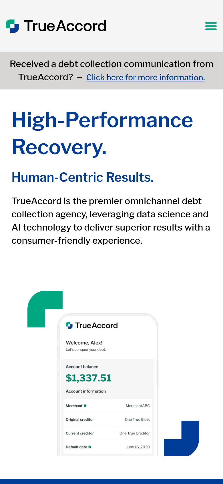
| Consumer app UI mockup showing "Welcome, Alex!" with account balance $1,337.51 and creditor details | |
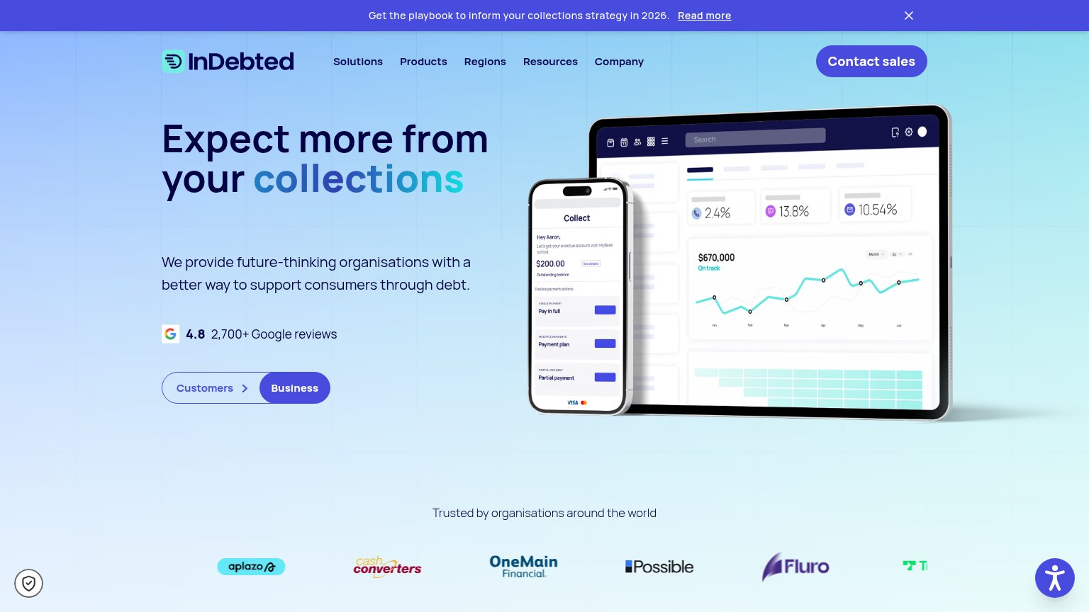
| 4.8 2,700+ Google reviews | |
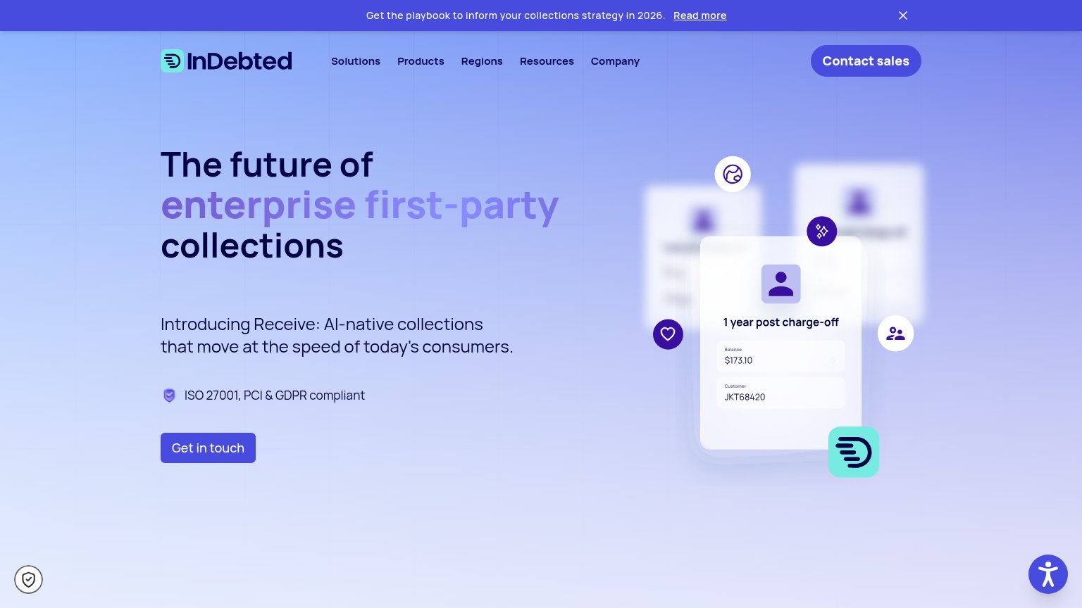
| ISO 27001, PCI & GDPR compliant | |
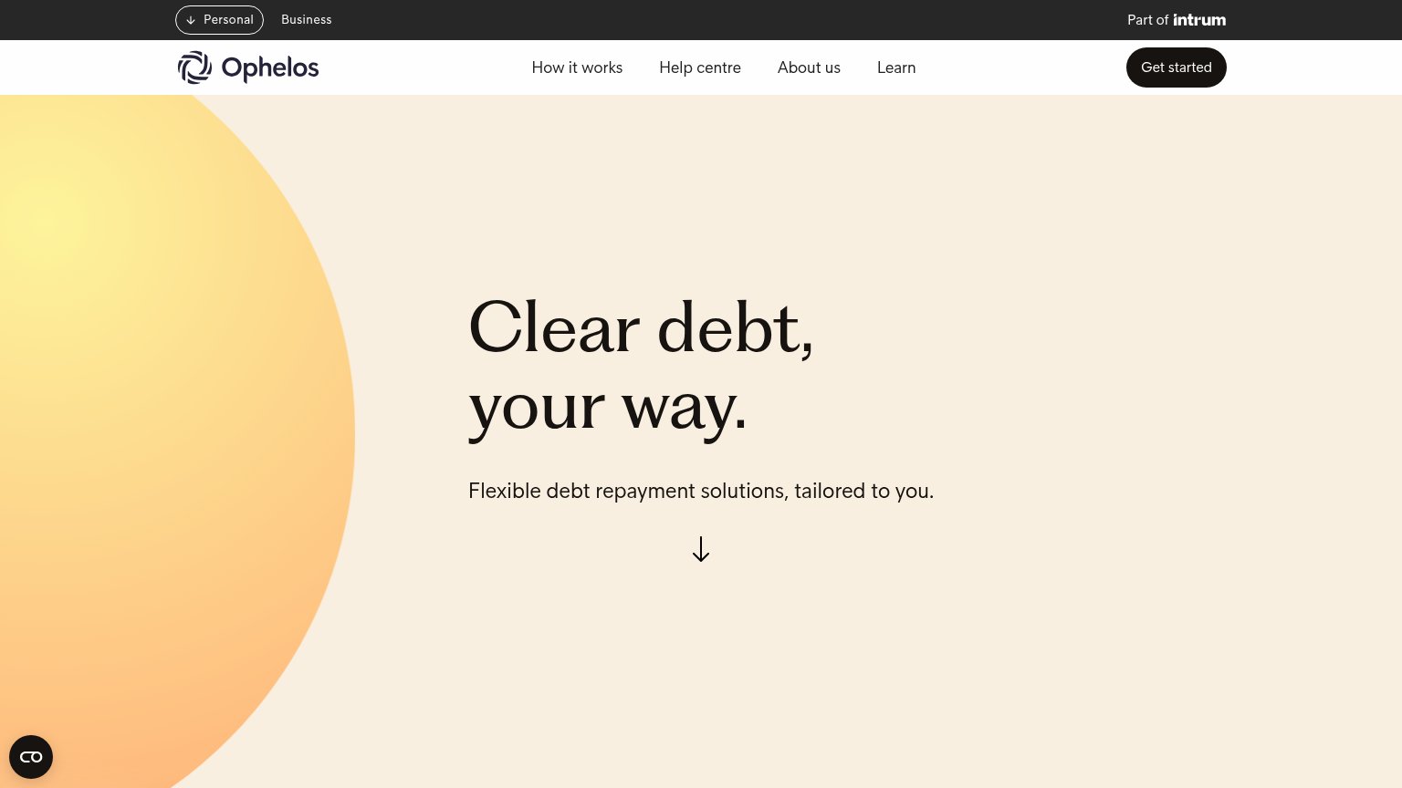
| "Part of intrum" parent-company badge in the top bar | |
| "$20B+ in debt worked across 20M+ consumers" stat block |
CTA
68FairCopy, size, verb, cost-feel — does the primary CTA earn the click?
Problems
- click promises contact, not value
- no payoff echoing the headline
- sales-process feel raises cost
Value props
68FairTitle, subtitle, hero — do they sell the product's true value?
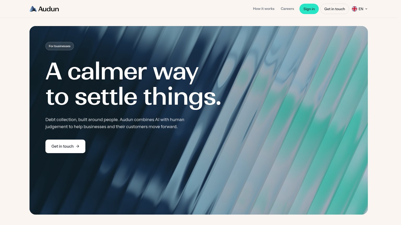
Audun’s headline undersells
A calmer way to settle things.
Debt collection, built around people. Audun combines AI with human judgement to help businesses and their customers move forward.
Working
- "Calmer" hits the emotion of debt stress
- Subhead names the category plainly
- "For businesses" badge sets the audience
Could improve
- Headline alone is category-blind
- Zero numbers or proof points in fold
- Hero image decorates, shows nothing
Information hierarchy
86StrongDoes the design help or inhibit what the page is trying to say?
12- Mint Sign in pill — Highest-contrast element on the page pulls first attention to a login, outranking the primary CTA.
- Nav Get in touch — Duplicates the hero CTA at equal weight, splitting the one intended click across two targets.
Mobile web
86StrongThe phone experience as a first-class citizen.
 12
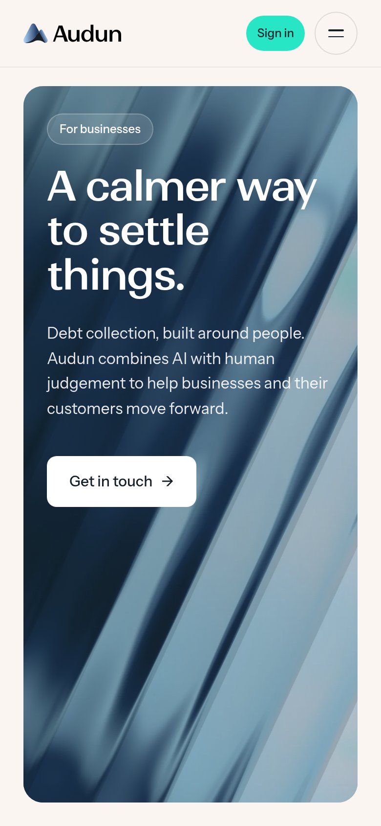
- Get in touch button — Desktop-proportioned button at ~half column width instead of a full-bleed thumb target.
- Body paragraph text — White copy sits on a light streak of the background image, thinning contrast mid-sentence.