
Your landing page’s weakest score is Value props.
How Solva ranks
60Growth scoreupdated
category scores
category scoresShowHide
Score over time
Value props
38PoorTitle, subtitle, hero — do they sell the product's true value?
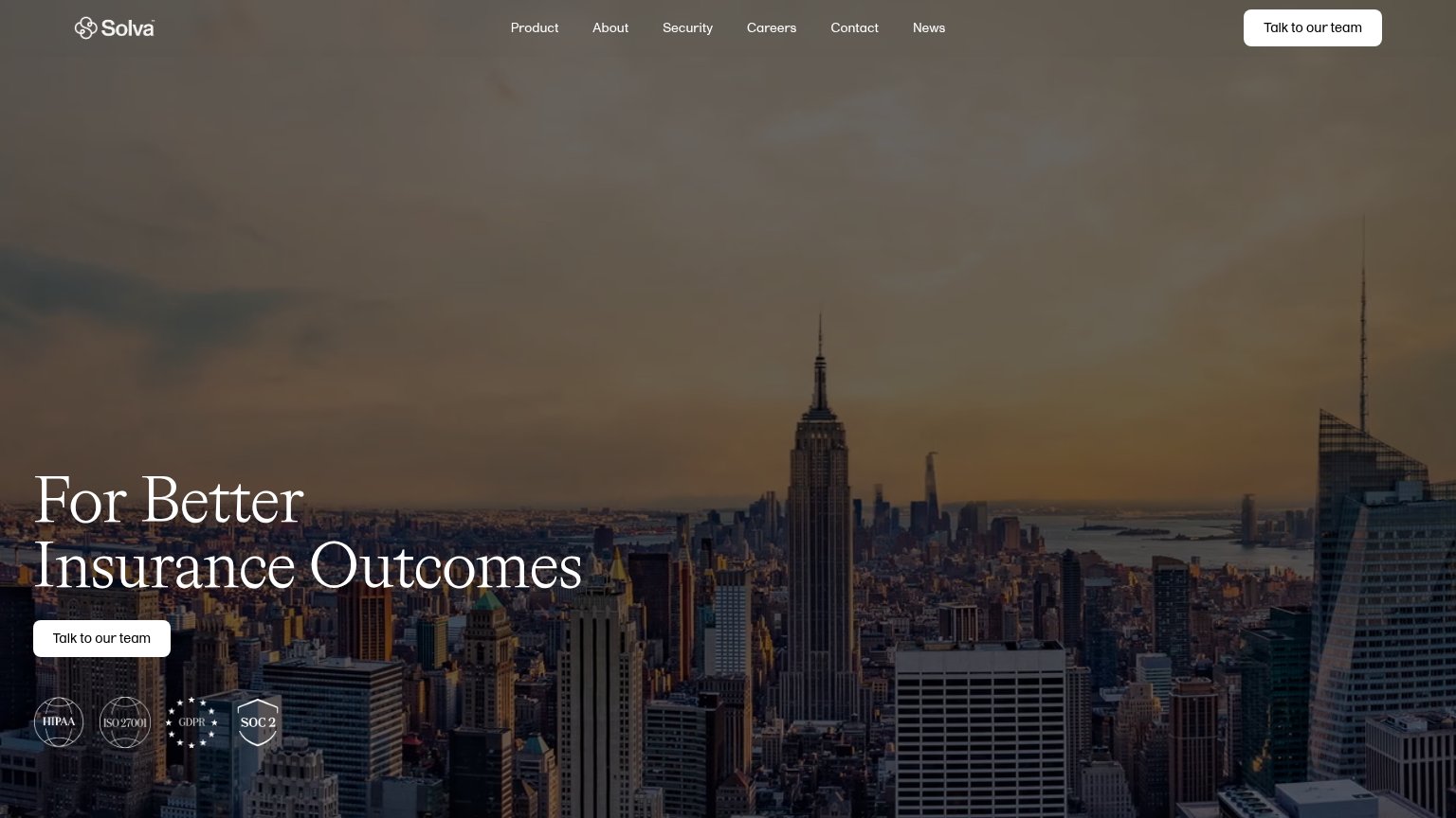
Solva’s headline vague
For Better Insurance Outcomes
Working
- Names the insurance category
- Gestures at an outcome, not a feature
- Compliance badges add credibility
Could improve
- No subhead explaining the product
- "Better" is unmeasurable and generic
- Skyline image shows nothing about product
Trust
52FairProof that the product is real, competent, and safe to try.
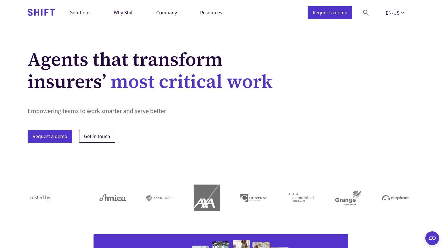
| Trust read | |
|---|---|
| Solva | HIPAA, ISO 27001, GDPR, and SOC 2 compliance badges below the CTA |
| Announcement bar: "Live Demo on Oct 6th: AI Underwriter for Life & Health → RSVP" | |
| No visible trust signal identified. | |
| No visible trust signal identified. | |
| "Trusted by" logo strip with Amica, Assurant, AXA, Central, Economical, Grange, and Elephant | |
| "Since 2017" longevity heading at the base of the fold |
CTA
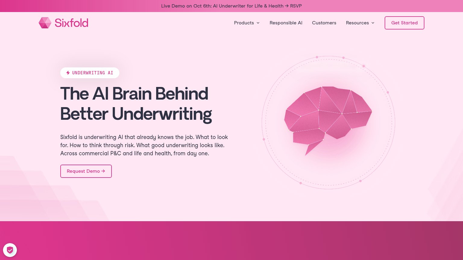
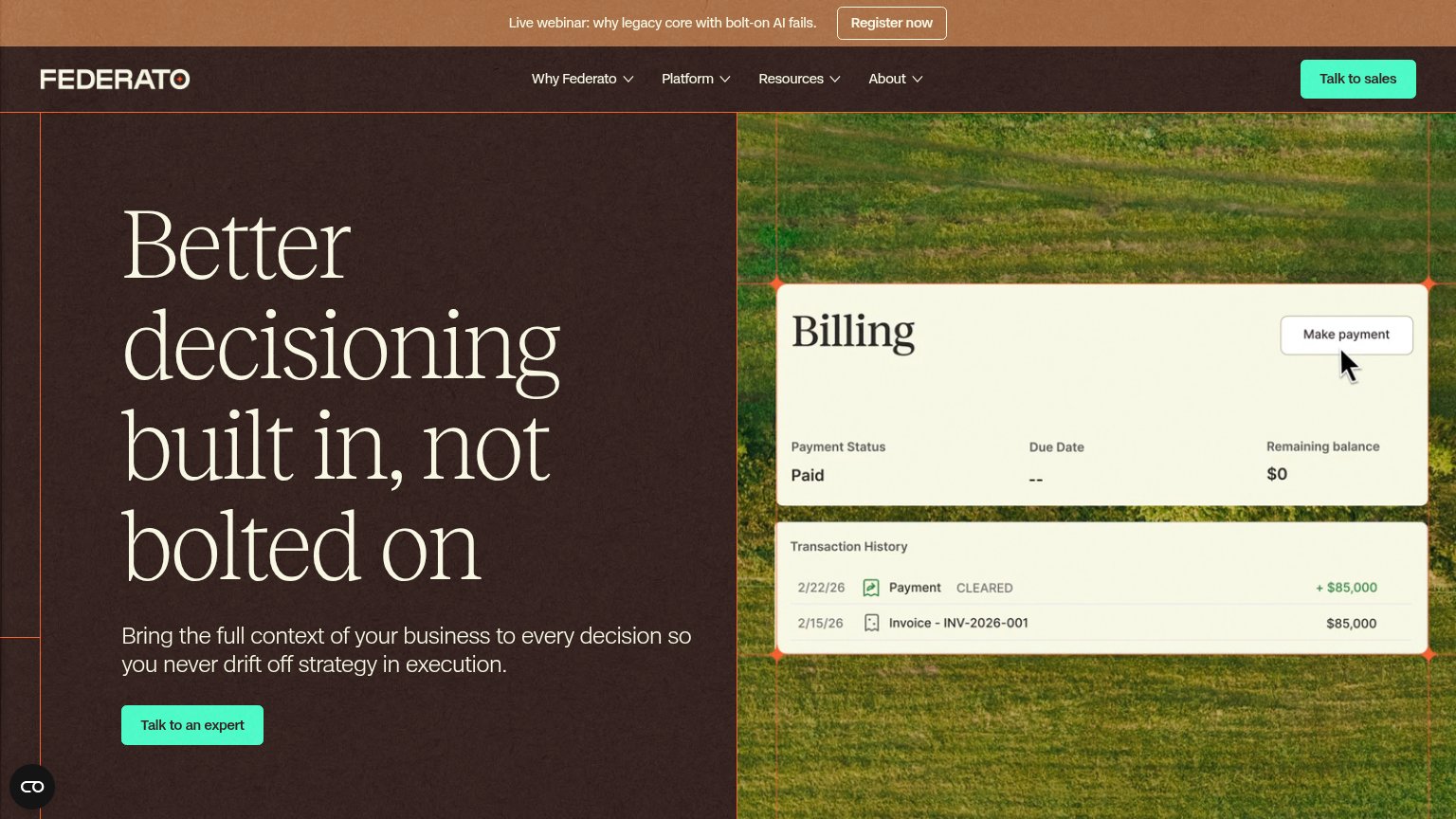
62FairCopy, size, verb, cost-feel — does the primary CTA earn the click?
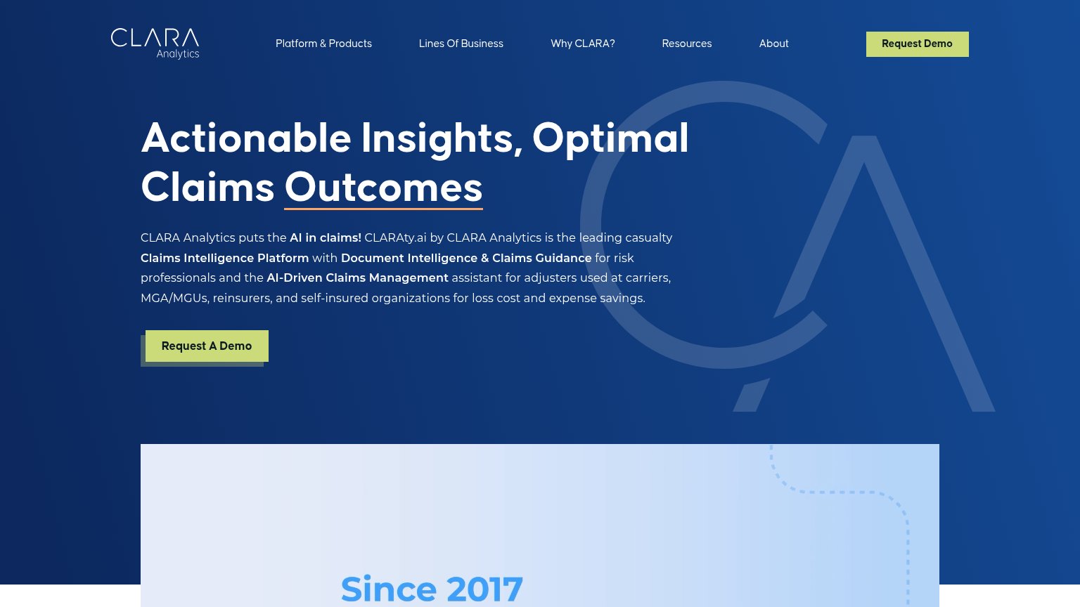
Problems
- click feels like a sales call
- 4 words, over 3-word ideal
- no payoff named for visitor
- small vs. huge hero headline
Information hierarchy
72FairDoes the design help or inhibit what the page is trying to say?
1234- Headline without subtitle — "For Better Insurance Outcomes" has no supporting line, so the layout never says what Solva actually is.
- Six-link nav row — Careers and News leak attention at the same visual weight as Product before the visitor reaches the CTA.
- Duplicate nav CTA — "Talk to our team" appears in the nav and the hero at equal styling, splitting focus across two identical buttons.
- Faint compliance badges — The HIPAA/ISO/GDPR/SOC 2 seals sit at low contrast over busy buildings and are barely legible as trust proof.
Mobile web
76FairThe phone experience as a first-class citizen.
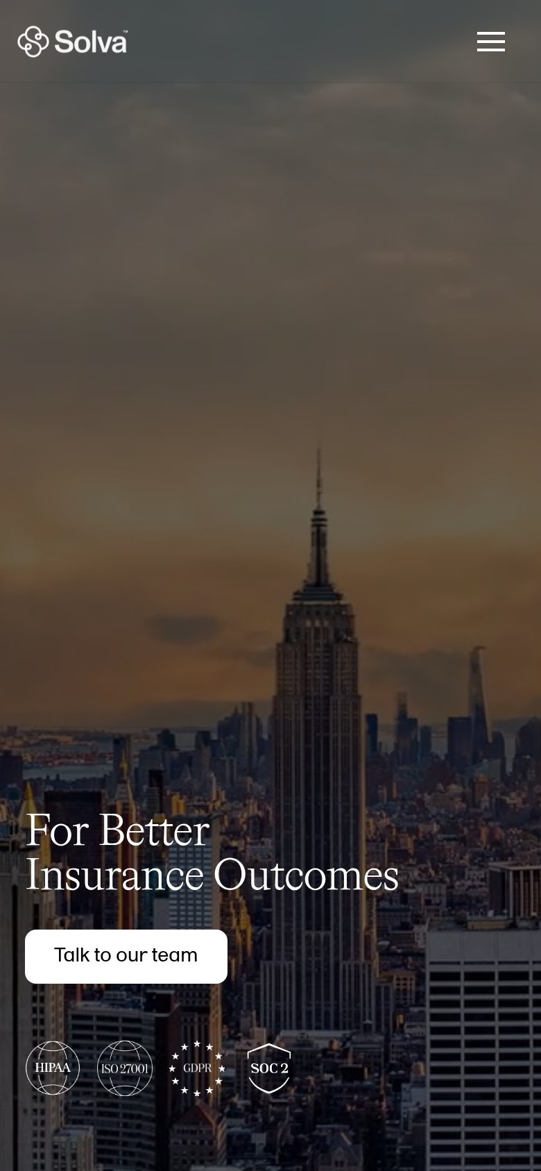 123
- Talk to our team — Desktop-width pill at ~half the column; should stretch near-full-bleed for the thumb.
- Hero headline — "For Better Insurance Outcomes" never says what Solva is; no supporting line clarifies the offer.
- Compliance badge row — Four low-contrast badges crowd directly under the CTA, competing with the tap target.