
Your landing page’s weakest score is Trust.
How Minimal AI ranks
- 1.
Richpanel76
- 2.
Minimal AI75
- 3.
Siena AI71
- 4.
Zowie69
- 5.
Decagon67
- 6.
Gorgias58
75Growth scoreupdated
category scores
category scoresShowHide
Score over time
Trust
58FairProof that the product is real, competent, and safe to try.
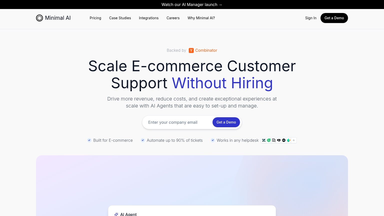
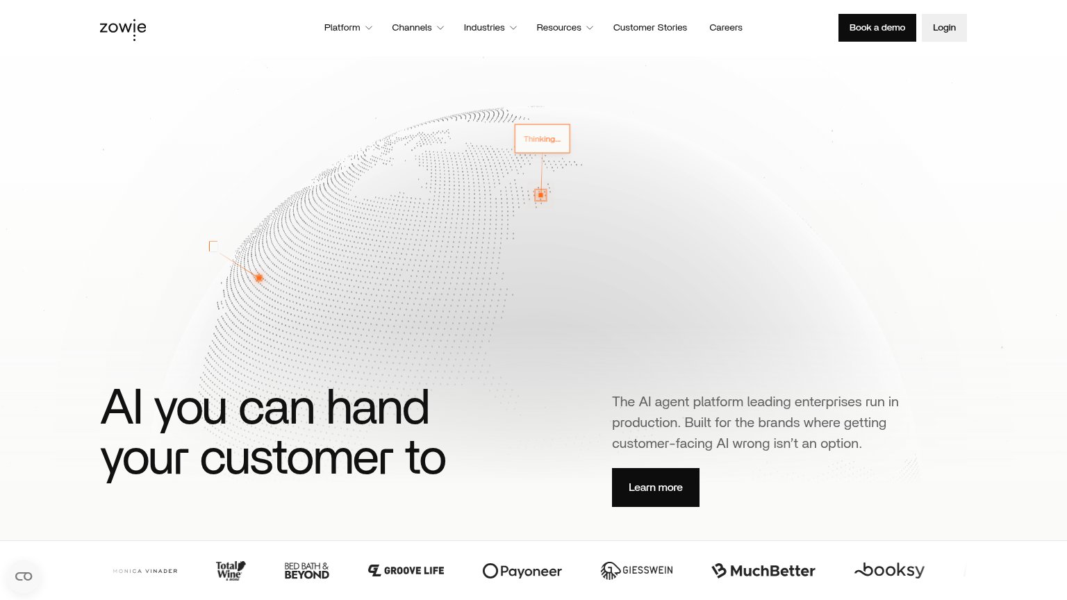
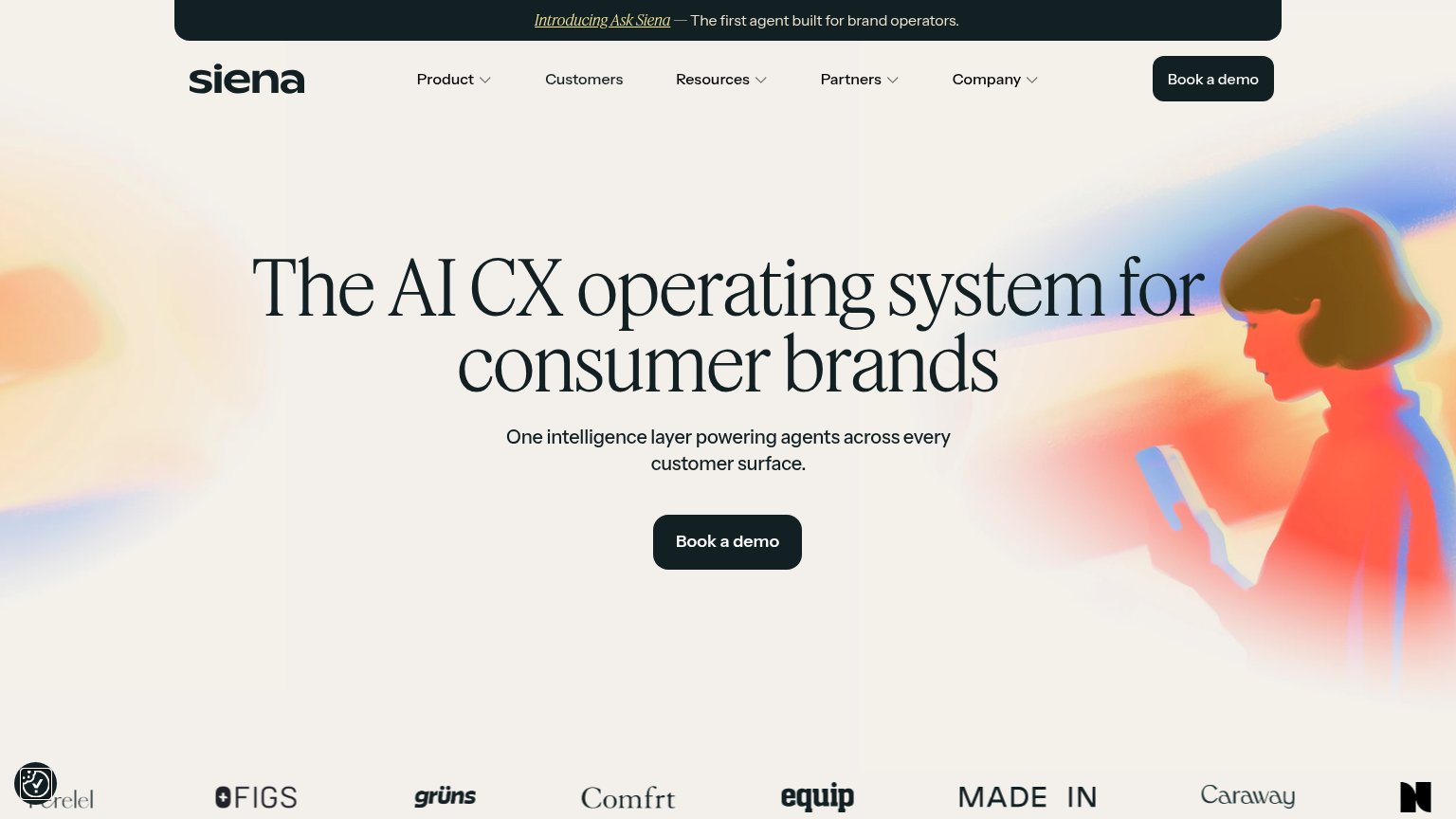
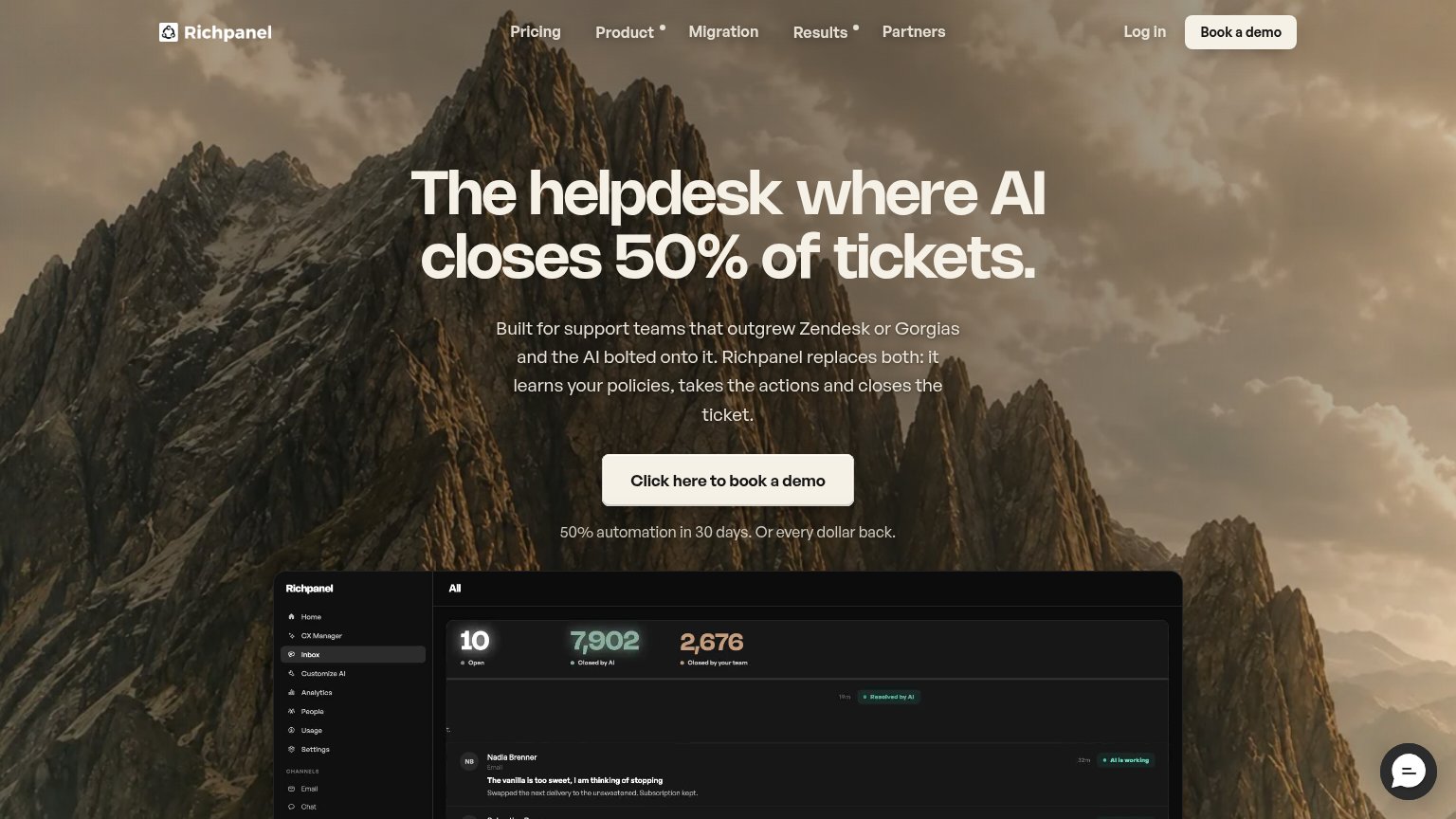
| Trust read | |
|---|---|
| Minimal AI | Backed by Y Combinator badge above the headline |
| Embedded Gorgias AI Agent demo answering "What's the return policy?" with a specific policy reply | |
| Customer logo strip featuring FIGS, Caraway, Made In, Grüns, Comfrt, Equip, Perelel, and Butcherbox | |
| Customer logo strip with Bed Bath & Beyond, Payoneer, Total Wine, MuchBetter, Booksy | |
| Product dashboard showing "7,902 Closed by AI" and "2,676 Closed by your team" ticket counters | |
| implicit context Decagon may benefit from pre-existing familiarity among its target audience. |
CTA
72FairCopy, size, verb, cost-feel — does the primary CTA earn the click?
Problems
- demo ask is a high-cost click
- requires company email upfront
- no low-friction alternative path
Information hierarchy
76FairDoes the design help or inhibit what the page is trying to say?
1234- Duplicate demo CTAs — The nav's black 'Get a Demo' button competes at equal weight with the hero's blue 'Get a Demo', splitting the primary action into two styles.
- Announcement banner — 'Watch our AI Manager launch →' occupies the highest-attention strip and routes visitors away before the value prop is read.
- Five-link nav row — Pricing, Case Studies, Integrations, Careers, and Why Minimal AI? plus Sign In create seven exits before the fold's one action.
- Cropped product preview — The 'AI Agent' panel is cut at the fold edge and shows no legible content, so the hero visual communicates nothing yet.
Value props
82StrongTitle, subtitle, hero — do they sell the product's true value?
Minimal AI’s headline sells
Scale E-commerce Customer Support Without Hiring
Drive more revenue, reduce costs, and create exceptional experiences at scale with AI Agents that are easy to set-up and manage.
Working
- 'Without Hiring' hits the real cost pain
- Names the exact audience: e-commerce
- 'Automate up to 90% of tickets' is concrete
Could improve
- Subhead stacks generic benefit clauses
- 'Exceptional experiences' is filler
- Move the 90% stat into the subhead
Mobile web
88StrongThe phone experience as a first-class citizen.
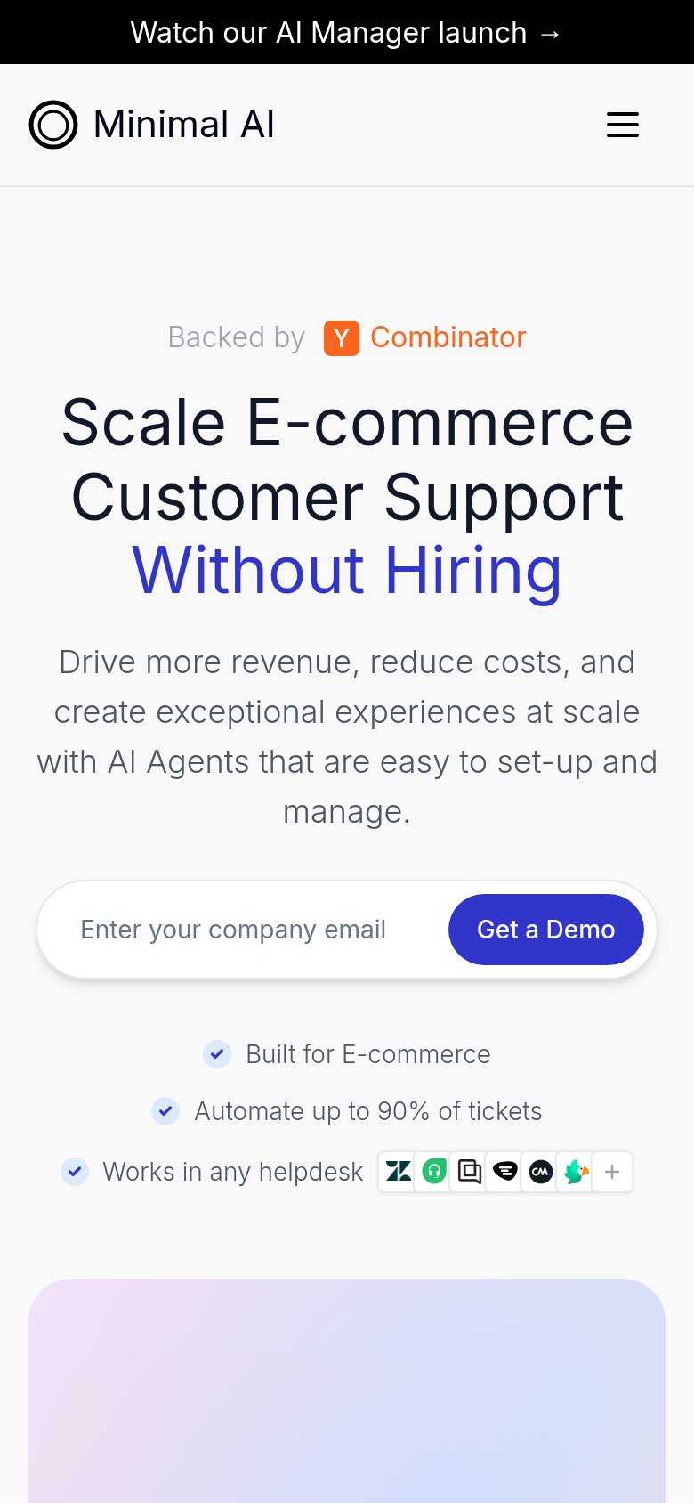 12
- Announcement bar — Sticky promo strip eats viewport height before the value prop and adds a competing message above the hero.
- Helpdesk logo strip — Tiny integration icons are near-illegible at phone size, wasting the 'Works in any helpdesk' proof point.