
Your landing page’s weakest score is CTA.
How Richpanel ranks
CTA
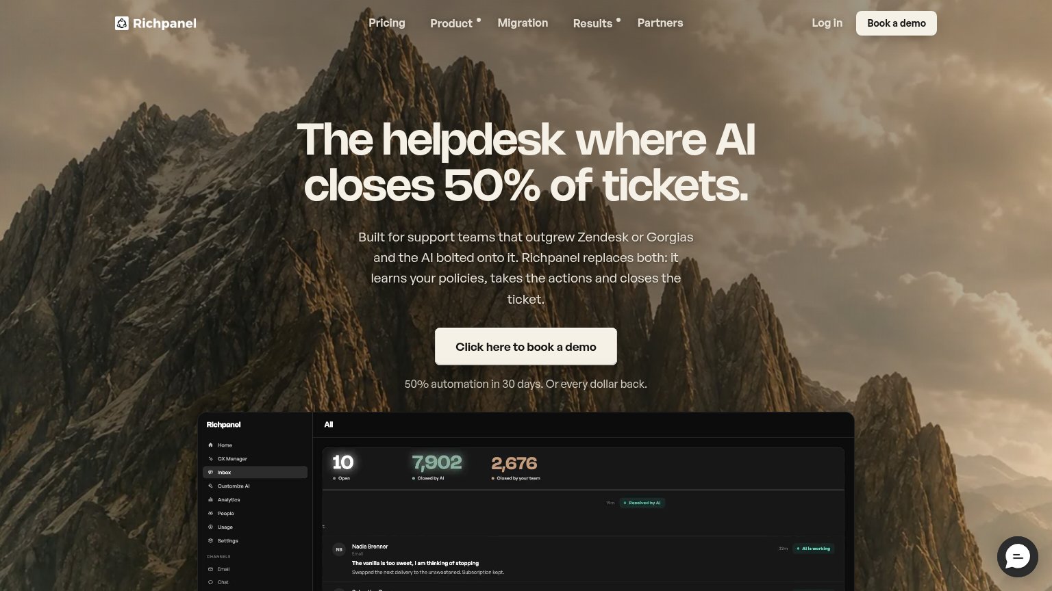
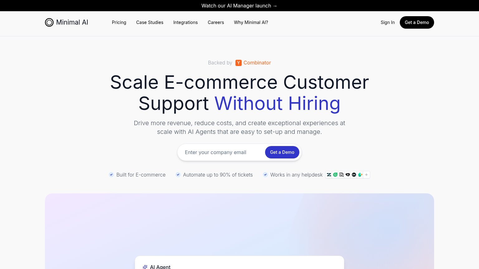
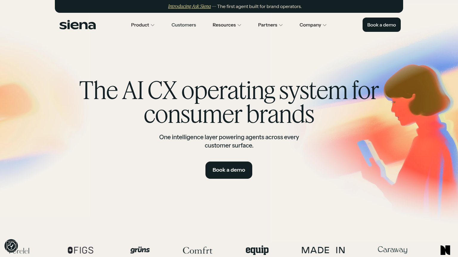
62FairCopy, size, verb, cost-feel — does the primary CTA earn the click?
Problems
- 'Click here to' is filler
- 6 words — too long
- demo booking feels costly
- hero and nav labels differ
Trust
62FairProof that the product is real, competent, and safe to try.
| Trust read | |
|---|---|
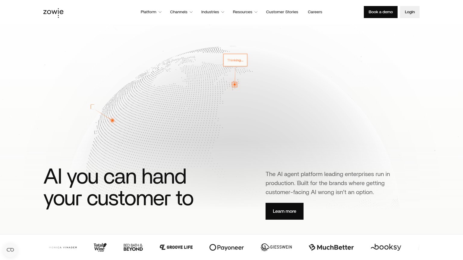
| Richpanel | Product dashboard showing "7,902 Closed by AI" and "2,676 Closed by your team" ticket counters |
| Backed by Y Combinator badge above the headline | |
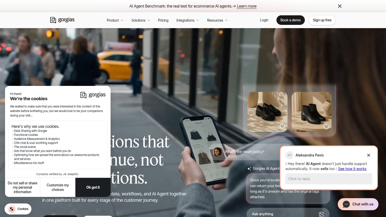
| Embedded Gorgias AI Agent demo answering "What's the return policy?" with a specific policy reply | |
| Customer logo strip featuring FIGS, Caraway, Made In, Grüns, Comfrt, Equip, Perelel, and Butcherbox | |
| Customer logo strip with Bed Bath & Beyond, Payoneer, Total Wine, MuchBetter, Booksy | |
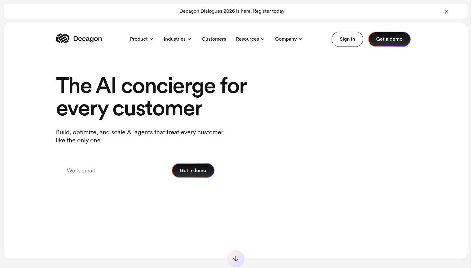
| implicit context Decagon may benefit from pre-existing familiarity among its target audience. |
Information hierarchy
84StrongDoes the design help or inhibit what the page is trying to say?
What works
What to improve
Mobile web
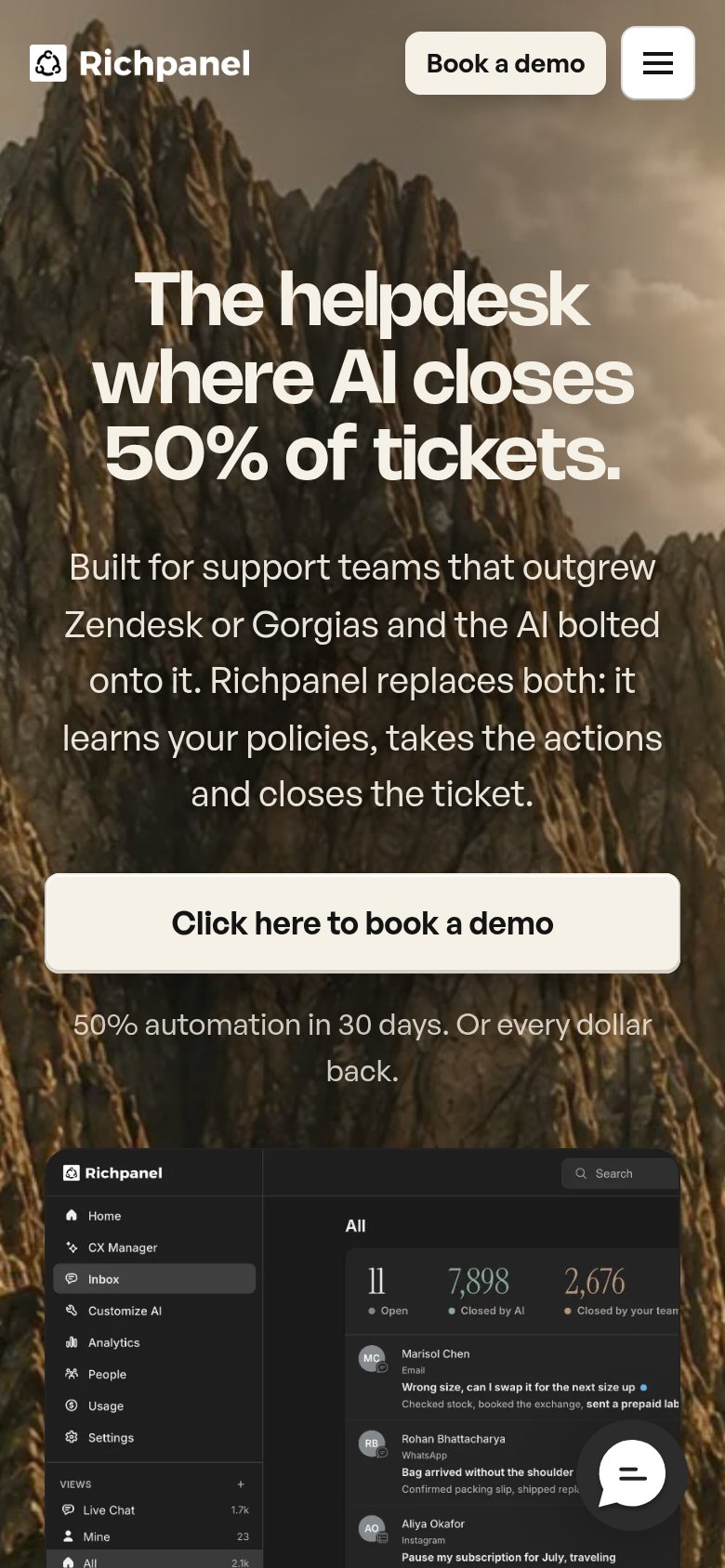
84StrongThe phone experience as a first-class citizen.
What works
What to improve
Value props
88StrongTitle, subtitle, hero — do they sell the product's true value?
Richpanel’s headline
The helpdesk where AI closes 50% of tickets.
Built for support teams that outgrew Zendesk or Gorgias and the AI bolted onto it. Richpanel replaces both: it learns your policies, takes the actions and closes the ticket.
Working
Could improve