
Your landing page’s weakest score is Mobile web.
How Gorgias ranks
58Growth scoreupdated
category scores
category scoresShowHide
Mobile web
42PoorThe phone experience as a first-class citizen.
 1234
- Cookie consent wall — Covers two-thirds of the viewport with a bulleted cookie list, burying the hero and any CTA.
- AI Agent promo banner — Three-line sticky banner stacks on the header and pushes the hero a third of the way down.
- Truncated hero subheadline — Body copy cuts off mid-sentence behind the consent sheet, leaving the value statement unfinished.
- Header Book a demo — Only visible CTA is a small header pill, not a thumb-friendly full-width hero button.
Information hierarchy
48PoorDoes the design help or inhibit what the page is trying to say?
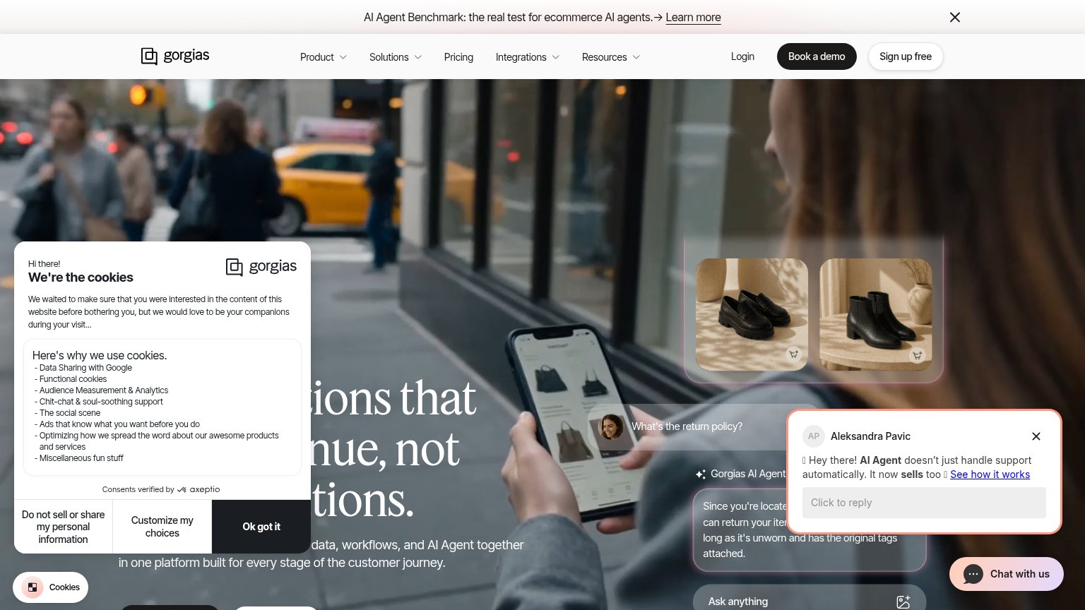 1234
- Cookie consent modal — Covers the left half of the headline, making the value proposition unreadable until dismissed.
- Chat popup overlay — A second uninvited dialog stacked on the fold, competing with the hero and hiding the AI Agent demo.
- Nav CTA pair — "Book a demo" and "Sign up free" sit at near-equal weight with no single primary action.
- Announcement banner — "Learn more" link at the very top routes attention away before the headline is read.
Trust
54FairProof that the product is real, competent, and safe to try.
How Gorgias compares
Trust read
CTA
72FairCopy, size, verb, cost-feel — does the primary CTA earn the click?
How Gorgias compares
Recommended rewrites
Value props
76FairTitle, subtitle, hero — do they sell the product's true value?
Gorgias’s headline
Conversations that drive revenue, not just resolutions.
Bring your support team, customer data, workflows, and AI Agent together in one platform built for every stage of the customer journey.
Working
Could improve