
Your landing page’s weakest score is Trust.
How Magnetic ranks
70Growth scoreupdated
category scores
category scoresShowHide
Score over time
Trust
52FairProof that the product is real, competent, and safe to try.
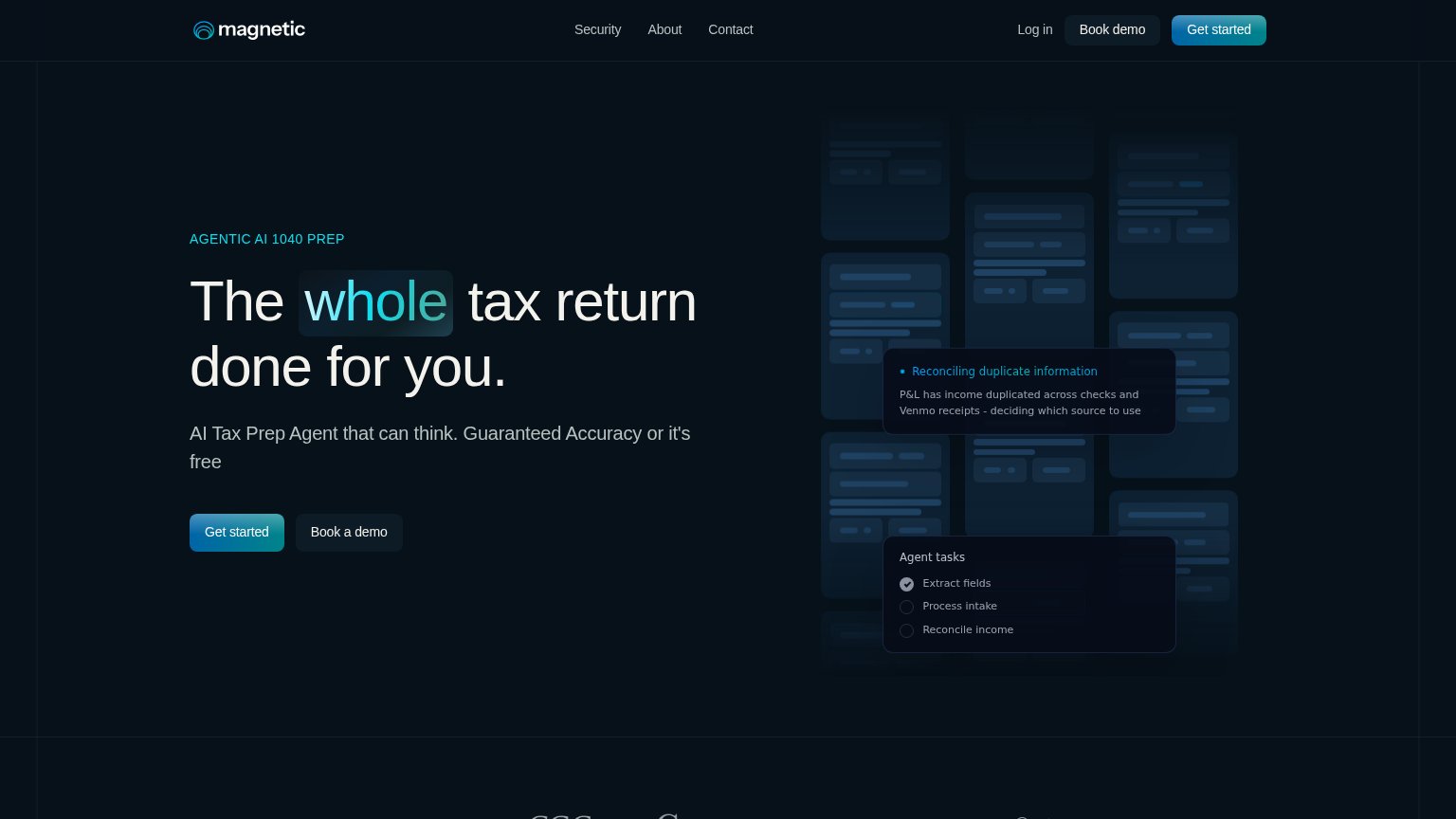
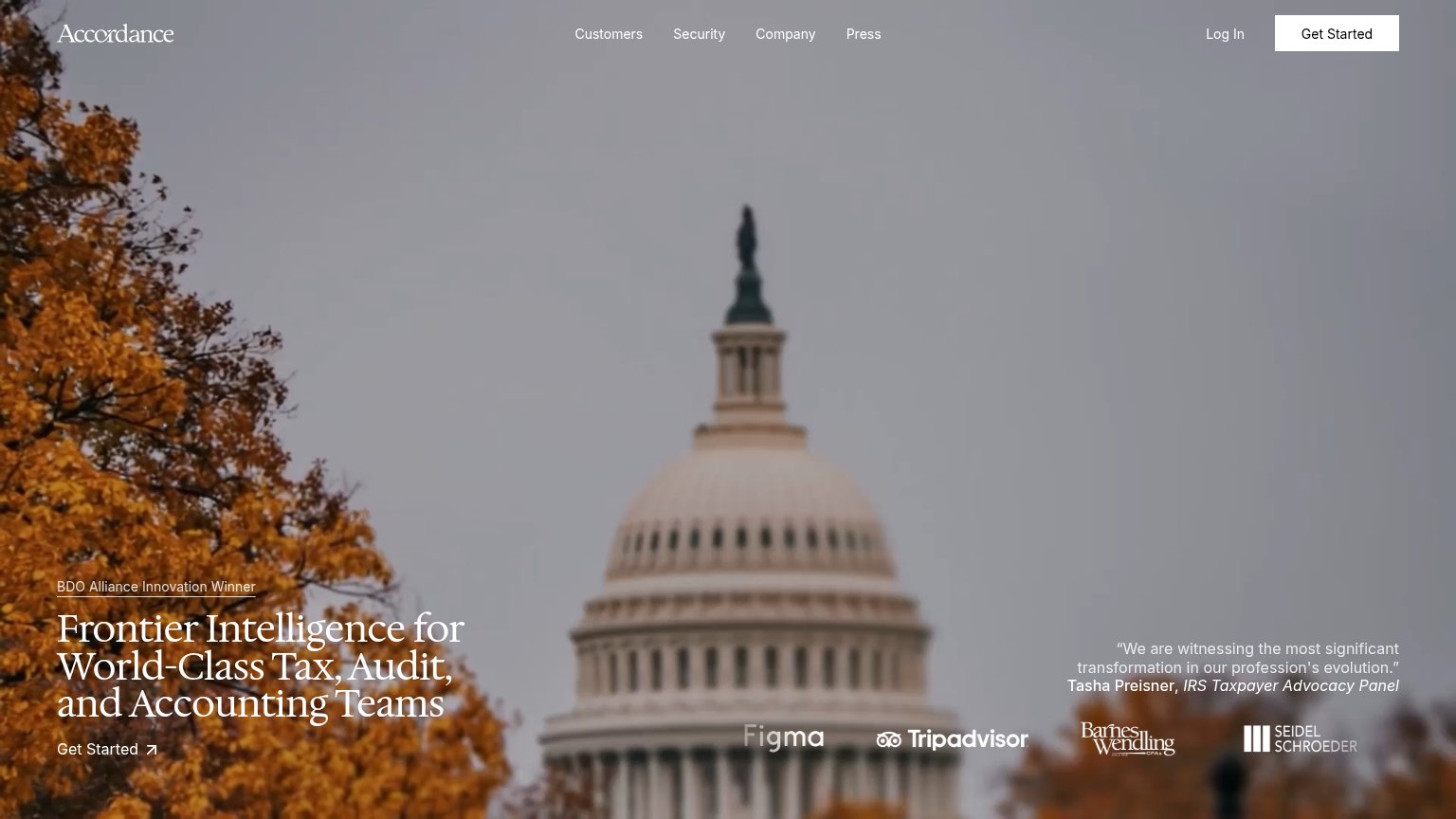
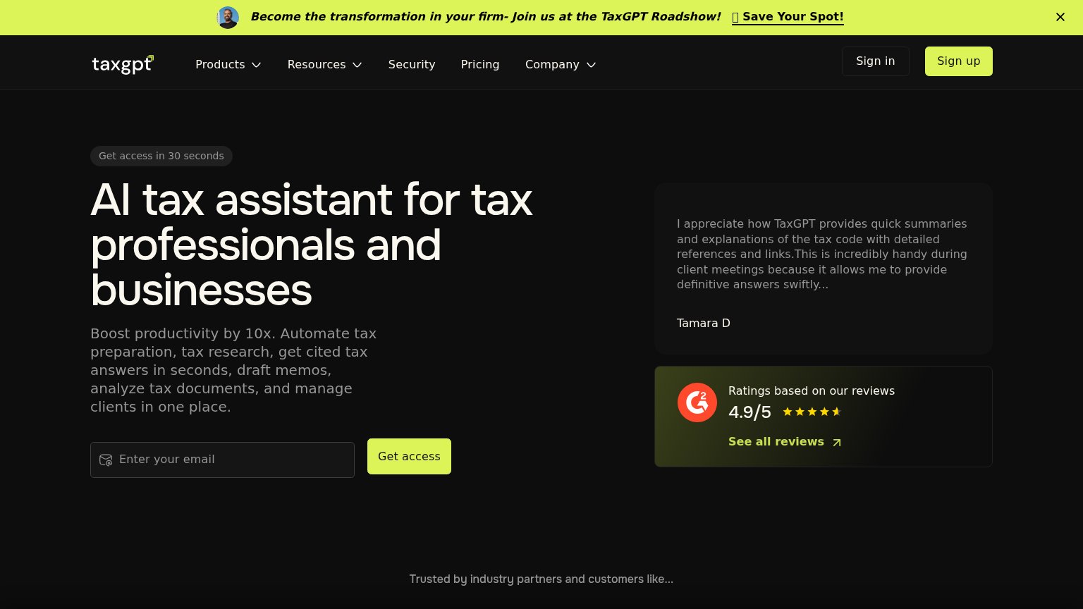
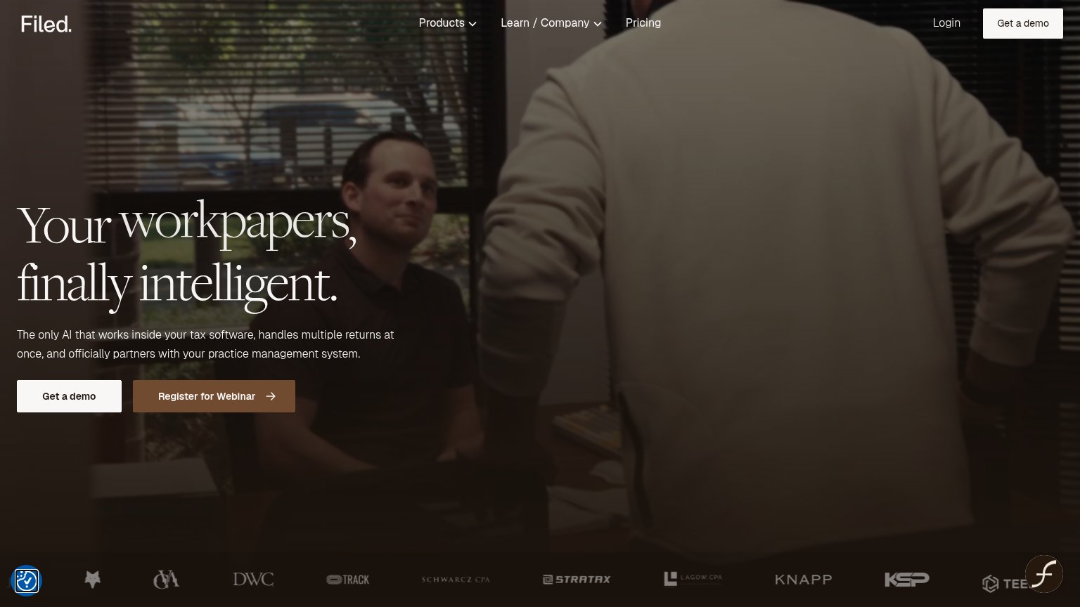
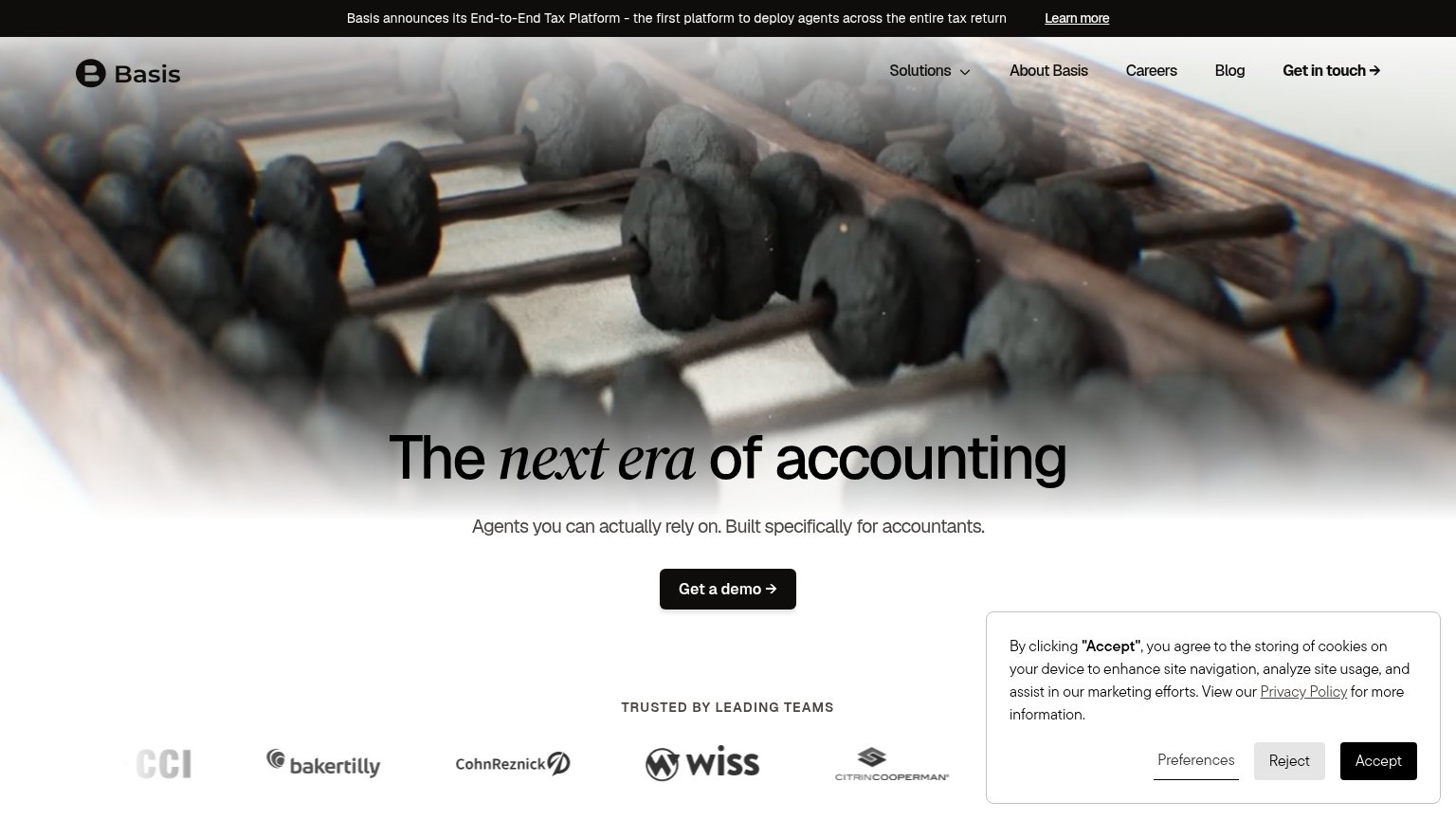
| Trust read | |
|---|---|
| Magnetic | "Guaranteed Accuracy or it's free" subhead |
| Customer logo strip with named CPA firms (DWC, Schwarcz CPA, Stratax, Lagow CPA, Knapp, KSP) | |
| G2 card: "Ratings based on our reviews — 4.9/5" with star rating and "See all reviews" link | |
| "TRUSTED BY LEADING TEAMS" logo bar with Baker Tilly, CohnReznick, Wiss, CitrinCooperman | |
| "AI Tax Summit — Recap the Day from Nasdaq Tower" event banner | |
| “We are witnessing the most significant transformation in our profession's evolution.” — Tasha Preisner, IRS Taxpayer Ad |
CTA
68FairCopy, size, verb, cost-feel — does the primary CTA earn the click?
Problems
- generic label, no payoff named
- ignores 'or it's free' guarantee
- hero button small vs headline
Information hierarchy
72FairDoes the design help or inhibit what the page is trying to say?
123- Duplicate header CTAs — Header stacks Log in, Book demo, and Get started at similar weight, duplicating both hero buttons and splitting the click.
- Ghosted document grid — Rows of near-invisible mock documents add visual bulk without communicating anything readable; only the agent callouts carry meaning.
- Agent tasks panel — Gray labels like Process intake sit at very low contrast against the dark card, making the product demo hard to parse in one glance.
Value props
78FairTitle, subtitle, hero — do they sell the product's true value?
Magnetic’s headline sells
The whole tax return done for you.
AI Tax Prep Agent that can think. Guaranteed Accuracy or it's free
Working
- Outcome-first: 'done for Magnetic'
- Guarantee reverses risk
- Hero shows agent reasoning, not decoration
Could improve
- No concrete numbers anywhere in fold
- 'Can think' is claim without proof
- Audience (CPA vs filer) unclear
Mobile web
78FairThe phone experience as a first-class citizen.
 123
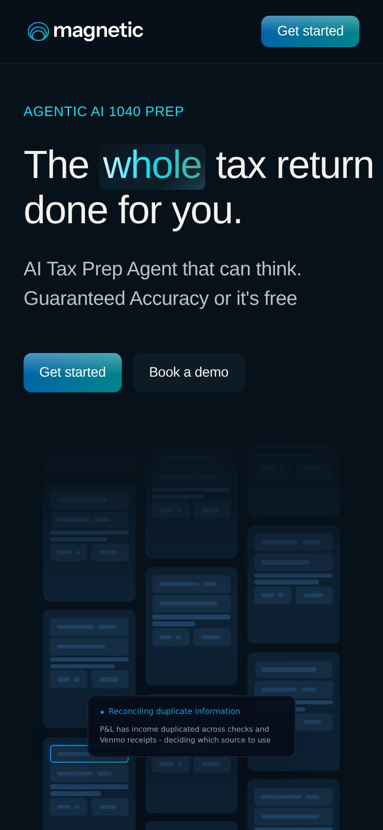
- Hero CTA pair — Desktop-proportioned buttons sit side by side at half width instead of stacking near full-bleed for the thumb.
- Headline right edge — "tax return" runs to the viewport edge with almost no right padding, looking clipped.
- Header Get started — Duplicates the hero CTA inches above it, splitting the tap target without adding a new action.