
Your landing page’s weakest score is Trust.
How Wealor ranks
65Growth scoreupdated
category scores
category scoresShowHide
Score over time
Trust
48PoorProof that the product is real, competent, and safe to try.
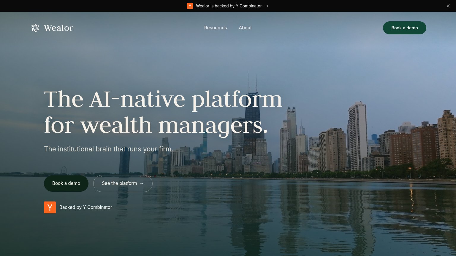

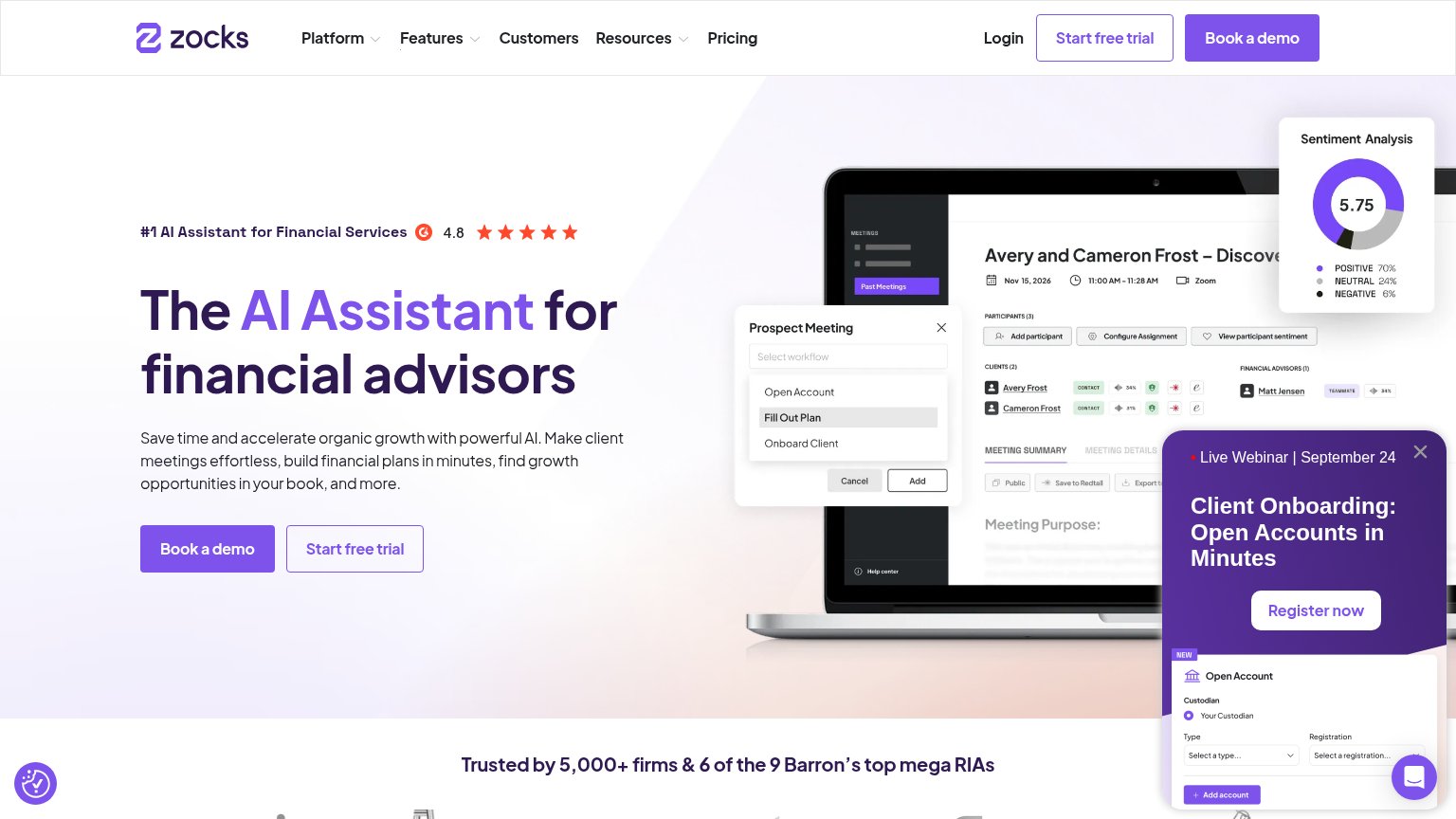
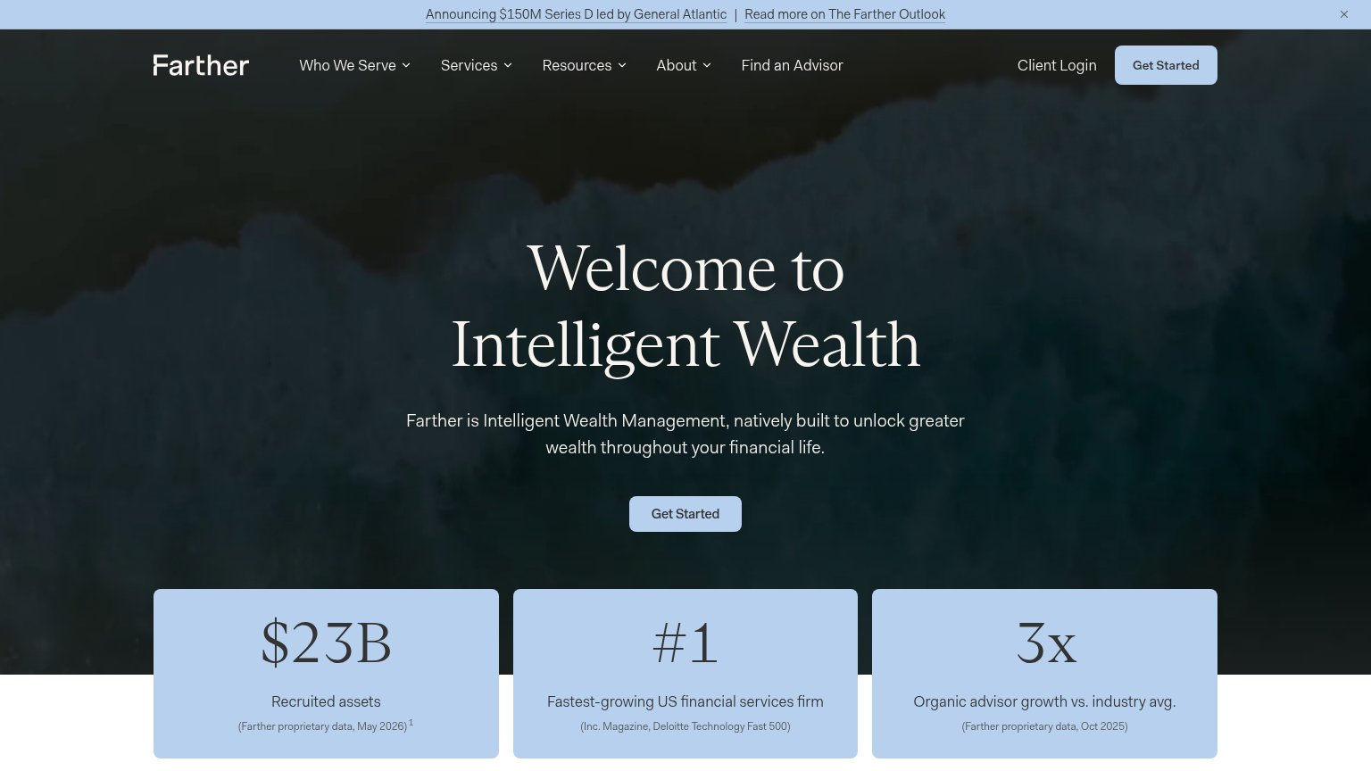
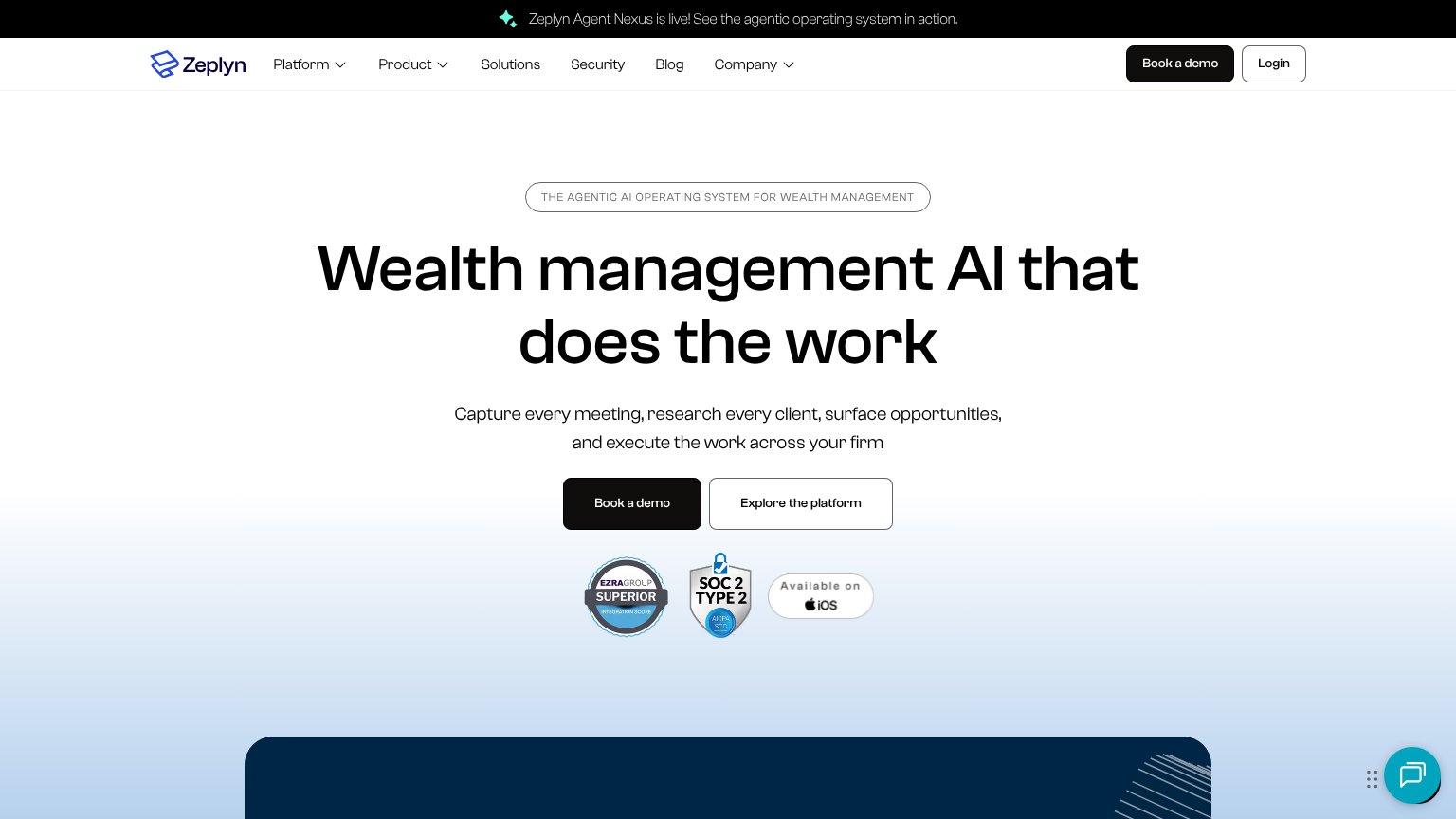
| Trust read | |
|---|---|
| Wealor | "Backed by Y Combinator" badge beneath the hero CTA |
| Demo video thumbnail showing real financial document scans (Guardian statement, alternatives report with KKR/Blackstone | |
| SOC 2 Type 2 AICPA badge beneath the hero CTAs | |
| Empowering 45,000+ advisors at top firms of all sizes | |
| "Trusted by 5,000+ firms & 6 of the 9 Barron's top mega RIAs" | |
| "#1 Fastest-growing US financial services firm (Inc. Magazine, Deloitte Technology Fast 500)" stat card |
Value props
52FairTitle, subtitle, hero — do they sell the product's true value?
Wealor’s headline vague
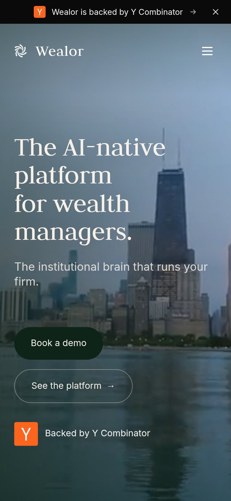
The AI-native platform for wealth managers.
The institutional brain that runs your firm.
Working
- Names the audience precisely
- Y Combinator badge adds credibility
- Confident, category-owning tone
Could improve
- No concrete task or outcome named
- Skyline hero shows nothing of the product
- Subhead is a metaphor, not a specific
CTA
72FairCopy, size, verb, cost-feel — does the primary CTA earn the click?
Problems
- 'Book' feels costly — sales-call click
- no product access before talking to sales
- cheaper action demoted to ghost button
Mobile web
72FairThe phone experience as a first-class citizen.
 123
- YC promo bar — Sticky banner eats top viewport and duplicates the YC badge shown lower in the fold.
- Book a demo button — Desktop-proportioned pill floats at under half the column width instead of a full-bleed thumb target.
- Backed by Y Combinator — Second YC mention in one viewport — redundant with the banner and dilutes the CTA stack.
Information hierarchy
82StrongDoes the design help or inhibit what the page is trying to say?
123- Hero Book a demo — Dark green button on dark teal water reads low-contrast; duplicates the identical nav CTA.
- Backed by YC badge — Repeats the top banner's exact message, spending fold attention on the same proof twice.
- Subtitle over skyline — 'The institutional brain that runs Wealor's firm.' sits on mid-tone buildings, thinning its legibility.