
Your landing page’s weakest score is CTA.
How Powder ranks
CTA
48PoorCopy, size, verb, cost-feel — does the primary CTA earn the click?
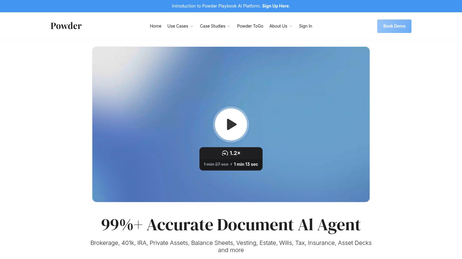
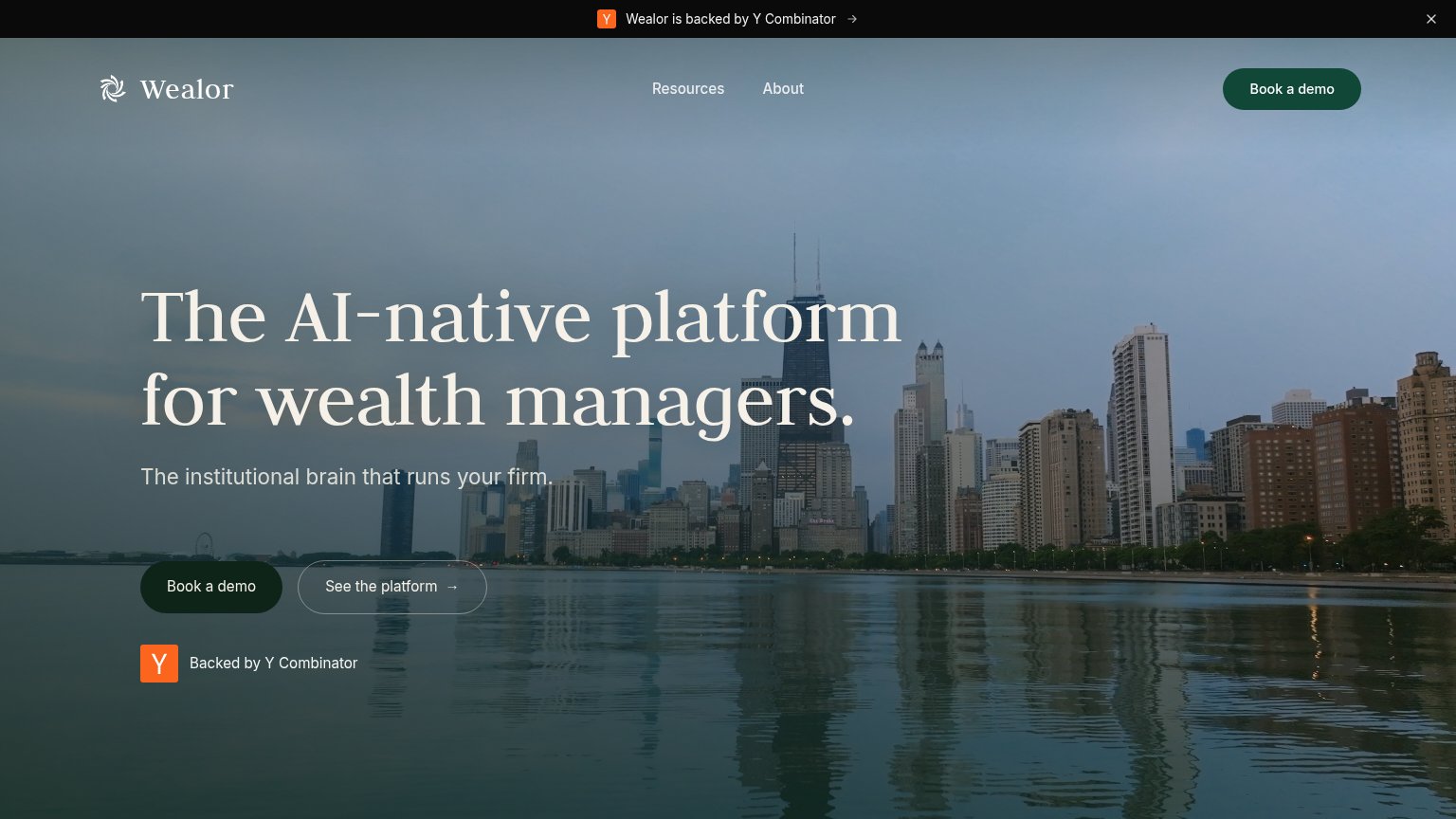

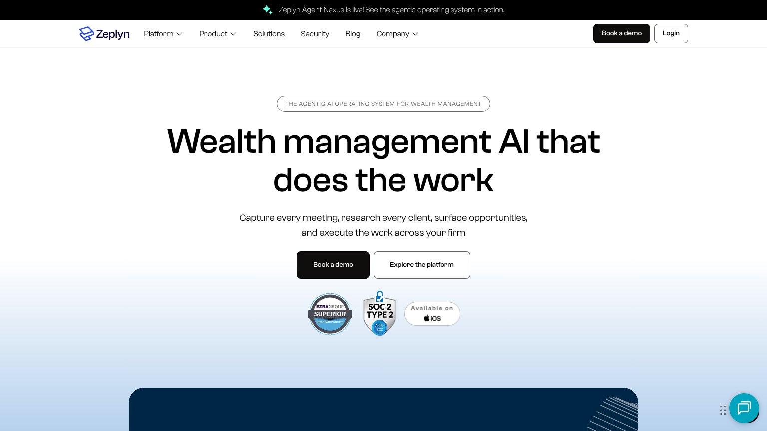
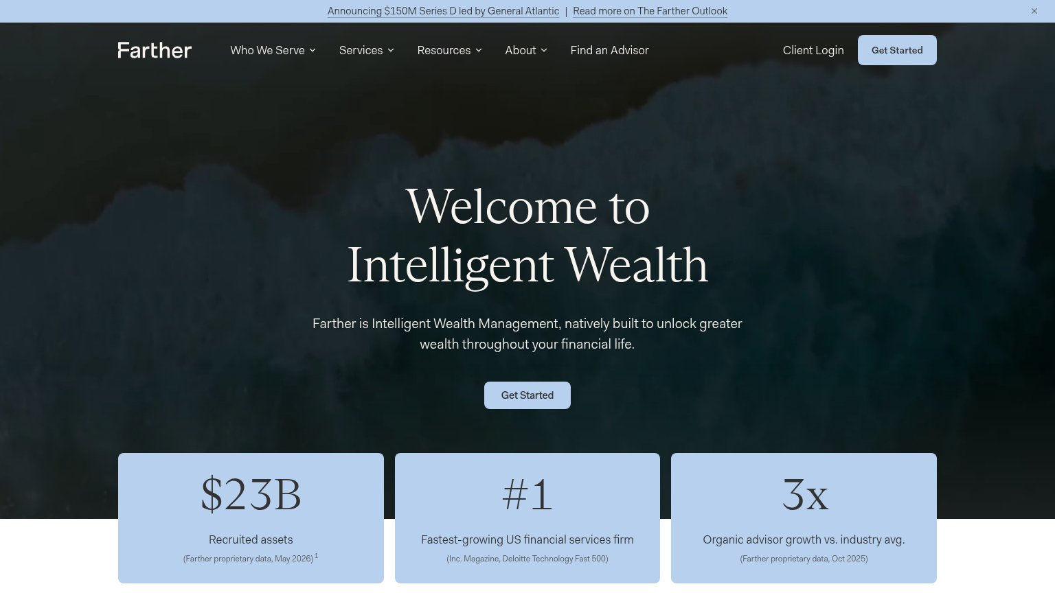
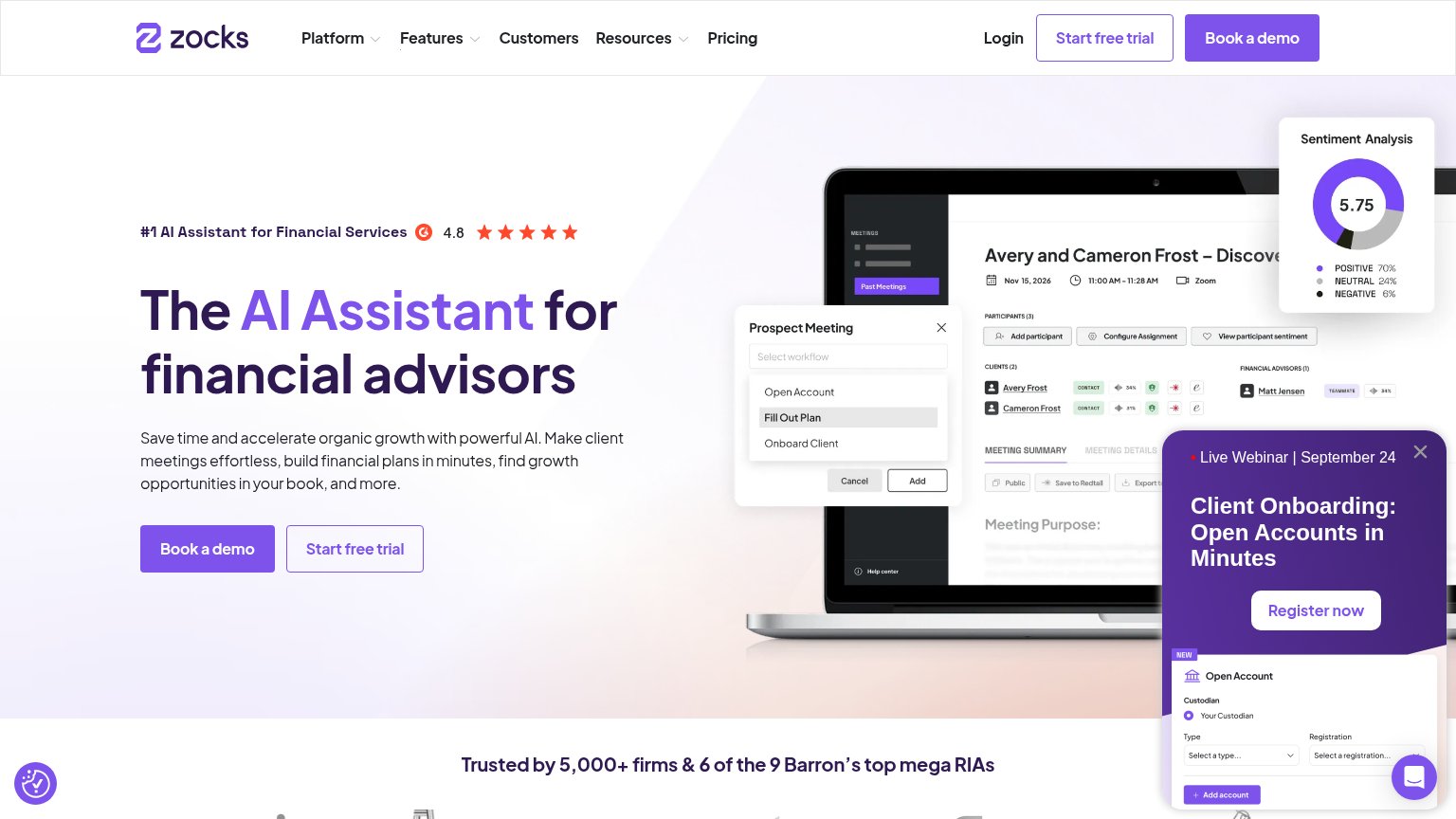
Problems
- high-cost 'demo' framing
- small, low-contrast nav button
- no CTA in hero on either viewport
- conflicts with 'Sign Up Here' banner
Trust
48PoorProof that the product is real, competent, and safe to try.
| Trust read | |
|---|---|
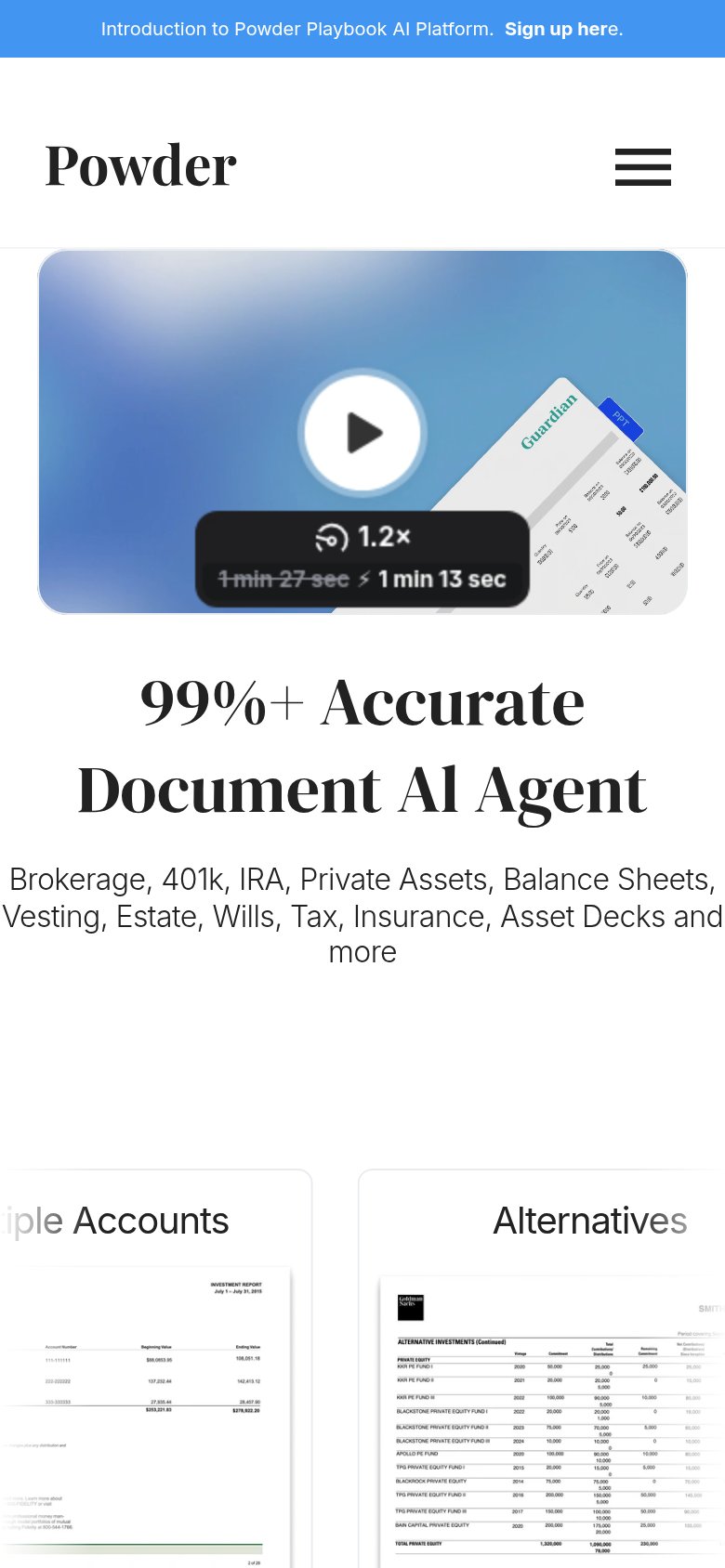
| Powder | Demo video thumbnail showing real financial document scans (Guardian statement, alternatives report with KKR/Blackstone |
| "Backed by Y Combinator" badge beneath the hero CTA | |
| SOC 2 Type 2 AICPA badge beneath the hero CTAs | |
| Empowering 45,000+ advisors at top firms of all sizes | |
| "Trusted by 5,000+ firms & 6 of the 9 Barron's top mega RIAs" | |
| "#1 Fastest-growing US financial services firm (Inc. Magazine, Deloitte Technology Fast 500)" stat card |
Information hierarchy
58FairDoes the design help or inhibit what the page is trying to say?
What works
What to improve
Mobile web
58FairThe phone experience as a first-class citizen.
What works
What to improve
Value props
72FairTitle, subtitle, hero — do they sell the product's true value?
Powder’s headline
99%+ Accurate Document AI Agent
Brokerage, 401k, IRA, Private Assets, Balance Sheets, Vesting, Estate, Wills, Tax, Insurance, Asset Decks and more
Working
Could improve