
Your landing page’s weakest score is Mobile web.
How Zocks ranks
65Growth scoreupdated
category scores
category scoresShowHide
Mobile web
48PoorThe phone experience as a first-class citizen.
 123
- Webinar overlay covers CTAs — The Live Webinar pop-up occludes both primary buttons, hiding their labels and blocking the tap.
- Buried primary CTA button — Only a thin unlabeled purple sliver of the main CTA is visible beneath the overlay.
- Chat bubble — Corner chat launcher stacks on top of the already-crowded overlay, adding a third competing tap target.
Information hierarchy
58FairDoes the design help or inhibit what the page is trying to say?
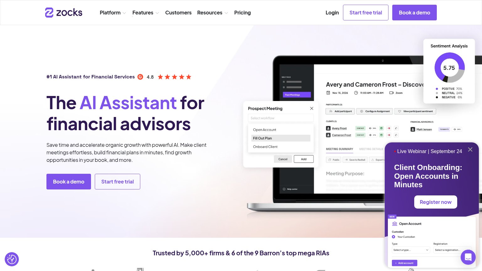 1234
- Webinar popup panel — Covers the product screenshot on desktop and buries both hero CTAs on mobile, hijacking the fold with a competing 'Register now' action.
- Duplicate header CTAs — 'Start free trial' and 'Book a demo' repeat in the nav at near-equal weight, doubling the hero's CTA pair to four competing buttons in the fold.
- Hero CTA pair — 'Book a demo' and 'Start free trial' sit side by side at similar footprint, splitting the click instead of declaring one primary action.
- Nav dropdown row — Three dropdowns plus Customers and Pricing add five exit paths that outrank the scan path to the hero CTA.
CTA
64FairCopy, size, verb, cost-feel — does the primary CTA earn the click?
How Zocks compares
Recommended rewrites
Value props
76FairTitle, subtitle, hero — do they sell the product's true value?
Zocks’s headline
The AI Assistant for financial advisors
Save time and accelerate organic growth with powerful AI. Make client meetings effortless, build financial plans in minutes, find growth opportunities in your book, and more.
Working
Could improve
Trust
78FairProof that the product is real, competent, and safe to try.
How Zocks compares
Trust read