
Your landing page’s weakest score is Trust.
How Userlens ranks
75Growth scoreupdated
category scores
category scoresShowHide
Score over time
Trust
58FairProof that the product is real, competent, and safe to try.
| Trust read | |
|---|---|
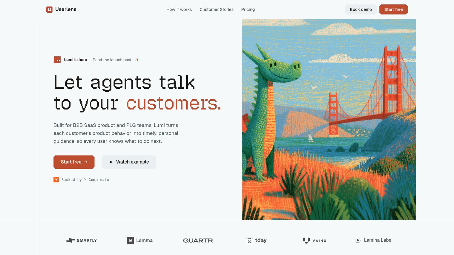
| Userlens | Customer logo strip: Smartly, Lemma, Quartr, tday, Vainu, Lamina Labs |
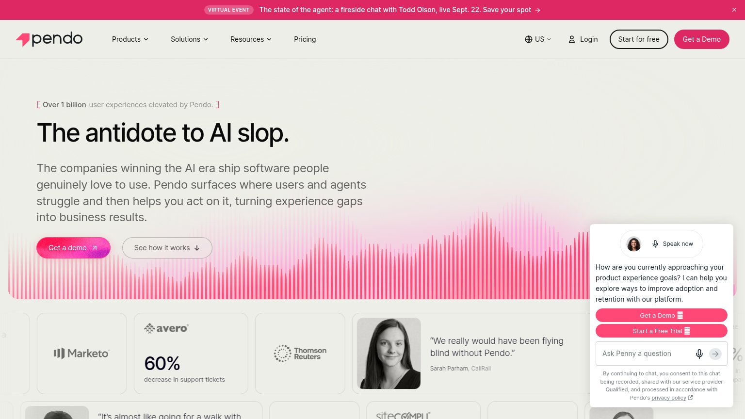
| Product dashboard screenshot showing "Welcome back, Sam" with onboarding checklist prompt | |
| 4.8 rating on G2 | |
| Feature tab bar listing "AI Data Analytics / AI Feedback Analysis / AI User Engagement" | |
| "We really would have been flying blind without Pendo." — Sarah Parham, CallRail (attributed testimonial with headshot) | |
| Product UI mockups of guides and surveys ("How did we do?" survey card, "Create your first project" onboarding checklist |
Value props
62FairTitle, subtitle, hero — do they sell the product's true value?
Userlens’s headline vague
Let agents talk to your customers.
Built for B2B SaaS product and PLG teams, Lumi turns each customer's product behavior into timely, personal guidance, so every user knows what to do next.
Working
- Subhead names audience: B2B SaaS and PLG teams
- Outcome stated: users know what to do next
- YC badge and logo strip add credibility
Could improve
- 'Agents' is ambiguous without context
- Hero art decorates, never shows product
- No numbers or proof points in fold
Mobile web
82StrongThe phone experience as a first-class citizen.
 12
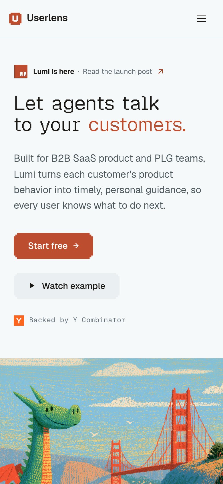
- Start free button — Desktop-proportioned button floats at roughly half the column width instead of going near full-bleed for the thumb.
- Watch example button — Second button stacked at similar visual weight competes with the primary CTA instead of being demoted to a text link.
Information hierarchy
84StrongDoes the design help or inhibit what the page is trying to say?
123- Duplicate Start free button — Same-weight twin of the hero CTA splits attention and dilutes the single conversion target.
- Book demo button — Pill-styled at near-equal weight beside Start free, creating a competing decision at the top of the scan path.
- Launch post banner link — Outbound 'Read the launch post' sits directly above the headline and leaks attention before the value prop lands.
CTA
88StrongCopy, size, verb, cost-feel — does the primary CTA earn the click?
Problems
- label names no payoff or product value
- generic — same copy on thousands of SaaS pages