
Your landing page’s weakest score is Trust.
How Userflow ranks
Trust
58FairProof that the product is real, competent, and safe to try.
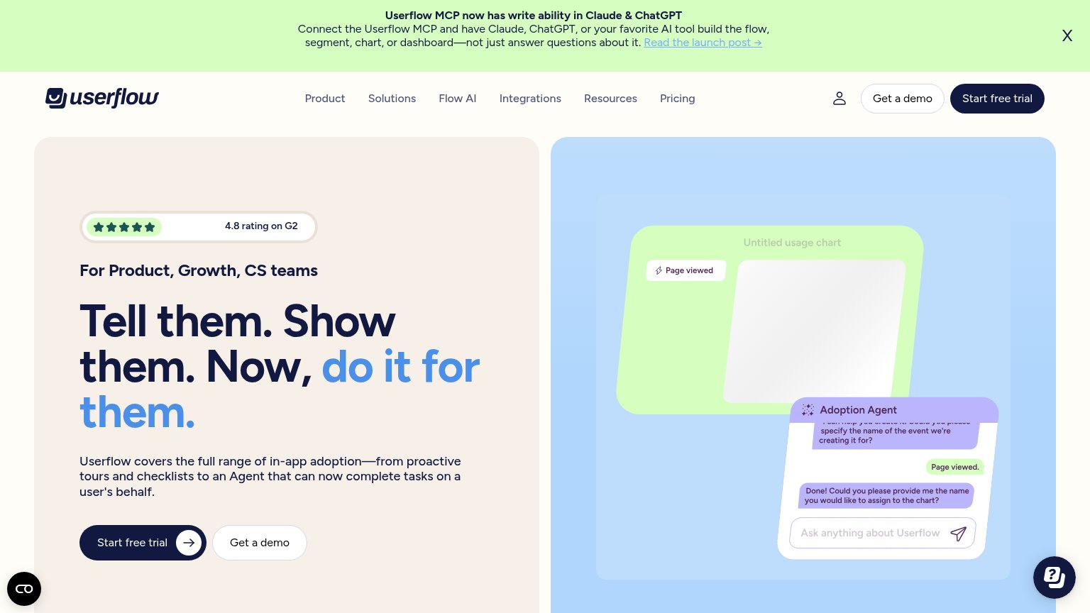
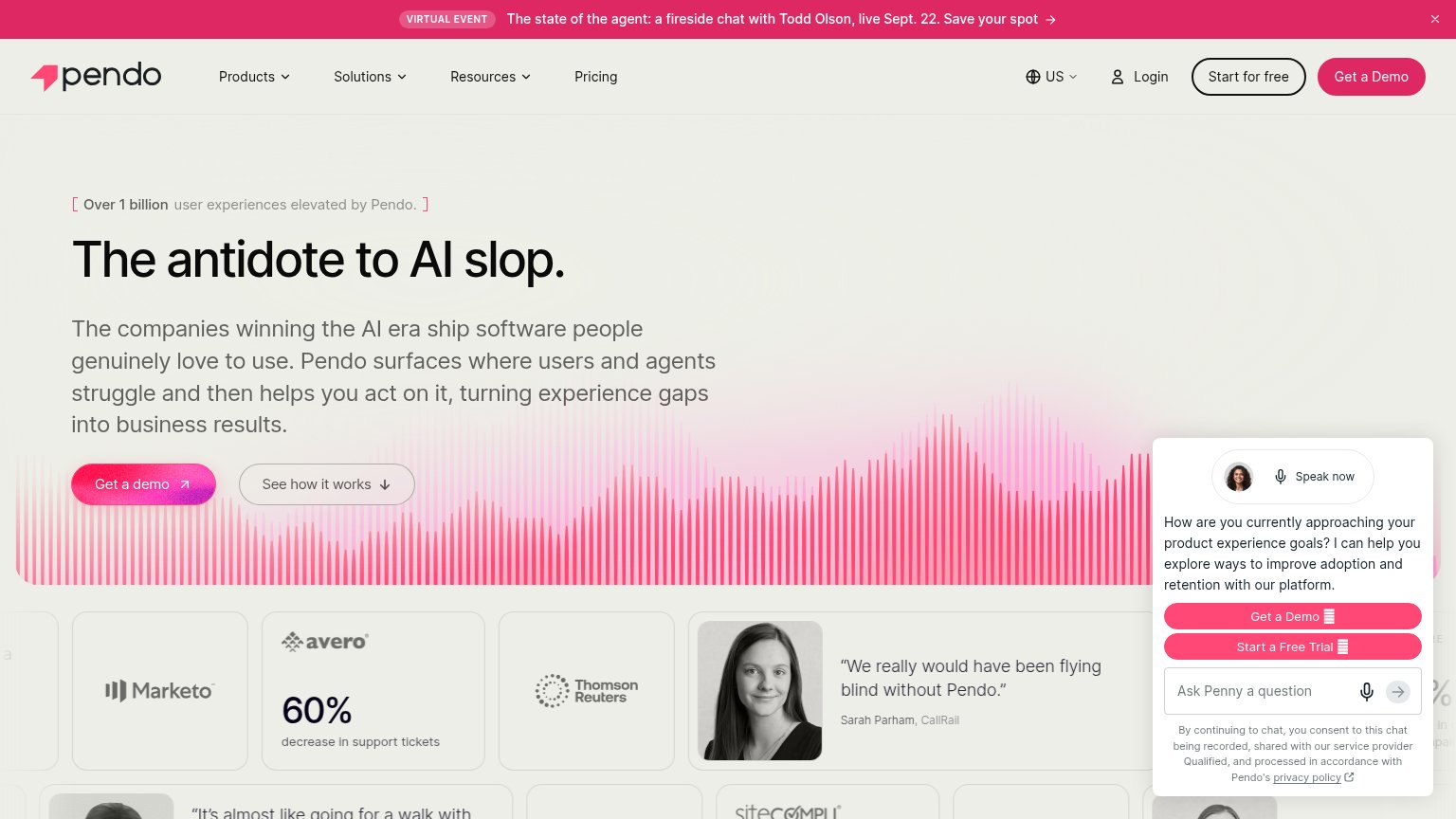
| Trust read | |
|---|---|
| Userflow | 4.8 rating on G2 |
| Customer logo strip: Smartly, Lemma, Quartr, tday, Vainu, Lamina Labs | |
| Product dashboard screenshot showing "Welcome back, Sam" with onboarding checklist prompt | |
| Feature tab bar listing "AI Data Analytics / AI Feedback Analysis / AI User Engagement" | |
| "We really would have been flying blind without Pendo." — Sarah Parham, CallRail (attributed testimonial with headshot) | |
| Product UI mockups of guides and surveys ("How did we do?" survey card, "Create your first project" onboarding checklist |
Mobile web
58FairThe phone experience as a first-class citizen.
 123
- MCP announcement banner — Eight-line promo banner eats the top quarter of the fold and pushes both CTAs to the bottom edge.
- Clipped trial button — A floating dark widget overlaps the primary CTA, clipping its label to 'tart free trial'.
- Chat bubble overlap — The help bubble crowds and partially covers the 'Get a demo' button's tap target.
Information hierarchy
72FairDoes the design help or inhibit what the page is trying to say?
What works
What to improve
Value props
72FairTitle, subtitle, hero — do they sell the product's true value?
Userflow’s headline
Tell them. Show them. Now, do it for them.
Userflow covers the full range of in-app adoption—from proactive tours and checklists to an Agent that can now complete tasks on a user's behalf.
Working
Could improve
CTA
82StrongCopy, size, verb, cost-feel — does the primary CTA earn the click?
How Userflow compares
Recommended rewrites