
Your landing page’s weakest score is CTA.
How Pendo ranks
71Growth scoreupdated
category scores
category scoresShowHide
CTA
62FairCopy, size, verb, cost-feel — does the primary CTA earn the click?
Problems
- demo ask feels costly (sales call)
- no 'free' despite nav free offer
- labels inconsistent across page
- competes with nav 'Start for free'
Information hierarchy
68FairDoes the design help or inhibit what the page is trying to say?
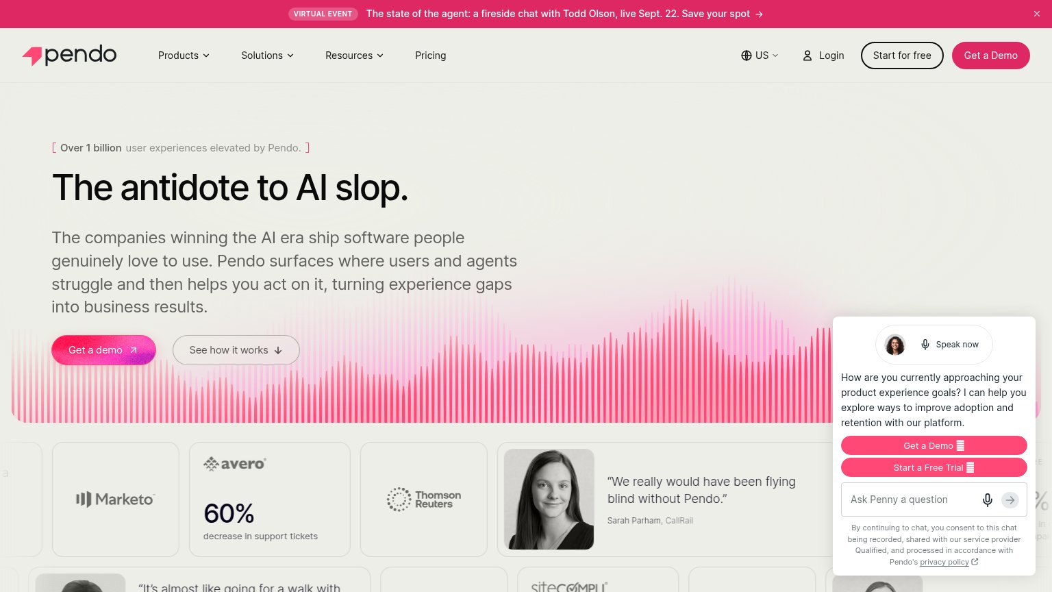
1234- Auto-opened chat widget — The Penny chat panel opens uninvited with its own 'Get a Demo' and 'Start a Free Trial' buttons, duplicating and competing with the hero CTA.
- Header CTA pair — 'Start for free' and 'Get a Demo' sit side by side at equal weight, splitting the primary action before the visitor reaches the hero.
- Event banner — The bright pink fireside-chat banner is the highest-contrast element on the page and routes attention off the conversion path first.
- Chat consent fine print — Legal recording-consent text inside the widget adds friction and clutter directly beside the fold's social proof row.
Value props
72FairTitle, subtitle, hero — do they sell the product's true value?
Pendo’s headline
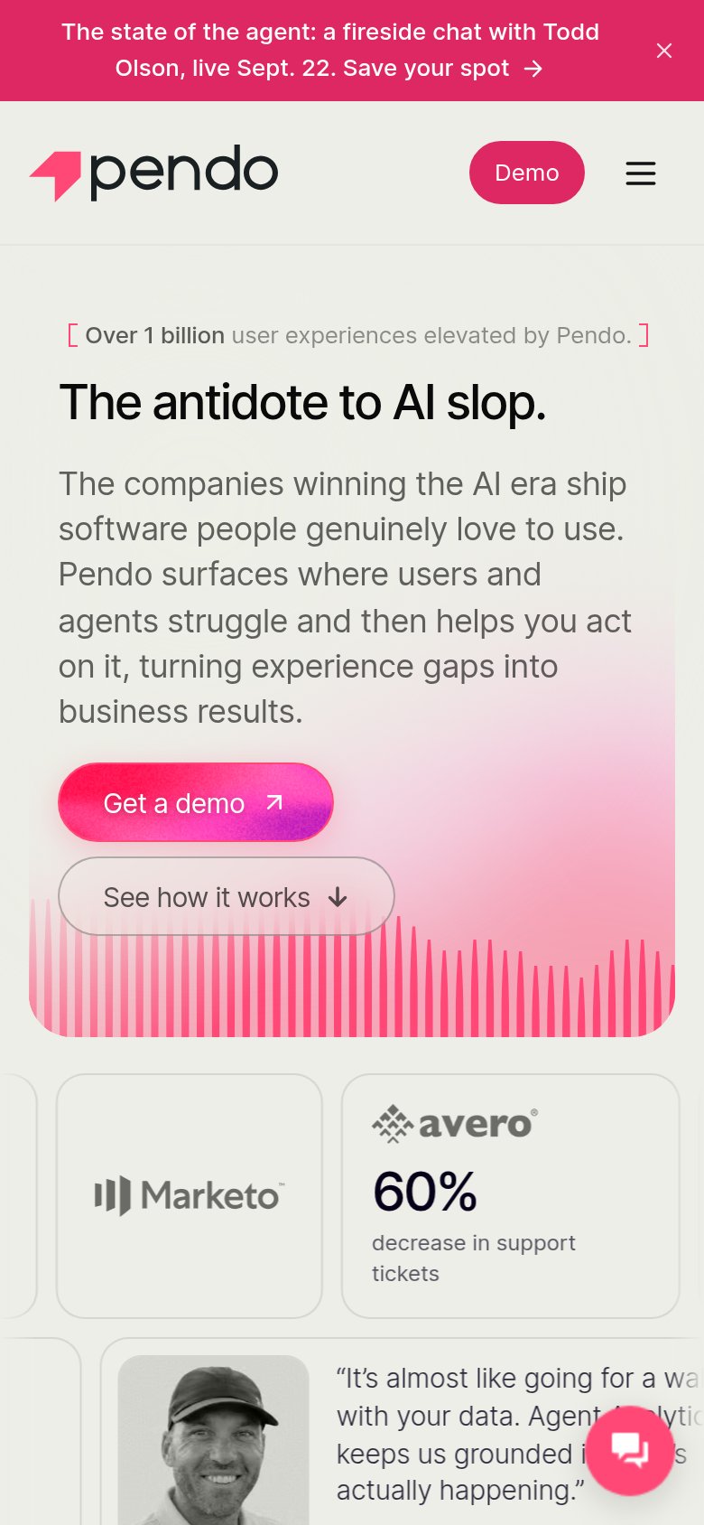
The antidote to AI slop.
The companies winning the AI era ship software people genuinely love to use. Pendo surfaces where users and agents struggle and then helps you act on it, turning experience gaps into business results.
Working
Could improve
Mobile web
72FairThe phone experience as a first-class citizen.
What works
What to improve
Trust
80StrongProof that the product is real, competent, and safe to try.
How Pendo compares
Trust read