
Your landing page’s weakest score is Trust.
How Paper Instruments ranks
55Growth scoreupdated
category scores
category scoresShowHide
Score over time
Trust
42PoorProof that the product is real, competent, and safe to try.

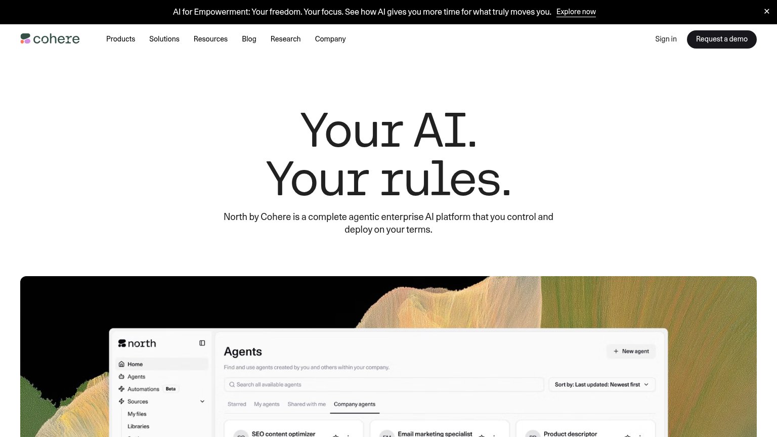
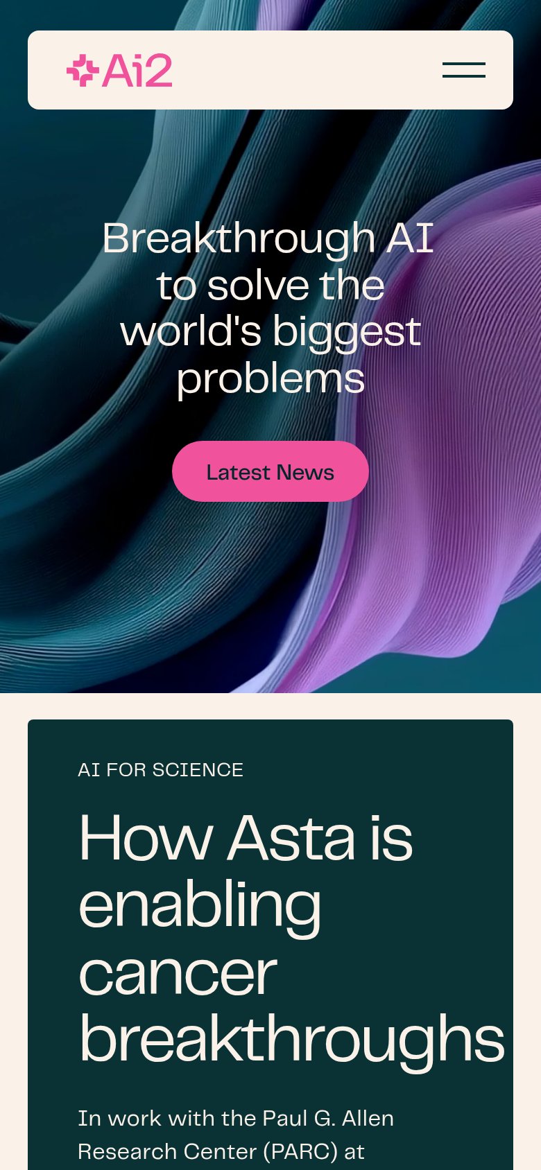
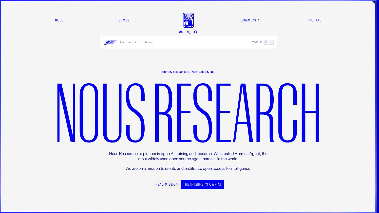
| Trust read | |
|---|---|
| Paper Instruments | "Research — Notes, methods, and results from our work." link block |
| Featured News card: "Mistral raises €3B to make sovereign, open-weight AI the…" | |
| implicit context AI21 Labs may benefit from pre-existing familiarity among its target audience. | |
| North Agents dashboard UI with named agents ("SEO content optimizer", "Email marketing specialist") and version tags | |
| "How Asta is enabling cancer breakthroughs" card citing work "with the Paul G. Allen Research Center (PARC)" | |
| "OPEN SOURCE · MIT LICENSE" badge above the hero headline |
CTA
44PoorCopy, size, verb, cost-feel — does the primary CTA earn the click?
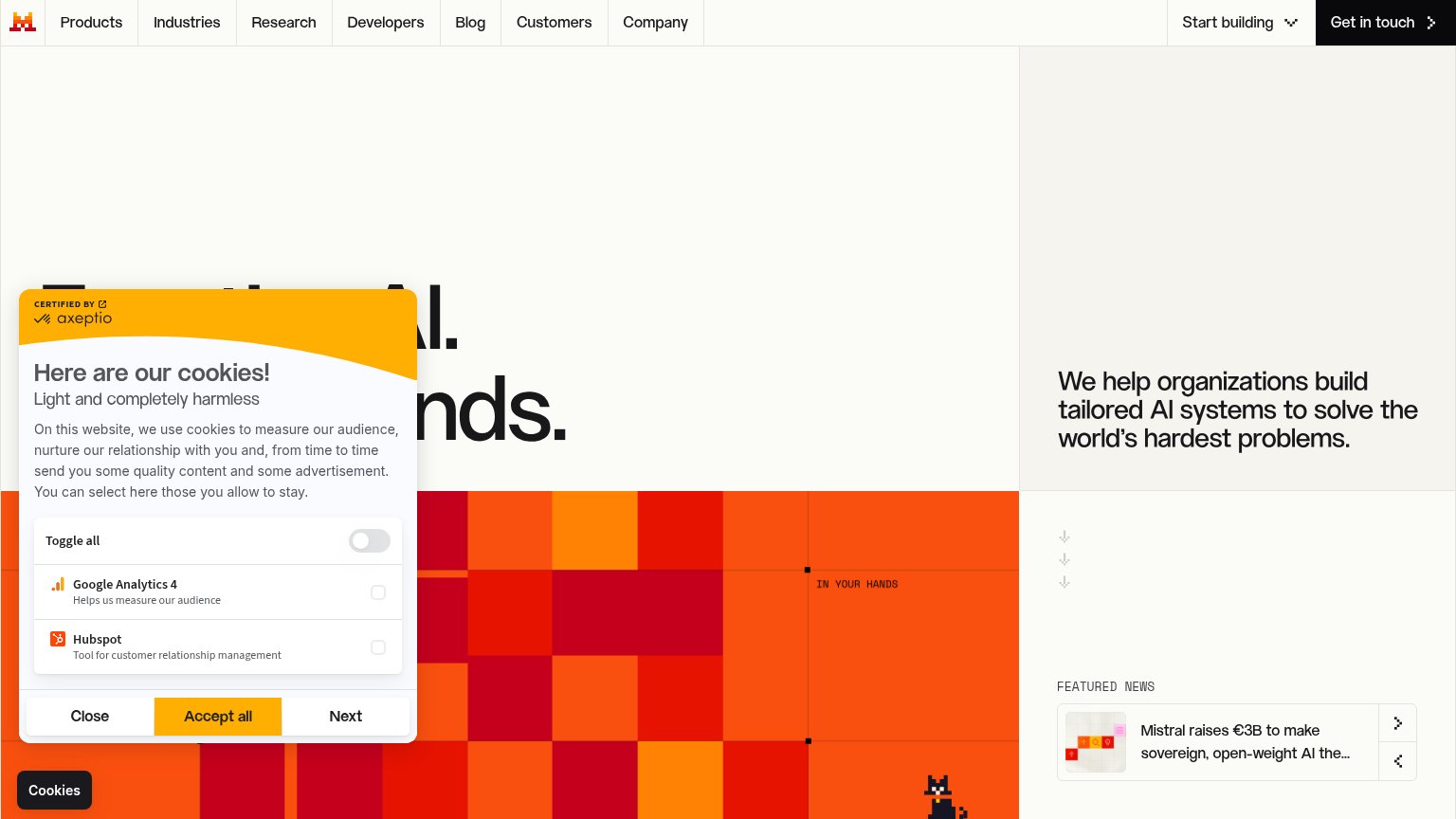
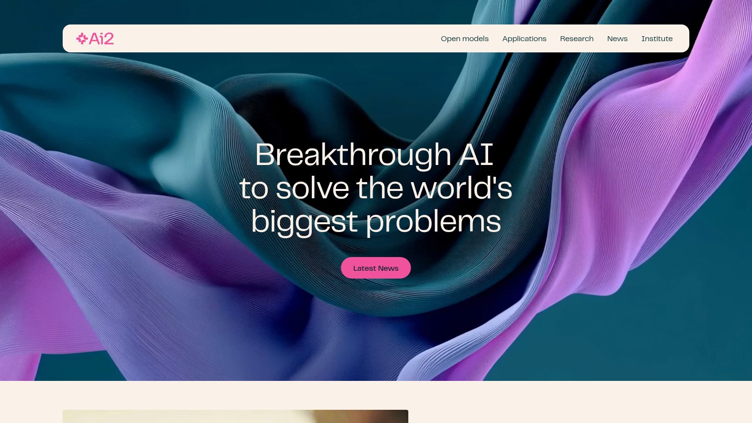

Problems
- no button or in-product action
- nav cards are nouns, not actions
- bare arrow icons, no payoff promised
- one card says 'Coming soon'
Mobile web
58FairThe phone experience as a first-class citizen.
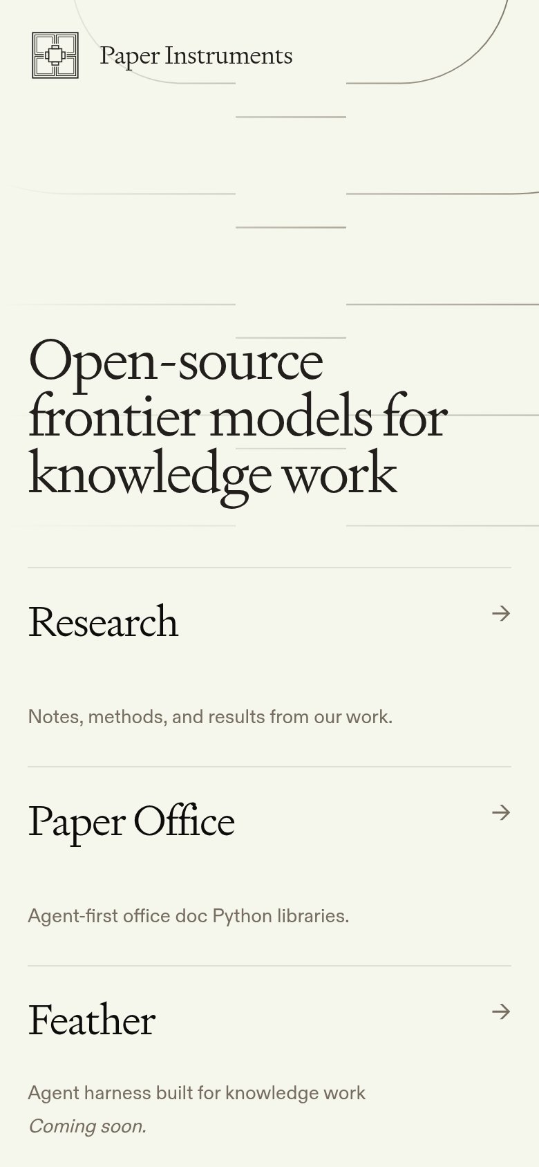 12
- Headline pushes cards down — The hero headline starts halfway down the viewport, leaving no room for a tappable action in the first fold.
- Arrow-only tap targets — Each section's action is a small thin arrow glyph, far below thumb-friendly size and easy to miss or mis-tap.
Value props
62FairTitle, subtitle, hero — do they sell the product's true value?
Paper Instruments’s headline undersells
Open-source frontier models for knowledge work
Working
- Names category and audience plainly
- Open-source is a real differentiator
- No buzzword stack; reads credible
Could improve
- No subhead or proof under the H1
- Zero numbers or benchmarks in fold
- Hero art decorates, shows nothing
Information hierarchy
68FairDoes the design help or inhibit what the page is trying to say?
123- Four equal-weight cards — Four identical arrow links share the same visual weight, so no primary action exists and attention splits four ways.
- Feather/Ultramarine row cropped — The second card row is cut by the fold with its descriptions hidden, leaving two half-legible destinations.
- Ultramarine underline accent — The blue scribble makes Ultramarine the only accented element without explaining why it deserves priority.