
Your landing page’s weakest score is Trust.
How Lucis ranks
64Growth scoreupdated
category scores
category scoresShowHide
Score over time
Trust
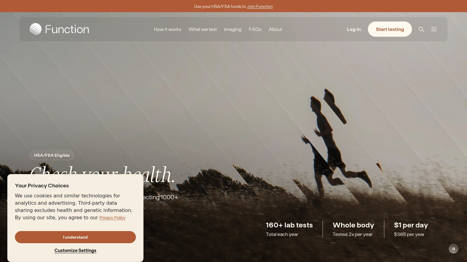
38PoorProof that the product is real, competent, and safe to try.
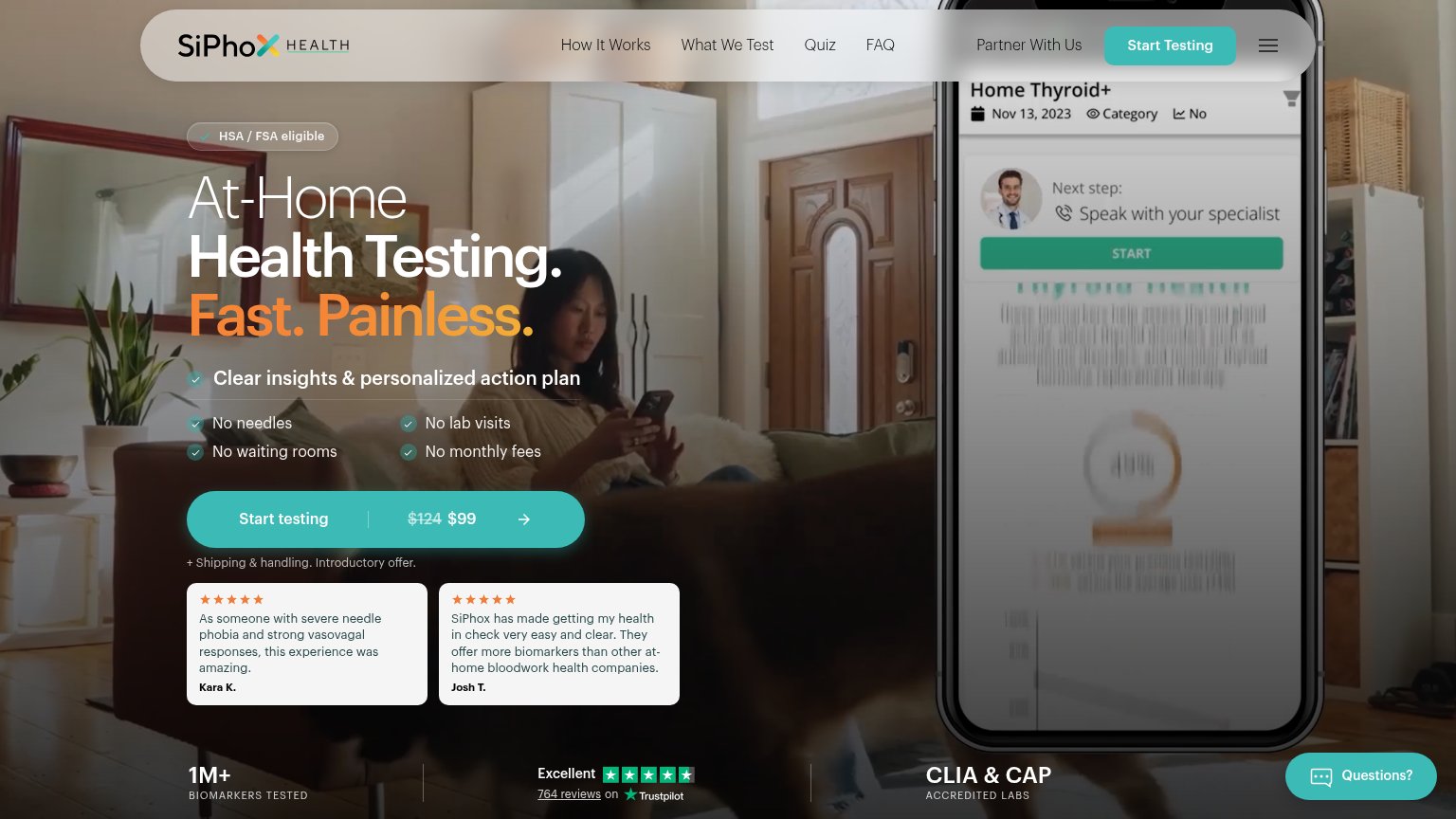
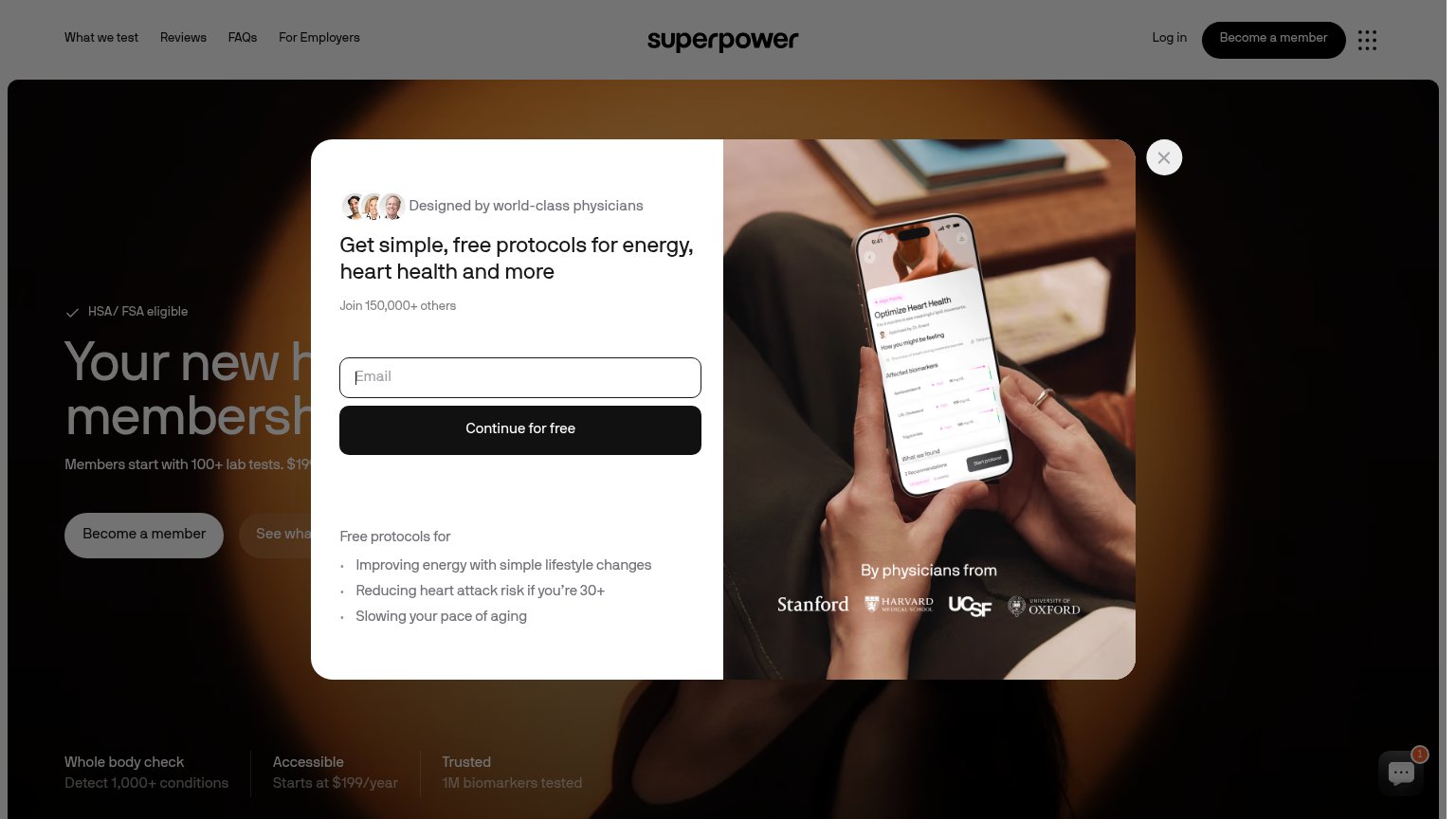
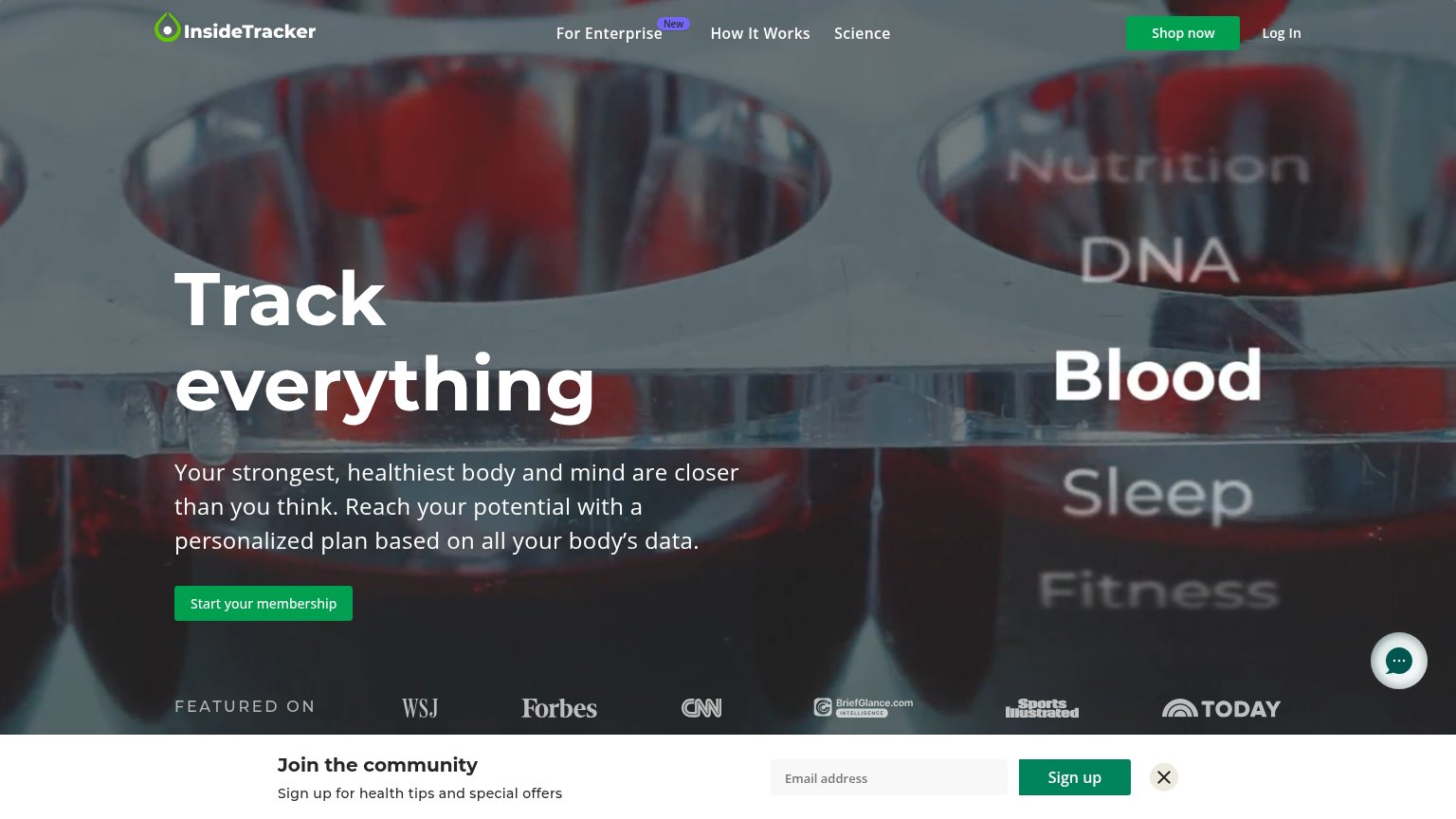
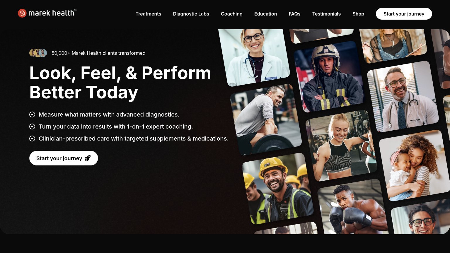
| Trust read | |
|---|---|
| Lucis | No visible trust signal identified. |
| "HSA/FSA Eligible" badge above the headline | |
| "FEATURED ON" press bar with WSJ, Forbes, CNN, Sports Illustrated, and TODAY logos | |
| Trustpilot badge: "Excellent — 764 reviews" alongside "CLIA & CAP accredited labs" | |
| "By physicians from" logo strip: Stanford, Harvard Medical School, UCSF, University of Oxford | |
| "50,000+ Marek Health clients transformed" with avatar thumbnails |
Value props
58FairTitle, subtitle, hero — do they sell the product's true value?
Lucis’s headline vague
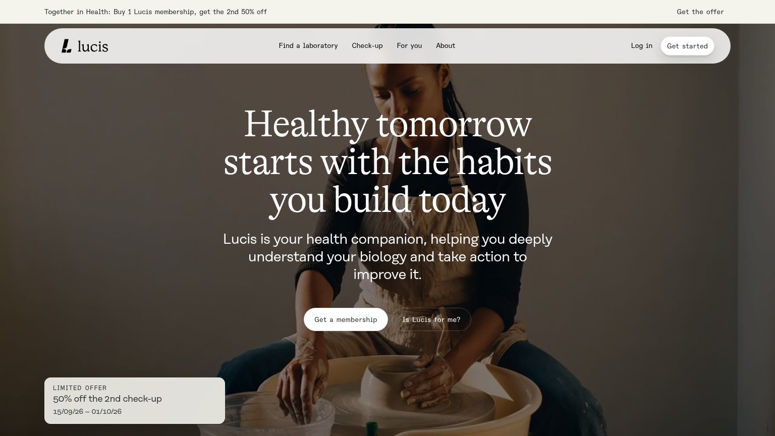
Healthy tomorrow starts with the habits you build today
Lucis is your health companion, helping you deeply understand your biology and take action to improve it.
Working
- Warm, aspirational emotional tone
- Subhead names the category: biology insight
- Clear paired CTAs support the pitch
Could improve
- Headline could fit any wellness brand
- No numbers, biomarkers, or timelines
- Hero image decorates, never demonstrates
CTA
70FairCopy, size, verb, cost-feel — does the primary CTA earn the click?
Problems
- 'membership' feels costly
- clashes with nav 'Get started'
- no value payoff in label
Mobile web
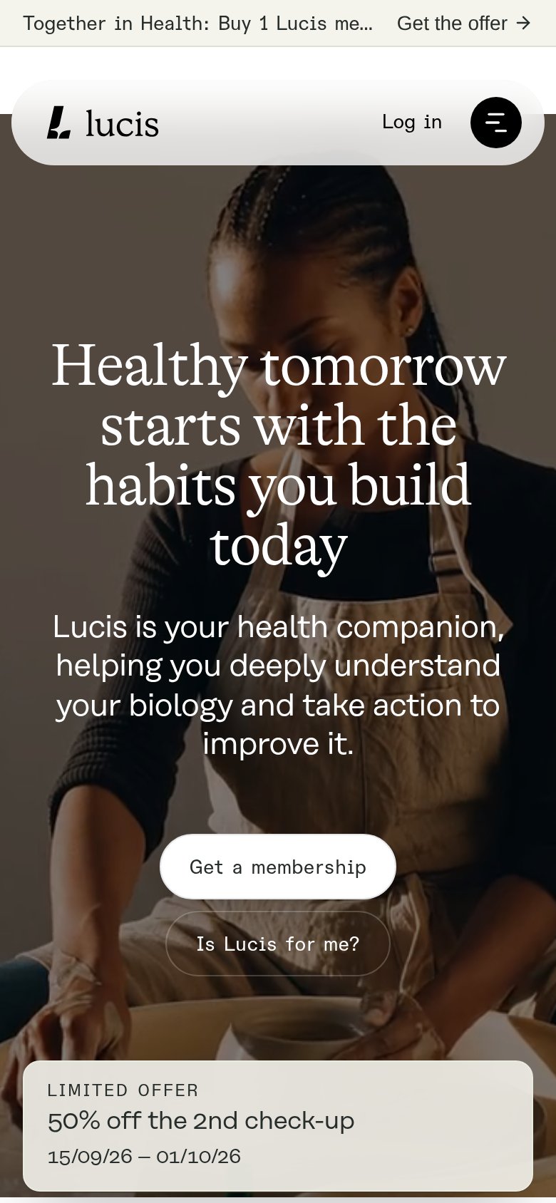
76FairThe phone experience as a first-class citizen.
 123
- Get a membership button — Desktop-proportioned pill floating in the column instead of a full-width thumb target.
- Truncated promo bar — Offer copy cuts to "Buy 1 Lucis me..." so the sticky bar burns top-of-fold space without communicating the deal.
- Four-line hero headline — Serif headline barely scales down, wrapping into four tall lines that push the CTAs to the bottom of the viewport.
Information hierarchy
78FairDoes the design help or inhibit what the page is trying to say?
1234- Twin pill buttons — 'Is Lucis for me?' matches 'Get a membership' in size and shape, splitting the primary action's weight.
- Nav 'Get started' button — A second styled conversion button duplicates the hero CTA and pulls the eye up and away from it.
- Limited offer card — The 50% offer sits isolated bottom-left with no visible link or button tying it to the membership action.
- Banner 'Get the offer' — A third offer entry point at the top adds another exit before the visitor reaches the hero CTA.