
Your landing page’s weakest score is Trust.
How twentyfour26 ranks
- 1.
Hubs80
- 2.
Protolabs74
- 3.
RapidDirect74
- 4.
twentyfour2670
- 5.
Fictiv70
70Growth scoreupdated
category scores
category scoresShowHide
Score over time
Trust
44PoorProof that the product is real, competent, and safe to try.

| Trust read | |
|---|---|
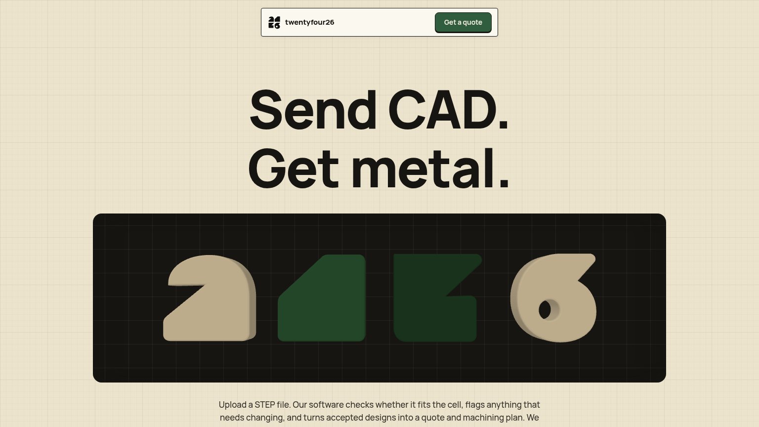
| twentyfour26 | "Upload a STEP file. Our software checks whether it fits the cell, flags anything that needs changing, and turns accepte |
| Customer logo strip: Blue Origin, John Deere, Medtronic, Polaris, Sonos under "Innovative Companies We Support" | |
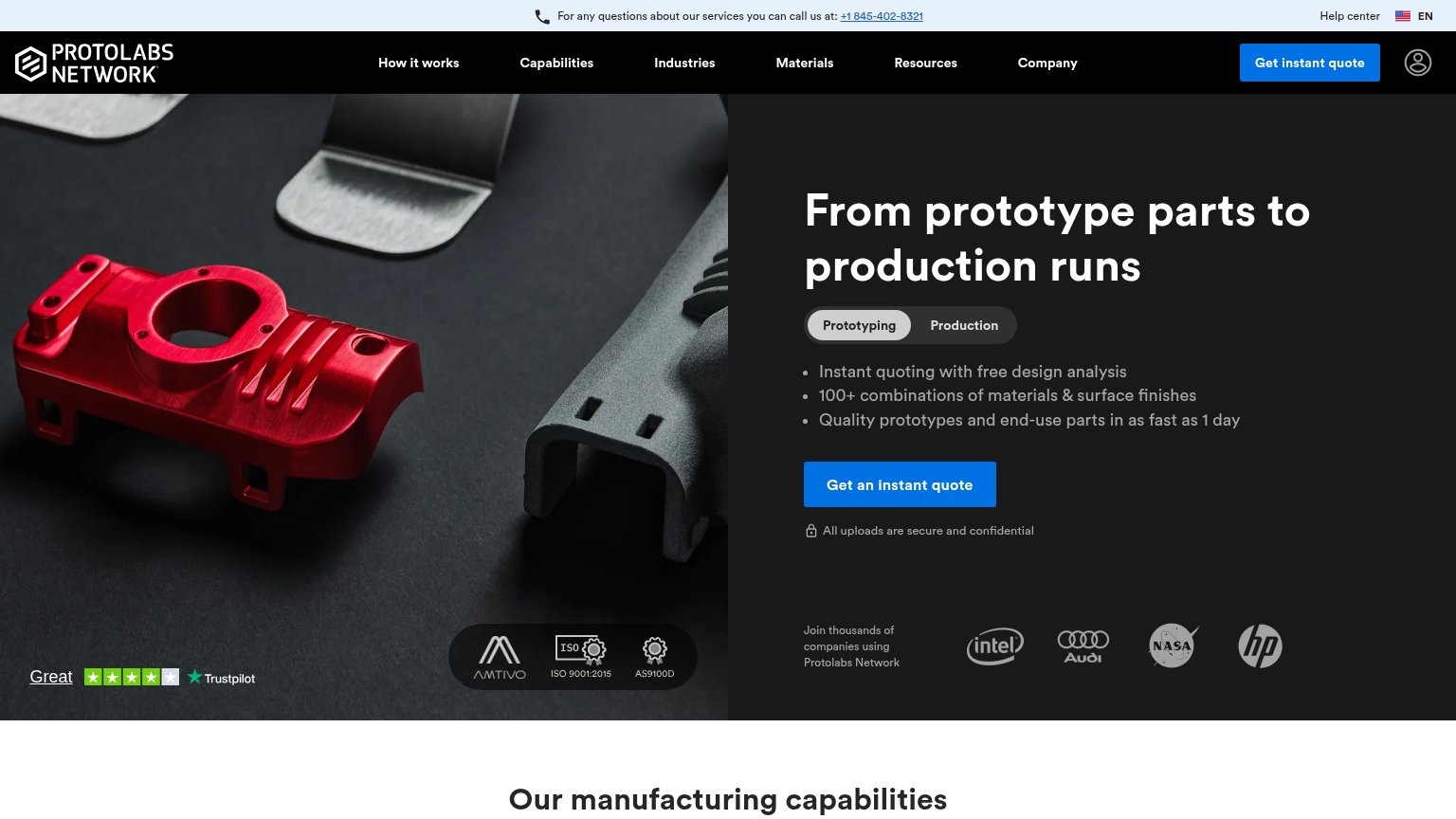
| Customer logo strip (Intel, Audi, NASA, HP) captioned "Join thousands of companies using Protolabs Network" | |
| No visible trust signal identified. | |
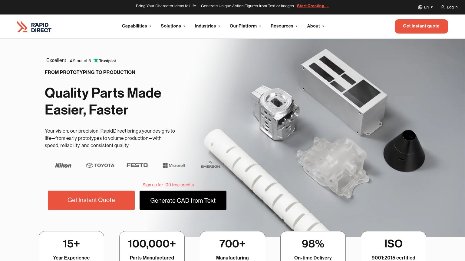
| Customer logo strip (Nikon, Toyota, Festo, Microsoft, Emerson) placed directly above the Get Instant Quote CTA |
CTA
72FairCopy, size, verb, cost-feel — does the primary CTA earn the click?

Problems
- no CTA in desktop hero
- labels differ: quote vs upload
- nav button small vs headline
- 'quote' hints at cost/sales step
Mobile web
72FairThe phone experience as a first-class citizen.
 123
- 2426 numerals graphic — Tall decorative block fills most of the fold and pushes the primary 'Upload a part' CTA two viewports down.
- Upload a part button — Desktop-proportioned pill at roughly a third of the column width instead of a thumb-friendly full-bleed bar.
- Intro paragraph block — Six dense lines separate the headline from the CTA, adding scroll distance before the action.
Value props
78FairTitle, subtitle, hero — do they sell the product's true value?
twentyfour26’s headline sells
Send CAD. Get metal.
Upload a STEP file. Our software checks whether it fits the cell, flags anything that needs changing, and turns accepted designs into a quote and machining plan. We cut it in San Francisco, same day when the part fits and capacity allows.
Working
- Four-word headline nails input-to-output
- Names STEP files, SF, same-day cutting
- Honest scope: 'when capacity allows'
Could improve
- Desktop cuts subhead mid-sentence
- Hero art decorates, shows no real part
- 'Same day' buried below the fold
Information hierarchy
86StrongDoes the design help or inhibit what the page is trying to say?
12- Truncated intro paragraph — The value explanation cuts off mid-sentence at the fold, leaving no in-flow CTA visible on desktop.
- Get a quote button — The only visible CTA is small and tucked in the header, outside the headline-to-hero scan path.