
Your landing page’s weakest score is Information hierarchy.
How Protolabs ranks
74Growth scoreupdated
category scores
category scoresShowHide
Information hierarchy
72FairDoes the design help or inhibit what the page is trying to say?
 123
- Duplicate quote CTAs — "Get Instant Quote" appears twice (nav and hero) while "Start Production Quote" sits beside it at near-equal weight, splitting the quote decision three ways.
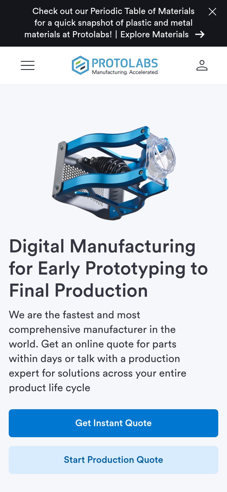
- Announcement banner — The Periodic Table of Materials banner is the first element in the scan path and routes attention away from the quote flow before the headline is read.
- Certification links block — The underlined "Certification + Compliance" link and ISO string add an exit and a dense credential line directly under the CTAs.
Value props
72FairTitle, subtitle, hero — do they sell the product's true value?
Protolabs’s headline sells
Digital Manufacturing for Early Prototyping to Final Production
We are the fastest and most comprehensive manufacturer in the world. Get an online quote for parts within days or talk with a production expert for solutions across your entire product life cycle
Working
- Names true scope: prototype to production
- Hero image shows real machined output
- ISO/ITAR certs + brand logos add proof
Could improve
- No hard numbers — 'within days' is soft
- 'Fastest in the world' reads as bravado
- No emotional hook on quoting pain
Mobile web
72FairThe phone experience as a first-class citizen.
What works
What to improve
Trust
76FairProof that the product is real, competent, and safe to try.
How Protolabs compares
Trust read
CTA
78FairCopy, size, verb, cost-feel — does the primary CTA earn the click?
How Protolabs compares
Recommended rewrites