
Your landing page’s weakest score is Information hierarchy.
How Hubs ranks
80Growth scoreupdated
category scores
category scoresShowHide
Information hierarchy
76FairDoes the design help or inhibit what the page is trying to say?
 123
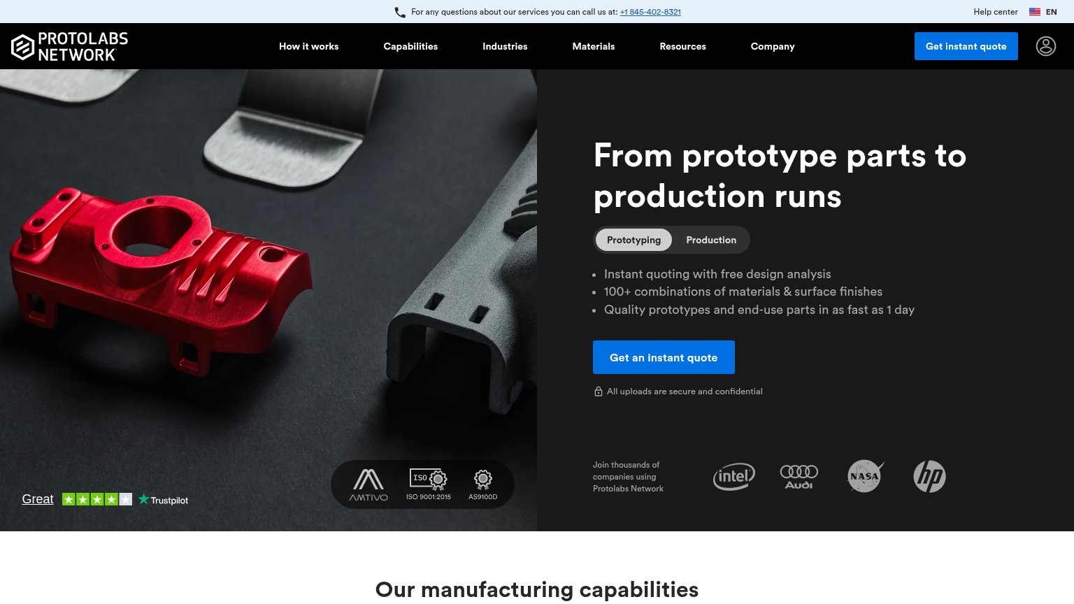
- Six-item main nav — Six equal-weight menus plus Help center and phone link give attention a dozen exits before the hero CTA.
- Duplicate quote buttons — Nav 'Get instant quote' is styled identically to the hero CTA, splitting the one action into two competing blue targets.
- Top phone banner — Underlined phone number sits at the very top of the scan path, pulling first attention to a call exit.
CTA
78FairCopy, size, verb, cost-feel — does the primary CTA earn the click?
Problems
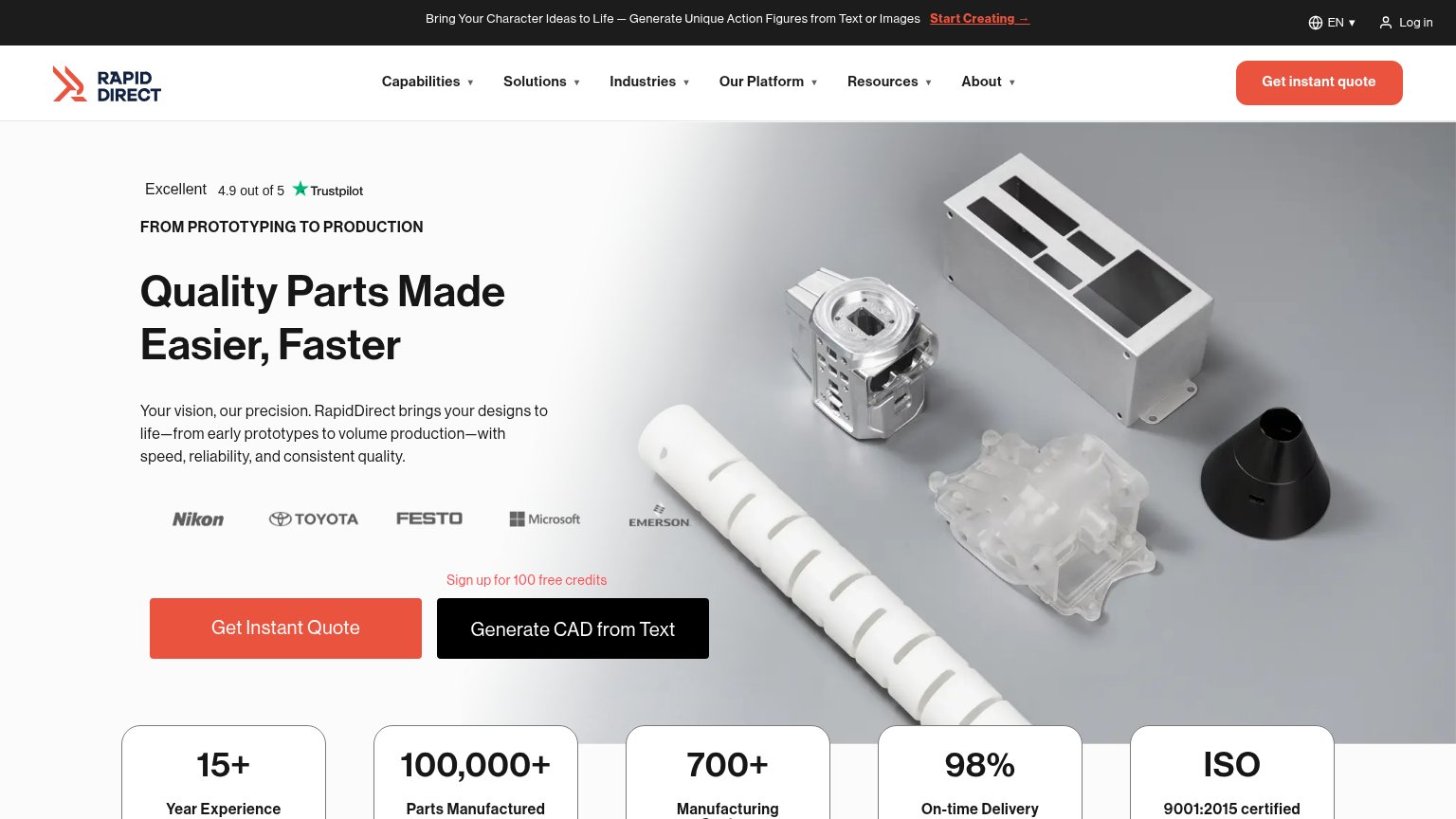
- 4 words — over 3-word ideal
- no 'free' despite free analysis
- three label variants across fold
Value props
78FairTitle, subtitle, hero — do they sell the product's true value?
Hubs’s headline
From prototype parts to production runs
Working
Could improve
Mobile web
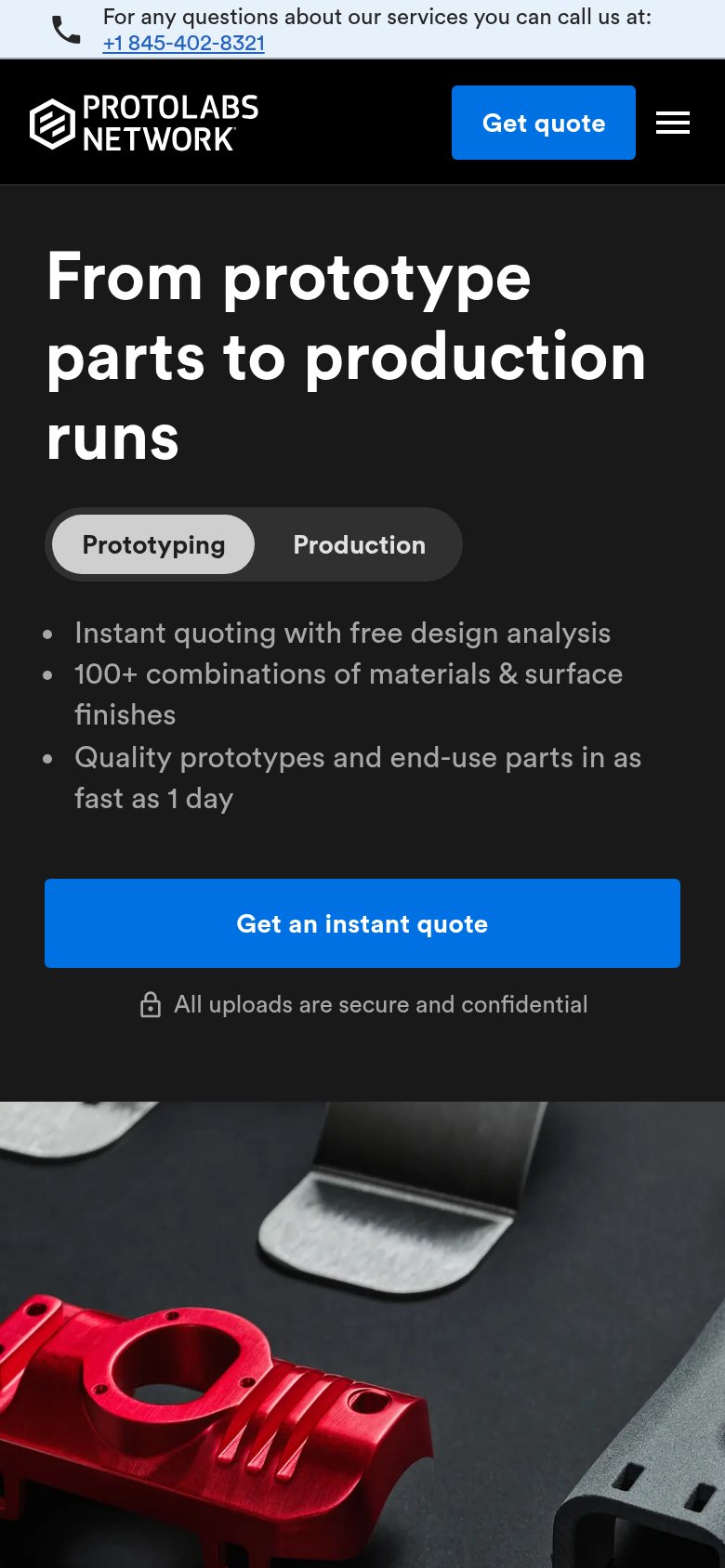
84StrongThe phone experience as a first-class citizen.
What works
What to improve
Trust
86StrongProof that the product is real, competent, and safe to try.
How Hubs compares
Trust read