
Your landing page’s weakest score is Trust.
How Fictiv ranks
70Growth scoreupdated
category scores
category scoresShowHide
Trust
52FairProof that the product is real, competent, and safe to try.
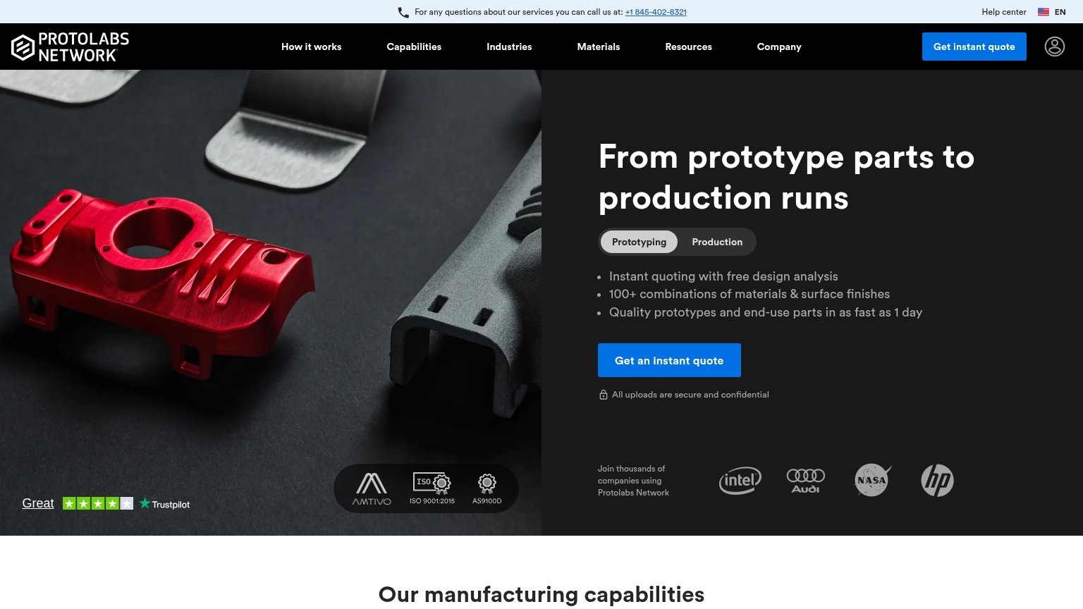
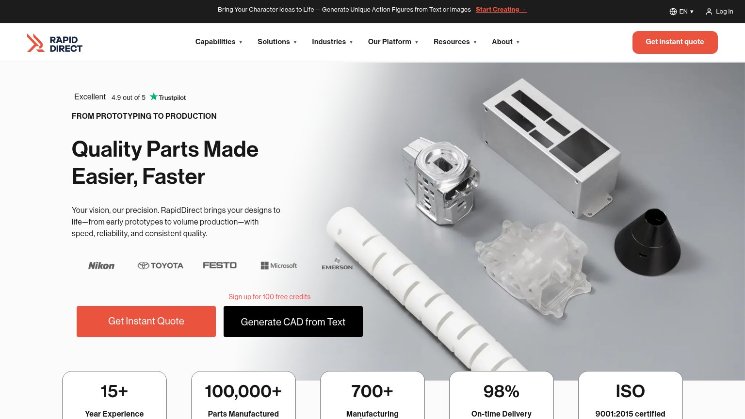


| Trust read | |
|---|---|
| Fictiv | No visible trust signal identified. |
| "Trusted by engineers building" logo band with gecko, lumafield, and revolve surgical | |
| Customer logo strip: Blue Origin, John Deere, Medtronic, Polaris, Sonos under "Innovative Companies We Support" | |
| Customer logo strip (Intel, Audi, NASA, HP) captioned "Join thousands of companies using Protolabs Network" | |
| Customer logo strip (Nikon, Toyota, Festo, Microsoft, Emerson) placed directly above the Get Instant Quote CTA |
Information hierarchy
72FairDoes the design help or inhibit what the page is trying to say?
 1234
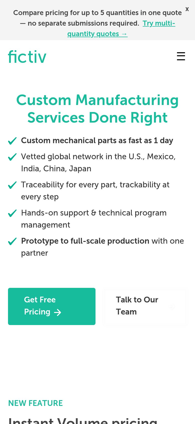
- Competing quote CTAs — "Get Free Pricing" duplicates the nav's "Get Instant Quote" with a different label, splitting the primary action's pull.
- Teal headline contrast — Green text over the amber machining photo drops legibility right where the value prop must land in one second.
- Promo banner link — "Try multi-quantity quotes →" is the first clickable element and routes attention away before the hero pitch.
- Six-dropdown nav row — Capabilities through Reviews plus search and Log In offer eight exits weighted equally against the conversion path.
Mobile web
72FairThe phone experience as a first-class citizen.
What works
What to improve
CTA
78FairCopy, size, verb, cost-feel — does the primary CTA earn the click?
How Fictiv compares
Recommended rewrites
Value props
78FairTitle, subtitle, hero — do they sell the product's true value?
Fictiv’s headline
Custom Manufacturing, Built to Scale from Prototype to Production
Working
Could improve