
Your landing page’s weakest score is Information hierarchy.
How RapidDirect ranks
- 1.
Hubs80
- 2.
RapidDirect74
- 3.
Protolabs74
- 4.
Forge Automation72
- 5.
Fictiv70
74Growth scoreupdated
category scores
category scoresShowHide
Information hierarchy
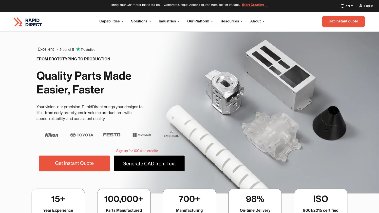
64FairDoes the design help or inhibit what the page is trying to say?
 1234
- Top announcement banner — "Start Creating →" promotes an unrelated action-figure tool, pulling first attention away from the manufacturing value prop.
- Generate CAD button — Black secondary CTA sits at near-equal weight beside "Get Instant Quote", splitting the primary action decision.
- Six-item dropdown nav — Six dropdown menus plus Log in create heavy exit density before the visitor reaches the hero CTAs.
- Sign up microcopy — "Sign up for 100 free credits" introduces a third offer above the CTA pair, adding a competing message at the decision point.
Mobile web
64FairThe phone experience as a first-class citizen.
 1234
- Get Instant Quote CTA — Primary CTA sits half-cut at the very bottom edge of the first viewport, barely tappable.
- Quality Parts headline — Headline scales down poorly, wrapping into three heavy lines that eat most of the fold.
- Announcement bar — Character-generator promo truncates mid-sentence and stacks awkwardly with the Log in link, wasting header space.
- Trustpilot rating row — Dark text on a light-gray product photo reads with weak contrast at the top of the hero.
Value props
76FairTitle, subtitle, hero — do they sell the product's true value?
RapidDirect’s headline
Quality Parts Made Easier, Faster
Your vision, our precision. RapidDirect brings your designs to life—from early prototypes to volume production—with speed, reliability, and consistent quality.
Working
Could improve
CTA
82StrongCopy, size, verb, cost-feel — does the primary CTA earn the click?
How RapidDirect compares
Recommended rewrites
Trust
86StrongProof that the product is real, competent, and safe to try.
How RapidDirect compares
Trust read