
Your landing page’s weakest score is Trust.
How Covera ranks
75Growth scoreupdated
category scores
category scoresShowHide
Score over time
Trust
54FairProof that the product is real, competent, and safe to try.
| Trust read | |
|---|---|
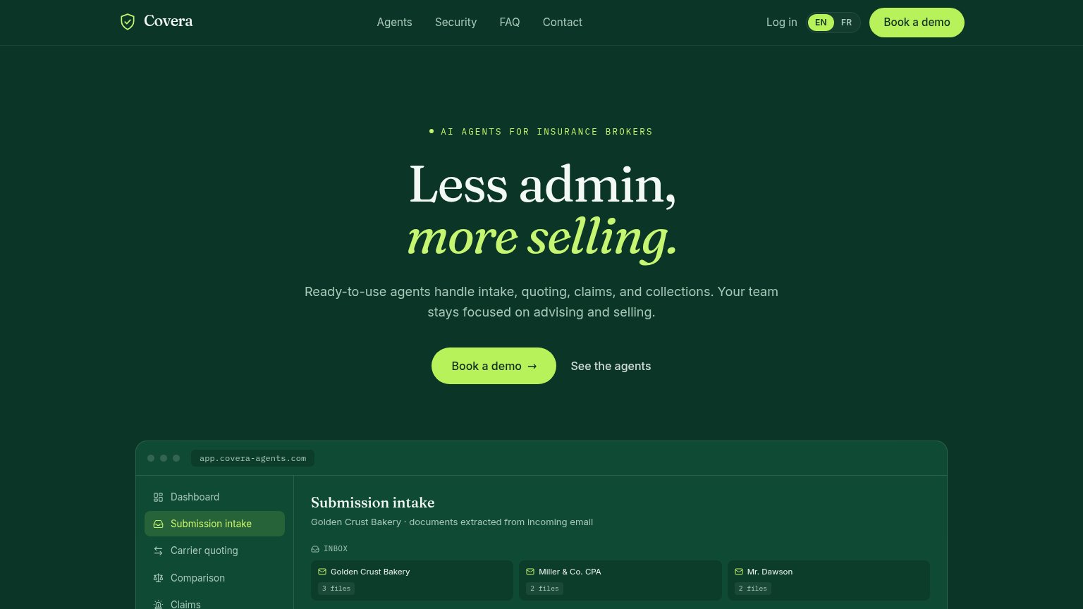
| Covera | Embedded "Submission intake" product UI showing real-looking client records ("Golden Crust Bakery · 3 files") |
| Announcement bar: "Live Demo on Oct 6th: AI Underwriter for Life & Health → RSVP" | |
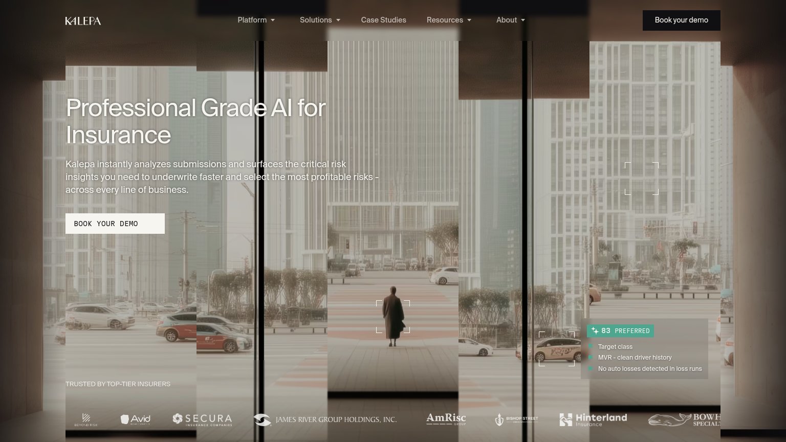
| "TRUSTED BY TOP-TIER INSURERS" logo strip (Secura, James River Group Holdings, AmRisc, Hinterland) | |
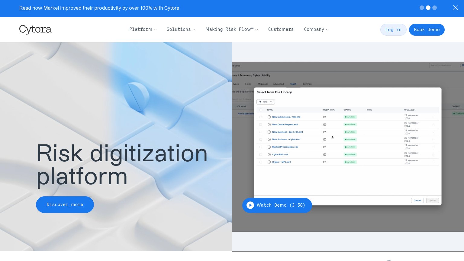
| Banner: "Read how Markel improved their productivity by over 100% with Cytora" | |
| No visible trust signal identified. | |
| No visible trust signal identified. |
CTA
72FairCopy, size, verb, cost-feel — does the primary CTA earn the click?
Problems
- 'Book' feels committal and costly
- no self-serve or in-product path
- secondary CTA is cheaper than primary
Information hierarchy
80StrongDoes the design help or inhibit what the page is trying to say?
123- Duplicate demo CTAs — Nav's 'Book a demo' pill matches the hero CTA's lime treatment, splitting the fold's single-action focus across two identical buttons.
- Nav link cluster — Agents, Security, FAQ, Contact plus Log in and EN/FR toggle stack seven exit paths above the fold before the hero CTA.
- See the agents link — Plain-text secondary CTA sits at the same eye level as the primary button, siphoning clicks with no visual subordination cue.
Mobile web
82StrongThe phone experience as a first-class citizen.
 1234
- Header without menu — Nav links (Agents, Security, FAQ, Contact) vanish on mobile with no hamburger, leaving them unreachable.
- Half-width hero CTA — "Book a demo →" floats at roughly half column width beside "See the agents" instead of a full-bleed thumb target.
- EN/FR toggle crowding — Language switcher takes prime header space while the header "Book a demo" duplicates the hero CTA below.
- Clipped Quoting tab — The product mock's tab row cuts off mid-label at the viewport edge, signaling an unadapted desktop component.
Value props
86StrongTitle, subtitle, hero — do they sell the product's true value?
Covera’s headline sells
Less admin, more selling.
Ready-to-use agents handle intake, quoting, claims, and collections. Your team stays focused on advising and selling.
Working
- Outcome-first headline with emotional pull
- Subhead names four concrete workflows
- Hero mockup shows product doing the job
Could improve
- No numbers in the actual copy
- Proof stats buried in mockup
- "Ready-to-use" is soft; quantify setup