
Your landing page’s weakest score is Trust.
How Boom AI ranks
61Growth scoreupdated
category scores
category scoresShowHide
Score over time
Trust
42PoorProof that the product is real, competent, and safe to try.
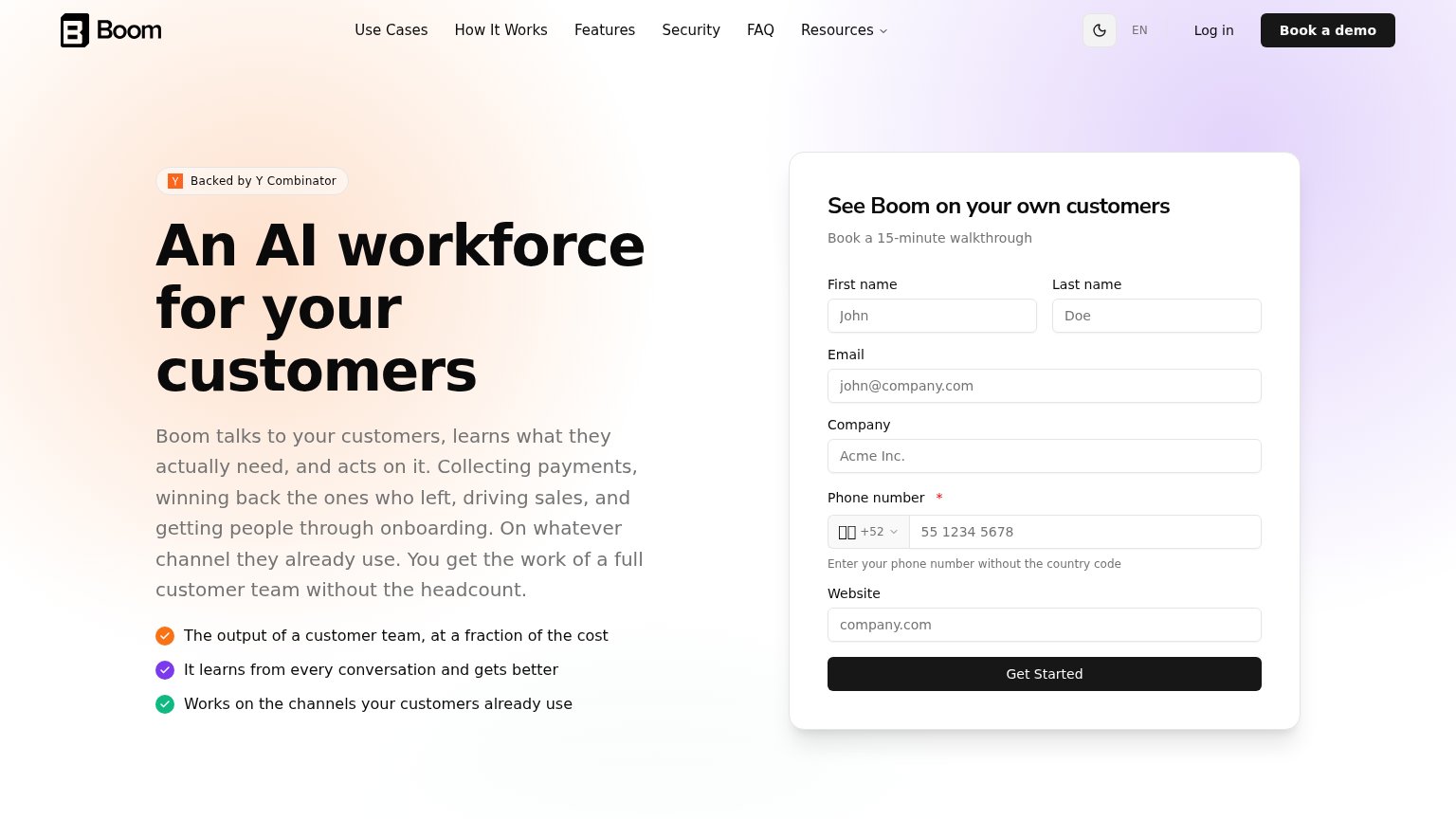
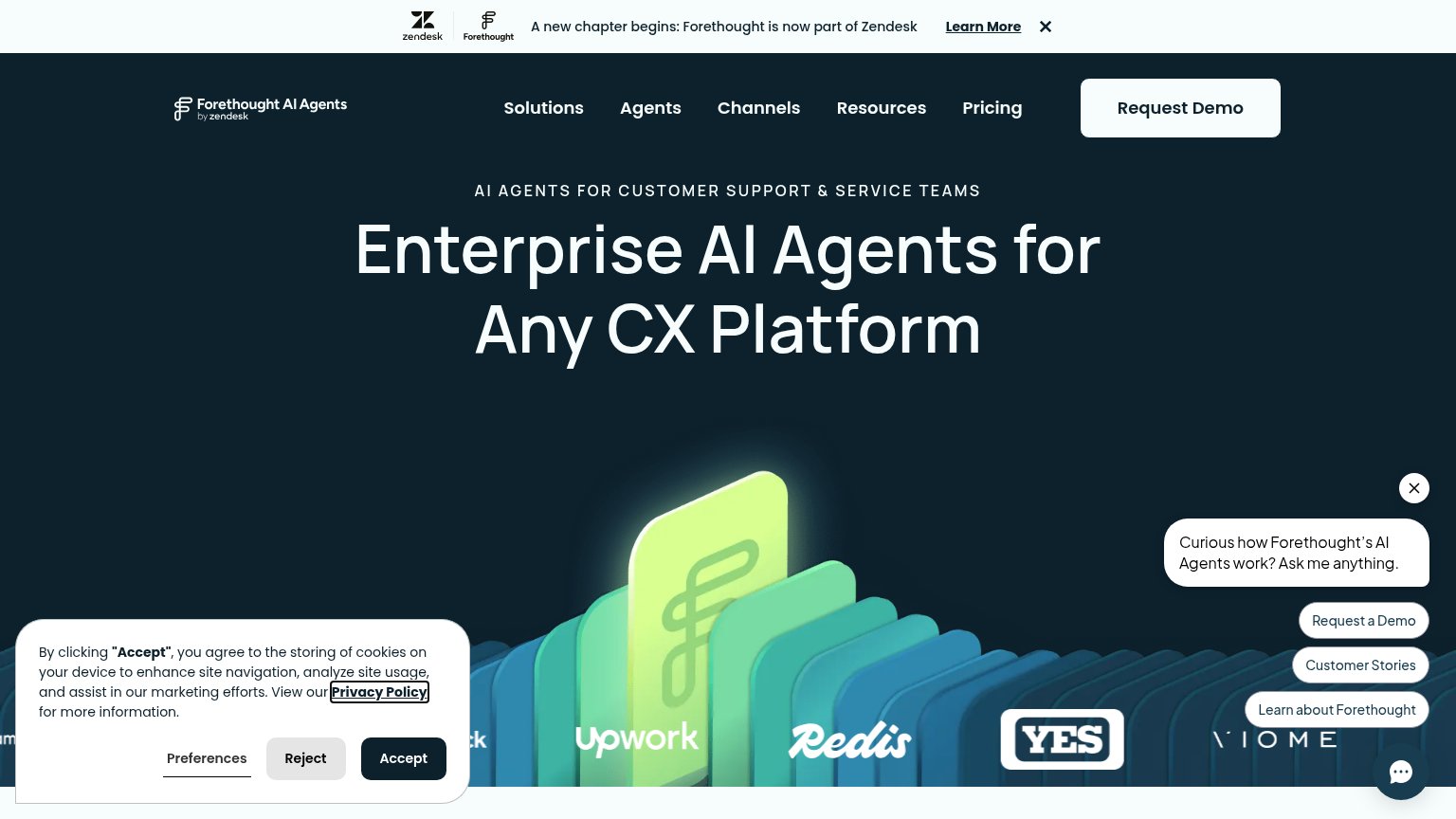
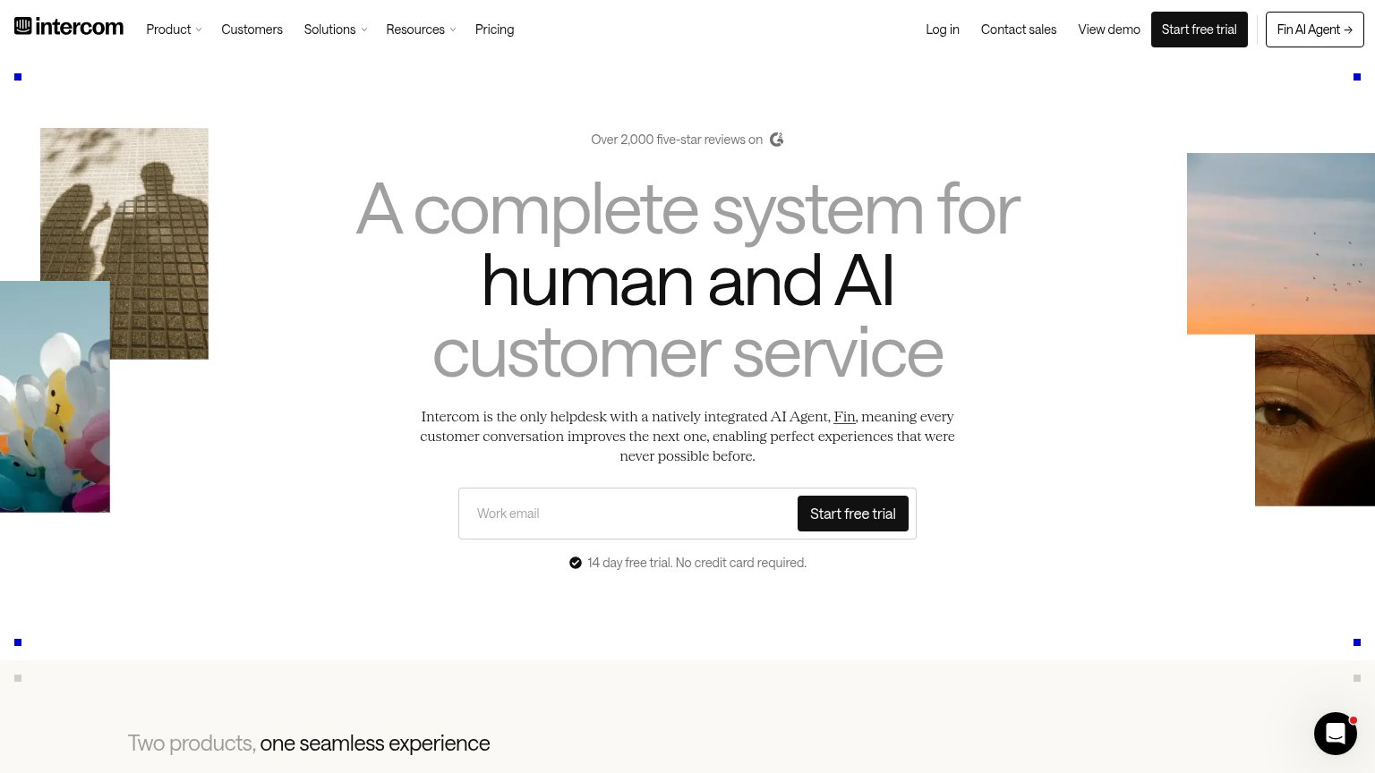
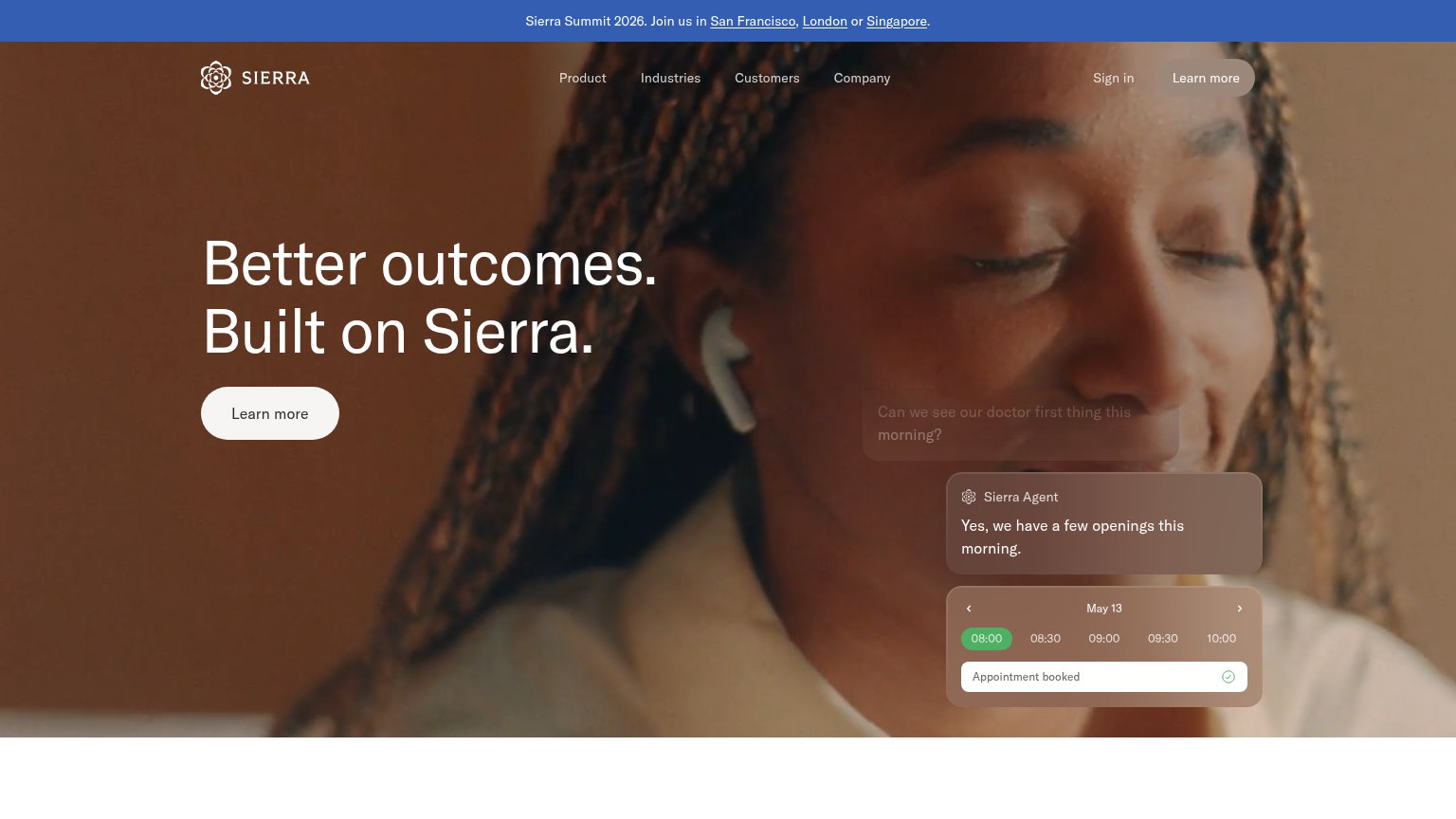
| Trust read | |
|---|---|
| Boom AI | "Backed by Y Combinator" badge |
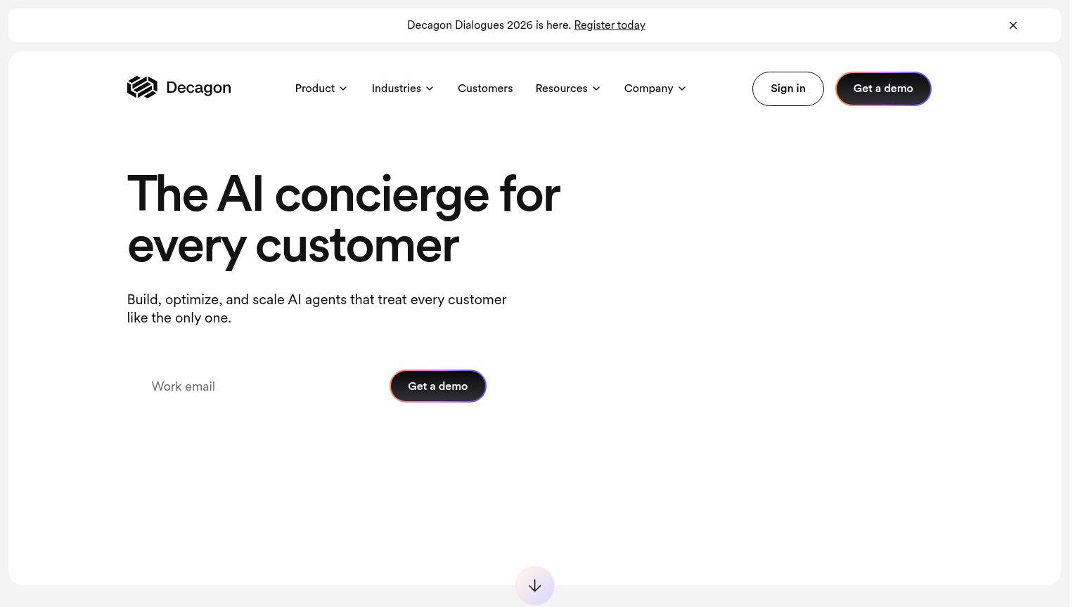
| implicit context Decagon may benefit from pre-existing familiarity among its target audience. | |
| Sierra Agent chat demo resolving "I don't recognize this $95 charge" and booking "Appointment booked" | |
| "Over 2,000 five-star reviews on" G2 badge above the headline | |
| Customer logo strip featuring Upwork, Redis, YES, and Viome |
Mobile web
58FairThe phone experience as a first-class citizen.
 12
- Clipped demo form — The primary 'Get Started' form is pushed below the fold; only its truncated heading is visible.
- Nine-line body paragraph — Desktop-length prose fills most of the mobile fold, delaying any CTA by a full scroll.
CTA
64FairCopy, size, verb, cost-feel — does the primary CTA earn the click?
Problems
- label hides a demo-booking form
- required phone field raises cost
- inconsistent with 'Book a demo' nav
- CTA below fold on mobile
Information hierarchy
68FairDoes the design help or inhibit what the page is trying to say?
1234- Book a demo button — Second high-contrast dark CTA competes at equal weight with the form's 'Get Started' button for the same action.
- Six-item nav row — Use Cases, How It Works, Features, Security, FAQ, and Resources give six equal-weight exits before the form.
- Hero paragraph block — Six-line subheadline is a text wall; the promise buries the outcome mid-paragraph instead of leading with it.
- Six-field demo form — Six labeled fields plus helper text in the fold create heavy friction for a first-touch conversion.
Value props
72FairTitle, subtitle, hero — do they sell the product's true value?
Boom AI’s headline undersells
An AI workforce for your customers
Boom talks to your customers, learns what they actually need, and acts on it. Collecting payments, winning back the ones who left, driving sales, and getting people through onboarding. On whatever channel they already use. You get the work
Working
- Subhead lists four concrete jobs
- "Without the headcount" nails true value
- Checkmarks reinforce cost + channels
Could improve
- H1 is category label, no outcome
- Zero numbers anywhere in the fold
- Hero is a form, not a product demo