AtlasGridYC F25 landing page report.
← Back to YC F25

Your landing page’s weakest score is Value props.

Fix Value props

Score over time

807060504030Sprig 73 on Jun 14 (Wayback)Sprig 70 on Jun 29 (Wayback)Sprig 70 on Jul 9 (Wayback)Sprig 73 on Jul 25 (Wayback)Sprig 72 on Aug 11 (Wayback)Sprig 71 on Sep 4 (Wayback)Sprig 73 on Sep 22 (Live)Amplitude 68 on Sep 22 (Live)Mixpanel 65 on Apr 6 (Wayback)Mixpanel 44 on Apr 21 (Wayback)Mixpanel 63 on May 5 (Wayback)Mixpanel 47 on May 19 (Wayback)Mixpanel 60 on Sep 8 (Wayback)Mixpanel 56 on Sep 22 (Live)June 37 on Jun 24 (Wayback)June 39 on Aug 9 (Wayback)June 38 on Aug 29 (Wayback)June 40 on Sep 11 (Wayback)June 37 on Sep 22 (Live)June 38 on Oct 14 (Wayback)Heap (by Contentsquare) 54 on May 20 (Wayback)Heap (by Contentsquare) 68 on Sep 22 (Live)AtlasGrid 57 on May 12 (Wayback)AtlasGrid 56 on Jun 6 (Wayback)AtlasGrid 55 on Sep 22 (Live)May 12Jun 6Sep 22
Past reportsShow past reportsHide past reports
  1. Sep 22, 202655LiveOverall −1 · Mobile web −30 · Trust +14Viewing
  2. Jun 6, 202656Overall −1 · Information hierarchy −10 · CTA −2View →
  3. May 12, 202657First tracked report — strongest Mobile web 76, weakest Value props 32View →

Value props

34Poor

Title, subtitle, hero — do they sell the product's true value?

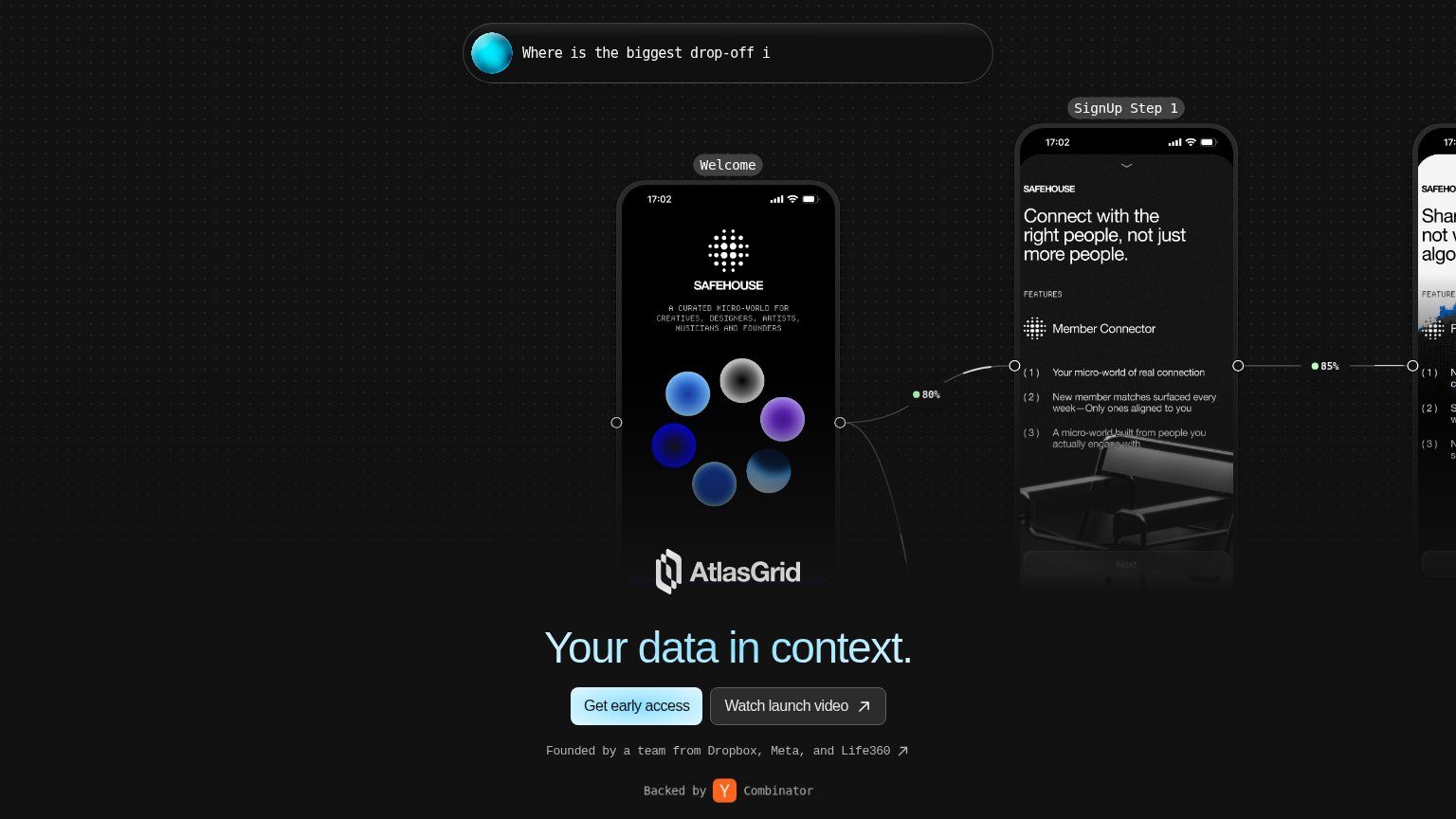
AtlasGrid’s headline vagueYour data in context.

Working

  • Strong founder and YC proof points
  • Hero mockups hint at real product use
  • Clean single primary CTA pairing

Could improve

  • Headline could caption any data product
  • No subhead explains what AtlasGrid does
  • Mobile hero overlaps logo over mockup

Mobile web

48Poor

The phone experience as a first-class citizen.

Mobile web annotations on the mobile capture123
  1. Headline overlaps mockup — "AtlasGrid's data in context." and the AtlasGrid logo render on top of the phone's feature list, making both unreadable.
  2. SAFEHOUSE demo phone — A full-height example screen fills the fold and pushes the value statement and primary CTA below the viewport.
  3. Truncated chat card — The top card cuts off mid-sentence at "How many peo", eating hero space with no readable message or action.

Information hierarchy

58Fair

Does the design help or inhibit what the page is trying to say?

Information hierarchy annotations on the desktop capture1234
  1. Safehouse phone mockups — Three screens of a different brand (SAFEHOUSE) dominate the fold and outrank AtlasGrid's own message with no framing as an example.
  2. Headline at fold bottom — "AtlasGrid's data in context." is pushed to the last pixels of the viewport, forcing visitors to process the mockups before the value prop.
  3. Truncated chat bubble — The query cuts off mid-word ("drop-off i"), muddying the one element that explains what AtlasGrid actually does.
  4. Right phone clipped — The third mockup is cut at the viewport edge, adding visual noise without communicating anything readable.

Trust

58Fair

Proof that the product is real, competent, and safe to try.

AtlasGrid
Heap (by Contentsquare)
Sprig
Trust read
AtlasGridFounded by a team from Dropbox, Meta, and Life360
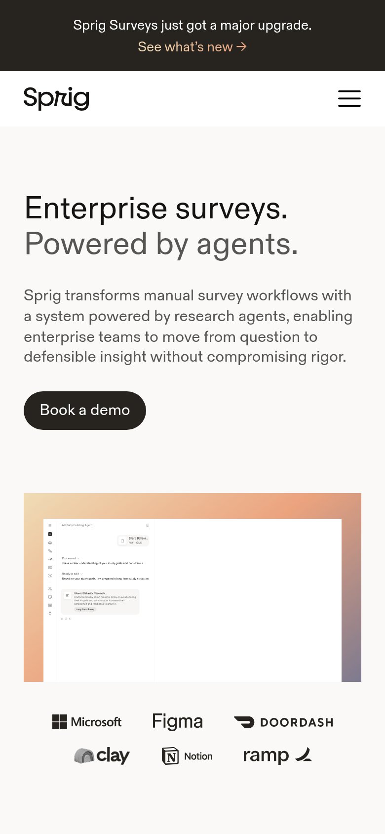
SprigCustomer logo row: Microsoft, Figma, DoorDash, Clay, Notion, Ramp (mobile fold)
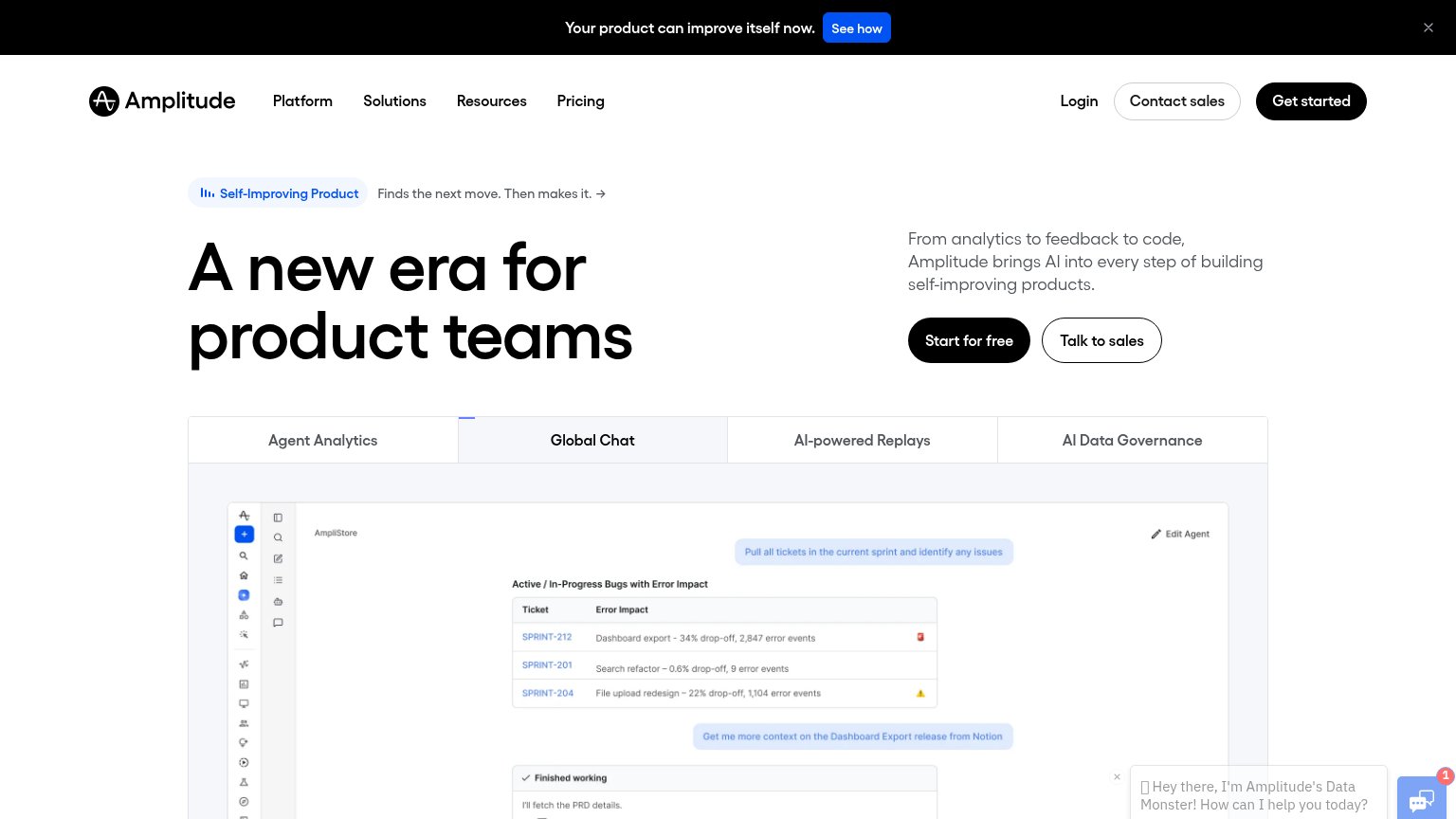
AmplitudeTabbed product demo showing real Amplitude UI ("Global Chat" agent view with sprint tickets and error-impact data)
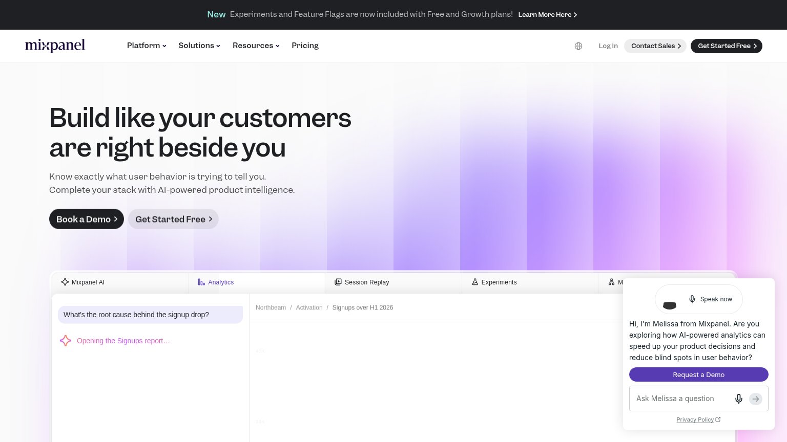
MixpanelEmbedded product UI showing Mixpanel AI answering "What's the root cause behind the signup drop?" alongside an Analytics
June"Over the past 5 years we've gone from zero to profitable"
Heap (by Contentsquare)Customer logo wall (Amway, Bridgestone, Dropbox Sign, Esurance, Eventbrite, Nielsen, Northwestern Mutual, Walmart Labs)

CTA

76Fair

Copy, size, verb, cost-feel — does the primary CTA earn the click?

AtlasGrid
Amplitude
Mixpanel

Problems

  • 'early access' implies waitlist delay
  • no payoff or headline echo in copy
  • no free/cost signal visible