
Your landing page’s weakest score is Trust.
How Zamp ranks
55Growth scoreupdated
category scores
category scoresShowHide
Trust
38PoorProof that the product is real, competent, and safe to try.

| Trust read | |
|---|---|
| Zamp | No visible trust signal identified. |
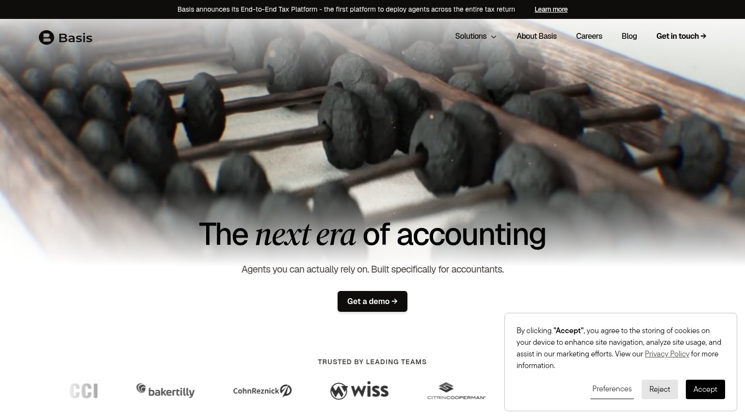
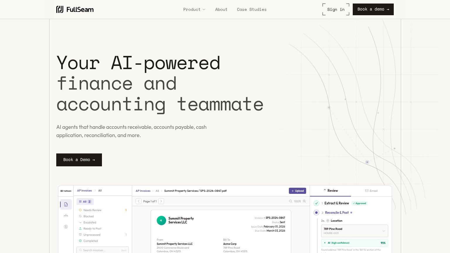
| AP Invoices product UI showing an AI review panel with "Extract & Review ✓ Approved" and a 95% confidence match on a rea | |
| "TRUSTED BY LEADING TEAMS" logo bar with Baker Tilly, CohnReznick, Wiss, CitrinCooperman | |
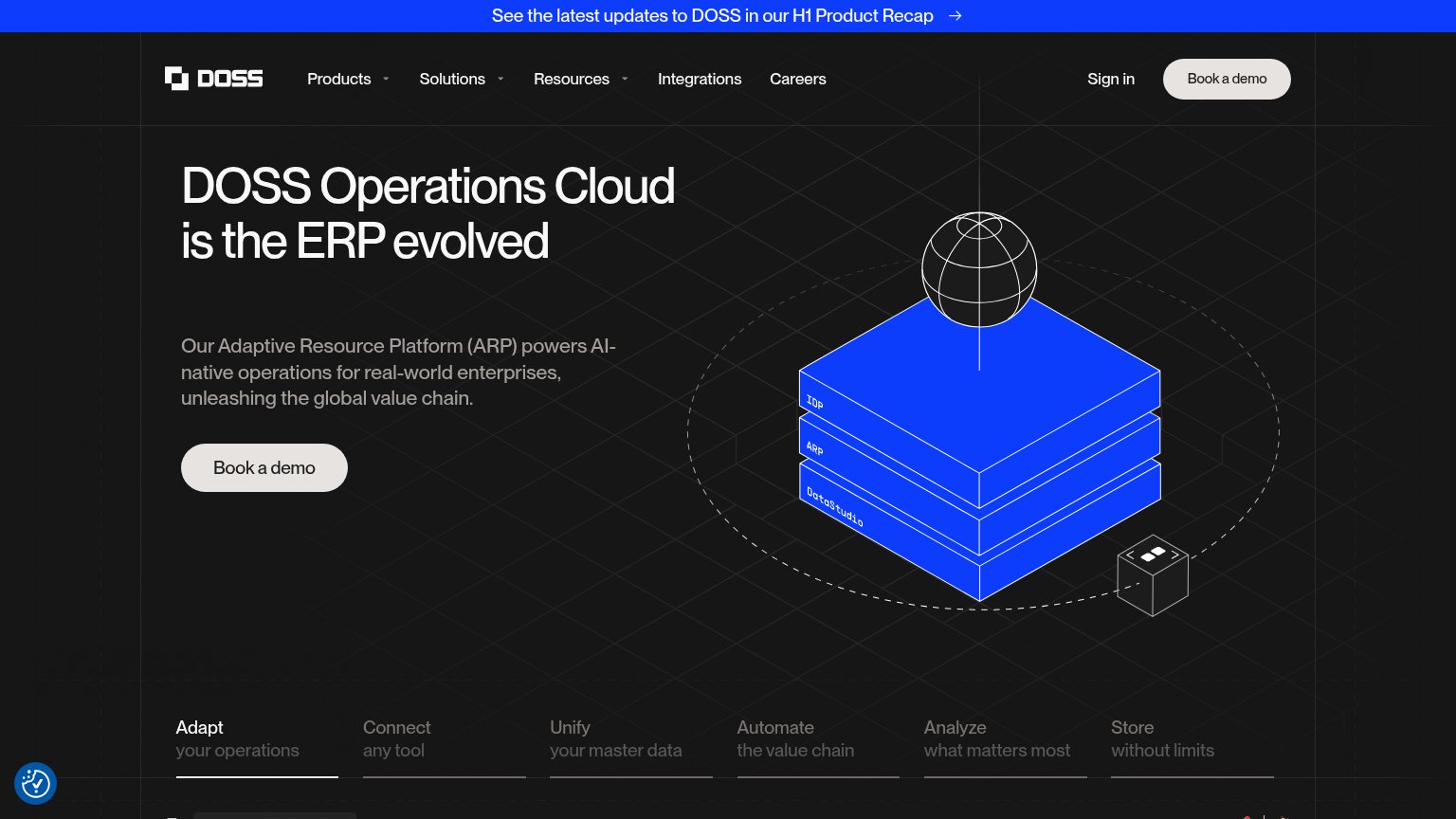
| See the latest updates to DOSS in our H1 Product Recap | |
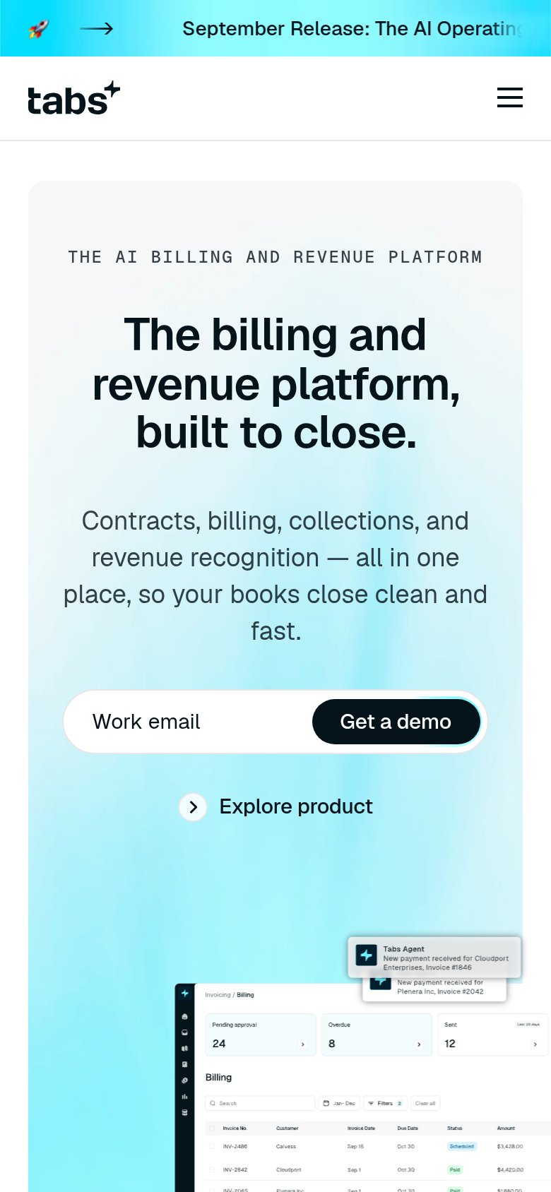
| Billing dashboard product UI with "Pending approval 24", "Overdue 8" and invoice table | |
| Product screenshot of the agent generating a "Working Paper Summary: COGS (Cost of Goods Sold) Journal Entry Calculation |
Information hierarchy
52FairDoes the design help or inhibit what the page is trying to say?
 1234
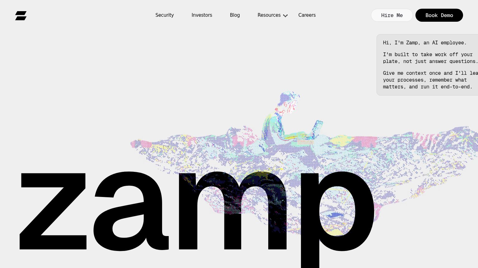
- Chat bubble text cutoff — The value-prop chat bubble is clipped at the right edge — "I'll lea..." truncates the core message mid-word.
- Giant zamp wordmark — The oversized wordmark dominates the fold and outranks the actual value proposition, which is exiled to a small corner bubble.
- Hire Me button — A second pill-styled CTA sits beside Book Demo at near-equal weight, splitting the conversion action in two.
- Nav link row — Five exit links (Security, Investors, Blog, Resources, Careers) sit in the scan path before the CTA, leaking attention.
Value props
58FairTitle, subtitle, hero — do they sell the product's true value?
Zamp’s headline
Hi, I'm Zamp, an AI employee.
I'm built to take work off your plate, not just answer questions. Give me context once and I'll learn your processes, remember what matters, and run it end-to-end.
Working
Could improve
CTA
62FairCopy, size, verb, cost-feel — does the primary CTA earn the click?
How Zamp compares
Recommended rewrites
Mobile web
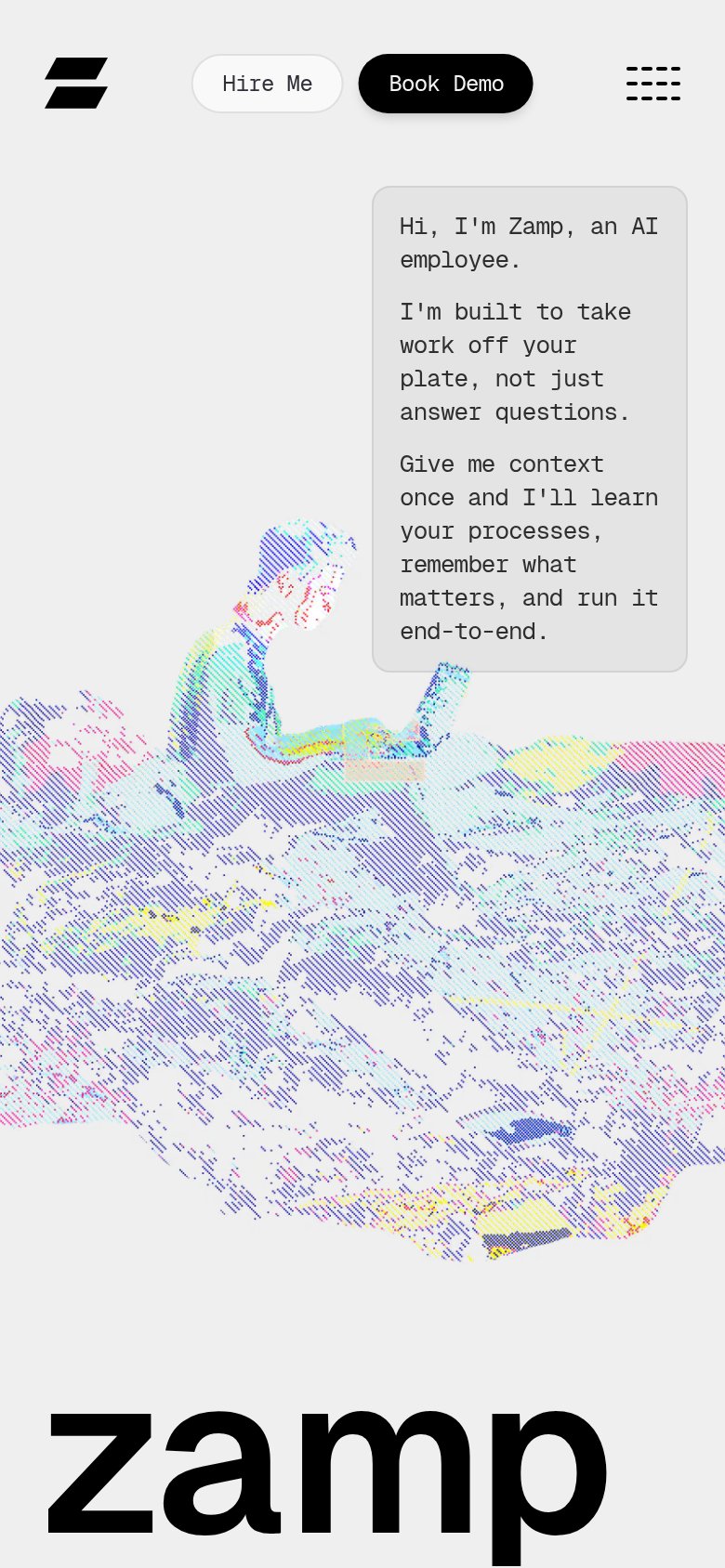
64FairThe phone experience as a first-class citizen.
What works
What to improve