
Your landing page’s weakest score is Trust.
How Yabble ranks
61Growth scoreupdated
category scores
category scoresShowHide
Trust
32PoorProof that the product is real, competent, and safe to try.
| Trust read | |
|---|---|
| Yabble | No visible trust signal identified. |
| No visible trust signal identified. | |
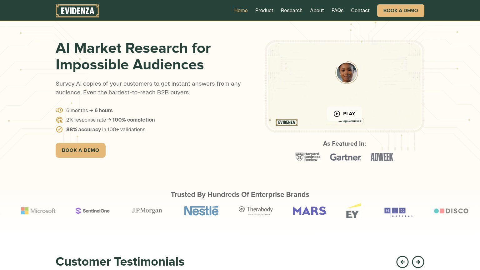
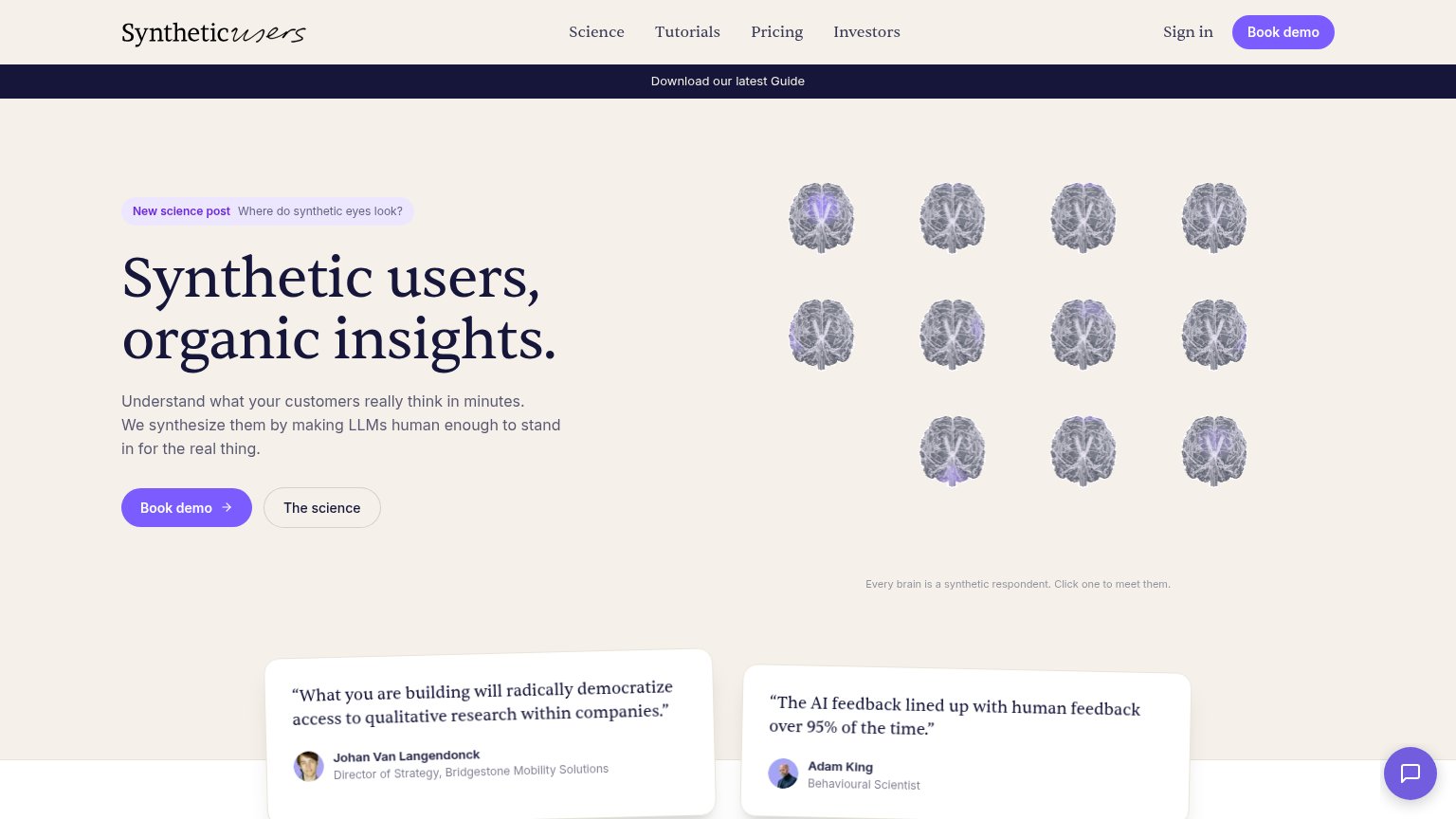
| "The AI feedback lined up with human feedback over 95% of the time." — Adam King, Behavioural Scientist | |
| "Trusted By Hundreds Of Enterprise Brands" logo wall with Microsoft, J.P. Morgan, Nestlé, Mars, and EY | |
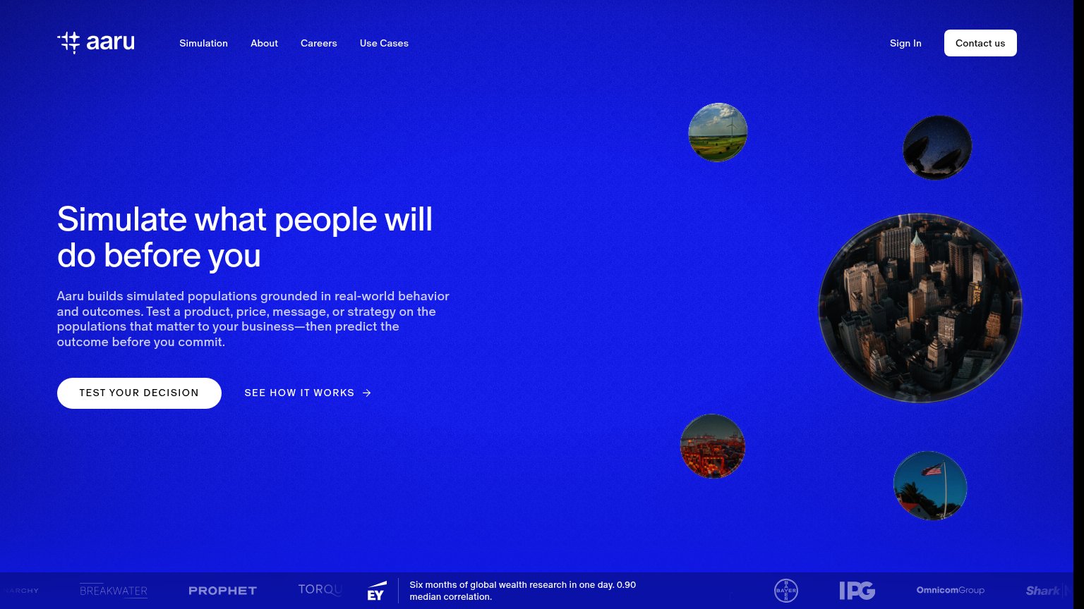
| "Six months of global wealth research in one day. 0.90 median correlation." beside EY, IPG, OmnicomGroup and Bayer logos | |
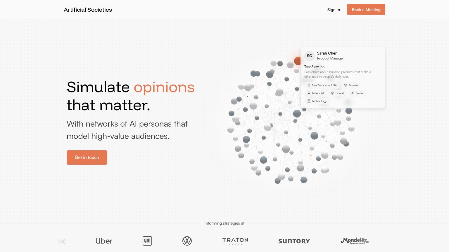
| Logo wall under "Informing strategies at" showing Uber, GM, Volkswagen, TRATON, Suntory, and Mondelez |
Information hierarchy
68FairDoes the design help or inhibit what the page is trying to say?
 1234
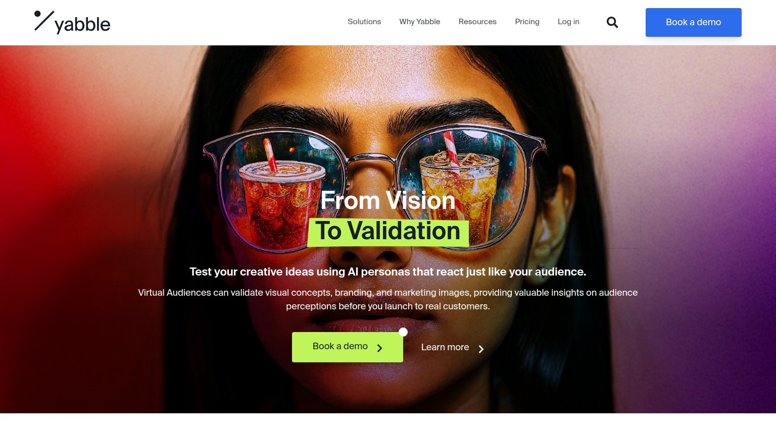
- Blue nav demo button — Second Book a demo in a different color competes with the green hero CTA and splits the primary action's visual identity.
- Five-link nav row — Solutions, Why Yabble, Resources, Pricing, and Log in plus search offer six exits before the visitor reaches the pitch.
- Learn more link — Sits at near-equal weight beside the primary CTA and diverts clicks from the demo booking.
- Stray white dot — Unexplained circle on the green button's top-right corner reads as a rendering glitch, not intentional design.
CTA
68FairCopy, size, verb, cost-feel — does the primary CTA earn the click?
How Yabble compares
Recommended rewrites
Value props
68FairTitle, subtitle, hero — do they sell the product's true value?
Yabble’s headline
From Vision To Validation
Test your creative ideas using AI personas that react just like your audience.
Working
Could improve
Mobile web
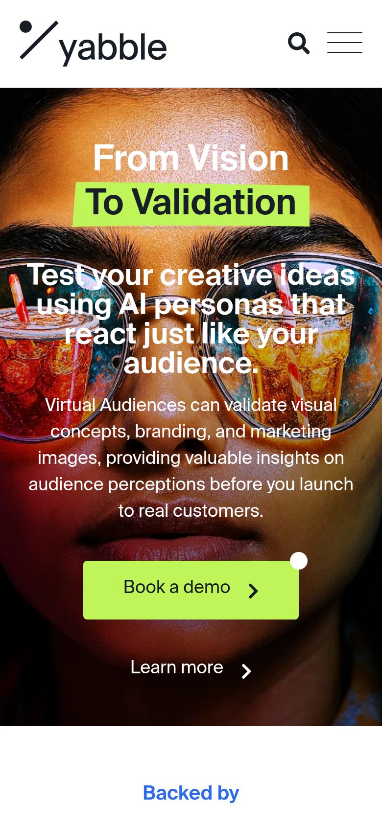
68FairThe phone experience as a first-class citizen.
What works
What to improve