
Your landing page’s weakest score is Value props.
How Workato ranks
76Growth scoreupdated
category scores
category scoresShowHide
Value props
68FairTitle, subtitle, hero — do they sell the product's true value?
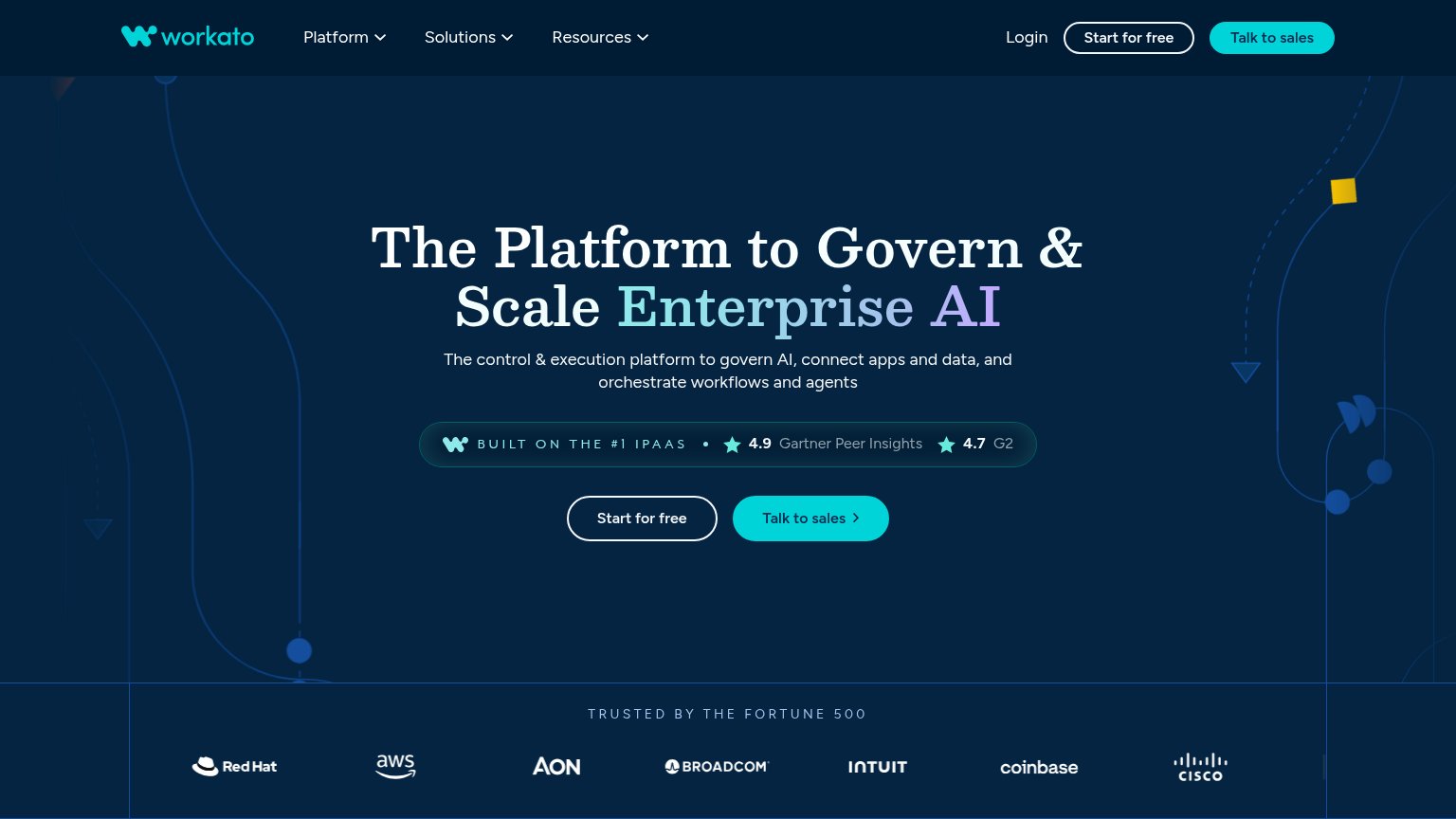
Workato’s headline sells
The Platform to Govern & Scale Enterprise AI
The control & execution platform to govern AI, connect apps and data, and orchestrate workflows and agents
Working
- Names the enterprise AI governance pain
- Strong proof: 4.9 Gartner, 4.7 G2, F500 logos
- #1 iPaaS claim anchors credibility
Could improve
- No concrete outcome or metric named
- Category verbs: govern, connect, orchestrate
- Hero art decorates, never shows product
Information hierarchy
78FairDoes the design help or inhibit what the page is trying to say?
 123
- Duplicate CTA pairs — "Start for free" and "Talk to sales" appear twice in the fold (nav and hero) with mirrored styling, splitting attention across four buttons.
- Hero CTA weight flip — The filled teal "Talk to sales" outweighs the outlined "Start for free", so the self-serve path reads as secondary despite sitting first.
- Three dropdown nav menus — Platform, Solutions, and Resources dropdowns plus Login give visitors four exit branches before they reach the hero promise.
CTA
78FairCopy, size, verb, cost-feel — does the primary CTA earn the click?
How Workato compares
Recommended rewrites
Trust
78FairProof that the product is real, competent, and safe to try.
How Workato compares
Trust read
Mobile web
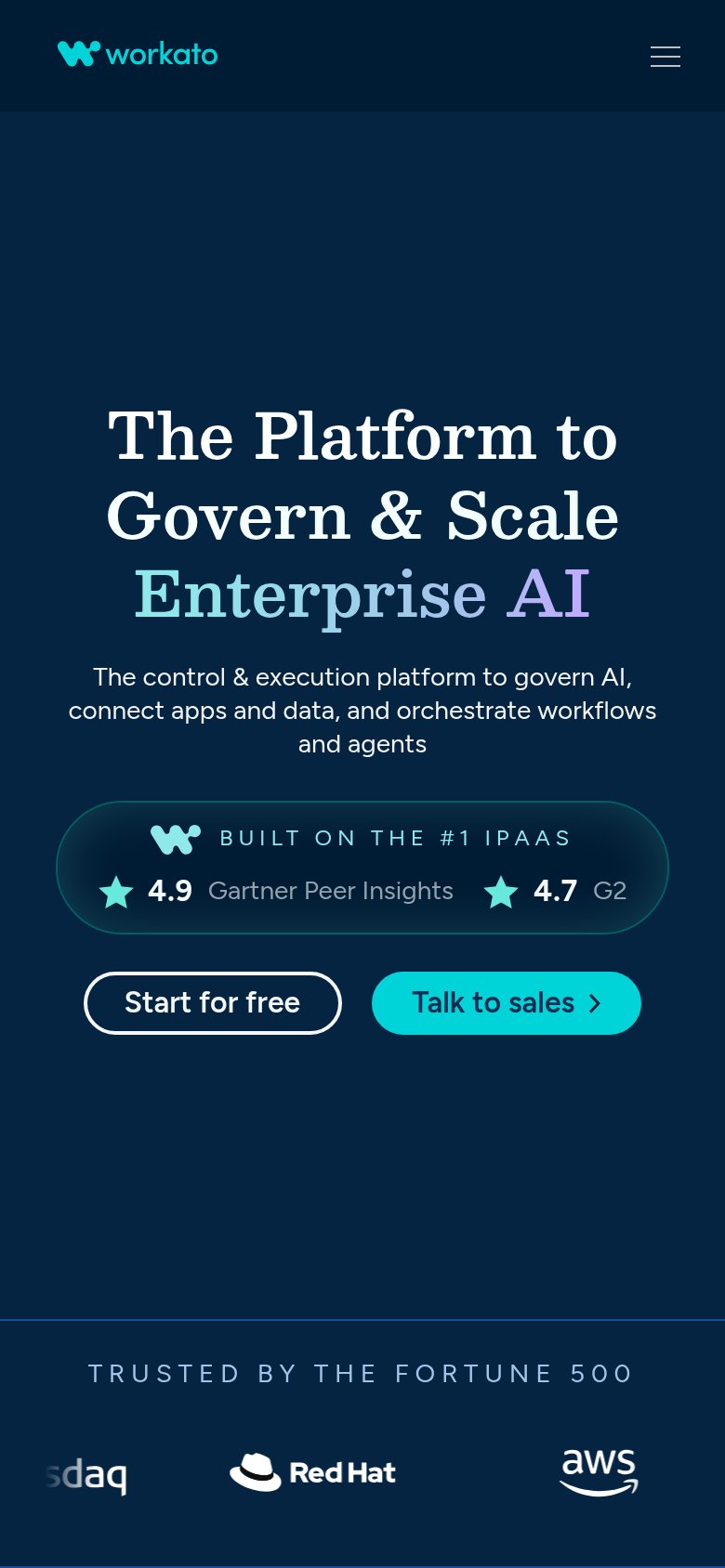
78FairThe phone experience as a first-class citizen.
What works
What to improve