
Your landing page’s weakest score is Information hierarchy.
How Nango ranks
77Growth scoreupdated
category scores
category scoresShowHide
Information hierarchy
72FairDoes the design help or inhibit what the page is trying to say?
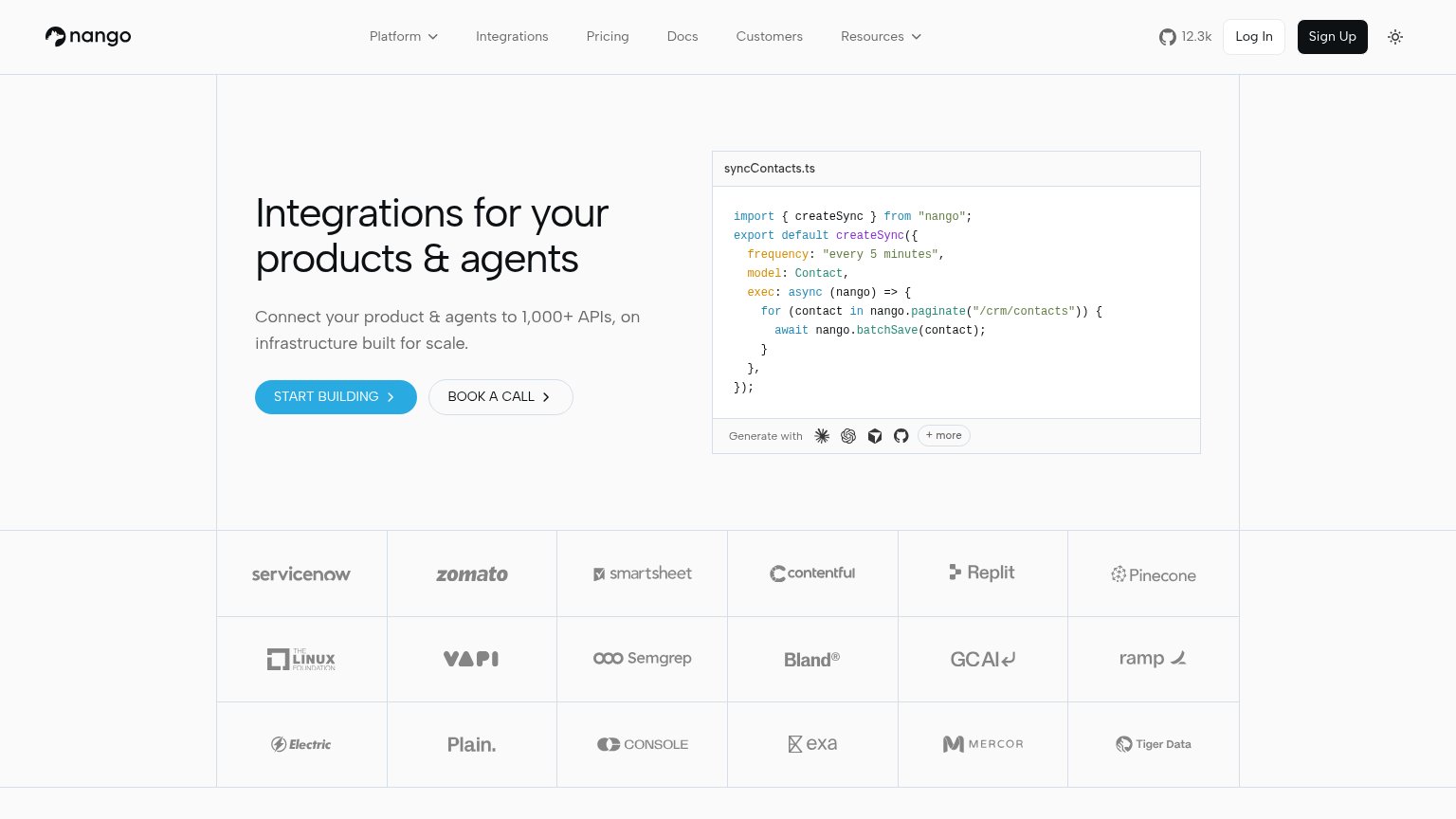 1234
- Nav link row — Seven nav items plus GitHub star, Log In, and Sign Up create ~10 equal-weight exits before the hero CTA.
- Sign Up button — High-contrast black button in the header outweighs the hero's blue START BUILDING, splitting the primary action.
- START BUILDING button — Small footprint and light-blue fill on a light background read weaker than the black header button competing above it.
- Code panel model icons — 'Generate with' icon row plus '+ more' adds four extra outbound-feeling targets inside the hero scan path.
Value props
76FairTitle, subtitle, hero — do they sell the product's true value?
Nango’s headline sells
Integrations for your products & agents
Connect your product & agents to 1,000+ APIs, on infrastructure built for scale.
Working
- 1,000+ APIs is concrete and credible
- Code sample shows the product working
- 12.3k stars + logo wall add proof
Could improve
- No emotional hook for integration pain
- 'Built for scale' is generic filler
- No time-to-ship outcome stated
Trust
76FairProof that the product is real, competent, and safe to try.
How Nango compares
Trust read
CTA
80StrongCopy, size, verb, cost-feel — does the primary CTA earn the click?
How Nango compares
Recommended rewrites
Mobile web
80StrongThe phone experience as a first-class citizen.
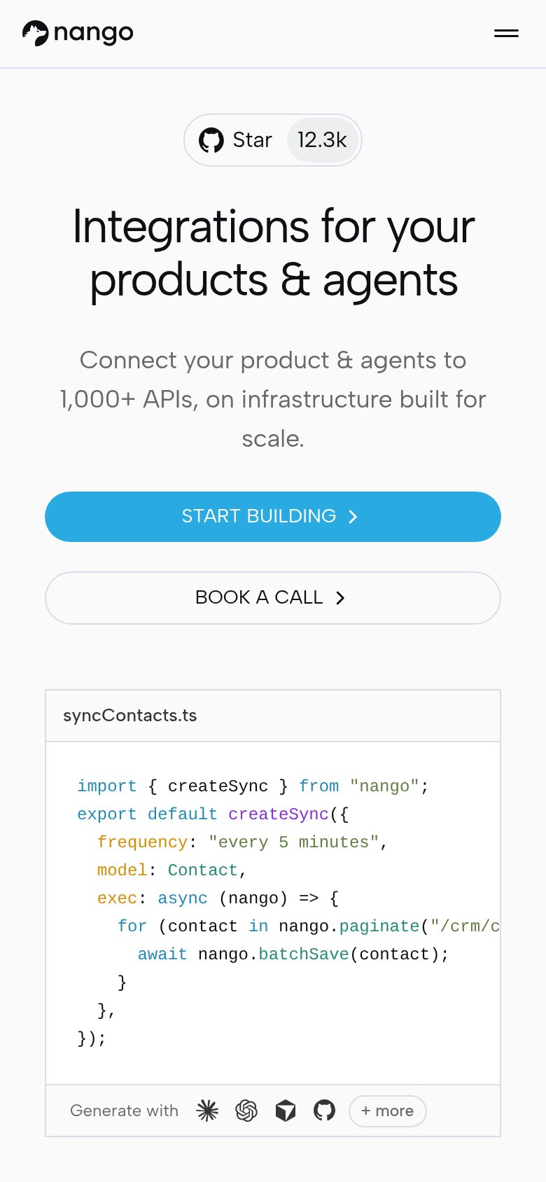
What works
What to improve