
Your landing page’s weakest score is Trust.
How Tray.ai ranks
63Growth scoreupdated
category scores
category scoresShowHide
Trust
42PoorProof that the product is real, competent, and safe to try.
| Trust read | |
|---|---|
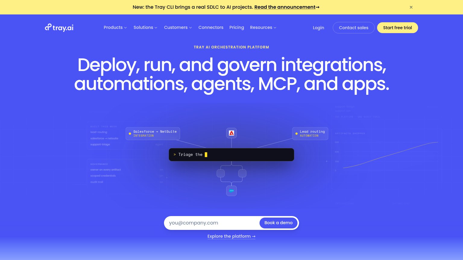
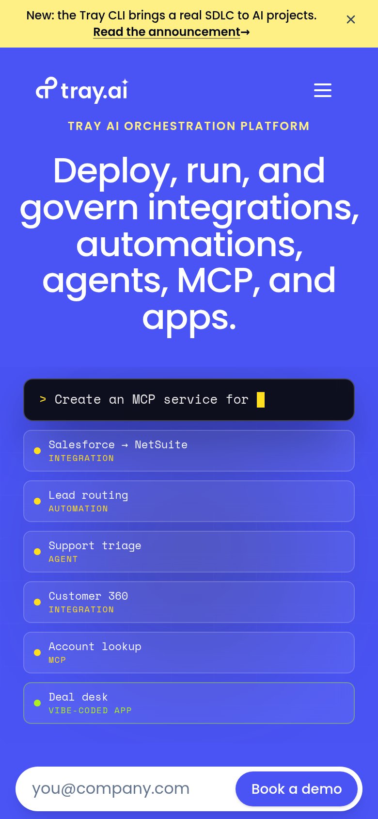
| Tray.ai | Animated platform visualization with artifact cards ("Salesforce → NetSuite INTEGRATION", "Lead routing AUTOMATION") sho |
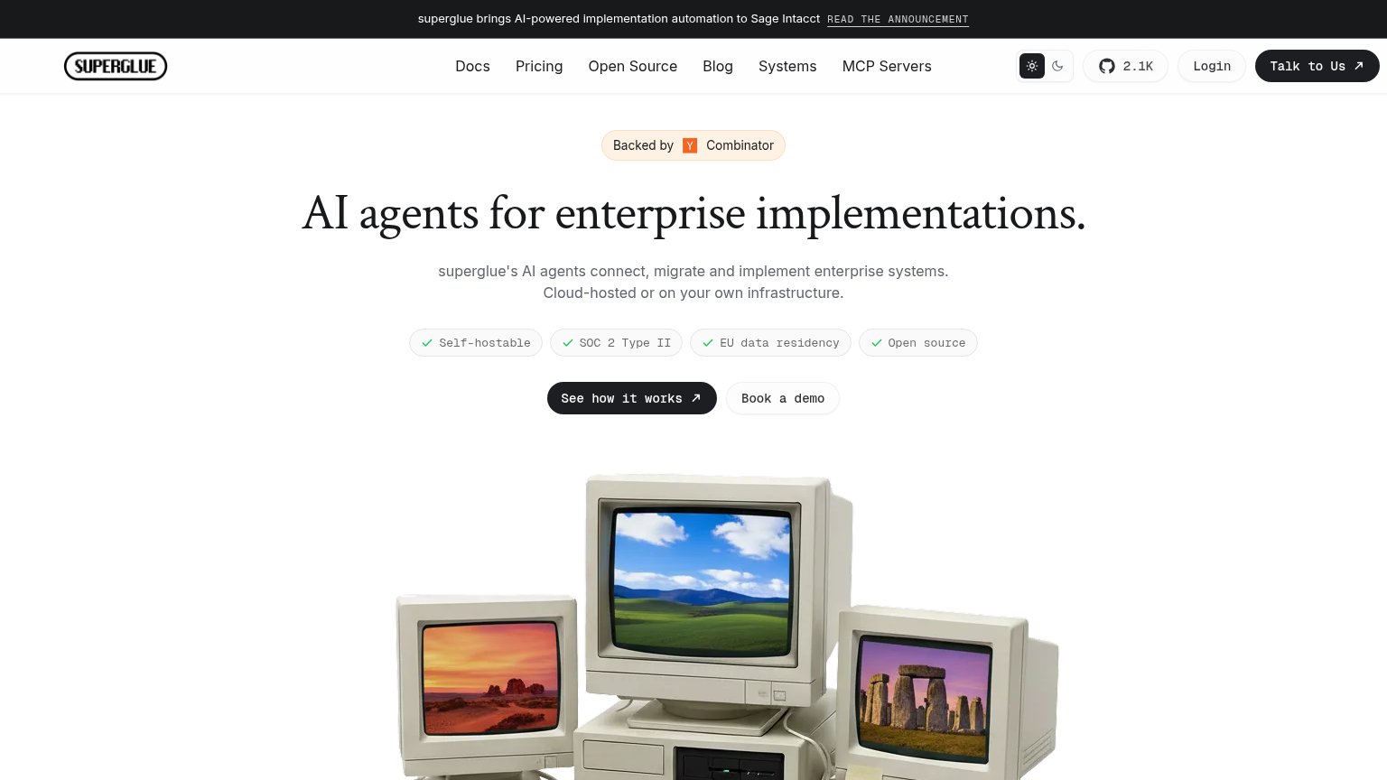
| SOC 2 Type II badge row ("Self-hostable", "SOC 2 Type II", "EU data residency", "Open source") above the CTAs | |
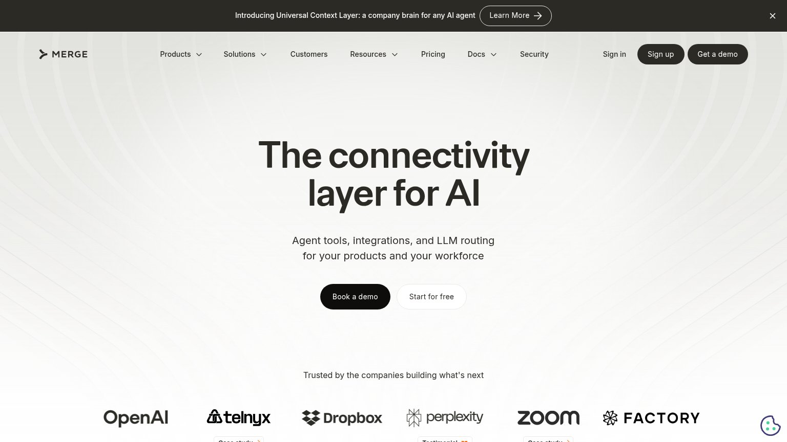
| "Trusted by the companies building what's next" logo bar with OpenAI, Telnyx, Dropbox, Perplexity, Zoom, and Factory | |
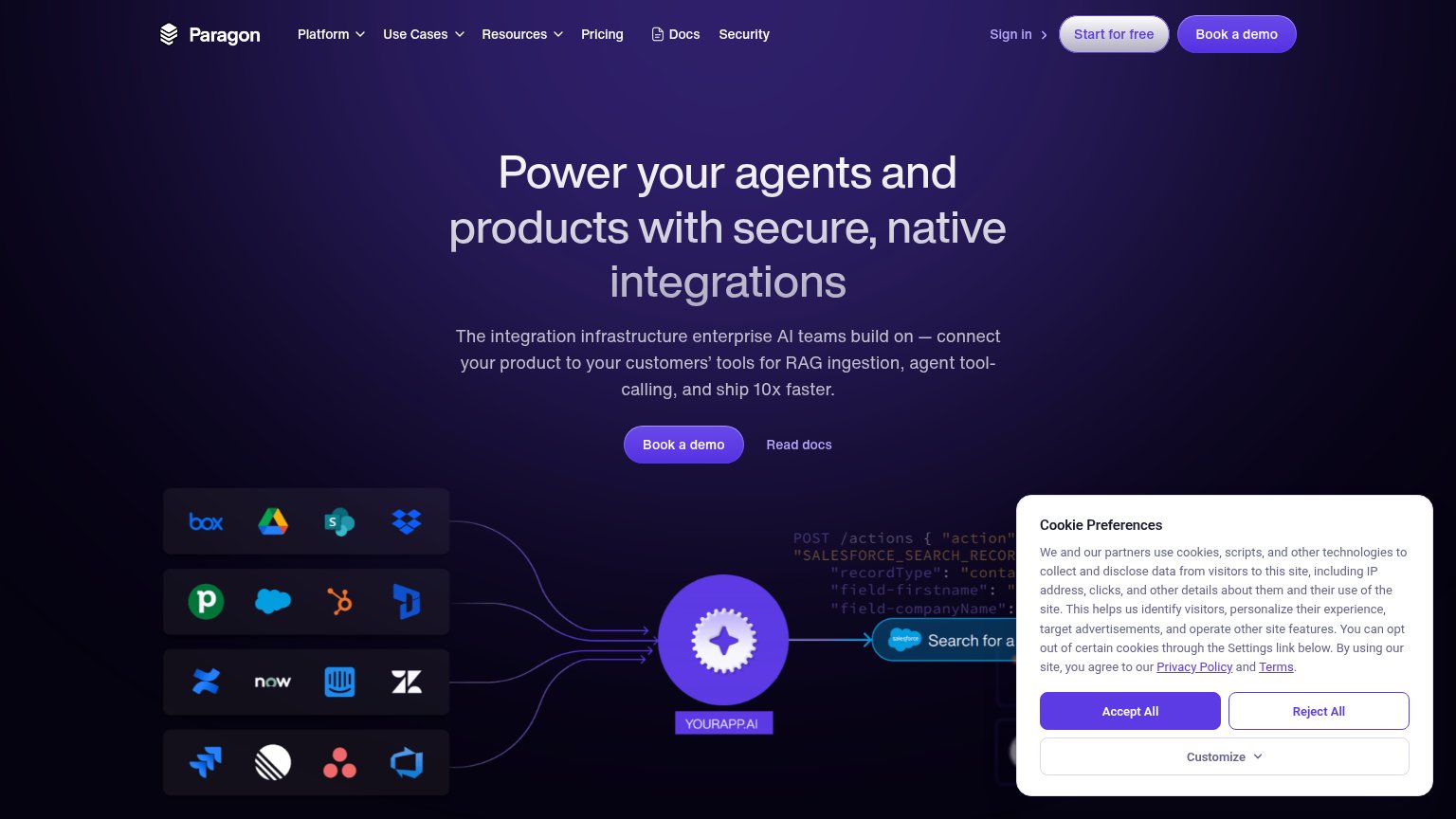
| Integration diagram showing a 'POST /actions' code payload (SALESFORCE_SEARCH_RECORDS) connecting real third-party app i | |
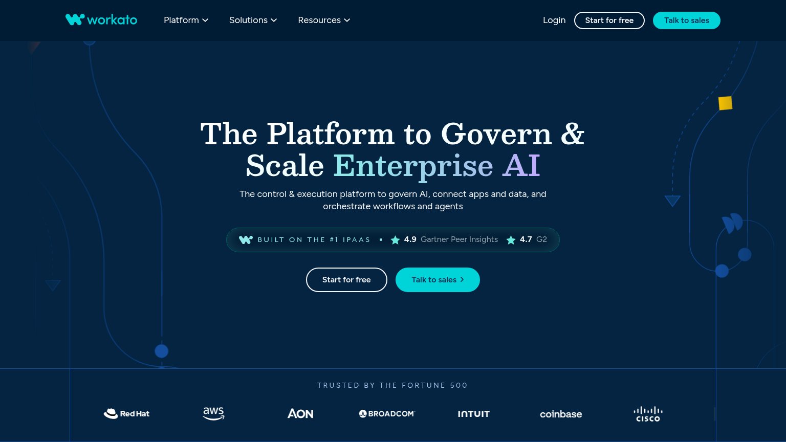
| "4.9 Gartner Peer Insights" and "4.7 G2" rating badge above the CTAs | |
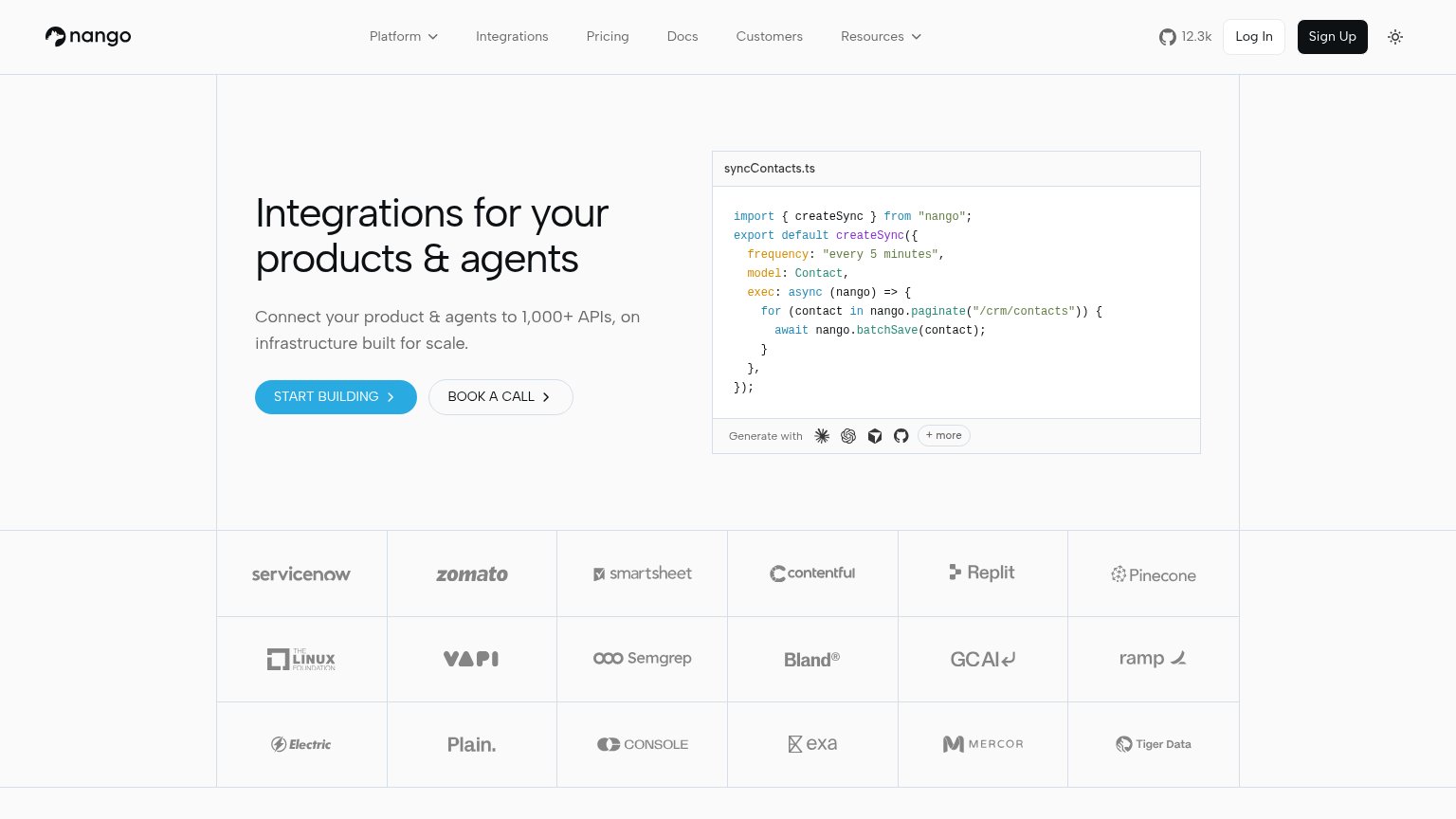
| Customer logo wall including ServiceNow, Zomato, Smartsheet, Contentful, Replit, Pinecone, The Linux Foundation, and Ram |
Information hierarchy
66FairDoes the design help or inhibit what the page is trying to say?
1234- Three header CTAs — "Start free trial", "Contact sales", and "Login" sit at similar weight, splitting the primary action before the visitor reaches the hero.
- Book a demo form — A second conversion path in the fold competes with "Start free trial"; the page never signals which action it actually wants.
- Announcement banner — The high-contrast yellow bar with "Read the announcement→" is the brightest element on the page and pulls the first glance to an exit.
- Explore the platform link — An underlined third path directly under the demo form adds one more equal-priority choice at the decision point.
Value props
68FairTitle, subtitle, hero — do they sell the product's true value?
Tray.ai’s headline
Deploy, run, and govern integrations, automations, agents, MCP, and apps.
Working
Could improve
Mobile web
68FairThe phone experience as a first-class citizen.
What works
What to improve
CTA
72FairCopy, size, verb, cost-feel — does the primary CTA earn the click?
How Tray.ai compares
Recommended rewrites