
Your landing page’s weakest score is CTA.
How Weave ranks
64Growth scoreupdated
category scores
category scoresShowHide
CTA
58FairCopy, size, verb, cost-feel — does the primary CTA earn the click?
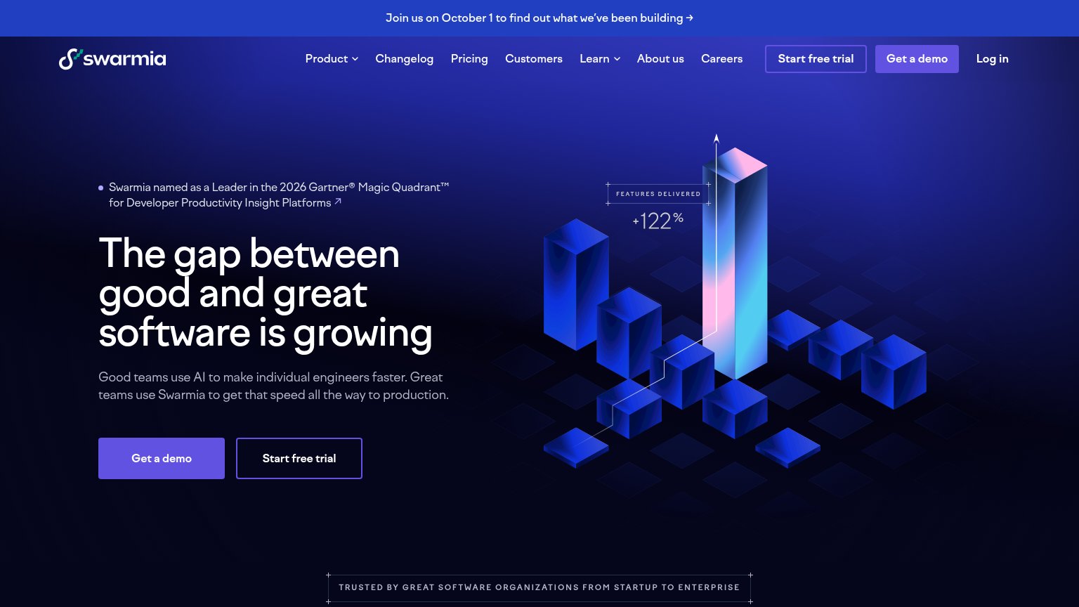
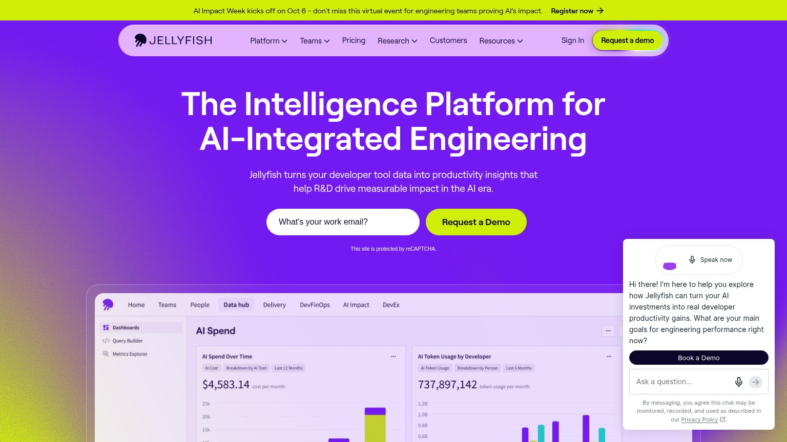
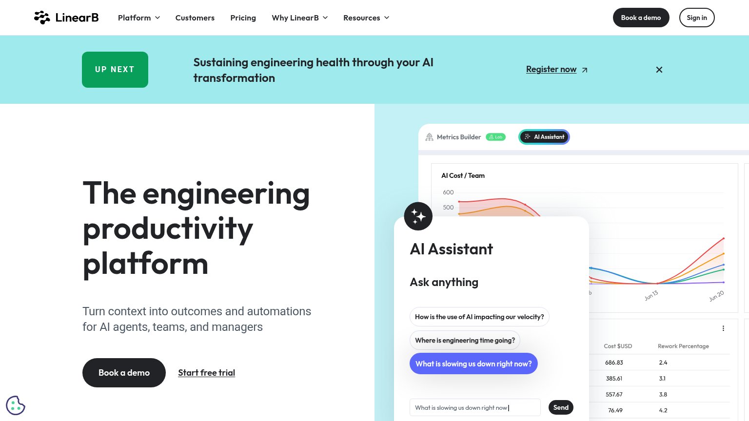
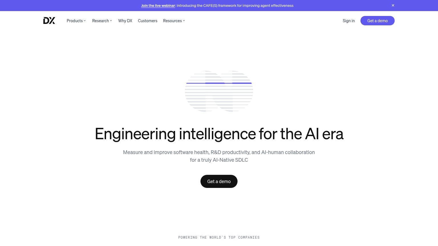
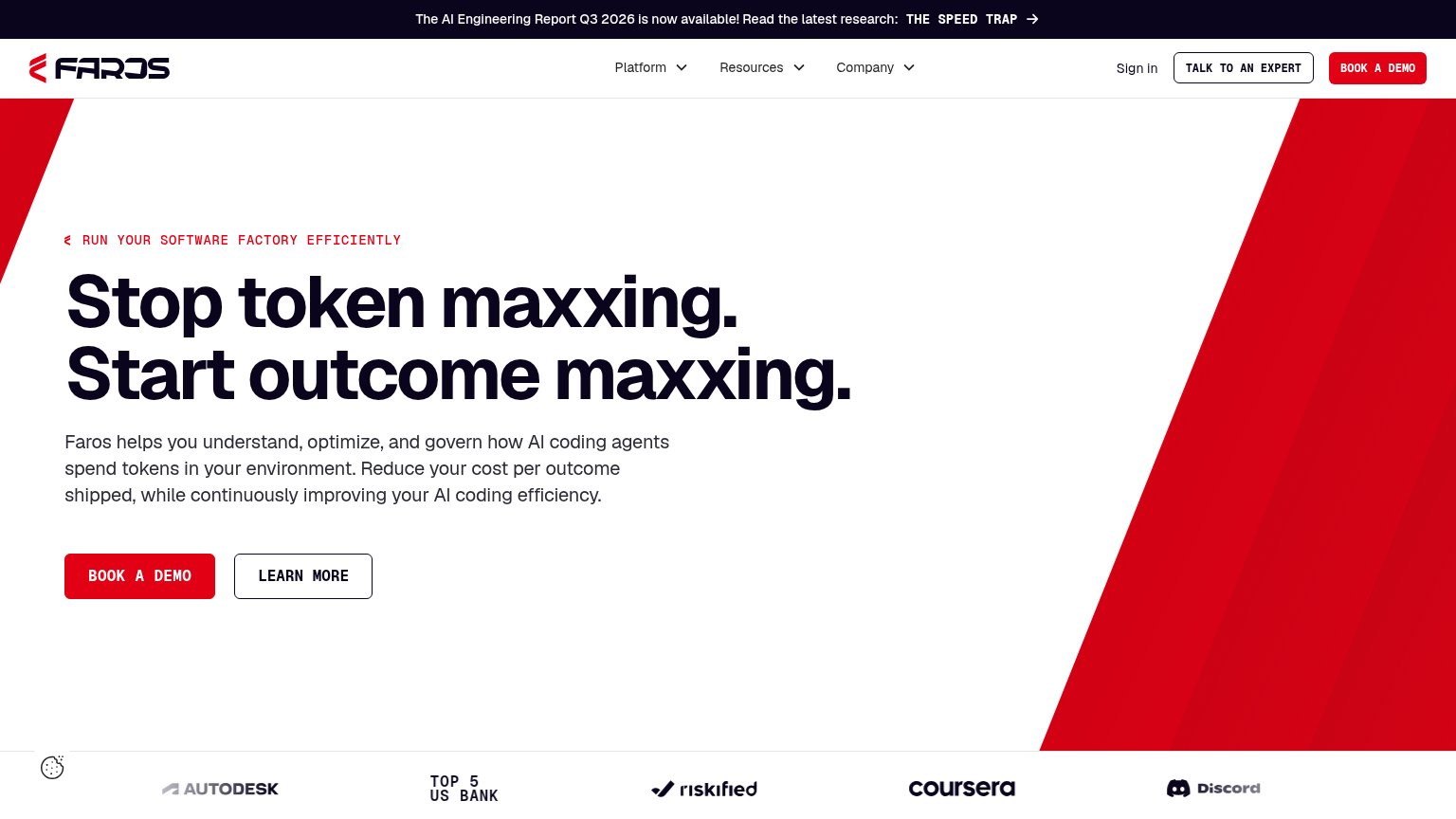
Problems
- demo booking feels costly
- free CTA hidden on desktop fold
- labels differ desktop vs mobile
- no hero CTA on desktop fold
Information hierarchy
62FairDoes the design help or inhibit what the page is trying to say?
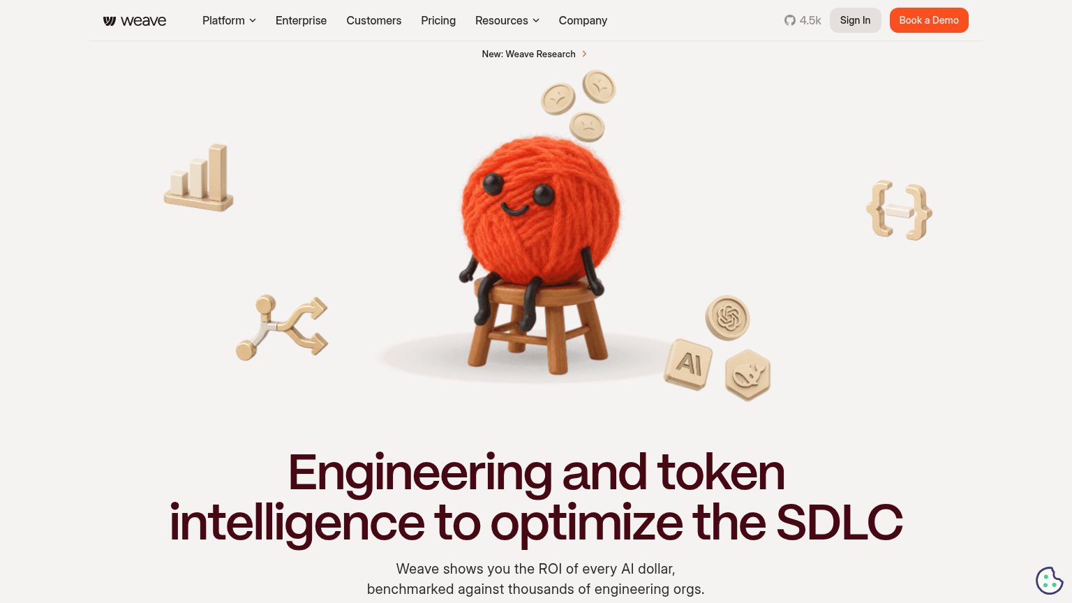
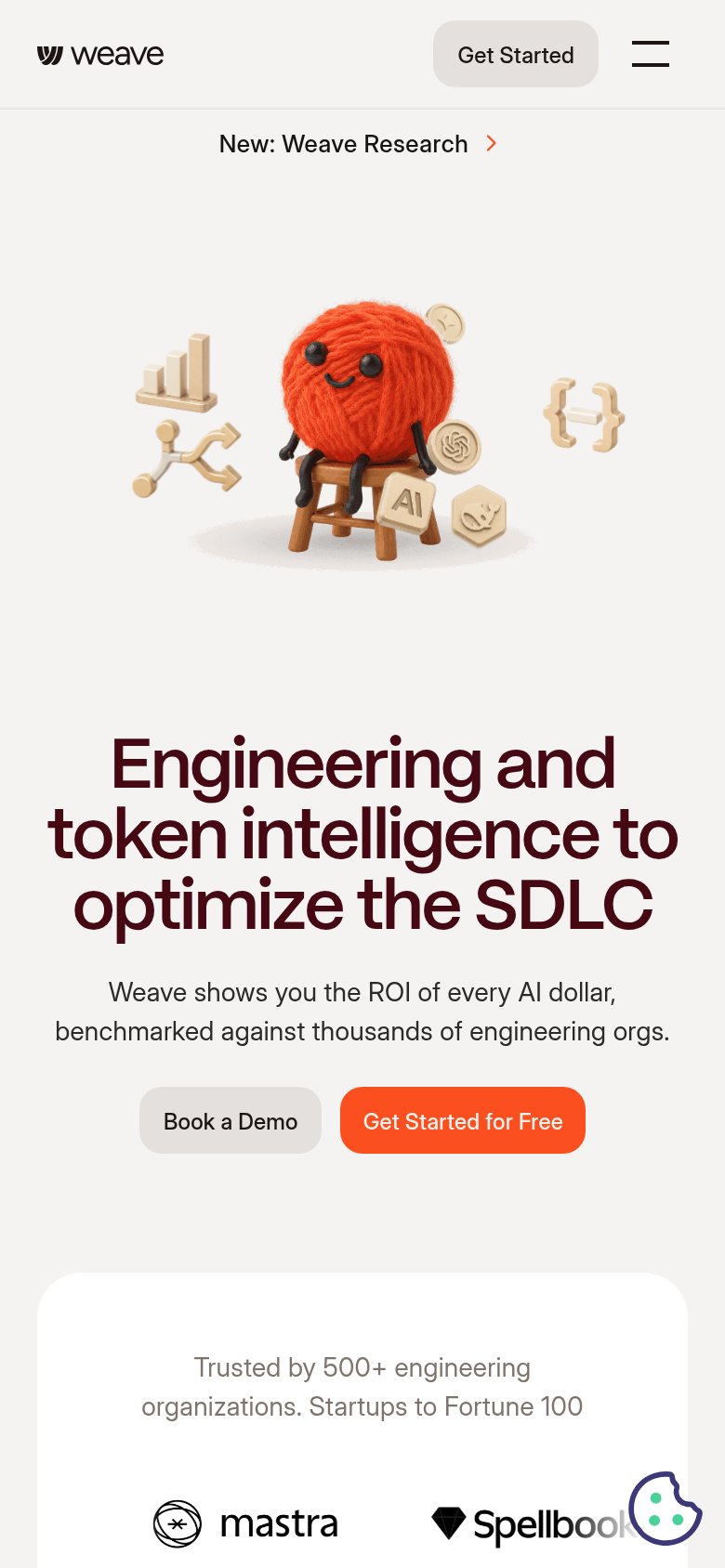
1234- Hero mascot illustration — The yarn mascot scene occupies the entire upper half of the fold, pushing the headline and both CTAs below the visitor's first scan.
- Book a Demo button — The only visible desktop CTA sits at the far top-right corner, outside the centered scan path of the headline and hero.
- Navigation link row — Six nav items plus a GitHub star count and Sign In offer eight exit paths before the value prop is even read.
- Weave Research banner — An announcement link sits directly above the hero, adding one more exit path that outranks the conversion action in scan order.
Trust
62FairProof that the product is real, competent, and safe to try.
How Weave compares
Trust read
Mobile web
68FairThe phone experience as a first-class citizen.
What works
What to improve
Value props
72FairTitle, subtitle, hero — do they sell the product's true value?
Weave’s headline
Engineering and token intelligence to optimize the SDLC
Weave shows you the ROI of every AI dollar, benchmarked against thousands of engineering orgs.
Working
Could improve