
Your landing page’s weakest score is Information hierarchy.
How Swarmia ranks
73Growth scoreupdated
category scores
category scoresShowHide
Information hierarchy
68FairDoes the design help or inhibit what the page is trying to say?
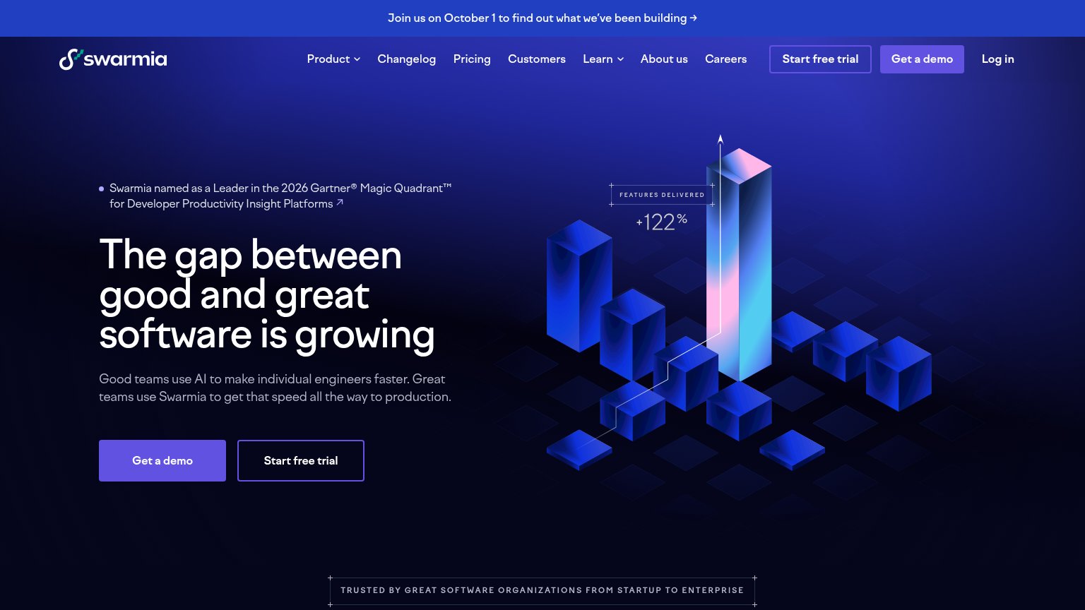 1234
- Duplicate CTA pairs — "Get a demo" and "Start free trial" appear twice in the fold at similar weight — nav and hero pairs split attention four ways.
- Top announcement banner — "Join us on October 1" banner is the first thing scanned and links away before the value prop or CTA is seen.
- Nav link row — Seven nav items plus Log in sit at equal weight, offering eight exits before the hero argument lands.
- Gartner badge line — Small light-weight text with an outbound arrow sits directly above the headline, adding a fifth exit at the exact scan entry point.
CTA
72FairCopy, size, verb, cost-feel — does the primary CTA earn the click?
Problems
- demo-first feels costly
- hero/nav emphasis flipped
- free trial demoted to ghost
Value props
74FairTitle, subtitle, hero — do they sell the product's true value?
Swarmia’s headline
The gap between good and great software is growing
Good teams use AI to make individual engineers faster. Great teams use Swarmia to get that speed all the way to production.
Working
Could improve
Trust
74FairProof that the product is real, competent, and safe to try.
How Swarmia compares
Trust read
Mobile web
76FairThe phone experience as a first-class citizen.
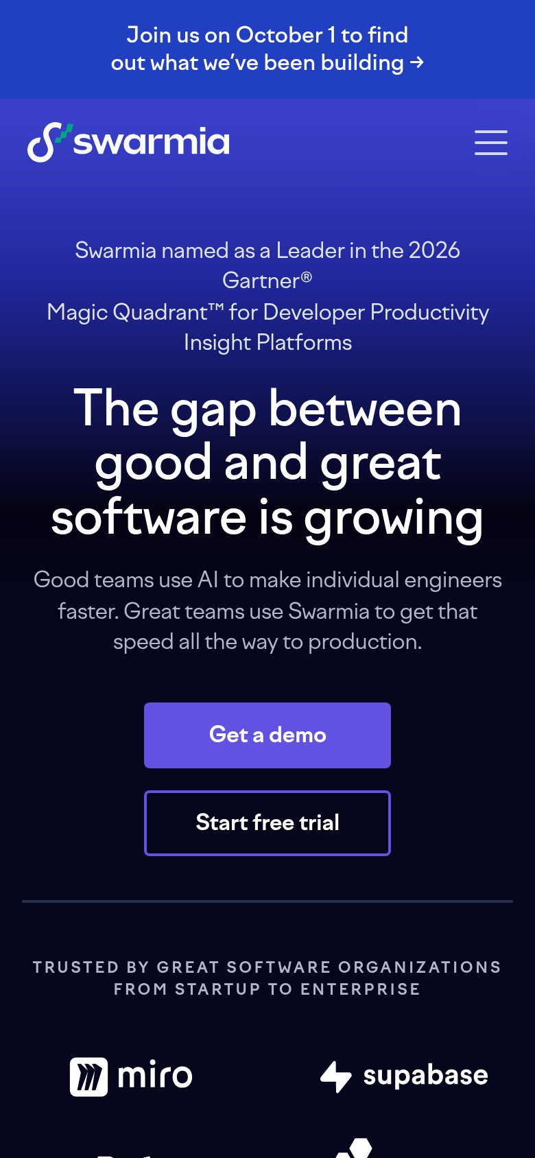
What works
What to improve