
Your landing page’s weakest score is Trust.
How Vortexa ranks
72Growth scoreupdated
category scores
category scoresShowHide
Trust
58FairProof that the product is real, competent, and safe to try.
| Trust read | |
|---|---|
| Vortexa | Real product dashboard screenshots showing "Cargo volume by origin" charts and "Vessel map (171)" with live-looking filt |
| No visible trust signal identified. | |
| No visible trust signal identified. | |
| 200+ oil and trading companies already using it | |
| implicit context DTN may benefit from pre-existing familiarity among its target audience. | |
| implicit context ICIS may benefit from pre-existing familiarity among its target audience. |
Information hierarchy
72FairDoes the design help or inhibit what the page is trying to say?
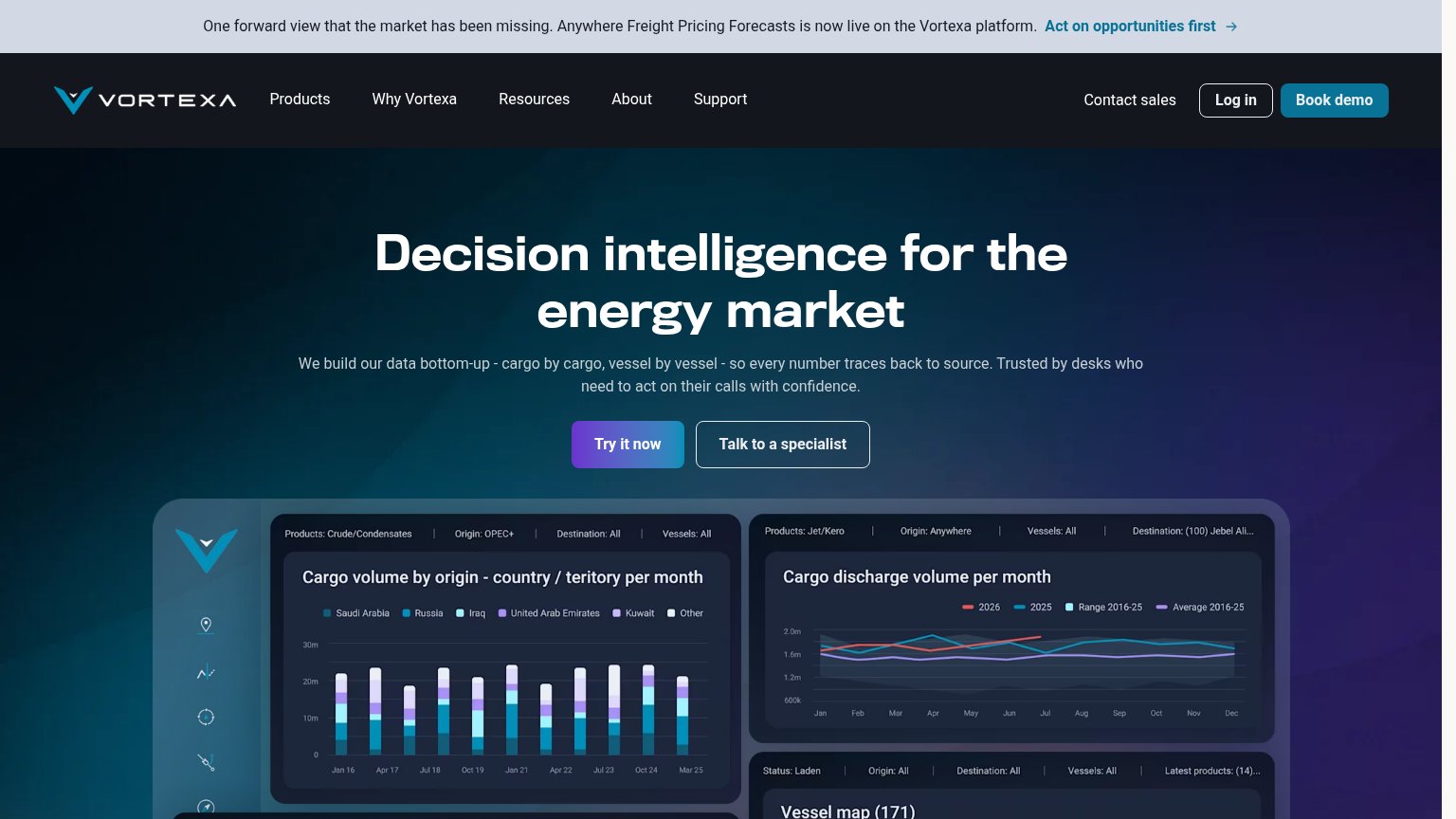 1234
- Announcement banner top — The 'Act on opportunities first' banner is the first clickable element and pulls attention off the hero before the headline lands.
- Talk to specialist button — Sized identically to 'Try it now' at the same position, splitting the visitor's decision between two equal actions.
- Book demo nav button — A third filled CTA in the header competes with 'Try it now' and adds a second conversion ask above the fold.
- Dashboard preview panels — Two dense chart panels with tiny filter chips and legends enter the fold as noise, not readable proof.
Value props
72FairTitle, subtitle, hero — do they sell the product's true value?
Vortexa’s headline
Decision intelligence for the energy market
We build our data bottom-up - cargo by cargo, vessel by vessel - so every number traces back to source. Trusted by desks who need to act on their calls with confidence.
Working
Could improve
Mobile web
76FairThe phone experience as a first-class citizen.
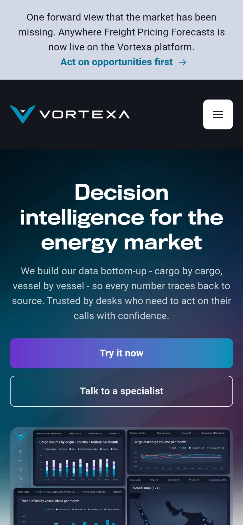
What works
What to improve
CTA
80StrongCopy, size, verb, cost-feel — does the primary CTA earn the click?
How Vortexa compares
Recommended rewrites