
Your landing page’s weakest score is Trust.
How Kpler ranks
54Growth scoreupdated
category scores
category scoresShowHide
Trust
42PoorProof that the product is real, competent, and safe to try.
| Trust read | |
|---|---|
| Kpler | No visible trust signal identified. |
| No visible trust signal identified. | |
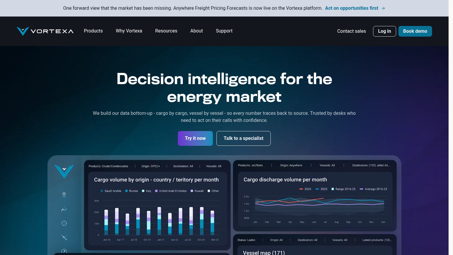
| Real product dashboard screenshots showing "Cargo volume by origin" charts and "Vessel map (171)" with live-looking filt | |
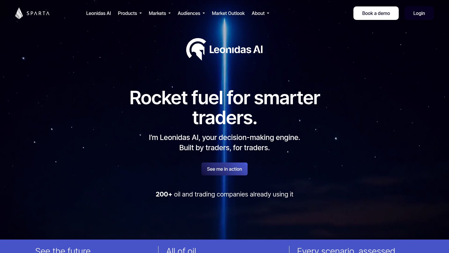
| 200+ oil and trading companies already using it | |
| implicit context DTN may benefit from pre-existing familiarity among its target audience. | |
| implicit context ICIS may benefit from pre-existing familiarity among its target audience. |
Information hierarchy
48PoorDoes the design help or inhibit what the page is trying to say?
 1234
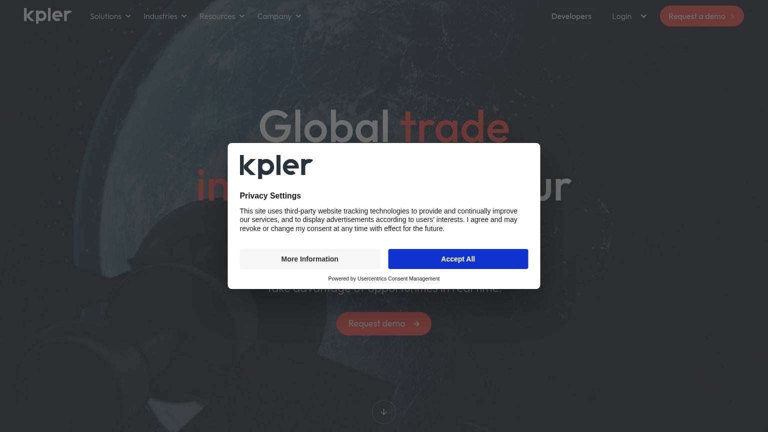
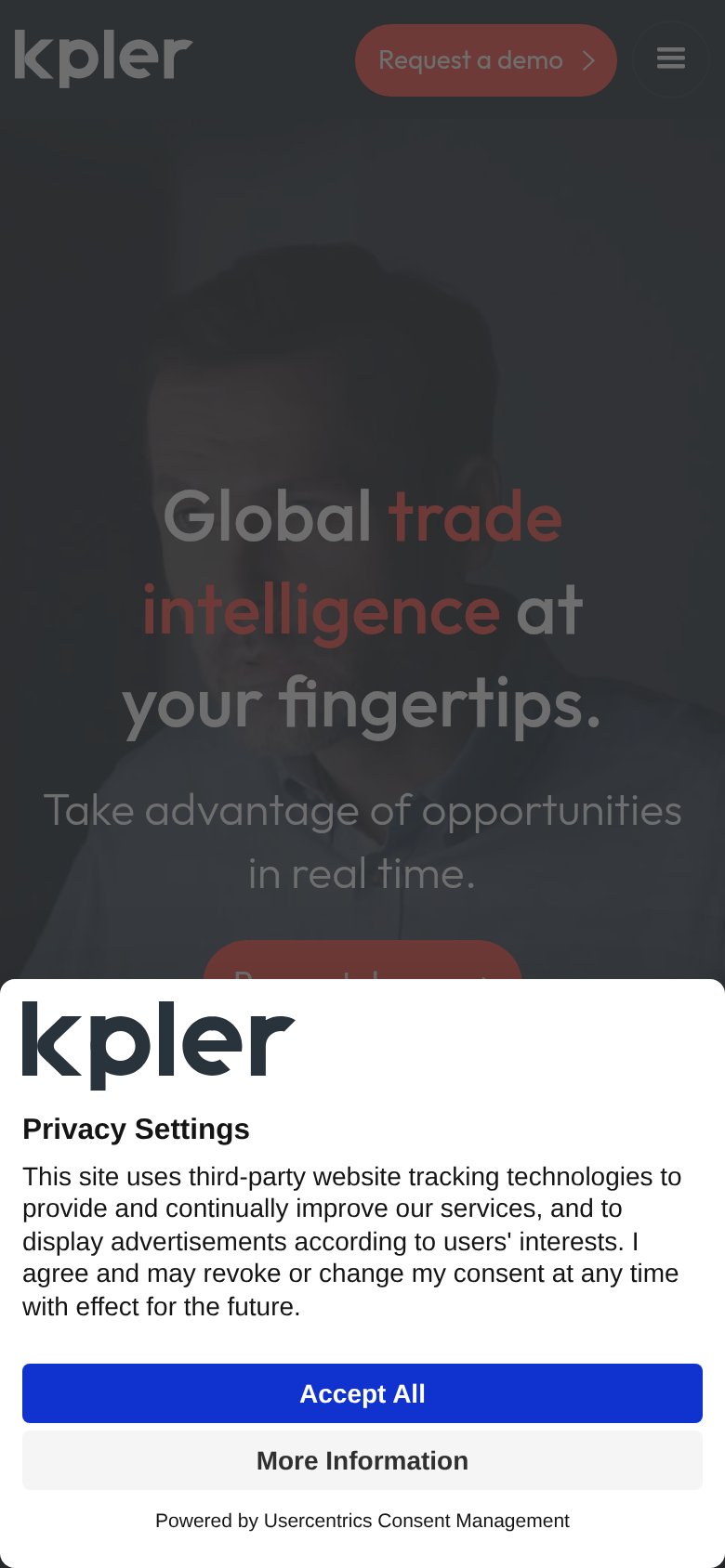
- Consent modal overlay — Centered dialog covers the headline and dims the whole fold, blocking both message and CTA on desktop and mobile.
- Request demo button — Muddy red on a dark background gives it near-invisible contrast; the same washed-out treatment repeats in the nav's demo button.
- Headline behind dimmer — The core value prop is greyed out and partially hidden mid-sentence, so the promise cannot be read at a glance.
- Login and Developers links — Two same-weight exit links sit beside the primary CTA, competing for the top-right scan path.
Value props
58FairTitle, subtitle, hero — do they sell the product's true value?
Kpler’s headline
Global trade intelligence at your fingertips.
Take advantage of opportunities in real time.
Working
Could improve
Mobile web
58FairThe phone experience as a first-class citizen.
What works
What to improve
CTA
62FairCopy, size, verb, cost-feel — does the primary CTA earn the click?
How Kpler compares
Recommended rewrites