
Your landing page’s weakest score is Trust.
How Vodex ranks
Trust
44PoorProof that the product is real, competent, and safe to try.

| Trust read | |
|---|---|
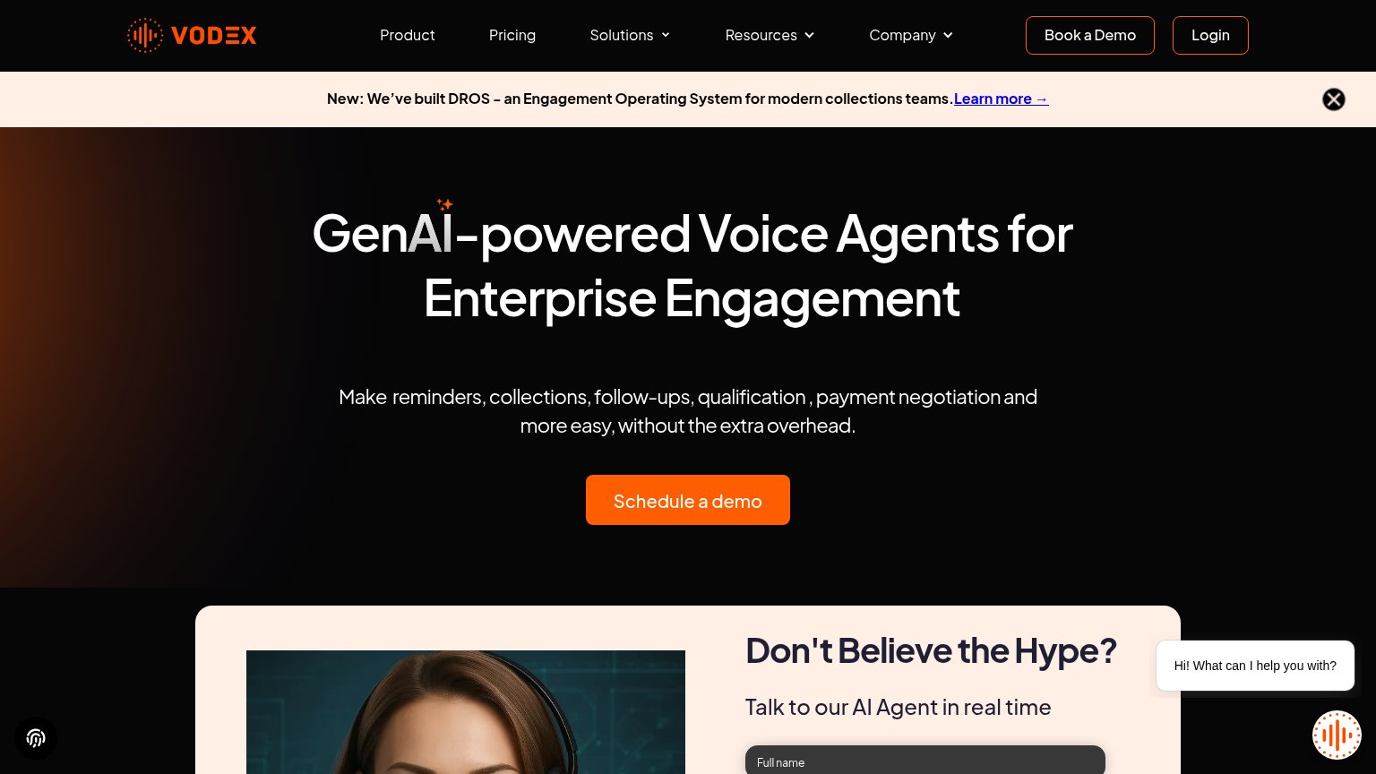
| Vodex | "Talk to our AI Agent in real time" live demo form |
| "TRUSTED IN ACTIVE COLLECTIONS" customer logo strip (Quipux, KrediYA, Aseguradora Solidaria) | |
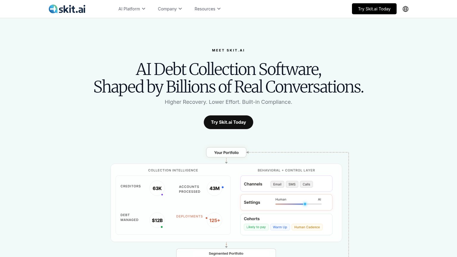
| Usage stats panel: "63K Creditors, 43M Accounts Processed, $12B Debt Managed, 125+ Deployments" | |
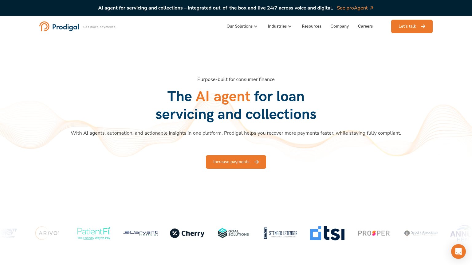
| Customer logo strip including Prosper, Cherry, PatientFi, Arivo, Carvant, Goal Solutions, TSI | |
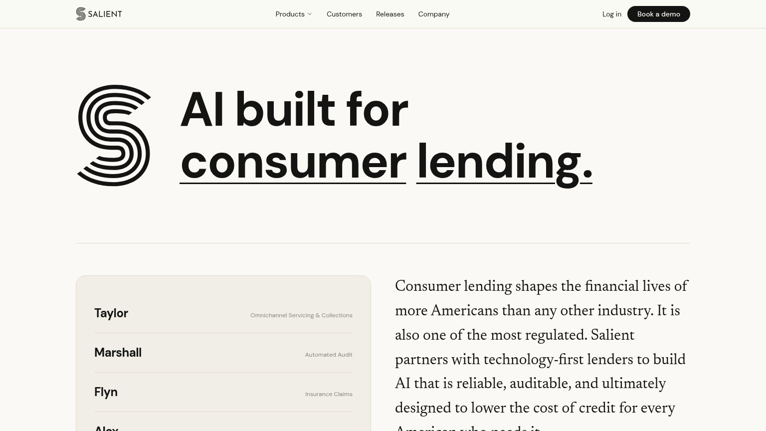
| Product roster card listing named AI agents with use cases ("Taylor — Omnichannel Servicing & Collections", "Marshall — | |
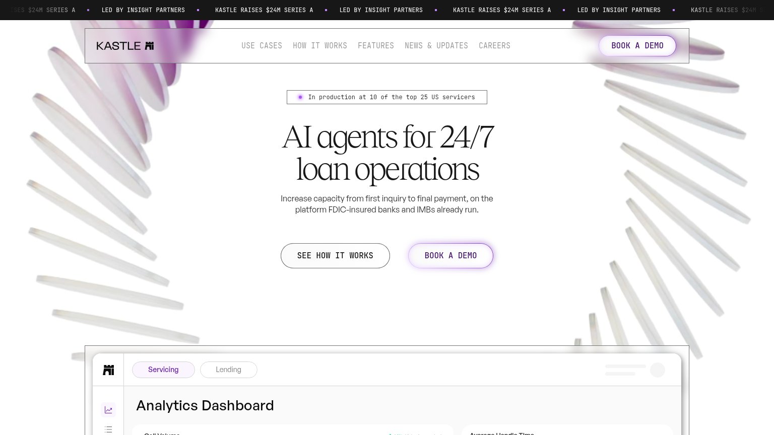
| "In production at 10 of the top 25 US servicers" badge above the hero headline |
Mobile web
58FairThe phone experience as a first-class citizen.
 1234
- DROS promo banner — Five wrapped lines consume ~25% of the fold and push the CTA to the bottom edge.
- Schedule a demo button — Desktop-proportioned pill with awkward two-line label wrap instead of a full-width thumb target.
- Hero headline block — Headline wraps to four tall lines, eating most of the viewport before the value line appears.
- Floating corner widgets — Chat bubble and voice widget stack in both lower corners, crowding the tap zone near the fold.
Value props
62FairTitle, subtitle, hero — do they sell the product's true value?
Vodex’s headline
GenAI-powered Voice Agents for Enterprise Engagement
Make reminders, collections, follow-ups, qualification , payment negotiation and more easy, without the extra overhead.
Working
Could improve
CTA
68FairCopy, size, verb, cost-feel — does the primary CTA earn the click?
How Vodex compares
Recommended rewrites
Information hierarchy
70FairDoes the design help or inhibit what the page is trying to say?
What works
What to improve