
Your landing page’s weakest score is Trust.
How Prodigal ranks
71Growth scoreupdated
category scores
category scoresShowHide
Trust
66FairProof that the product is real, competent, and safe to try.
| Trust read | |
|---|---|
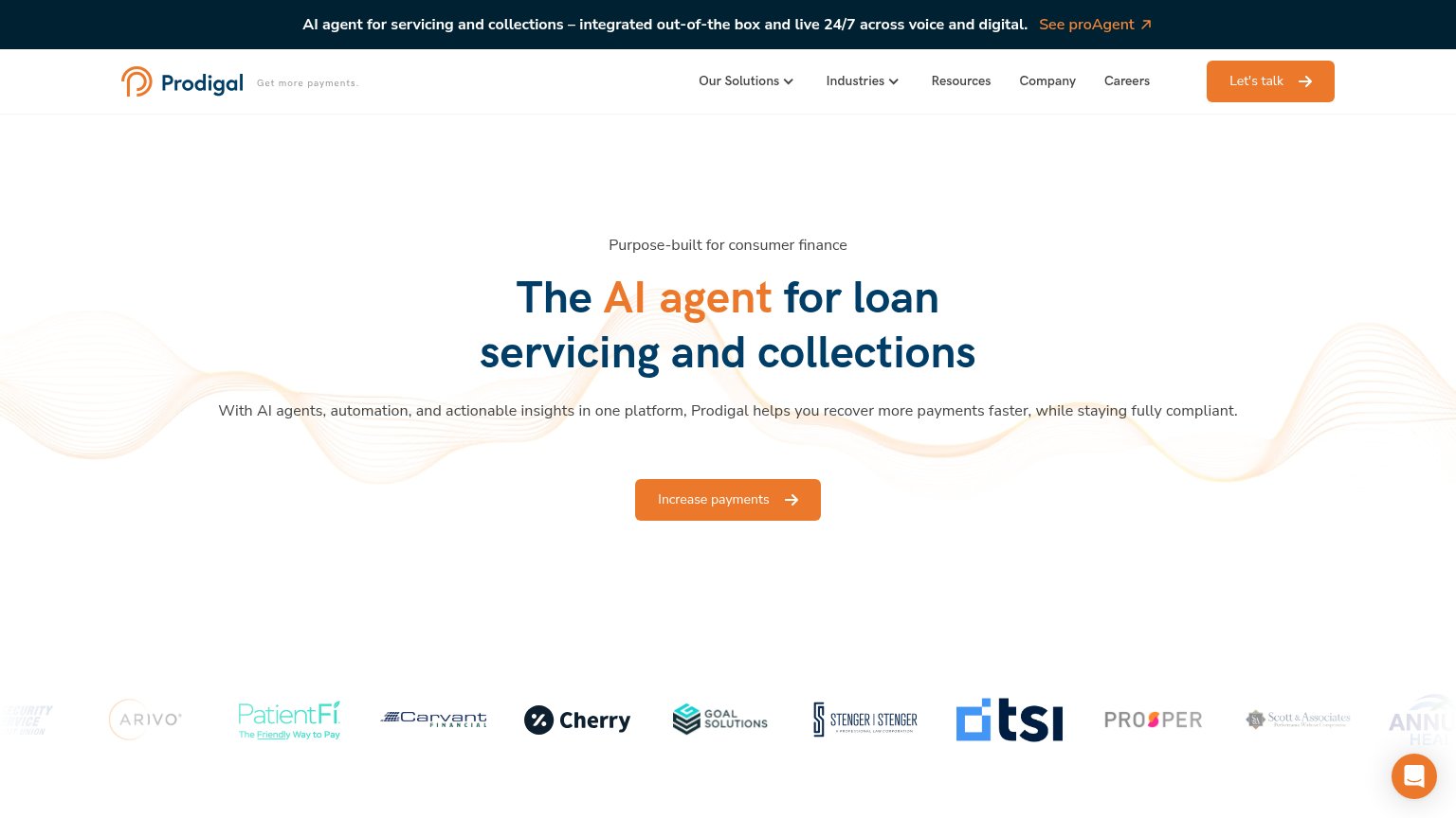
| Prodigal | Customer logo strip including Prosper, Cherry, PatientFi, Arivo, Carvant, Goal Solutions, TSI |
| "TRUSTED IN ACTIVE COLLECTIONS" customer logo strip (Quipux, KrediYA, Aseguradora Solidaria) | |
| Usage stats panel: "63K Creditors, 43M Accounts Processed, $12B Debt Managed, 125+ Deployments" | |
| "Talk to our AI Agent in real time" live demo form | |
| Product roster card listing named AI agents with use cases ("Taylor — Omnichannel Servicing & Collections", "Marshall — | |
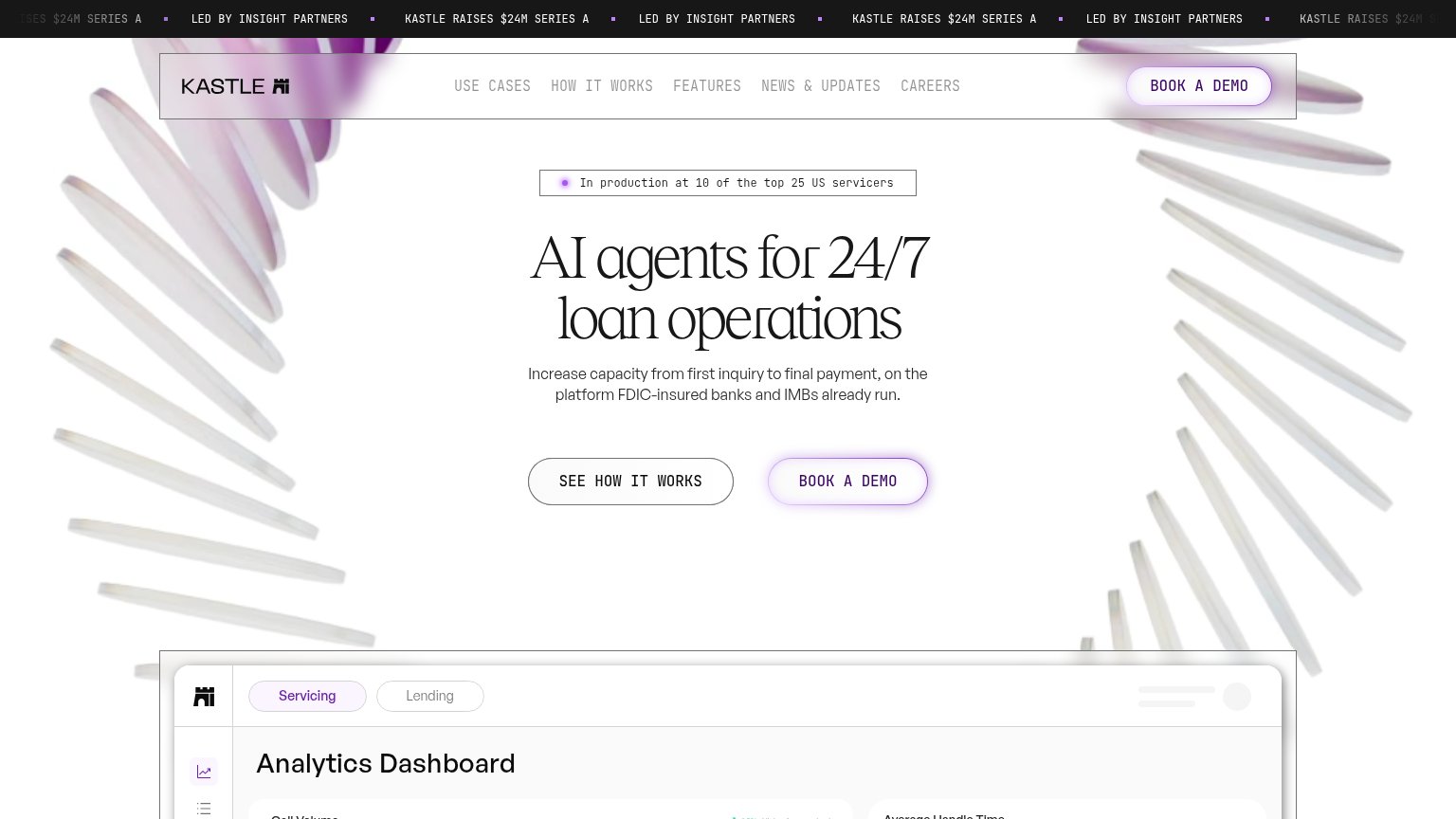
| "In production at 10 of the top 25 US servicers" badge above the hero headline |
Information hierarchy
72FairDoes the design help or inhibit what the page is trying to say?
123- Announcement bar link — "See proAgent" sits at the very top with high-contrast orange, pulling first attention to an exit before the hero CTA.
- Dual CTA competition — "Let's talk" in the nav uses the same orange fill and weight as the hero "Increase payments" button, splitting the primary action.
- Nav link row — Six nav items plus two dropdowns offer eight exit paths above the fold, all before the visitor reaches the hero button.
CTA
72FairCopy, size, verb, cost-feel — does the primary CTA earn the click?
How Prodigal compares
Recommended rewrites
Value props
72FairTitle, subtitle, hero — do they sell the product's true value?
Prodigal’s headline
The AI agent for loan servicing and collections
With AI agents, automation, and actionable insights in one platform, Prodigal helps you recover more payments faster, while staying fully compliant.
Working
Could improve
Mobile web
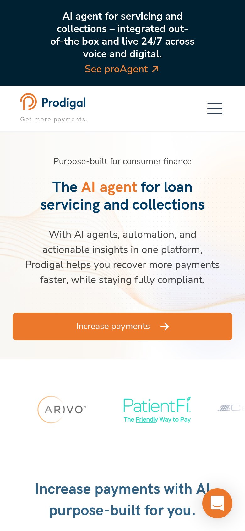
74FairThe phone experience as a first-class citizen.
What works
What to improve