
Your landing page’s weakest score is Trust.
How Skit.ai ranks
Trust
62FairProof that the product is real, competent, and safe to try.
| Trust read | |
|---|---|
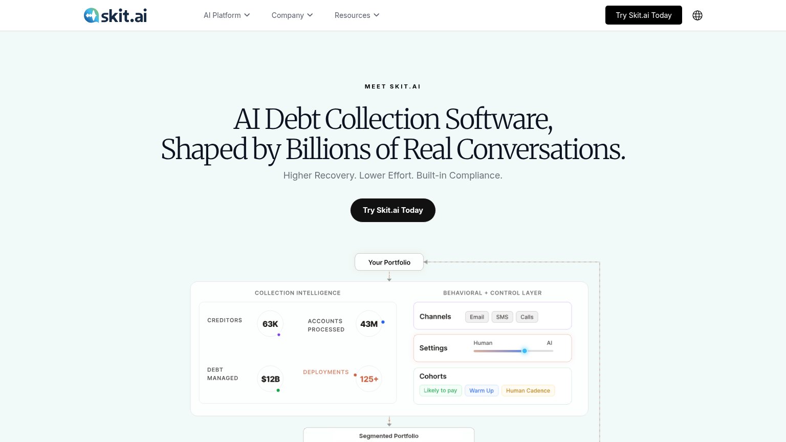
| Skit.ai | Usage stats panel: "63K Creditors, 43M Accounts Processed, $12B Debt Managed, 125+ Deployments" |
| "TRUSTED IN ACTIVE COLLECTIONS" customer logo strip (Quipux, KrediYA, Aseguradora Solidaria) | |
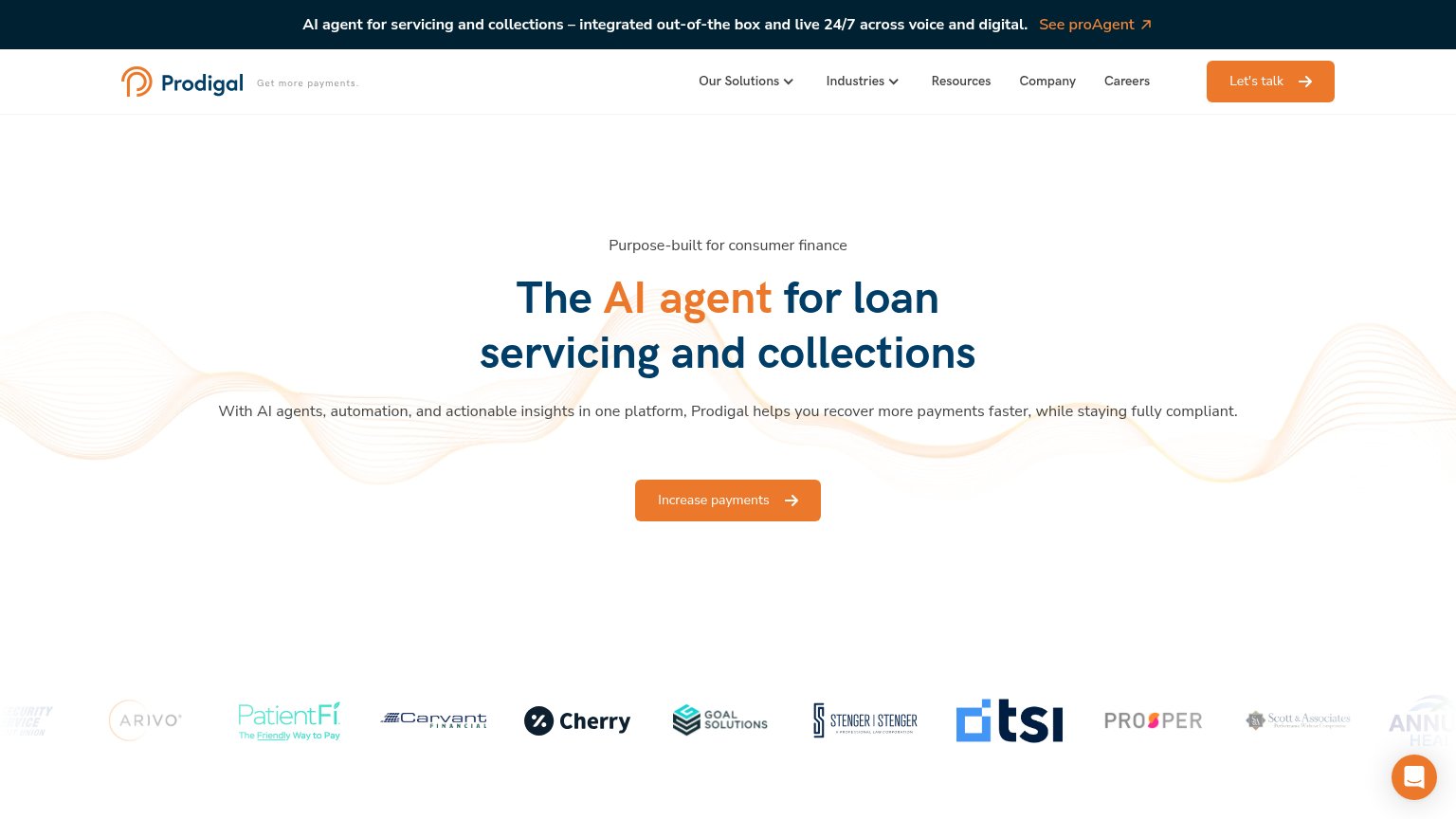
| Customer logo strip including Prosper, Cherry, PatientFi, Arivo, Carvant, Goal Solutions, TSI | |
| "Talk to our AI Agent in real time" live demo form | |
| Product roster card listing named AI agents with use cases ("Taylor — Omnichannel Servicing & Collections", "Marshall — | |
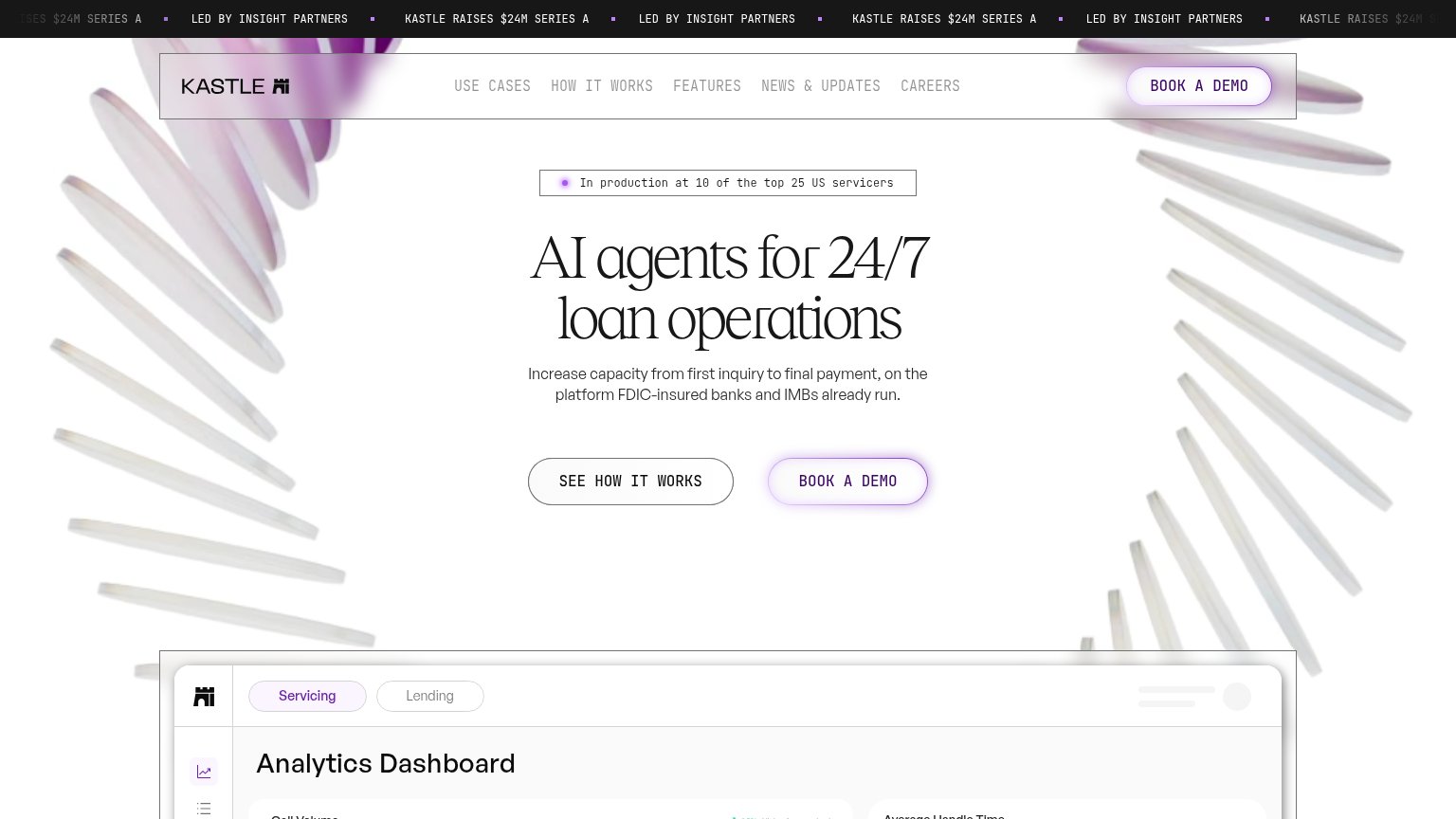
| "In production at 10 of the top 25 US servicers" badge above the hero headline |
Mobile web
72FairThe phone experience as a first-class citizen.
 123
- Oversized hero headline — Serif headline barely scales down, wrapping into five huge lines that push the subhead and CTA deep into the fold.
- Narrow CTA button — "Try Skit.ai Today" keeps desktop proportions at ~40% width instead of a thumb-friendly full-bleed button.
- Shrunken dashboard diagram — Desktop stats graphic compressed to phone width leaves labels like "Likely to pay" and "63K" illegibly small.
CTA
76FairCopy, size, verb, cost-feel — does the primary CTA earn the click?
How Skit.ai compares
Recommended rewrites
Value props
76FairTitle, subtitle, hero — do they sell the product's true value?
Skit.ai’s headline
AI Debt Collection Software, Shaped by Billions of Real Conversations.
Higher Recovery. Lower Effort. Built-in Compliance.
Working
Could improve
Information hierarchy
84StrongDoes the design help or inhibit what the page is trying to say?
What works
What to improve