
Your landing page’s weakest score is Trust.
How vk.ru ranks
48Growth scoreupdated
category scores
category scoresShowHide
Trust
35PoorProof that the product is real, competent, and safe to try.
| Trust read | |
|---|---|
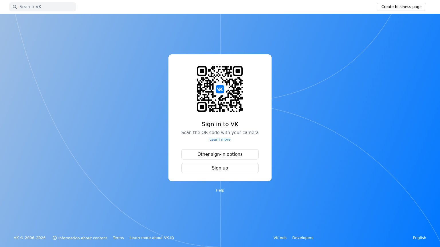
| vk.ru | "VK © 2006–2026" footer copyright indicating ~20 years of operation |
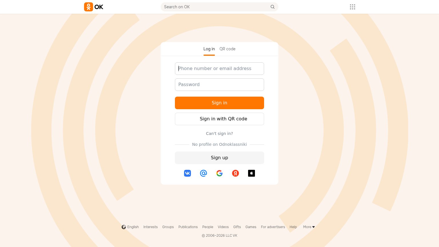
| Third-party sign-in row with VK, Mail.ru, Google, Yandex and Apple icons | |
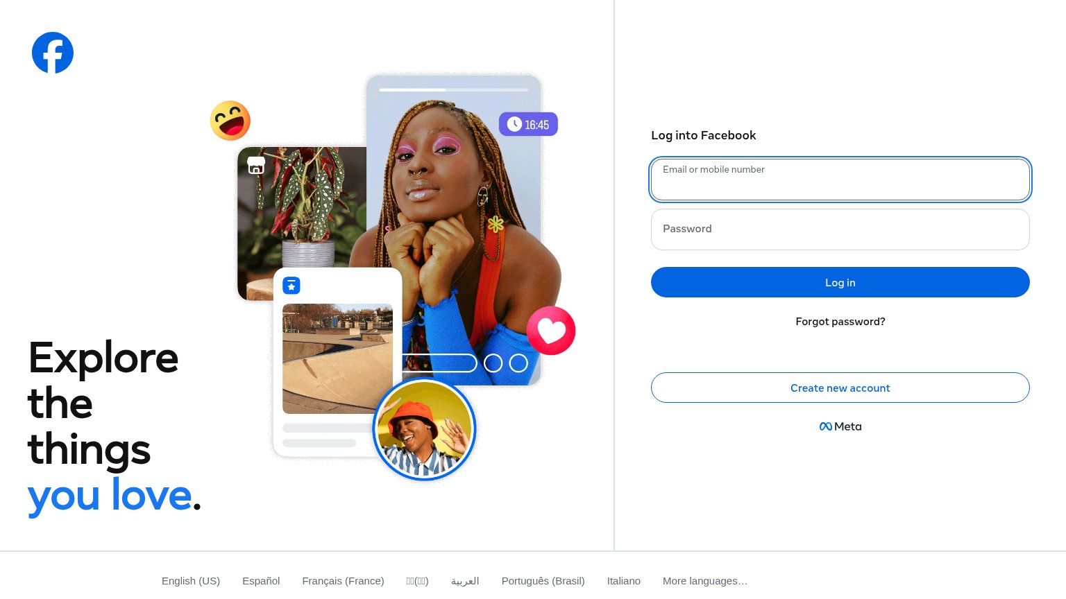
| Product collage showing feed cards, story timer "16:45", and reaction icons next to "Explore the things you love." | |
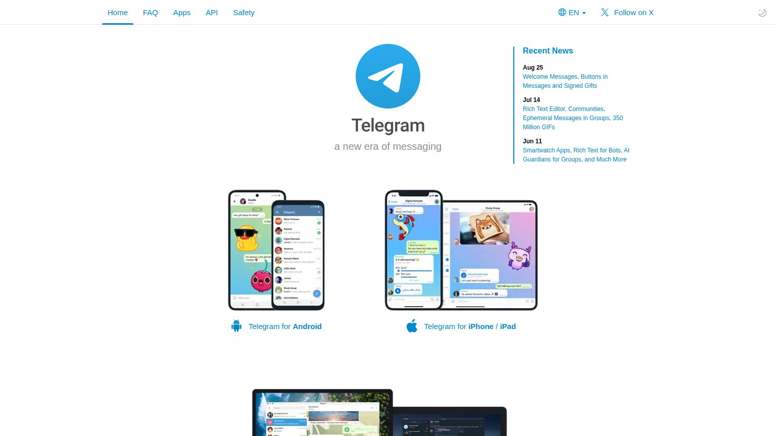
| Real Telegram app screenshots on Android and iPhone/iPad showing live chats, polls, voice messages, and large file shari | |
| "Continue with Google" / "Continue with Apple" OAuth sign-in options |
Value props
38PoorTitle, subtitle, hero — do they sell the product's true value?
vk.ru’s headline vague
Sign in to VK
Scan the QR code with your camera
Working
- Instruction is clear for returning users
- Sign up path is visible
- No clutter competing with the action
Could improve
- No statement of what VK is or does
- QR code replaces a product demo
- Zero numbers, proof, or outcomes
Information hierarchy
52FairDoes the design help or inhibit what the page is trying to say?
What works
What to improve
CTA
58FairCopy, size, verb, cost-feel — does the primary CTA earn the click?
How vk.ru compares
Recommended rewrites
Mobile web
58FairThe phone experience as a first-class citizen.
What works
What to improve