
Your landing page’s weakest score is Mobile web.
How viktor.ai ranks
Mobile web
52FairThe phone experience as a first-class citizen.
 123
- Clipped prompt placeholder — Placeholder truncates mid-word to "Ask VIKTOR to po" — the only interactive element in the fold looks broken on mobile.
- Oversized announcement banner — Five-line Arup banner eats ~20% of the first viewport before the logo, pushing the hero and any CTA down.
- Hamburger hides all CTAs — "Book a demo" and "Create free account" vanish into the menu, leaving no visible conversion action on the fold.
Trust
58FairProof that the product is real, competent, and safe to try.
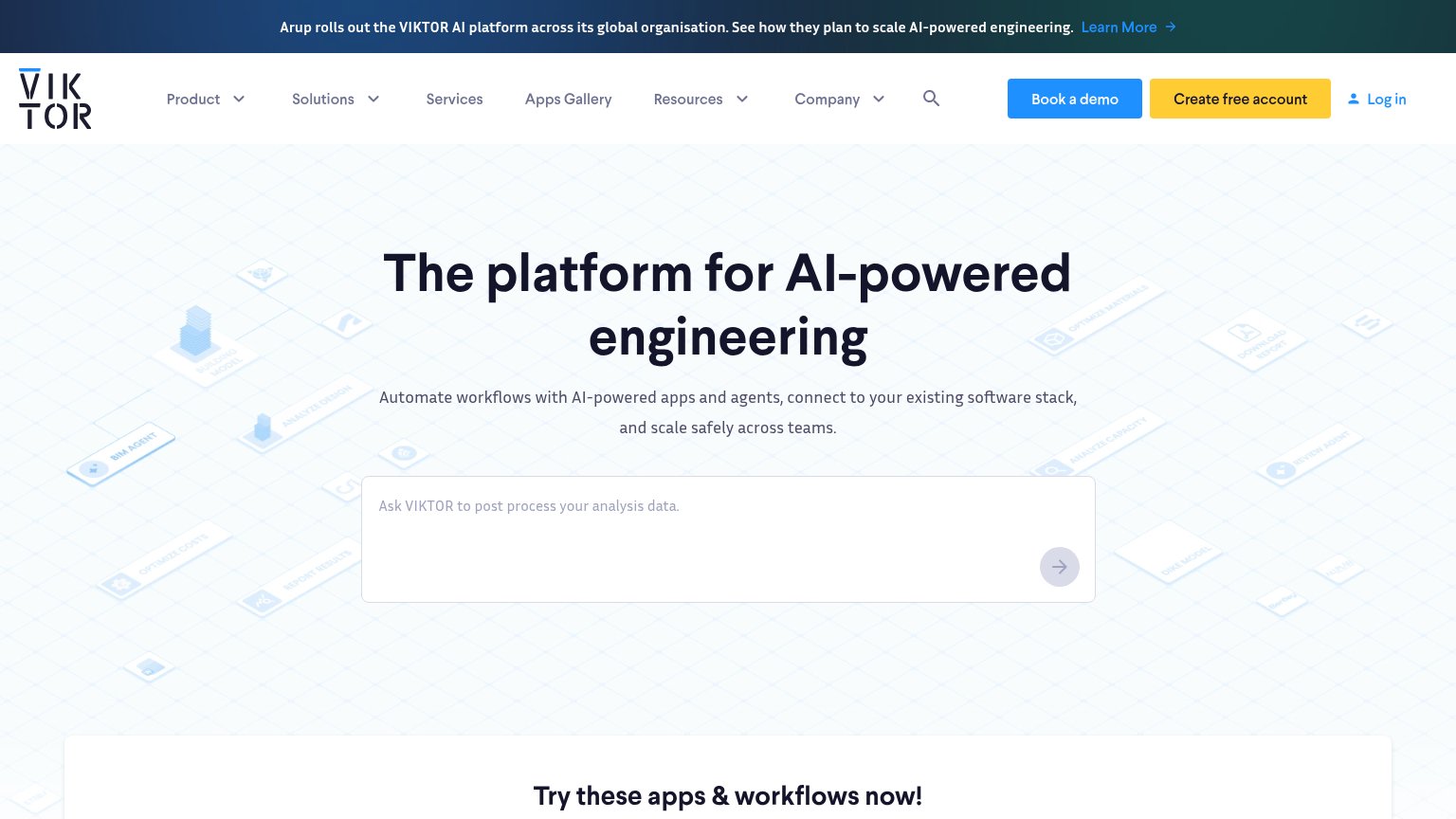
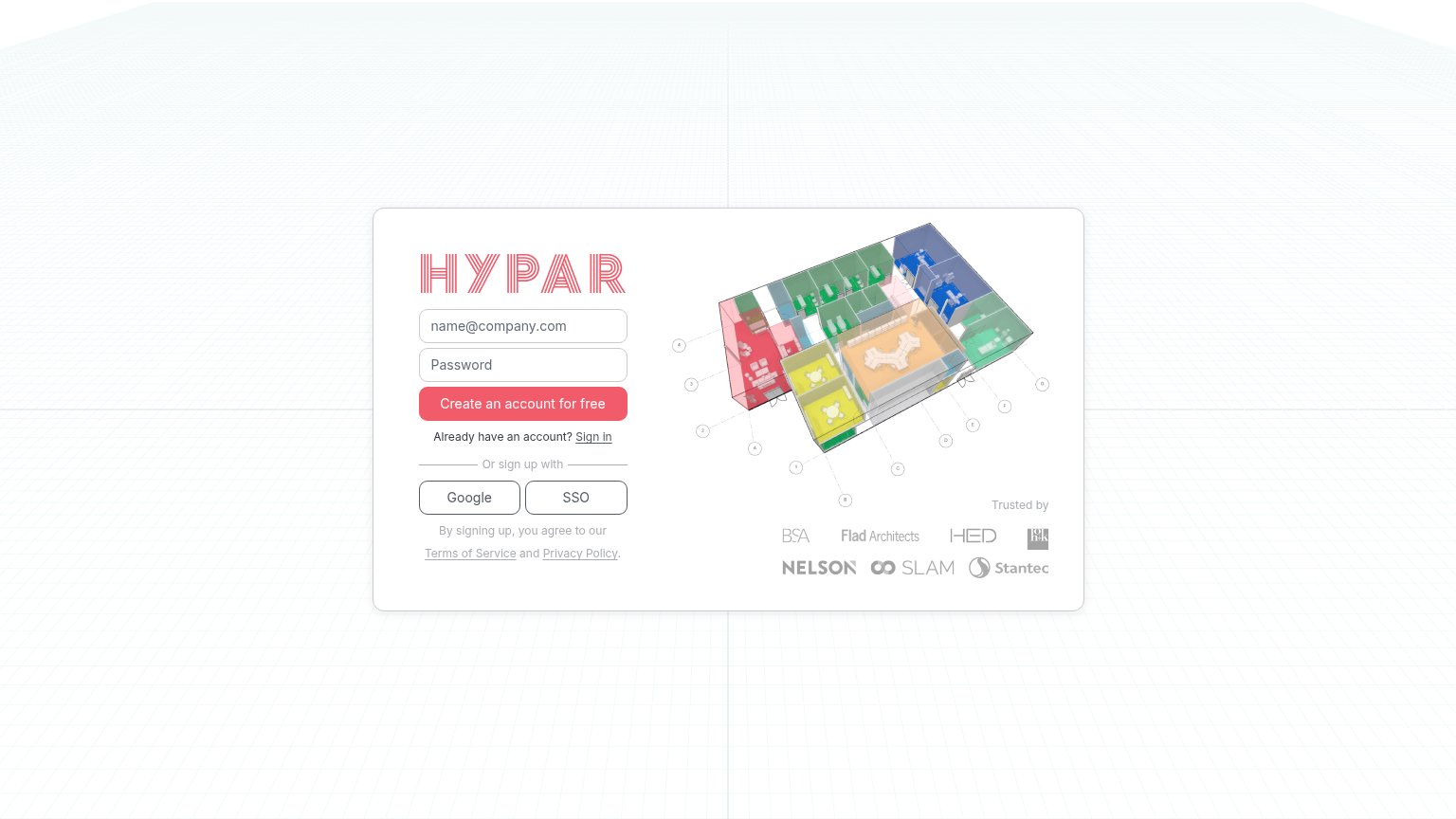
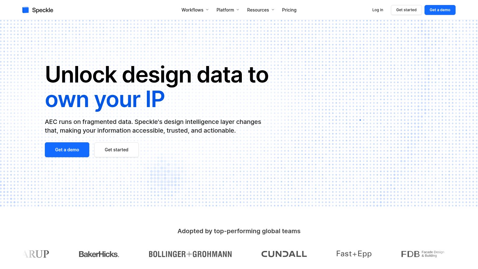
| Trust read | |
|---|---|
| viktor.ai | Banner: "Arup rolls out the VIKTOR AI platform across its global organisation." |
| Laptop hero image showing a real Grasshopper/Rhino-style parametric design interface in use | |
| "Trusted by" logo wall: BSA, Flad Architects, HED, NELSON, SLAM, Stantec | |
| "Adopted by top-performing global teams" logo strip (Arup, BakerHicks, Bollinger+Grohmann, Cundall, Fast+Epp, FDB) | |
| Construction industry card showing a tablet displaying real CAD drawing software in a worker's hands |
Information hierarchy
66FairDoes the design help or inhibit what the page is trying to say?
What works
What to improve
Value props
66FairTitle, subtitle, hero — do they sell the product's true value?
viktor.ai’s headline
The platform for AI-powered engineering
Automate workflows with AI-powered apps and agents, connect to your existing software stack, and scale safely across teams.
Working
Could improve
CTA
76FairCopy, size, verb, cost-feel — does the primary CTA earn the click?
How viktor.ai compares
Recommended rewrites