
Your landing page’s weakest score is Value props.
How Hypar ranks
66Growth scoreupdated
category scores
category scoresShowHide
Value props
30PoorTitle, subtitle, hero — do they sell the product's true value?
Working
- "Trusted by" logos add real credibility
- Free account offer lowers friction
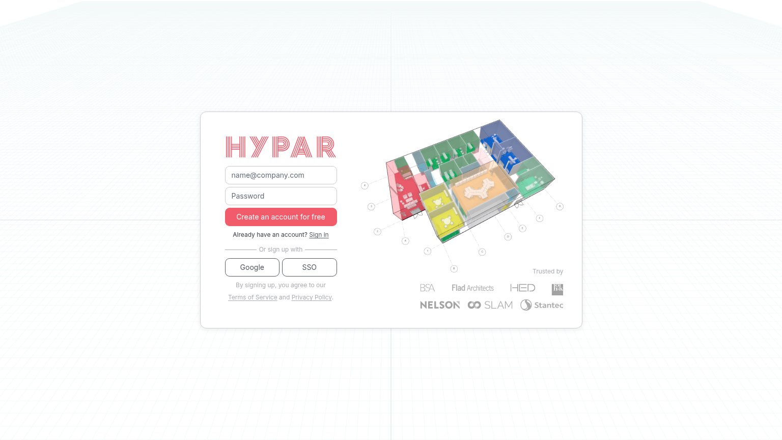
- Floor-plan art hints at the domain
Could improve
- No headline states what Hypar does
- Hero image decorates, never explains
- Zero outcomes or numbers on the fold
Information hierarchy
68FairDoes the design help or inhibit what the page is trying to say?
 123
- Signup card — No headline or subtitle anywhere — visitors must sign up before learning what Hypar is.
- Isometric building illustration — Carries the entire value proposition alone with no caption or claim anchoring it to an outcome.
- Terms and Privacy links — Underlined exit links sit directly in the signup flow's scan path beneath the social buttons.
Trust
70FairProof that the product is real, competent, and safe to try.
How Hypar compares
Trust read
CTA
78FairCopy, size, verb, cost-feel — does the primary CTA earn the click?
How Hypar compares
Recommended rewrites
Mobile web
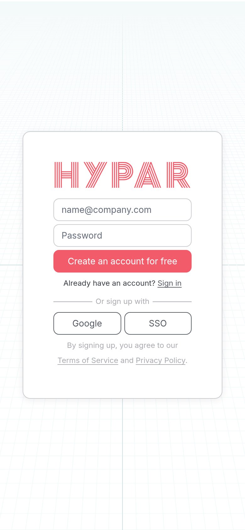
82StrongThe phone experience as a first-class citizen.
What works
What to improve