
Your landing page’s weakest score is Information hierarchy.
How vidalion.ai ranks
- 1.
Synthesia83
- 2.
Creatify79
- 3.
Arcads77
- 4.
HeyGen70
- 5.
Captions70
- 6.
vidalion.ai43
43Growth scoreupdated
category scores
category scoresShowHide
Information hierarchy
38PoorDoes the design help or inhibit what the page is trying to say?
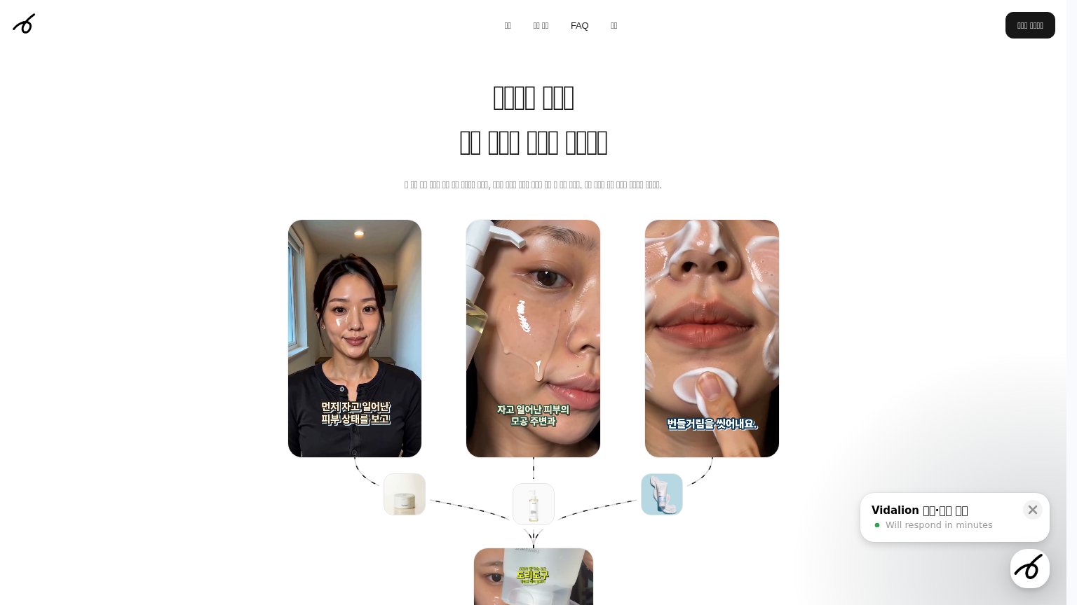 123
- Headline text rendering — The hero headline and subheadline render as broken tofu boxes, so the value proposition is unreadable at the page's most important position.
- Three equal-weight images — Three same-size video stills compete at identical visual weight with no focal point, reading as a collage rather than one argument.
- Chat widget overlap — The Vidalion chat bubble covers the lower-right content and adds a fourth competing element before the visitor reaches any CTA.
Value props
38PoorTitle, subtitle, hero — do they sell the product's true value?
vidalion.ai’s headline vague
□□□□ □□□ □□ □□□ □□□ □□□□
□ □□ □□ □□□ □□ □□ □□□□□ □□□, □□□ □□□ □□□ □□ □ □□ □□□. □□ □□□ □□ □□□ □□□□ □□□□.
Working
- Hero images show real product-style UGC clips
- Visual flow maps content into a pipeline
Could improve
- Headline text fails to render (tofu boxes)
- No outcome or product name in the fold
- No numbers or proof points visible
Mobile web
38PoorThe phone experience as a first-class citizen.
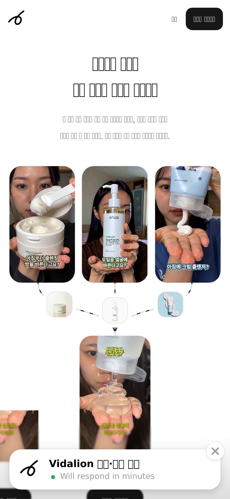
What works
What to improve
Trust
42PoorProof that the product is real, competent, and safe to try.
How vidalion.ai compares
Trust read
CTA
58FairCopy, size, verb, cost-feel — does the primary CTA earn the click?
How vidalion.ai compares
Recommended rewrites