
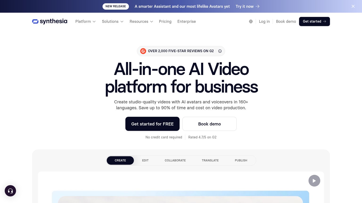
Your landing page’s weakest score is Information hierarchy.
How Synthesia ranks
83Growth scoreupdated
category scores
category scoresShowHide
Information hierarchy
78FairDoes the design help or inhibit what the page is trying to say?
 123
- Announcement banner — 'Try it now' link sits at the very top and siphons first attention away from the hero CTA.
- Header Get started — Same-weight duplicate of the hero CTA splits the primary action across two locations.
- Nav link cluster — Five nav items plus Log in and Book demo create most of the fold's nine exit paths.
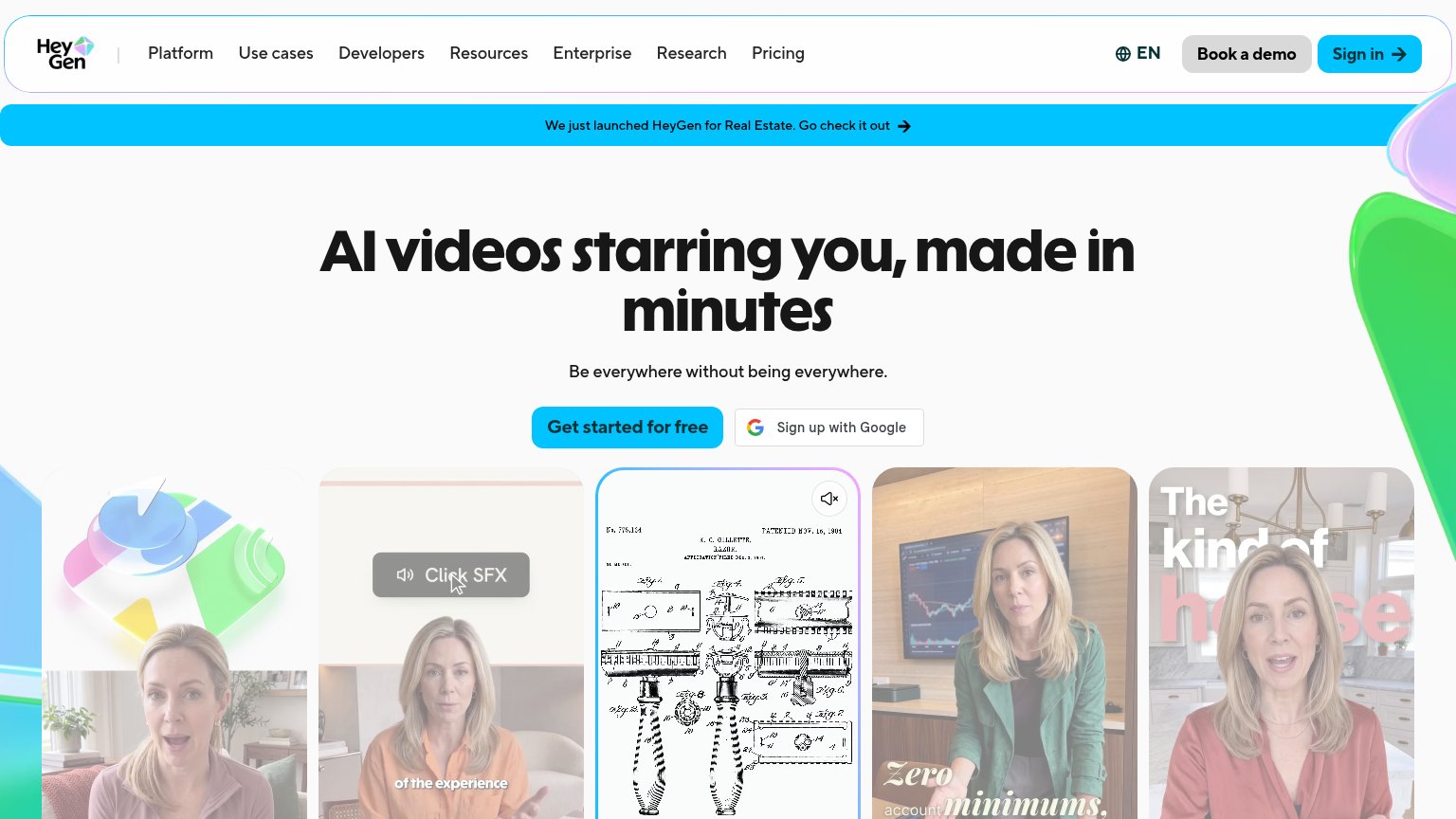
CTA
82StrongCopy, size, verb, cost-feel — does the primary CTA earn the click?
Problems
- 4 words, over the 3-word ideal
- desktop and mobile labels differ
- 'Get started' generic vs mobile copy
- nav says 'Get started' without free
Trust
82StrongProof that the product is real, competent, and safe to try.
How Synthesia compares
Trust read
Value props
84StrongTitle, subtitle, hero — do they sell the product's true value?
Synthesia’s headline
All-in-one AI Video platform for business
Create studio-quality videos with AI avatars and voiceovers in 160+ languages. Save up to 90% of time and cost on video production.
Working
Could improve
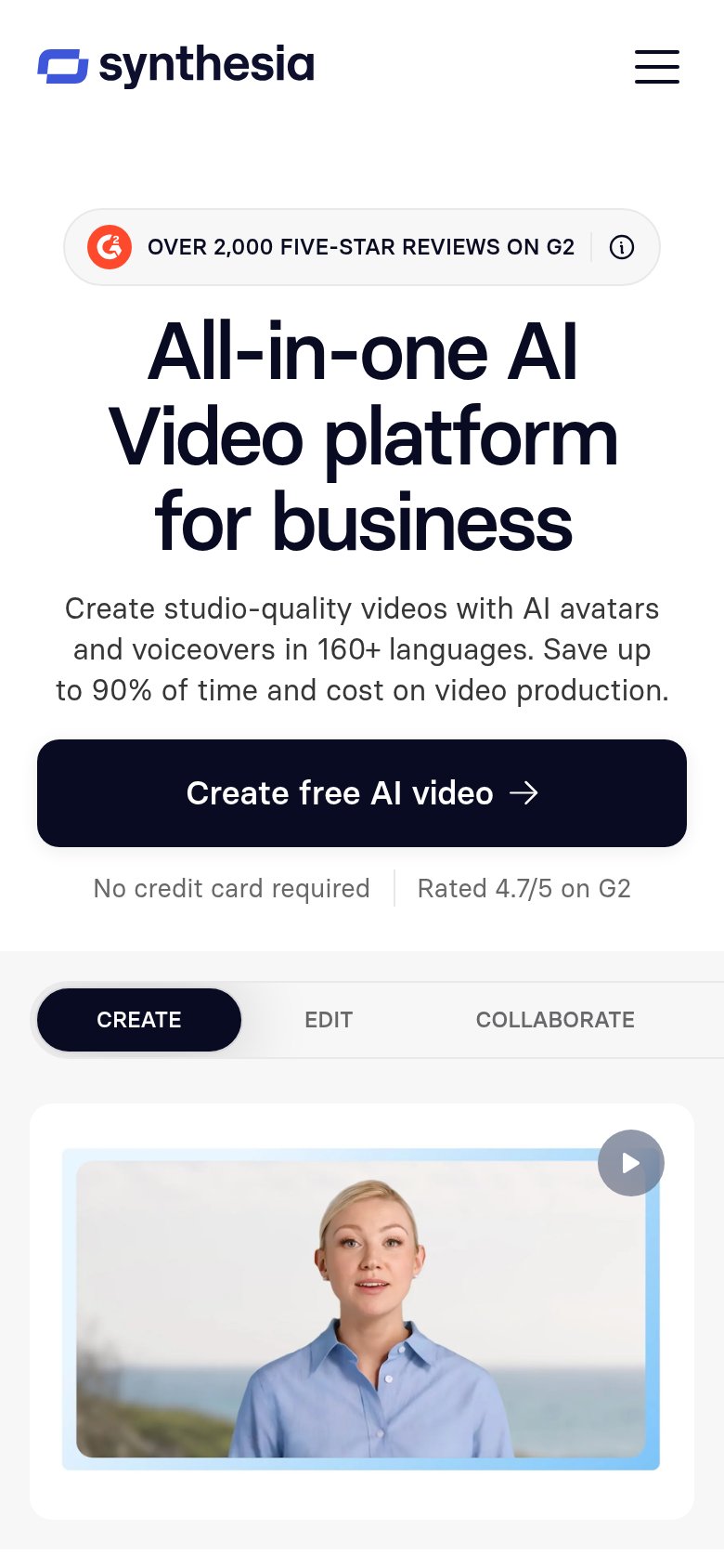
Mobile web
88StrongThe phone experience as a first-class citizen.
What works
What to improve