
Your landing page’s weakest score is Trust.
How Caucus ranks
- 1.
Fireside68
- 2.
Indigov64
- 3.
Caucus59
- 4.
NationBuilder56
Trust
48PoorProof that the product is real, competent, and safe to try.
| Trust read | |
|---|---|
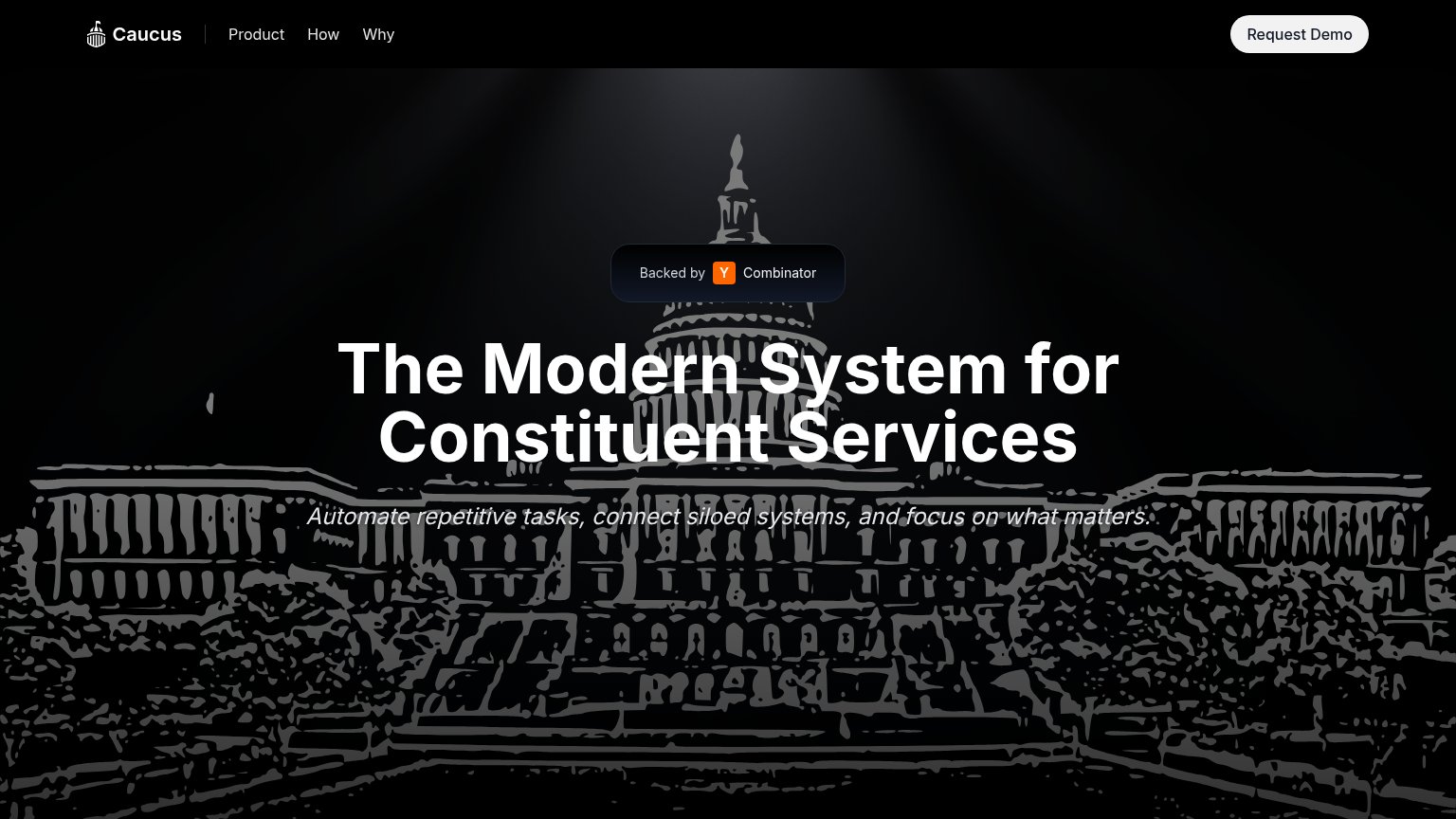
| Caucus | "Backed by Y Combinator" badge |
| "Trusted by Hundreds of Public Offices" section header | |
| "Exciting News: Indigov is now part of the Granicus family." banner with "now part of Granicus" header lockup | |
| implicit context NationBuilder may benefit from pre-existing familiarity among its target audience. |
Mobile web
54FairThe phone experience as a first-class citizen.
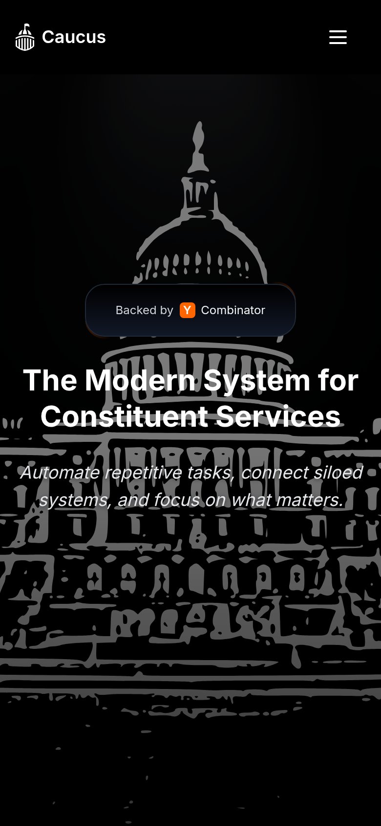
The biggest failure is that the primary CTA is missing from the mobile fold entirely: the desktop "Request Demo" button collapses behind the hamburger menu, leaving no tappable action anywhere in the first viewport — a visitor sees the "Backed by Y Combinator" badge, the headline, and the subhead, but nothing to do next. The nav itself collapses cleanly into a compact hamburger, and the fold stays uncrowded with a single value statement, "The Modern System for Constituent Services." Readability suffers where the italic subhead "Automate repetitive tasks, connect siloed systems..." sits in gray over the busy Capitol illustration, dropping contrast at exactly the line that explains the product. The single biggest lever is adding a full-width "Request Demo" button directly under the subhead so the mobile fold converts instead of dead-ending.
CTA
56FairCopy, size, verb, cost-feel — does the primary CTA earn the click?
How Caucus compares
Recommended rewrites
Value props
58FairTitle, subtitle, hero — do they sell the product's true value?
The Modern System for Constituent Services
Automate repetitive tasks, connect siloed systems, and focus on what matters.
Working
Could improve
Information hierarchy
78FairDoes the design help or inhibit what the page is trying to say?
What works
What to improve