
Your landing page’s weakest score is Trust.
How NationBuilder ranks
- 1.
Fireside68
- 2.
Indigov64
- 3.
Caucus59
- 4.
NationBuilder56
Trust
42PoorProof that the product is real, competent, and safe to try.
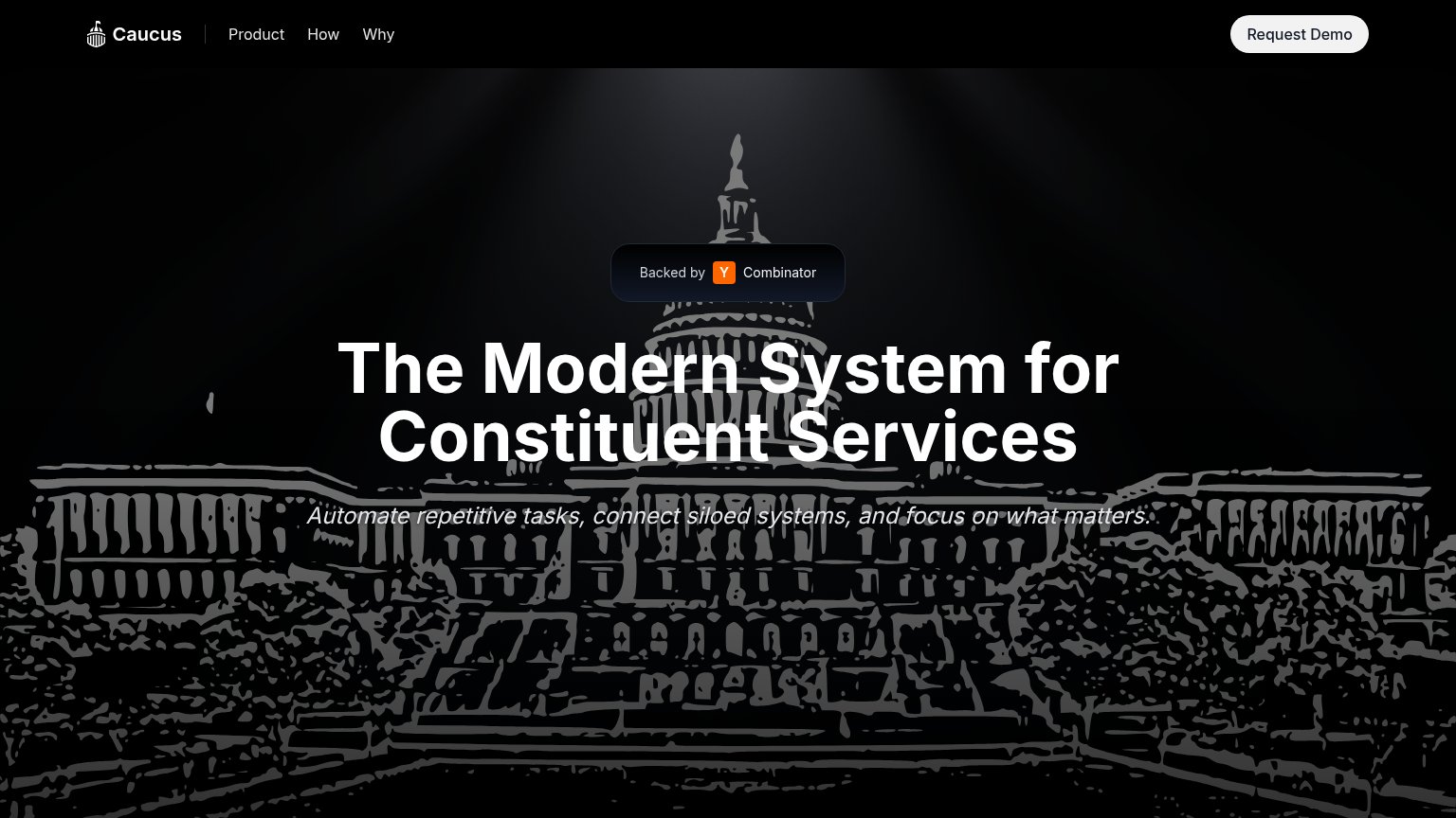
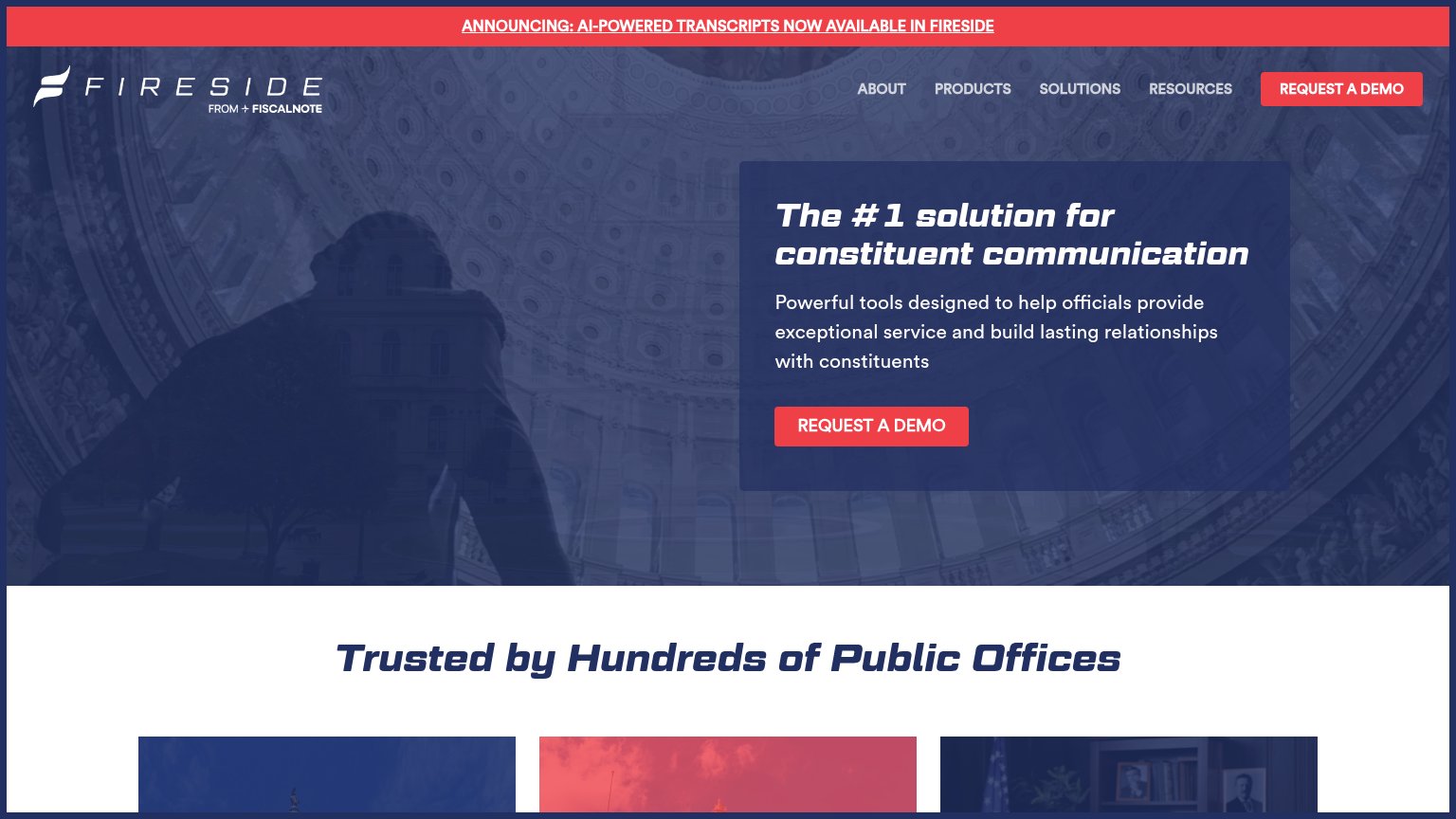
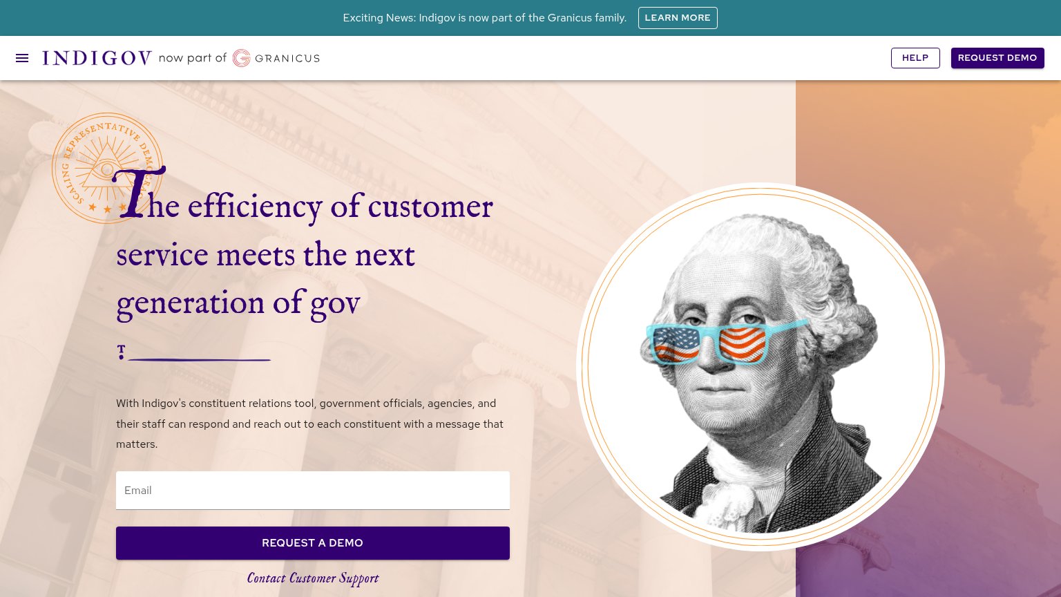
| Trust read | |
|---|---|
| NationBuilder | implicit context NationBuilder may benefit from pre-existing familiarity among its target audience. |
| "Backed by Y Combinator" badge | |
| "Trusted by Hundreds of Public Offices" section header | |
| "Exciting News: Indigov is now part of the Granicus family." banner with "now part of Granicus" header lockup |
Mobile web
45PoorThe phone experience as a first-class citizen.
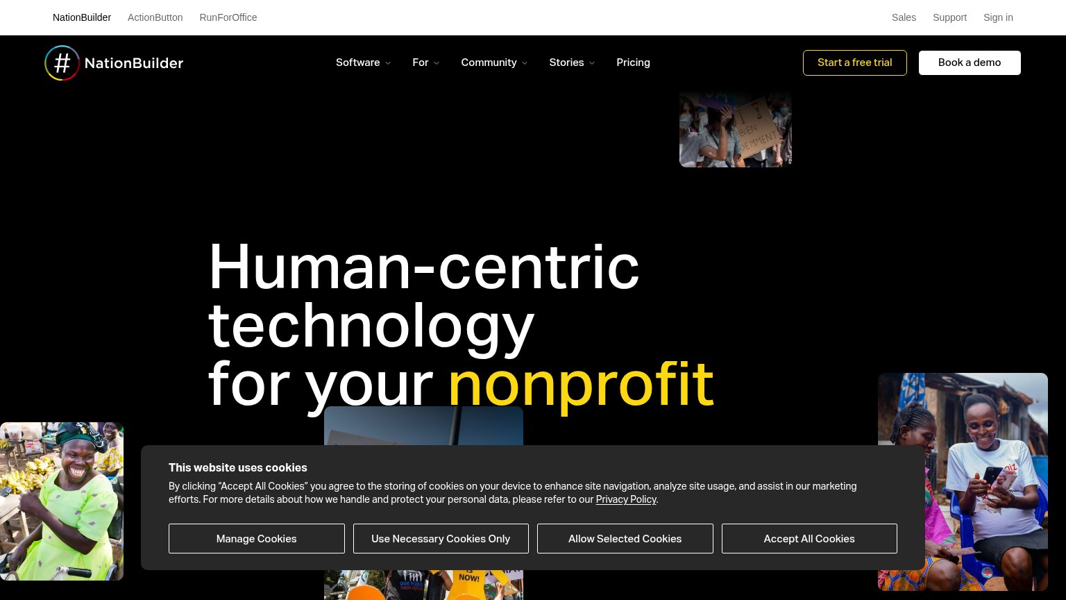
The mobile capture failed, so NationBuilder's mobile web is graded from responsive signals in the desktop capture only, which caps the score at 65. The desktop fold shows a cookie consent banner with four buttons ("Manage Cookies", "Use Necessary Cookies Only", "Allow Selected Cookies", "Accept All Cookies") — a dead blocker with no conversion-valuable CTA that would consume most of a phone viewport and stand between the visitor and "Start a free trial". The oversized "Human-centric technology for NationBuilder's nonprofit" headline and the four scattered photo tiles suggest heavy scaling work is needed for a phone column, and there is no visible evidence of how the five-item nav ("Software", "For", "Community", "Stories", "Pricing") collapses. The biggest lever is shrinking the cookie banner to a compact single-action bar so the primary CTA stays reachable on mobile.
Information hierarchy
52FairDoes the design help or inhibit what the page is trying to say?
What works
What to improve
Value props
58FairTitle, subtitle, hero — do they sell the product's true value?
Human-centric technology for your nonprofit
Working
Could improve
CTA
82StrongCopy, size, verb, cost-feel — does the primary CTA earn the click?
How NationBuilder compares
Recommended rewrites