
Your landing page’s weakest score is Mobile web.
How Autumn ranks
78Growth scoreupdated
category scores
category scoresShowHide
Mobile web
72FairThe phone experience as a first-class citizen.
 123
- Five-line hero headline — Headline scales down too little and wraps into five tall lines, pushing the CTAs to the fold edge.
- Six-line body paragraph — Desktop-length paragraph runs six lines on mobile, crowding the column and delaying the CTA.
- CTA row at fold edge — "START FOR FREE" sits at the very bottom of the first viewport and risks falling below the fold on shorter screens.
Information hierarchy
78FairDoes the design help or inhibit what the page is trying to say?
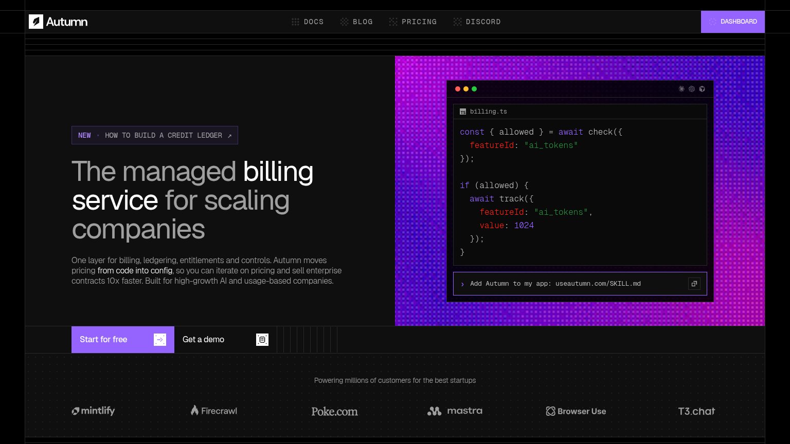 1234
- Start for free CTA — Pinned to the bottom strip of the viewport, outside the headline scan path where the eye lands first.
- Get a demo button — Sits at near-equal size beside the primary CTA, splitting the single action into two choices.
- NEW credit ledger banner — High-contrast outlined pill above the headline pulls first attention toward a blog exit.
- Dashboard nav button — Only filled button in the nav, outweighing the fold's conversion CTA for returning-user traffic.
Value props
78FairTitle, subtitle, hero — do they sell the product's true value?
Autumn’s headline
The managed billing service for scaling companies
One layer for billing, ledgering, entitlements and controls. Autumn moves pricing from code into config, so you can iterate on pricing and sell enterprise contracts 10x faster. Built for high-growth AI and usage-based companies.
Working
Could improve
Trust
78FairProof that the product is real, competent, and safe to try.
How Autumn compares
Trust read
CTA
86StrongCopy, size, verb, cost-feel — does the primary CTA earn the click?
How Autumn compares
Recommended rewrites