
Your landing page’s weakest score is Trust.
How Schematic ranks
- 1.
Autumn78
- 2.
Lago76
- 3.
Schematic74
- 4.
Orb74
- 5.
Metronome73
- 6.
Stigg70
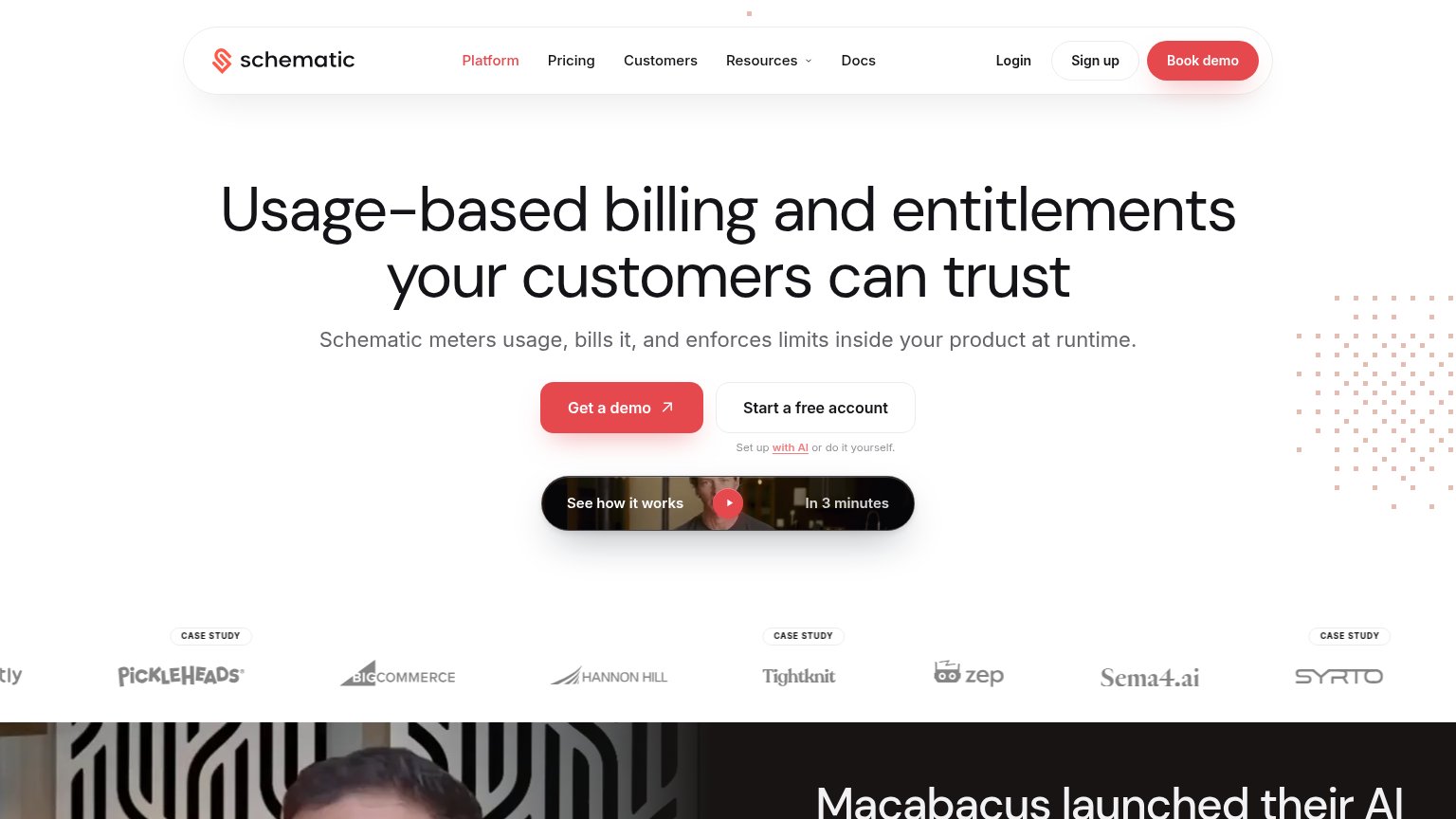
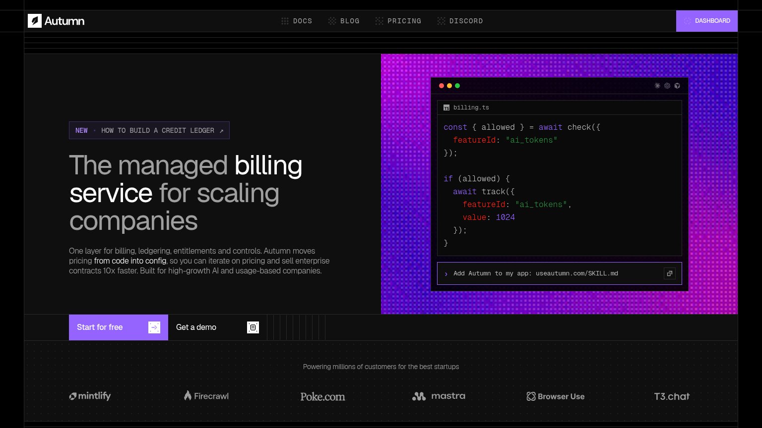
Trust
68FairProof that the product is real, competent, and safe to try.


| Trust read | |
|---|---|
| Schematic | Customer logo strip with CASE STUDY badges (Pickleheads, BigCommerce, Hannon Hill, Tightknit, Zep, Sema4.ai, Syrto) |
| Customer logo strip (Mintlify, Firecrawl, Poke.com, Mastra, Browser Use, T3.chat) captioned "Powering millions of custom | |
| "Lago helps companies like CoreWeave, Mistral AI and PayPal manage and scale any pricing model" | |
| Customer logo bar with Neo4j, Vercel, Replit, Supabase, Redis, LaunchDarkly | |
| "Metronome is now part of Stripe" banner with "a stripe product" badge in the header | |
| "p99 < 10ms ENTITLEMENT CHECKS / 1M+ events/sec INGESTION RATE" metric strip with live terminal snippet "$ stigg stream |
CTA
72FairCopy, size, verb, cost-feel — does the primary CTA earn the click?
Problems
- demo feels costly — sales call
- no 'free' despite free account
- header says 'Book demo' instead
- free path demoted to ghost button
Information hierarchy
76FairDoes the design help or inhibit what the page is trying to say?
What works
What to improve
Value props
76FairTitle, subtitle, hero — do they sell the product's true value?
Schematic’s headline
Usage-based billing and entitlements your customers can trust
Schematic meters usage, bills it, and enforces limits inside your product at runtime.
Working
Could improve
Mobile web
76FairThe phone experience as a first-class citizen.
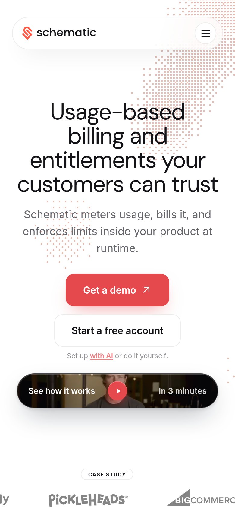
What works
What to improve